Form
A form allows people to input information.Usage
Use a form when you want people to provide and submit relevant information, such as changing personal settings or creating a work item.
Components that can be used within a form include text fields, (opens new window), text areas, (opens new window), selects, (opens new window), radio buttons, (opens new window), checkboxes, (opens new window), date and time pickers, (opens new window), toggles, (opens new window), ranges, (opens new window), and buttons, (opens new window).
Parts
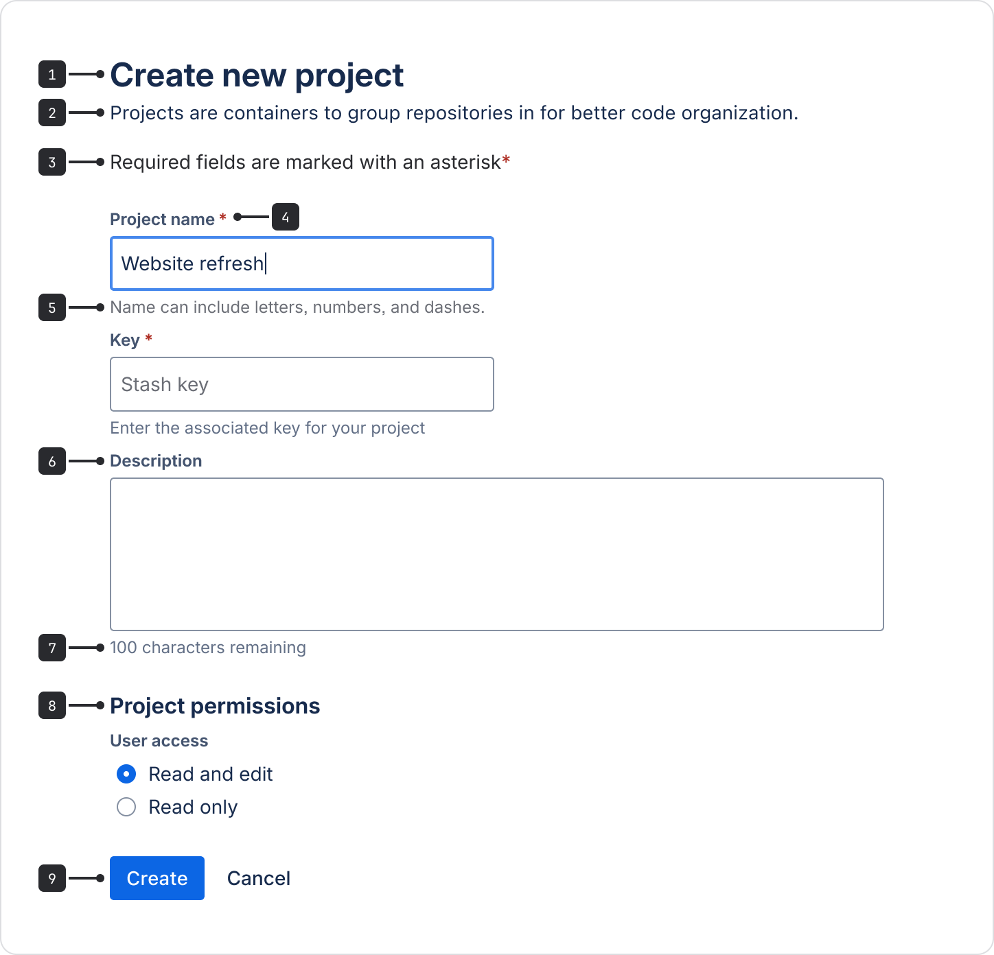
- Title: Use a short title to explain the form’s intention.
- Description (optional): A short description can be placed after the title.
- Required fields legend: When a form has required fields, always include the legend. View legend wording.
- Required fields: Use a red asterisk after the field label to clearly show it's a required field.
- Helper text: Use for information that clarifies the input and helps people fill in the field.
- Labels: Labels are required for all form inputs. Labels should be concise, left-aligned, and placed above a form field.
- Character counter: Use when a field has a character limit to show a real-time countdown of characters used. View details of the character counter, (opens new window).
- Form section: Use sections to group form fields into smaller parts. Include a concise section title to describe the group of controls and fields. If needed, add a short description to explain the section.
- Form footer: Always use a submit button and distinguish primary and secondary buttons. Read about button placement.
Accessibility guidance for forms
- Autofocus the first field by default. This allows people to tab through elements in the form in a logical way.
- Make sure all fields have a visible and accessible label. The only exception to a visible label is for a search field, but only when it has a search icon, accessible label, and placeholder.
- Never disable a submit button, even if all of the required fields aren't filled in. Instead, describe what needs to be done with clear instructions and validation and error messages.
- Use standard HTML autofill tokens, (opens new window) to reduce typing and user error by letting the browser suggest previously saved information.
- Persist forms on refresh so user data isn’t lost.
- Validate forms inline so people using keyboards don't have to navigate far to get feedback.
- Make interactions and written instructions clear to prevent errors and help people fix problems as they occur.
- On mobile, match the keyboard to the input type. For example: if asking for a phone number, bring up the numbers keys.
Avoid placeholder text
- Don’t use placeholder text – it isn’t accessible and won’t be read out by assistive technologies.
- Exception: placeholder text can be used in search fields if it’s accompanied by a search icon and accessible label. This ensures that people using assistive technologies understand what type of field it is.

Do
Use helper text to give information that helps people fill in the field.

Don’t
Don't use placeholder text to give critical information.
Layout
The width of a form typically follows the width of where it lives, for example in a modal or page.
Use form sections, (opens new window) to group related fields into logical sections. This helps people better understand the information they need to enter.
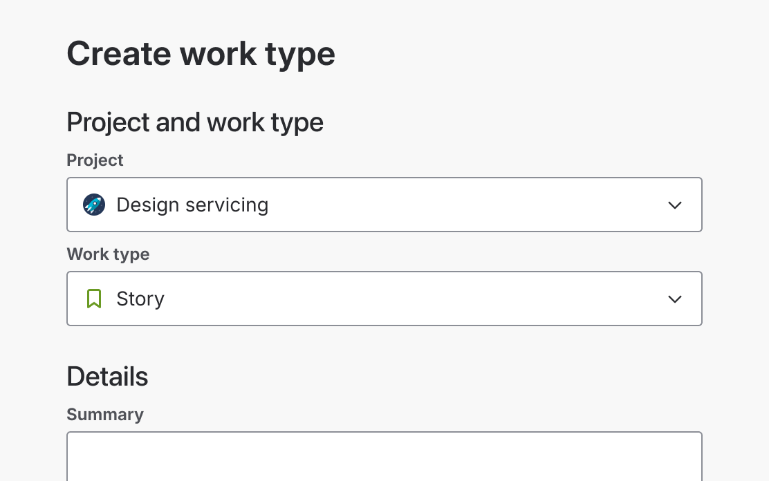
Do
Group related information into form sections.
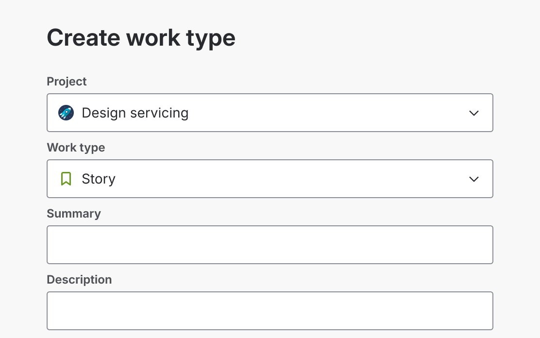
Don’t
Don't provide a form of unrelated information.
Use one form column as it’s easier to follow and comprehend. People using screen magnifiers may also miss content in a second column.

Do
Use only one column in a form.

Don’t
Don't use multiple form columns.
Fields and labels
Fields
- Limit the number of form fields to avoid cognitive load and help people submit the form faster.
- Avoid optional fields by only asking for relevant information.
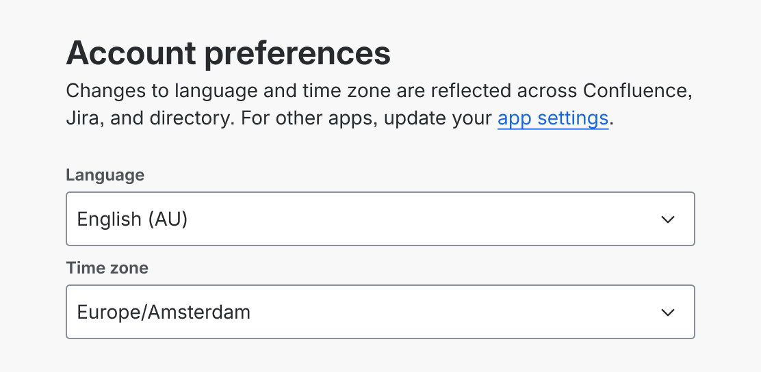
- Instead of using default selections, use smart defaults where relevant. For example, preselect the user's country based on location data.
- The length of a field should reflect the intended length of content. Available lengths are 75px, 150px, 250px, 350px, and 500px.
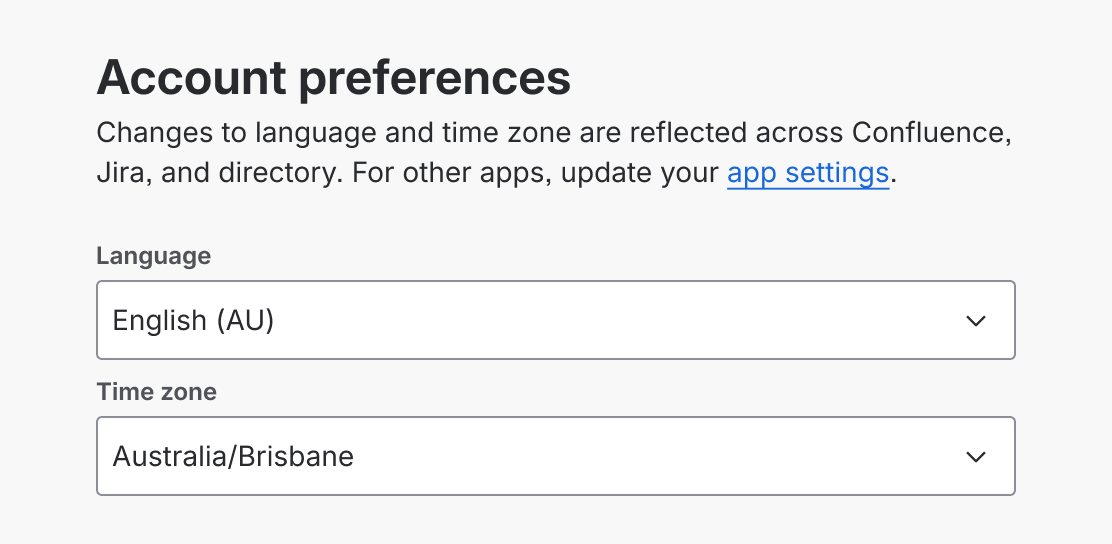
Do
Provide smart default values.
Don’t
Don't give random default values.

Do
Use input masks to help users understand correct field formats.

Don’t
Don’t use default inputs for particular fields.
Required fields
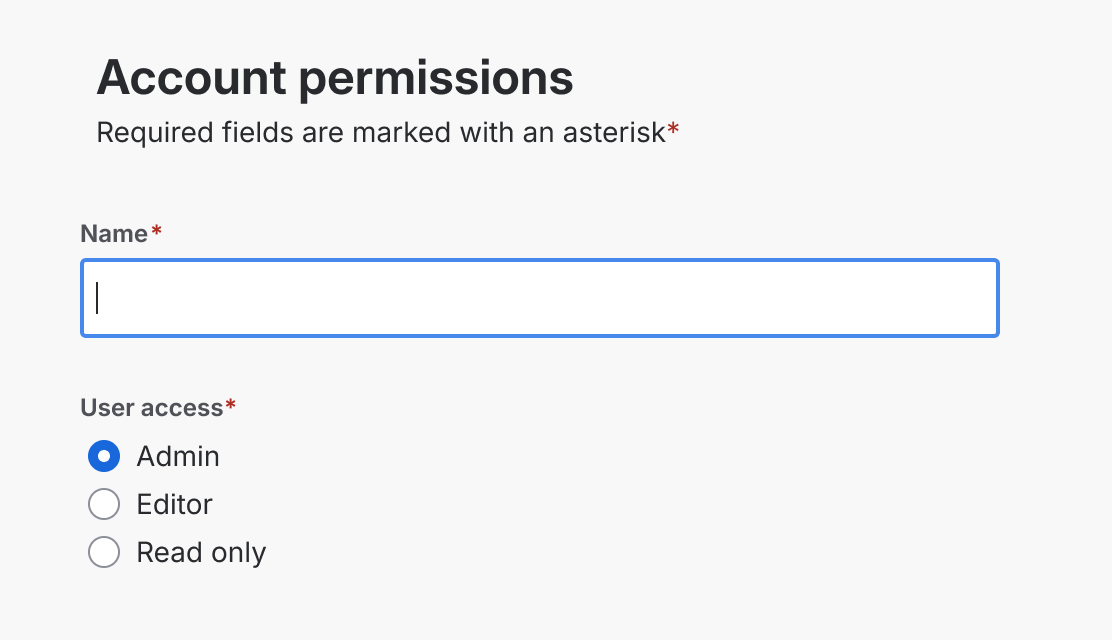
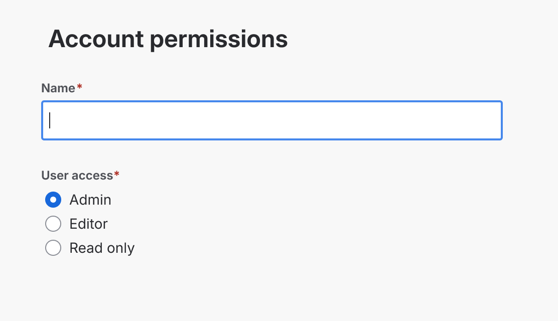
When a form has required fields, always include a legend at the top of the form and add an asterisk after the field label.
- Legend wording must be: 'Required fields are marked with an asterisk *'
- If a form has a description, place the legend after the description.
- Use a red asterisk (*) after the field label to clearly show which fields are required.
Do
Always include the legend: Required fields are marked with an asterisk *.
Don’t
Don’t forget the legend and only mark a required field with an asterisk (*).
Labels
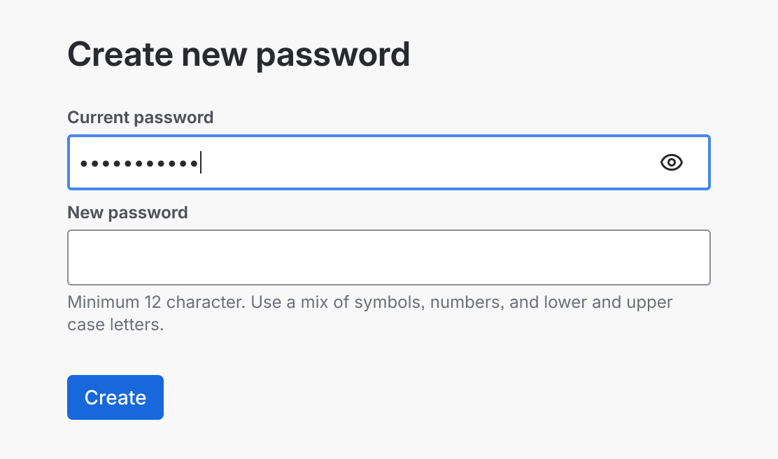
- Always include a visible label with an input field.
- The only exception is for a search field that has a search icon, accessible label, and placeholder text.
Do
Always include a visible label.

Don’t
Don’t use placeholder text instead of a visible label.
Write concise labels and avoid using verbs.

Do
Describe the field.

Don’t
Don’t use a verb or action in a label.
- Use a primary button for the main action. Then, if required, use a standard or a link button.
- Use a link button for a 'cancel' action.
- The button label should state the action the button performs when selected.
Avoid multiple action buttons and reset buttons. This will reduce confusion about how to submit the form.
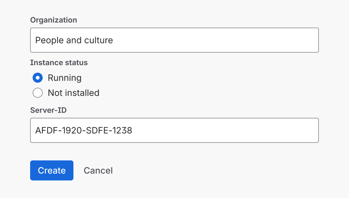
Do
Use clear, binary actions in button labels.
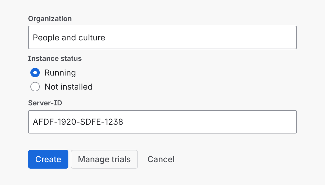
Don’t
Don't use multiple action buttons and a cancel button in the footer of a form.
Ensure the primary action button provides feedback that the form is being submitted.

Do
Give feedback, like a spinner, to show the form is being submitted.

Don’t
Don't let the user question whether their action might not have worked.
The button’s label should reflect the action in the heading.

Do
If your form has an action (verb) in the heading, use the same action in the button label.

Don’t
Don’t show a different action in the button label. Align it with the form’s heading.
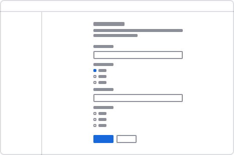
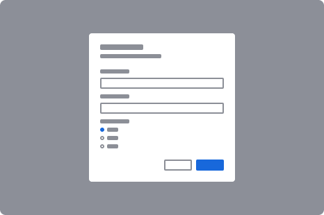
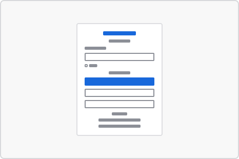
How buttons are aligned depends on the type of form you’re designing. For detailed guidance on button positioning, view button alignment and positioning, (opens new window).
| Left-aligned buttons | Right-aligned buttons | Center-aligned buttons |
|---|---|---|
| - Single-page forms | - Modal dialogs | - Login forms |
| - Multi-step forms | - Series of tasks, such as spotlights, (opens new window) | |
| - Data Center forms, (opens new window) | - Focussed tasks | |
 |  |  |
Character counter
A character counter shows people how many characters can be entered into a text field or text area. It provides real-time feedback on characters used and remaining.
A counter can be set to show a maximum length, minimum length, and both a minimum and maximum length. View an interactive example of character counter, (opens new window).
Maximum length
Use to set a maximum number of characters for a field.

Minimum length
Use for setting a minimum number of characters on a text field or field label.

Minimum and maximum length
Use when your field has both a minimum and maximum character count.
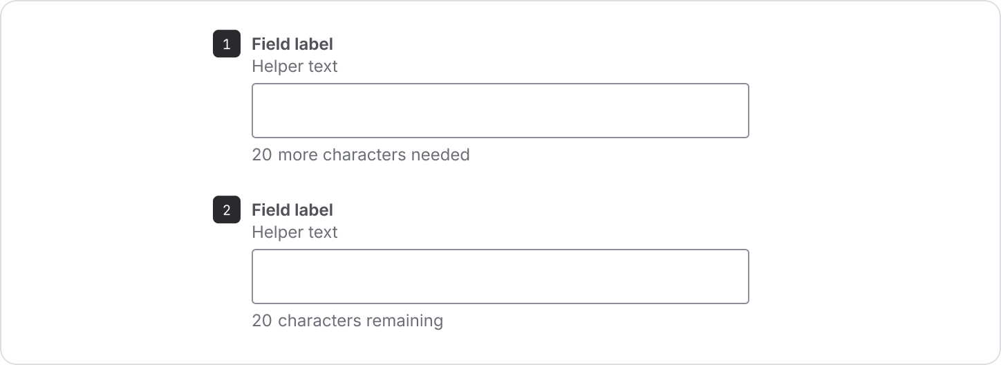
- Minimum length - the first message shows the minimum number of characters that can be entered.
- Maximum length - When the minimum character length has been met, the second message displays the maximum number of characters that can be entered.
Helper text placement
The placement of helper text differs on a character counter to allow for the counter to update in real time. It is designed to sit under the label of a text field or text area.
Validation and error messages
Use validation and error messages to indicate when a form or field submission fails or requires additional information to be shown.
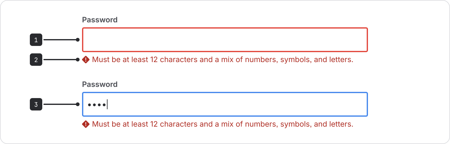
- Unfocused text field
- Error message and icon
- Focused text field
The focus color changes to blue when a user selects the text field and starts typing or changes content.
When validating text fields in real-time, a warning or error icon will appear when the content entered doesn't fit the criteria. If there’s helper text in text fields or text areas, it will be replaced by a warning or error message.
Error and warning messages disappear when the criteria is met.
Long forms
When people access a form, it can be daunting to be shown a large number of fields.
While what ‘long’ is depends on audience and context, there are ways to make long forms easier for people.
- Break up forms into multiple steps.
- Use progressive disclosure.
- Try to only use required fields.
Multi-step forms
You can spread form fields across more than one screen to make a multi-step form using a progress tracker, (opens new window).
- Make sure each screen contains fields that belong together.
- Ensure people know their status at each step of a form and that their progress is saved.
Progressive disclosure
Use conditional fields, (opens new window) to configure a form to show more content as users fill in its fields.
Use this technique when it isn’t necessary to see all fields unless someone has made a specific decision. For example, if they tick a particular checkbox, related information would be revealed.
Numerous input components can be added to a form component. See the individual component pages for the details of using: