Checkbox
A checkbox is an input control that allows a user to select one or more options from a number of choices.Neutral selected states
When the platform-dst-tokens-finesse feature flag is enabled, this component uses the new neutral treatment for selected states.
Usage
Usually used in forms, checkboxes collect input from users. They can select a number of options ranging from zero to multiple options.
Use checkboxes when:
- People need to select one or more options from a list of related items.
- You need an explicit confirmation from the user to apply settings.
Parts
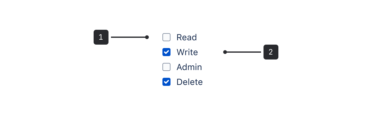
- Checkbox: The selection control.
- Checkbox label: Use this text label to describe what the checkbox is for.
Accessibility
- Include error messages for required or invalid checkbox fields (for example, "Please select an option").
- Don’t use a disabled checkbox if it needs to remain in the tab order. Instead, use validation so that screen reader users can perceive the checkbox and hear an error message explaining why that option cannot currently be selected.
Content guidelines
- Keep checkbox labels short and descriptive.
- Don't include punctuation after checkbox labels.
Behavior
- Individual checkboxes have two states: selected and unselected.
- When checkboxes are grouped, there are three states: selected, unselected, and indeterminate. The parent checkbox shows an indeterminate state when some, but not all of the child checkboxes are selected.
Data Center apps
For all new features, we recommend using Atlassian Design System and other Atlaskit components, (opens new window). For existing code, you can continue to use Atlassian User Interface (AUI), (opens new window).
- To display a list of options where people can only make a single selection, use radio buttons.
- For a more compact way of displaying options where people can only make a single selection, use a dropdown menu.
- To allow people to turn an option on or off, use a toggle.