Better teamwork
by design
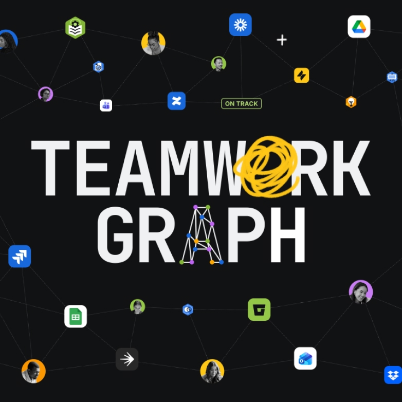
Iconography

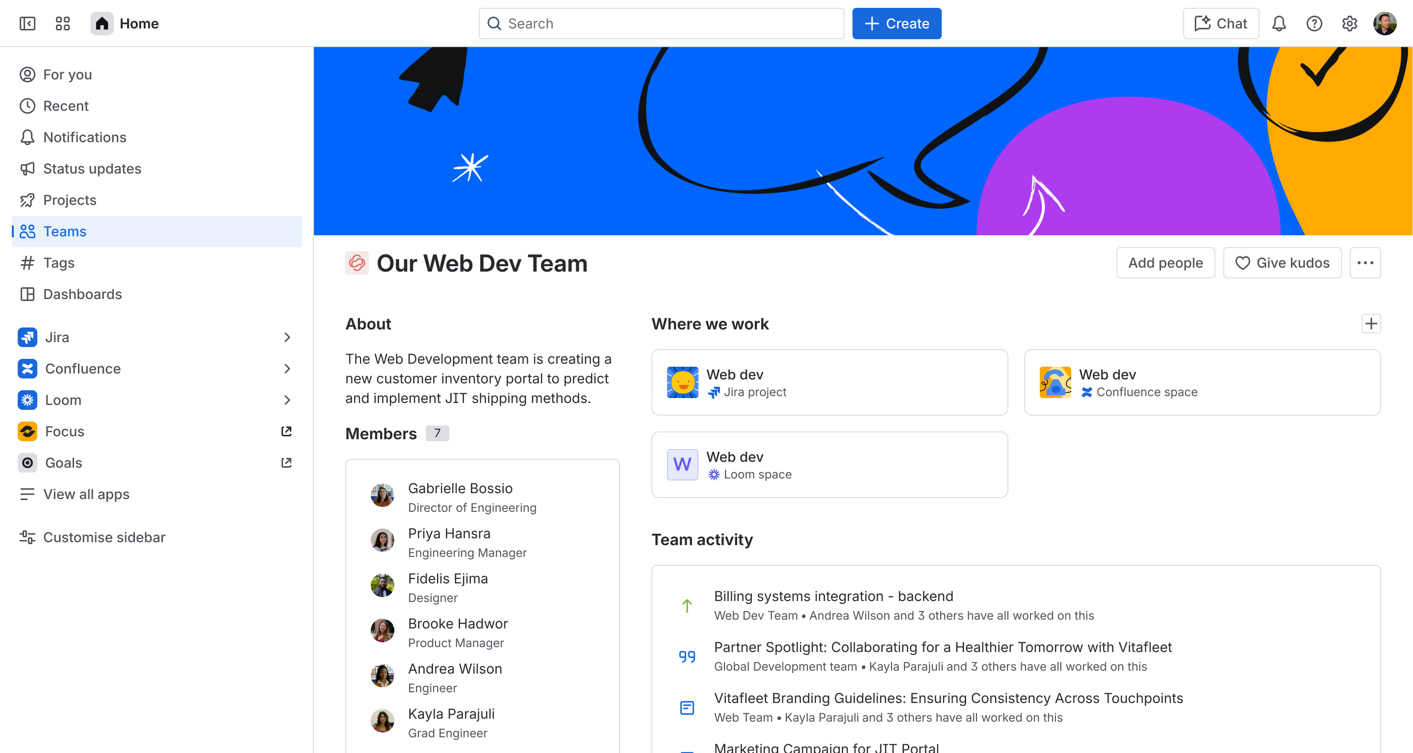
A unified design language
Across all collections, every app feels cohesive and familiar, empowering teams through one design language.
Learn how we craft moments that matterLearn how we craft moments that matter

Discover the system
powering our designs


Shape the future of teamwork
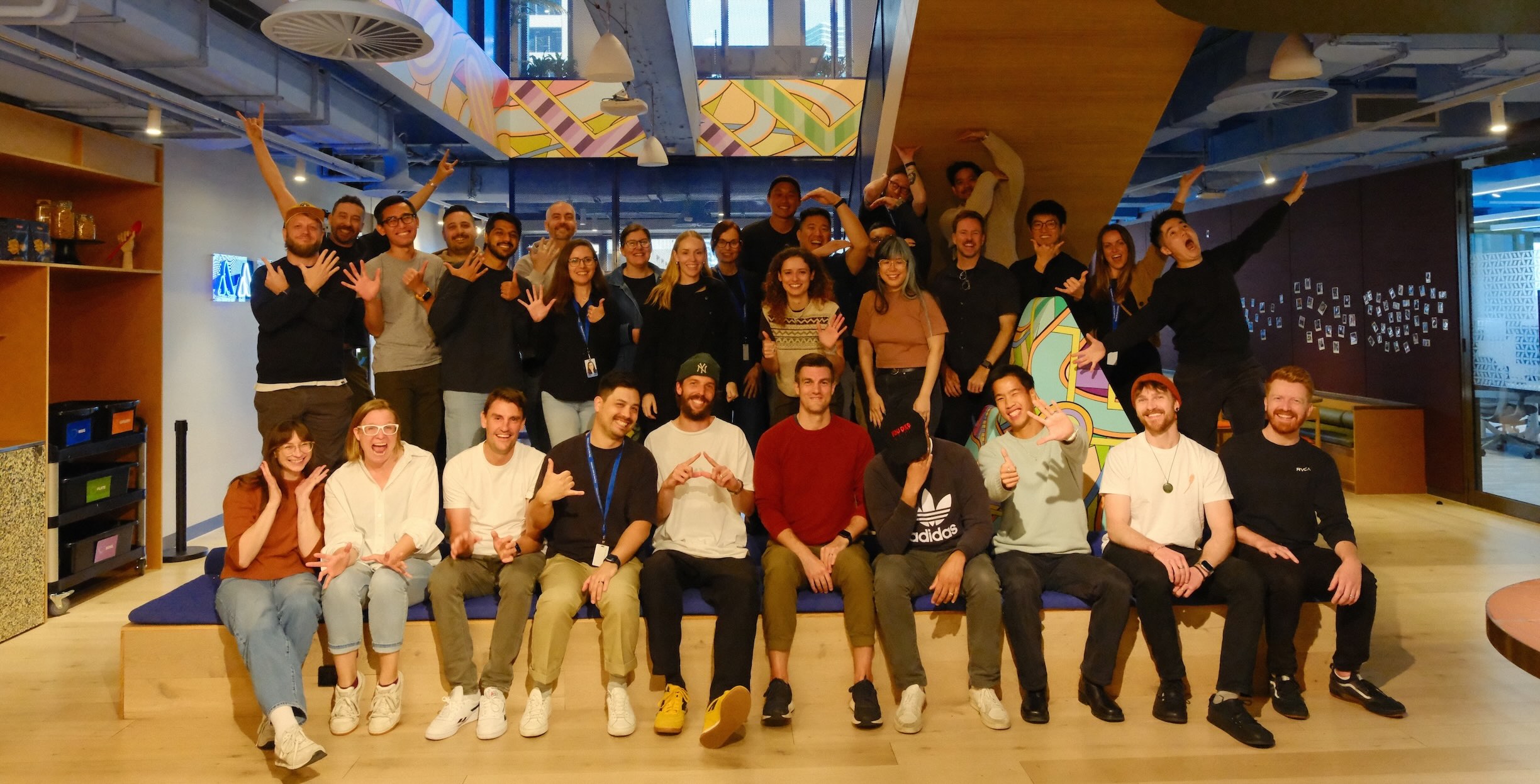
Join our global team of designers, engineers, and researchers, using elegant design to help millions of customers achieve more.

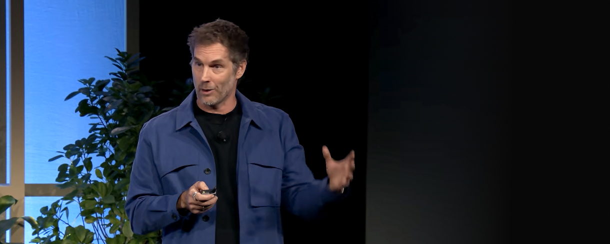
Understanding the underlying material of new technologies is essential for designers to move beyond surface-level interaction and truly innovate.
Charlie SuttonChief Design Officer, Atlassian