
Atlassian UI refresh updates and how to apply them
How to apply Atlassian’s bold new visual style with the design system.At Team ‘25, we announced a new brand and design direction with one goal: to unleash the potential of every team through clear, modern, and consistent design.
Since then, Atlassian websites and apps have been making moves towards this refreshed new style.
Learn what’s changing in our design system and how to use the new styles.
What’s changing
Atlassian’s foundational styles and components are getting a refresh to improve usability and showcase our new brand.
Note that some features are still early access (ready to preview and test, but not for widespread use).
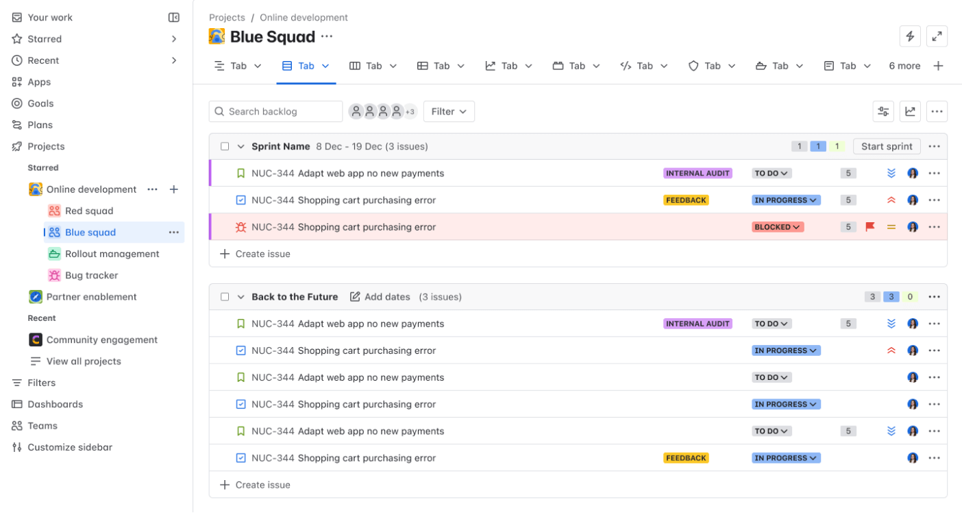 A Jira screen using the new styles
Typography
We’re rolling out more readable fonts with more distinct heading levels to aid scanning.
Updated text components and tokens are ready to use in code and our Figma libraries.
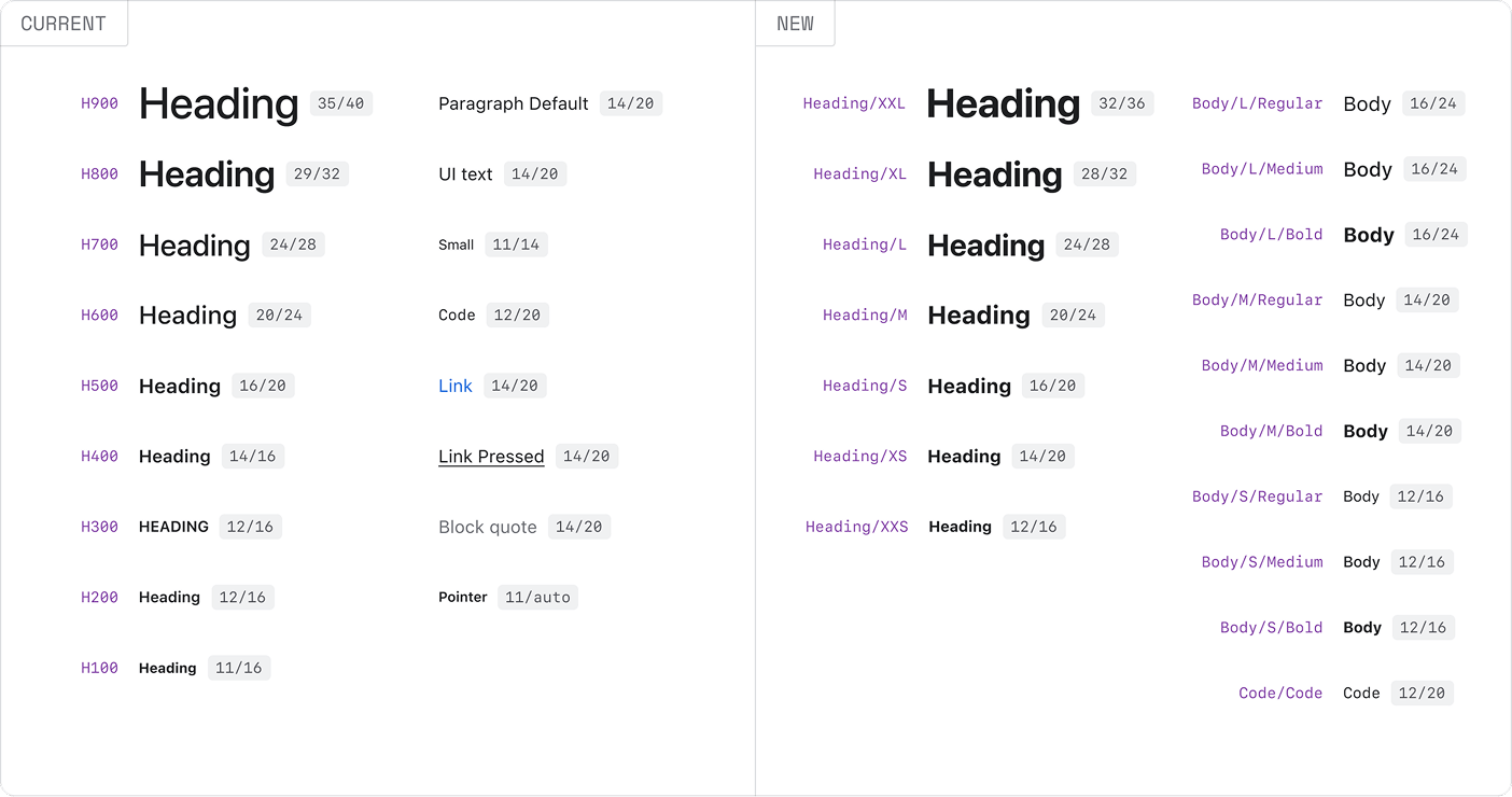 The current text styles compared to Atlassian Sans and Atlassian Mono.
Iconography
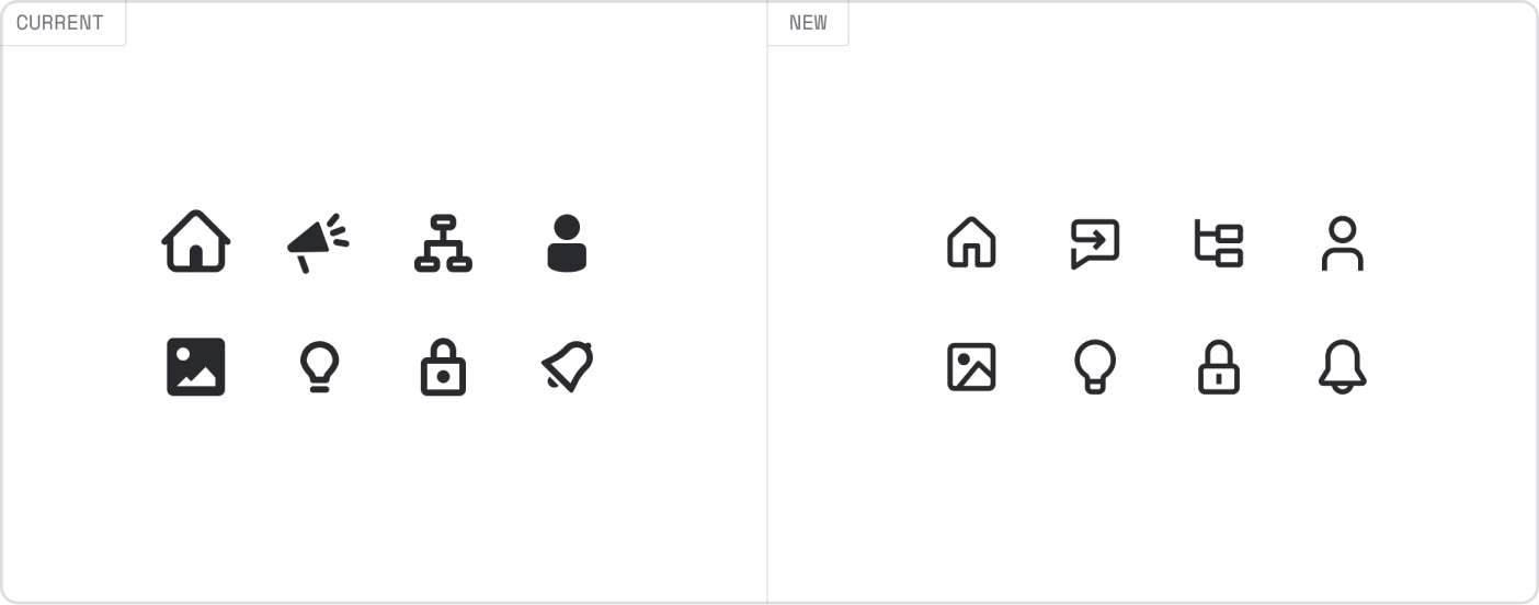
Icons have a new, more streamlined style. In the new system, icon sizes and shapes are more consistent and fit better with the refreshed text styles.
New icons are available in code and Atlassian Figma libraries.
Color
New colors are being trialed in some apps to showcase our refreshed brand identity.
We’ll update this page and the general color guidance when the new colors are ready for broad use.

Components
We’re testing some component changes to go with the new styles.
You can preview some of these early access updates in our component examples.

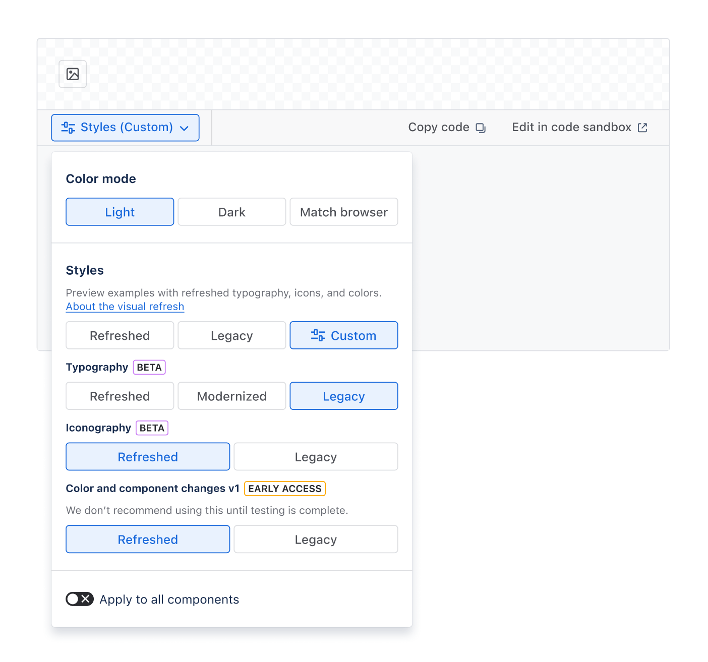
Try out the new look
In component examples, choose Styles then select the new design language to see refreshed styles applied.
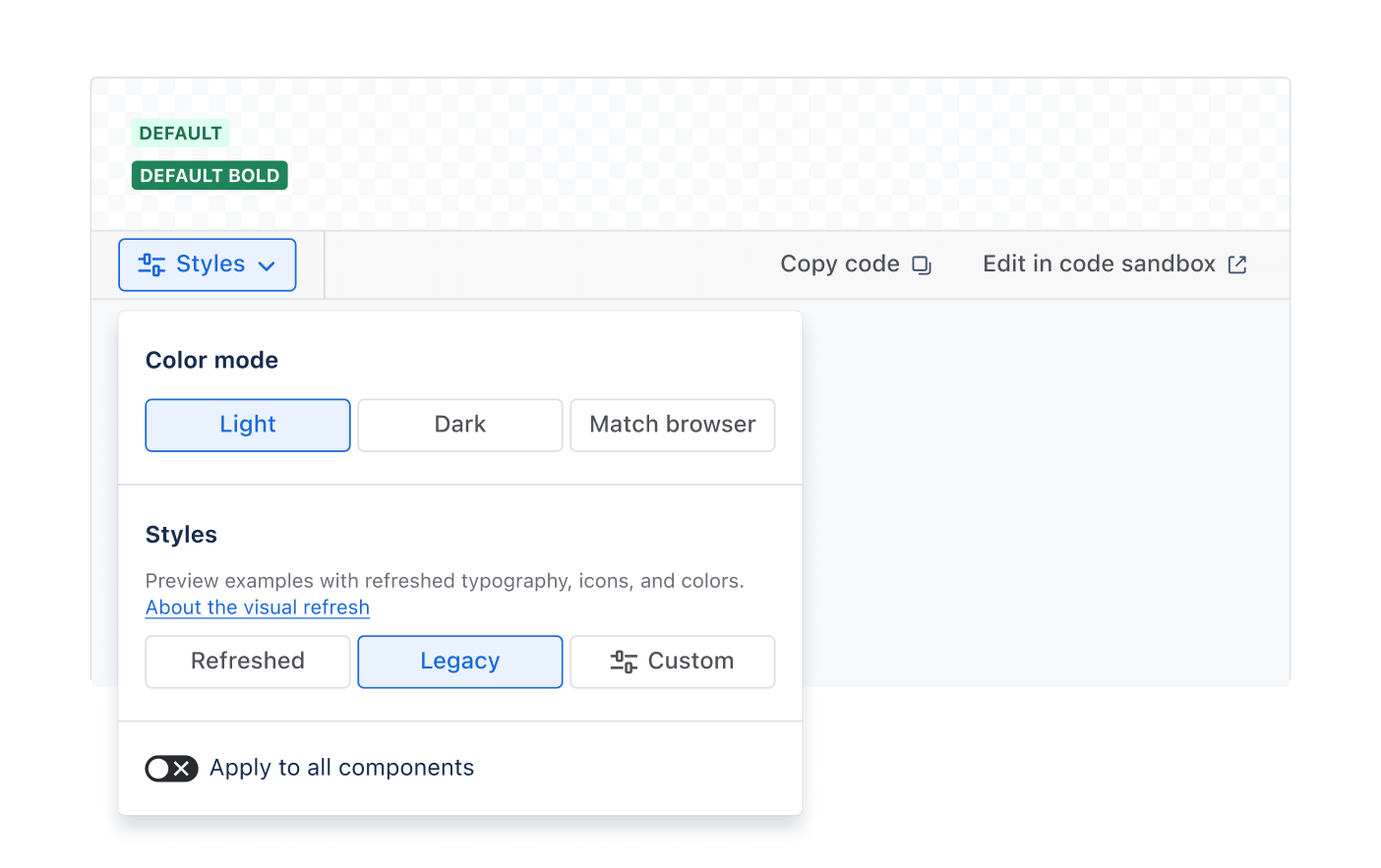
Select the Custom option to choose individual styles. This is helpful if you want to see how the component looks with specific styles turned on (controlled by feature flags).
For example, if you’re migrating to the new icons, you can customize the examples to just show new icons.
Use the new styles
Some apps are already testing the refreshed styles with customers. Check out guidance on using the latest styles and components:
For Atlassians
Get more details on using refreshed UI in Figma and in code:
Design with the latest Figma libraries using the new design language
Migrate code and use refreshed components with feature flags
For Marketplace partners
We’ll update this page and the developer community with more resources soon.