Spacing
A spacing system simplifies the creation of page layouts and UI.
The consistent and intentional use of a spacing system creates a more harmonious experience for the end user. A spacing system also lays a foundation for responsive design and customisable UI density in the future, which will enhance the overall quality and accessibility of our apps.
8 pixel base unit
Our spacing system is built around a base unit of 8 pixels. This base unit determines the spacing scale and ensures visual consistency across apps.
Scale
Building off of the 8px base unit, the main foundation of our spacing system is the spacing scale. This scale is a limited set of space values that can be used to lay out UI elements in a consistent way.
Each spacing value is a multiple of the base unit and ranges from 0px to 80px to allow for flexibility while still maintaining consistency across different layouts.
Space tokens
The 8px base unit also forms the basis of our space token system, as the base unit space.100.
Every space token is a multiple of this base unit, the number suffix representing the percentage of
the base unit.
For example, space.200 is 200% of the size of the base unit, therefore represents 16px.
Each space token should be used in place of the raw pixel or REM values when adding space between components or objects on a page. Usage examples are detailed below.
| Token | Base unit multiplier | REM | Pixels | Visual representation |
|---|---|---|---|---|
space.0 | 0× | 0rem | 0px | |
space.025 | 0.25× | 0.125rem | 2px | |
space.050 | 0.5× | 0.25rem | 4px | |
space.075 | 0.75× | 0.375rem | 6px | |
space.100 | 1× | 0.5rem | 8px | |
space.150 | 1.5× | 0.75rem | 12px | |
space.200 | 2× | 1rem | 16px | |
space.250 | 2.5× | 1.25rem | 20px | |
space.300 | 3× | 1.5rem | 24px | |
space.400 | 4× | 2rem | 32px | |
space.500 | 5× | 2.5rem | 40px | |
space.600 | 6× | 3rem | 48px | |
space.800 | 8× | 4rem | 64px | |
space.1000 | 10× | 5rem | 80px |
Negative values
Our space token system also includes
negative values from
space.negative.025 to space.negative.400 (-2px to -32px) available in code. These can be useful
for breaking out of a container's padding or for overlapping elements. Before reaching for negative
tokens, see if you can use the
Bleed primitive which is designed
specifically to handle negative whitespace.
Spacing usage
Different use cases require different ranges of spacing units to achieve the best outcomes. Our spacing scale can be broken into three different size ranges:
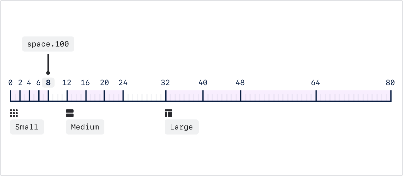
Small values - 0px to 8px
Use the tokens from space.0 to space.100 (0px to 8px) for small and compact pieces of UI.
Examples
- Gap between small icons and text
- Container padding of small components (ie badges, icon buttons, table cells)
- Gap between repeating elements (ie button groups)
- Padding within input components
- Vertical spacing between elements in a card (ie a title and description, a description and actions)
- Gap between the trigger and elevated element (ie between dropdown button & menu)
Medium values - 12px to 24px
Use the tokens space.150 to space.300 (12px to 24px) for larger and less dense pieces of UI.
Examples
- Container padding of larger components (ie buttons)
- Space between avatar/large icon and content (ie section messages)
- Vertical spacing between elements in cards
- Spacing between items in less densely packed or larger components
Large values - 32px to 80px
Use the tokens space.400 to space.1000 (32px to 80px) for the largest pieces of UI and for
layout elements.
Examples
- The space between content on the page (ie spacing between top of page and header)
- Alignment within larger pieces of content (ie alignment of content in Flag)
Layout guidelines
A layout is composed of UI elements and components as well as the space between them. Applying these guidelines helps customers quickly understand the relationship between elements, allowing them to scan and digest page content with ease.
Use these guidelines in combination with space tokens to create layouts that are consistent and easy to understand.
Group by similarity
Users expect elements to be grouped semantically, or grouped in such a way that it provides greater context around the information provided.
Using consistent spacing around elements lends them a visual similarity that helps the user understand their semantic relationship. For example, a table or list of items should be spaced consistently to create the sense of a cohesive unit or collection.
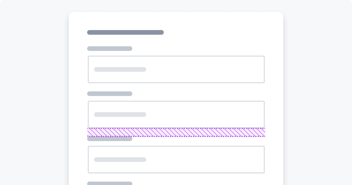
Do
Group similar items together using similar spacing.
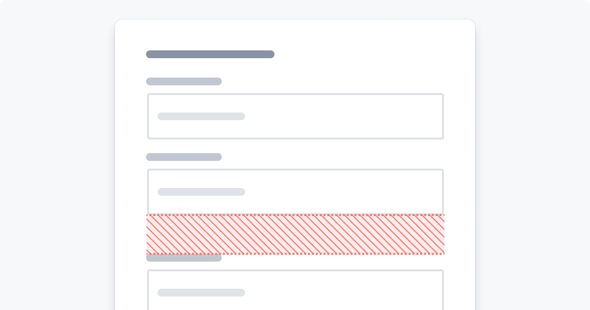
Don’t
Group similar items differently.
Group by proximity
The distance between elements creates semantic meaning, elements that are placed close to one another are assumed to be related.
Use this principle to create meaning by placing more related objects closer together, and less related objects further apart. For example, place elements that are part of the same flow or user action closer together so users can understand their relation.
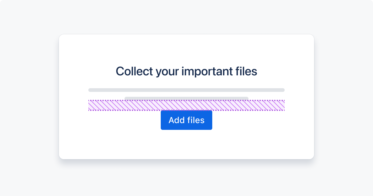
Do
Group related items close together so that users can scan the content more easily.
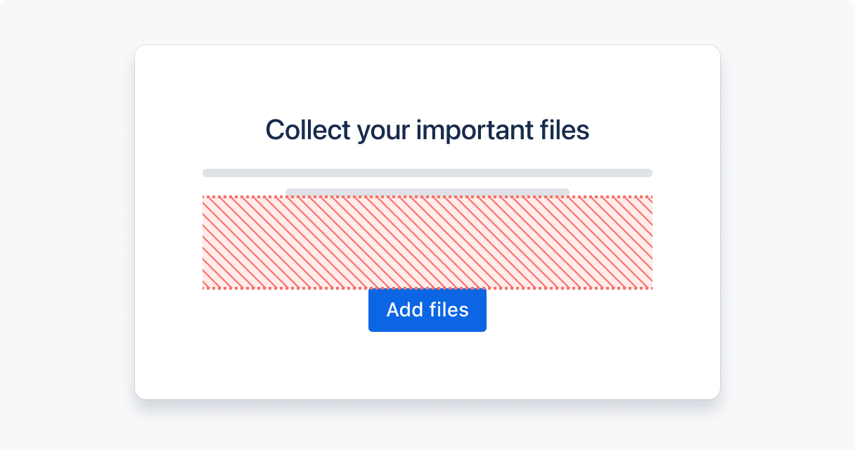
Don’t
Group related items far apart.
Create order and hierarchy
Users look for order in visual information to reduce the mental effort required to scan and process data. Therefore, the ordering of elements on a page can be used to encourage users to follow a certain flow or journey.
Hierarchy is used to rank elements and influence the order in which users view them. The sizing of different elements lends more importance to larger elements by drawing focus, and less to smaller-sized elements. Similarly, varying the amount of whitespace around an element can be used to group elements together or separate them to impart greater importance.
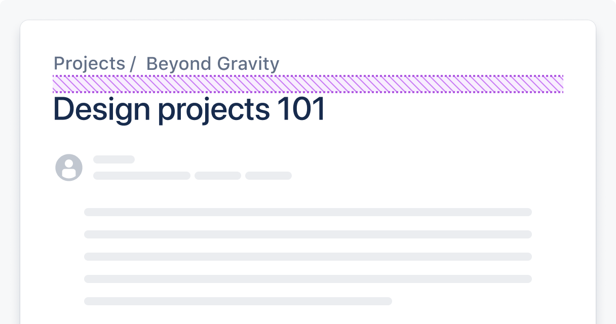
Do
Use scale and whitespace to rank elements.
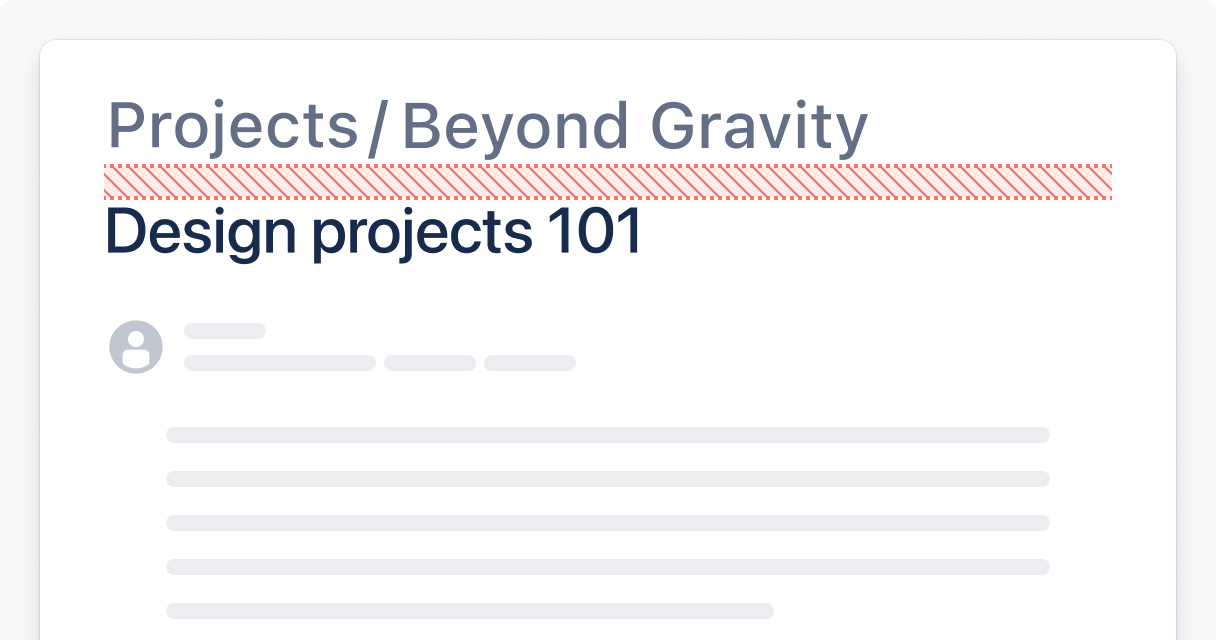
Don’t
Give every element the same visual importance.
Introduce visual rhythm
Patterns of alternating elements and white space create visual rhythm, which influences way users scan a page and focus their attention.
Using a pattern of similar spacing between elements (such as in a table or list) creates a predictable rhythm for the user to follow. This consistent rhythm reinforces the similarity in importance of each of these elements.
Varying the spacing between and sizing of objects creates a more organic flow and guides the user through a page or experience naturally. Variation creates points of attention and contrast between objects on the page and improves scannability.

Use optical adjustment
While using a spacing system improves consistency, the visual harmony of a page may not be perfect the first time. The visual weight of an element affects the size and spacing that may be required to create balance on the page, and may deviate from standard spacing patterns. Optical adjustments should be used to correct these imbalances and maintain the page’s flow.
Optical adjustments require using the spacing scale units and visual intuition to make minor changes to the spacing between objects in order to create visual harmony.
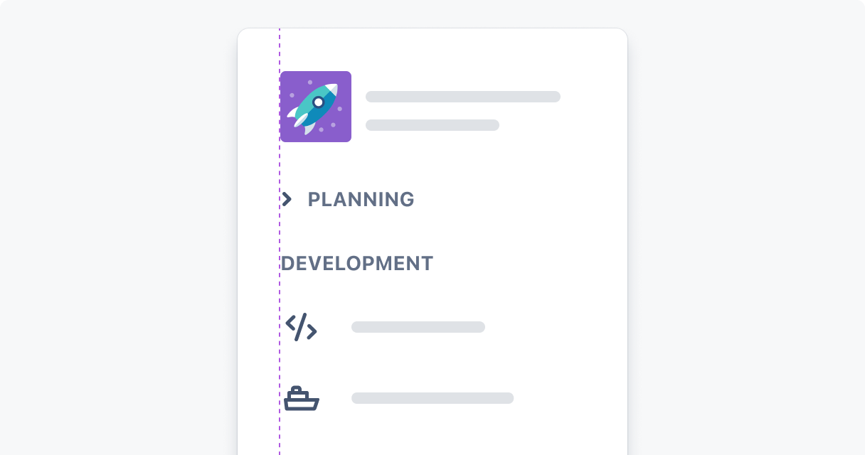
Do
Adjust spacing to create visual balance.

Don’t
Use standard spacing without considering its alignment with other elements.
- Learn more about design tokens
- List of all design tokens