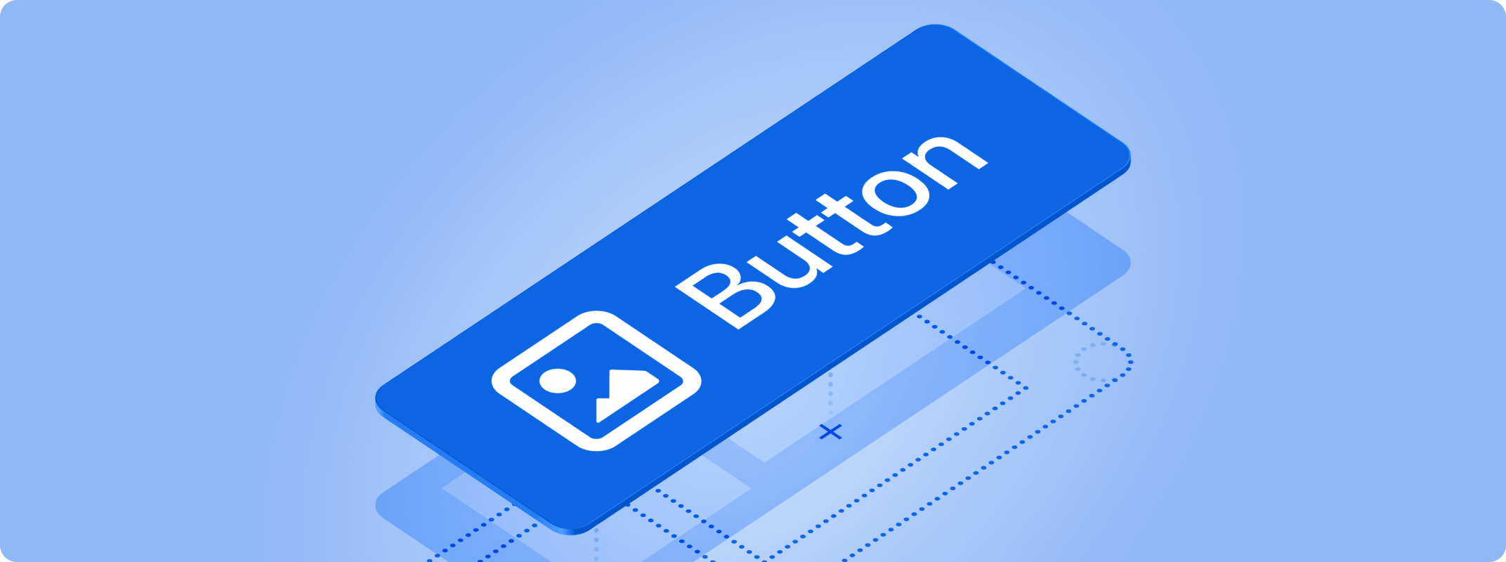
Evolving buttons and links
Explore how we've revamped our button and link components to be more accessible, performant, and consistent.The button is a foundational part of UI and every design system. In reviewing how buttons were being used across Atlassian’s interfaces we realized our trusty button component was trying to do too much.
Enter our new button and link components that improve performance, visual consistency, and make it easier to create more accessible interfaces by default.
Understanding the problem
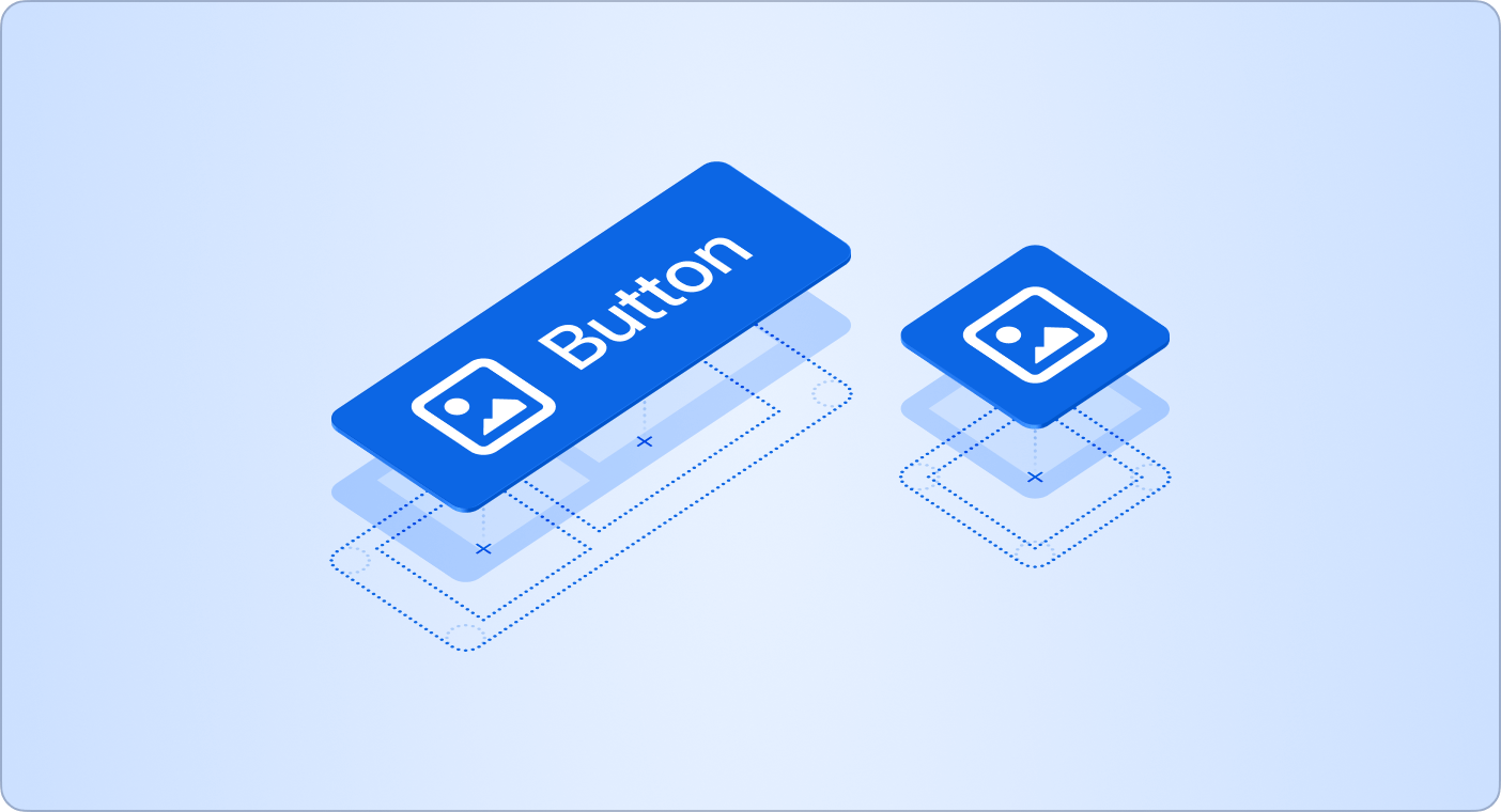
The first stage was to understand how our button was being used, and the challenges people faced. We quickly discovered the component itself was large and slow, and there was a lot of visual variation and customization, as teams weren’t able to build the interfaces they needed using the one-size-fits-all solution.
The demand was clear for a wider range of purpose-built buttons that included:
icon buttons
link and link icon buttons
split buttons
At the same time as defining new purpose-built solutions, we knew we needed to make sure the code itself was performant and easier to maintain.
To do this, we switched from dynamic to static styling, removed customization APIs, which yielded on average a 10% reduction in render times. Which seems small on its own, but when considering how frequently buttons are used across Atlassian, this is a huge upgrade.
As a result we’ve had significant performance improvements:
10.6% reduction in hydration time
9.9% reduction via renderToStaticMarkup
22% reduction in SSR via renderToString
Increasing visual harmony
By aligning on consistent spacing our dropdown buttons and other buttons now look much more balanced.
 Button spacing before
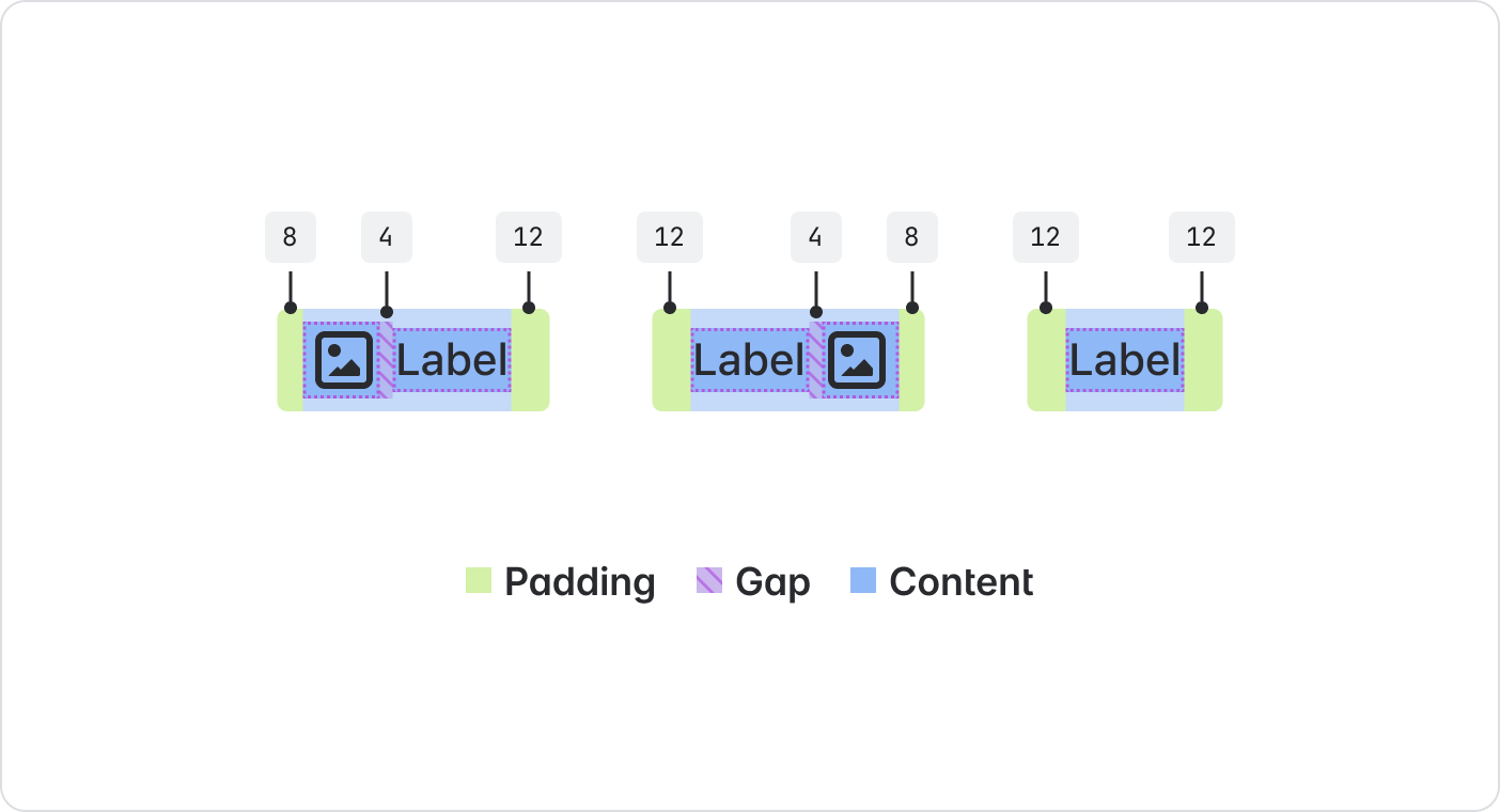 Button spacing after
More accessible apps by default
We’re always looking at ways to support building more accessible and consistent apps by default, and so we designed our new API to force a deliberate choice between links, buttons, and links that look like buttons.
The deliberate choice between links and buttons protects you from a11y gotchas.
The result is that our new components make it easier to implement semantically correct and accessible buttons and links.
Of course, designing and coding the new buttons was just the first stage. We needed to migrate around 2000 callsites in the codebase.
In order to roll out our new button we ran a comprehensive campaign, working directly with teams as well as establishing new lint rules and codemods.
Improved performance through greater consistency
The value of the new buttons is clear: they are more accessible and consistent, and semantically aligned with web standards. And by separating concerns into multiple smaller and purpose-built components, we’ve reduced the performance cost for teams and customers.
Our new buttons are ready and available for everyone to use: