Date time picker
A date time picker allows the user to select an associated date and time.Usage
Date time pickers help users navigate past, present, and future dates as well as specific times. Users may select a particular date and time via their respective fields.
Date time picker is commonly used in forms.
Parts
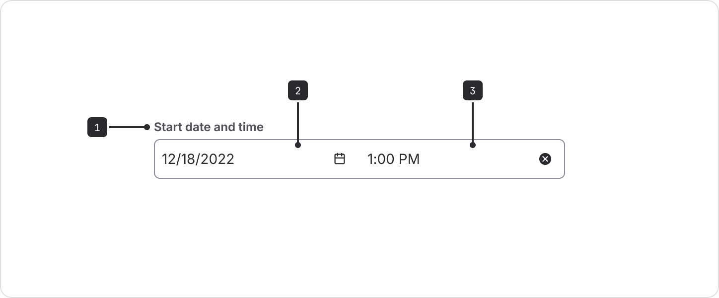
Label: Labels should indicate what information the field requires. The label is left-aligned above the input area.
Date input field: Selecting this field opens the calendar component. Users can also input dates into the field. Once a date is selected, the option will be shown in the text input. This example shows date formatted in ‘dd/mm/yyyy’ but this can be customized using the
dateFormatprop.Time input field: Selecting this field opens the select menu showing available times on the selected date. Once a time is selected, the option will be shown in the text input. This example shows time formatted in AM/PM but this can be customized using the
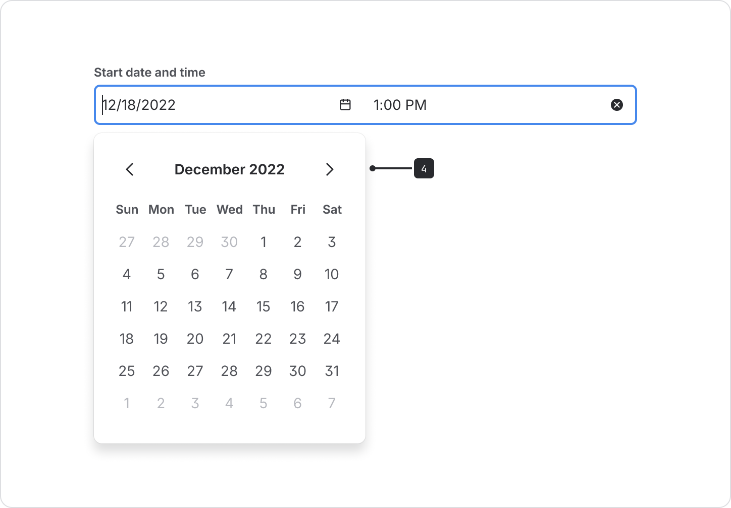
timeFormatprop.Calendar: A menu that contains the list of all dates. Selecting the previous or next arrows moves the calendar through months. The selected date area is highlighted by a different color fill.
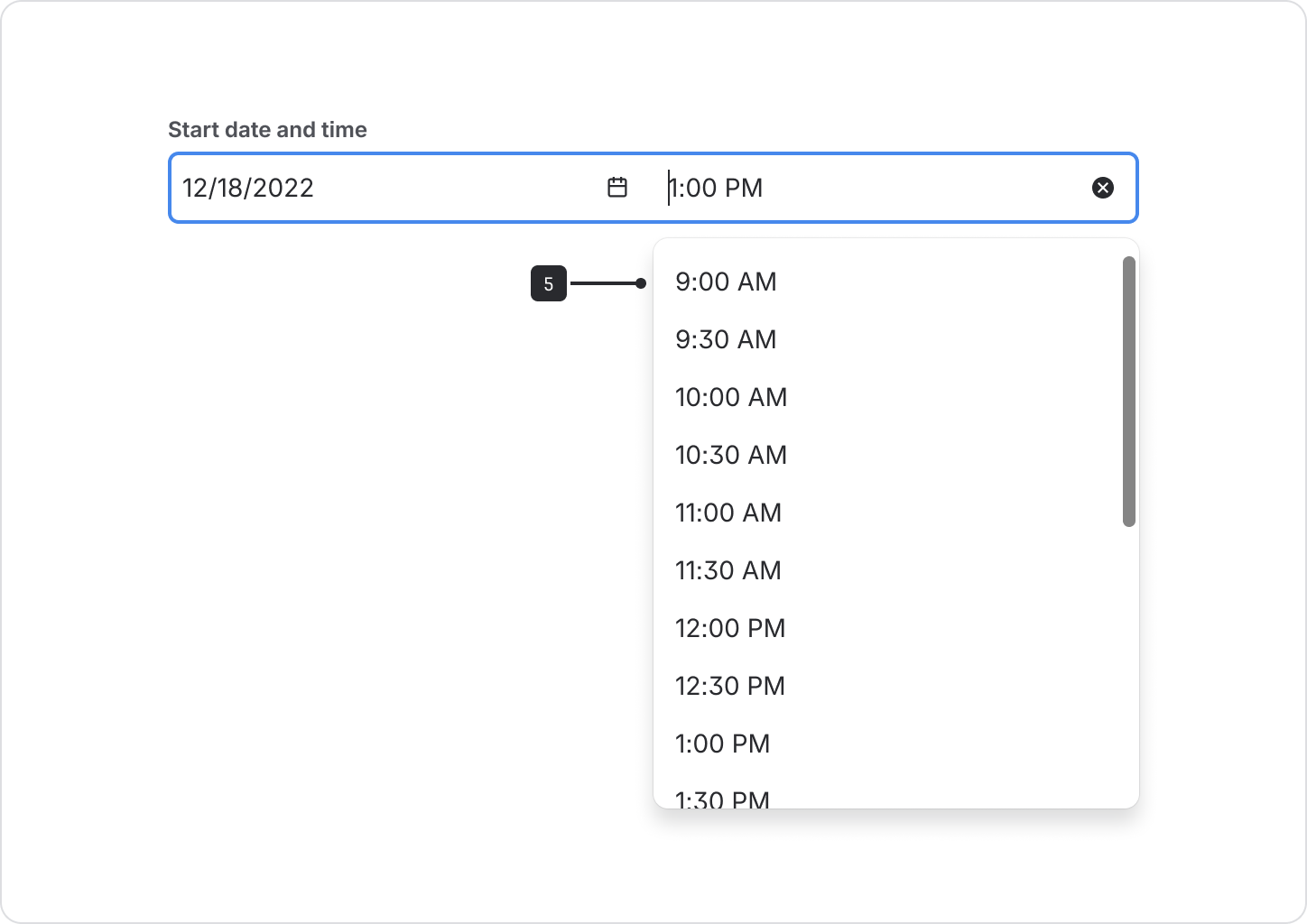
Time dropdown: A menu that contains the list of all selectable times relating to the selected date. This example shows time increments of 30 minutes but can be customized using the times prop.
Accessibility
- If using fields with labels other than "Date" and "Time" for the date picker and time picker
respectively, use the
labelprop within thedatePickerPropsand thetimePickerProps. Assistive technologies will announce these along with the label from the field component when activated. - Allow multiple modes of data entry. Some users prefer entering date and time information by typing instead of selection, especially keyboard users.
- If some dates are
disabled, provide accurate validation and error messaging for keyboard users, for example:Please enter a future date and time - Use the
shouldShowCalendarButtonprop fromdatePickerProps. It provides a button for users to show the calendar picker popup. This should also be used with both theopenCalendarLabeland one of the following props from thedatePickerProps:label,inputLabel, orinputLabelId. This ensures the calendar button gets a proper accessible name. This will become the standard in the future.
Content guidelines
- Ensure that locale is appropriately set so that users see dates and times in a familiar format.
- Use a concise label to indicate what the date and time selections refer to.
- If you need to specify date or time only, see date picker or time picker.