Range
A range lets users choose an approximate value on a slider.Usage
Use ranges in forms to let people select a value within a given range of minimum and maximum values.
Parts
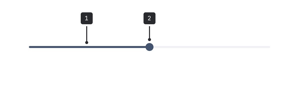
- Track: The track is a horizontal line that displays the range available for the user to select from.
- Handle: A circular position indicator that people can move along the track to change the value.
Accessibility
- Don't use a range if choosing a specific value is important. The slider interaction isn't as precise as explicitly typing or choosing an option from a list.
- Don't use a range for values that aren't numeric. For example, selecting weekdays (Monday to Friday).
Best practices
- Place labels directly above the input, and align to the left.
- Don't use for ranges that are extremely large. For example, values over 100.
- Don't use for ranges that are very small (for example, 1-3). The range moves in steps when the range of values is lower.
- For left-to-right user interfaces, put the lowest value on the left of the slider. For right-to-left user interfaces, put the lowest value on the right.
Content guidelines
- Keep labels short and concise.
- If necessary, use helper text to clarify how to use the range.
- Ranges are used in forms.