Text field
A text field is an input that allows a user to write or edit text.Usage
Use text fields in forms, (opens new window) to help people enter, select, and search for text. Text fields are normally found within a form but can also be part of a modal, search, or card.
Common text input types include: usernames, descriptions, URLs, emails, addresses, and plain text searches.
Parts
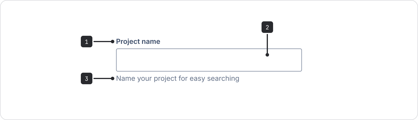
- Label: Must indicate the information the field requires and be left-aligned directly above the input area.
- Input area: This is where people enter text.
- Helper text (optional): Use to provide extra information about the field or to give specific
formats the text area will accept (for example:
Passwords must contain at least 8 characters).
Accessibility
Make sure all fields have a visible label. If you're not using the provided field label component, make sure the label is associated properly to the field for accessibility.
Don’t use placeholder text. Make sure any critical information is communicated in the field label or helper text below the field. Search fields are the only exception, but only if they include a search icon and accessible label.
Don’t nest interactive elements in the text field, as it will cause focus issues.
To announce errors in the helper text area during custom validation (reference to Custom validation example, (opens new window)):
- Validate field onBlur.
- Make sure your error container would have
aria-liveattribute value being explicitly set topoliteby default. - Add
aria-relevant="all" aria-atomic="false"to error container when field lose focus and remove those when field is focused again. - Dynamically manipulate error's text content to trigger live region content changes.
When you use the above techniques, the announcement behavior is:
- Chrome announces the error message onBlur.
- Safari announces the error message both onBlur and on keyup events after first loss of focus.
Character counter
You can add a character counter to a text area. It shows people how many characters can be entered and provides real-time feedback on characters used and remaining.
A counter can be set to show a maximum length, minimum length, and both a minimum and maximum length. View details and examples of character counters, (opens new window).
Content guidelines
- Use the helper text area for any examples or formatting hints, so that it's visible after the user enters text in the input area. Only use this where clarification is required, and try not to overuse it.
- Keep field label text short and concise.
Data Center apps
For all new features, we recommend using Atlassian Design System and other Atlaskit components, (opens new window). For existing code, you can continue to use Atlassian User Interface (AUI), (opens new window).
Text fields are commonly used in forms, (opens new window).