Select
Select allows users to make a single selection or multiple selections from a list of options.Neutral selected states
When the platform-dst-tokens-finesse feature flag is enabled, this component uses the new neutral treatment for selected states.
Motion in Early Access
Motion updates for multi-value Select tags are in Early Access and available behind the platform-dst-motion-uplift-labels feature flag.
Usage
Use select to let people choose one or more items from a list of menu items. It’s usually found in forms, (opens new window) or inline edit, (opens new window).
Parts
Single select
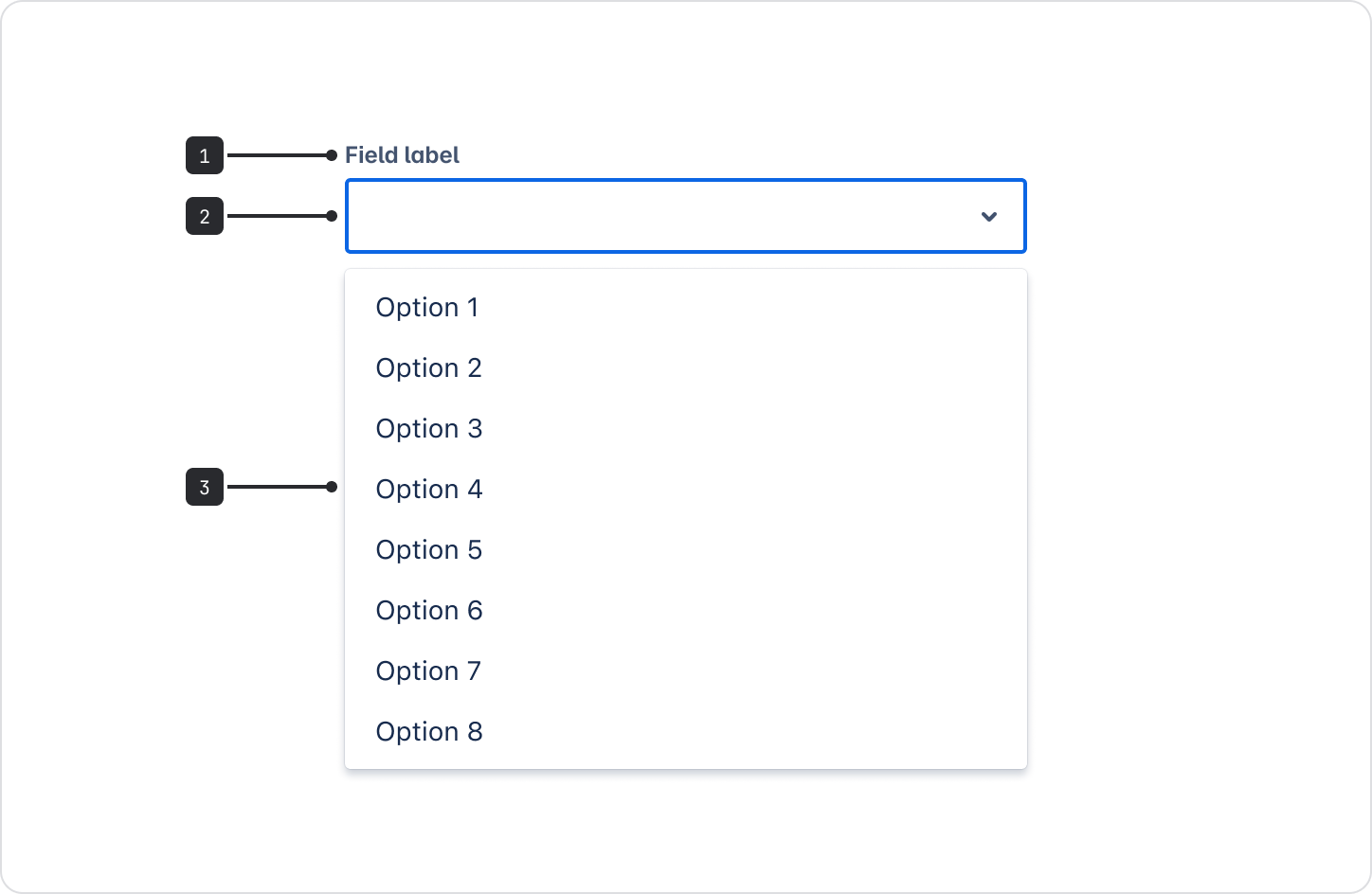
- Field label: Use the field label to indicate what information the field requires. The label is usually left-aligned above the input area.
- Text input field: The field people click in to receive the options they can choose from. Once selected, the option will be shown in the text input.
- Menu: Contains the list of all selectable items. These can be grouped into sub-categories under headings.
Multi select
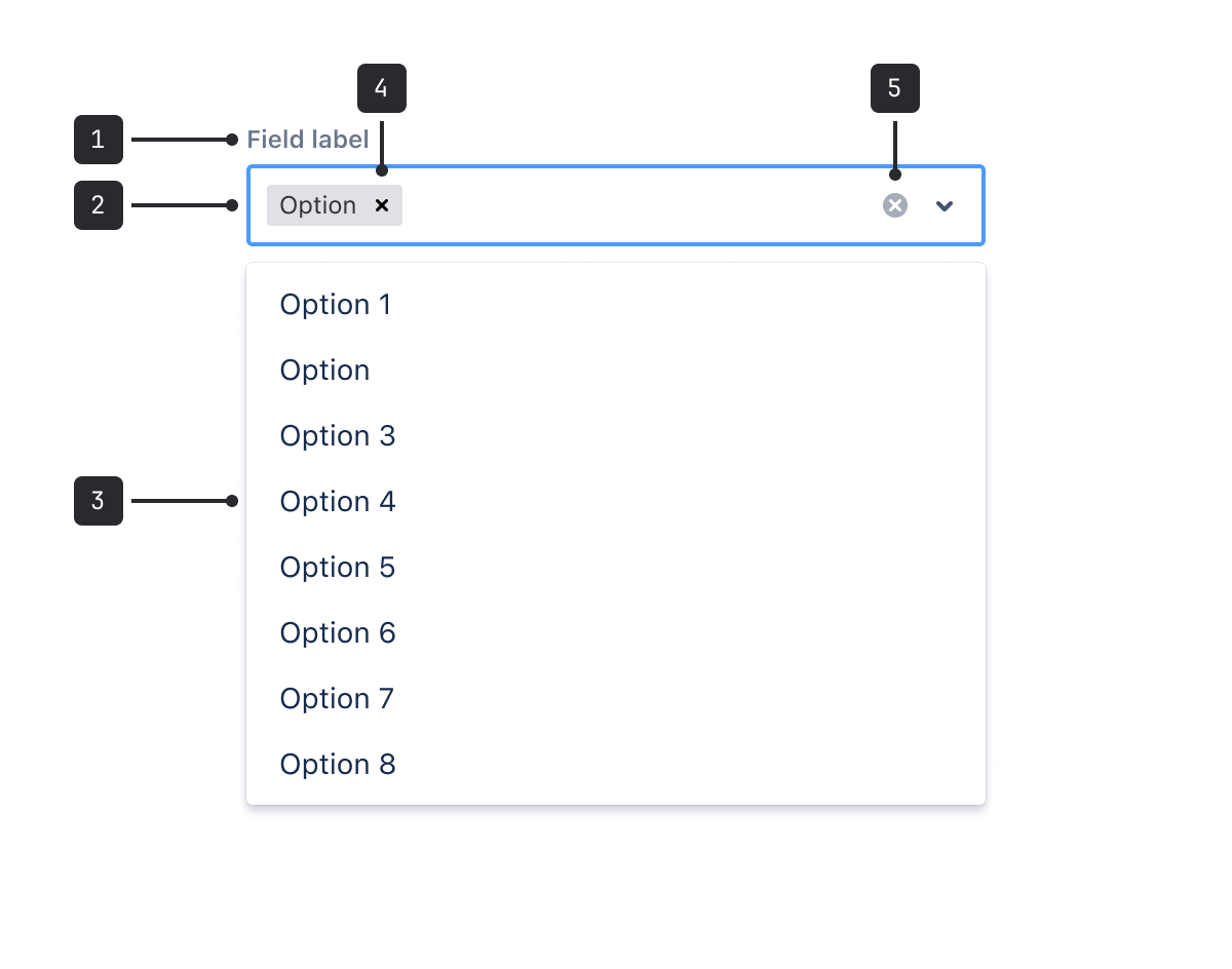
- Field label: Field labels should indicate what sort of information the field requires and are usually left-aligned directly above the input area.
- Text input field: The field people click in to receive the options they can choose from. Once selected, each option is shown in the text input.
- Menu: Contains the list of all selectable items. These can be grouped into sub-categories under headings.
- Selected item: Displays what options have been selected. Users can remove selections by clicking the x.
- Clear all: The x clears everything in the text input field. It only appears when at least one option has been selected.
Accessibility
Use labels instead of placeholders
Don’t use placeholder text to clarify field inputs – use the field label and helper text.
Use a field label to indicate what information goes in the text input. Ensure the label is positioned outside the field so it remains visible at all times.
Use helper text when it’s important to explain or give more information about what to enter in the text field.

Do
Use a field label and helper text to ensure all users can understand what’s required.

Don’t
Don't use placeholder text instead of a field label. It’s not accessible and disappears when information is entered.
Removed clear control
To avoid introducing multiple tab stops per text field, and reduce keystrokes for assistive technology users, the clear control has been intentionally removed from the tab order. Keyboard users can clear content using the delete key.
Group select options sparingly
If some select options are grouped and some are single options, the group names will be ignored. Only create groupings if all items can be grouped, don't create groups of one as this can be very noisy.
Only use groups when the categories are well-known to most people, or give clarity to multiple items that would otherwise have the same name. For example, "Portland, Maine" and "Portland, Oregon".
Best practices
- Order your list of options in a way that will make the most sense. This could be by the most commonly selected option or numerically.
- Avoid putting things in alphabetical order because it isn’t localization-friendly.
- Don’t overwhelm people with too many options.
Content guidelines
- Use concise, descriptive field labels so that people clearly know the purpose of the selection. For example, use a Save to label for a list containing options such as Cloud and Local drive.
- Keep options to a single line of text.
- Use commonly known terms for your options and make sure they’re clear and direct.
Data Center apps
For all new features, we recommend using Atlassian Design System and other Atlaskit components, (opens new window). For existing code, you can continue to use Atlassian User Interface (AUI), (opens new window).
Consult AUI for implementation details on AUI single select, (opens new window) or AUI multi select, (opens new window).
- Use a dropdown menu to display a list of immediate actions to a user.
- Use toggles to turn an option on or off instantly.
- Use checkboxes for options that require a button press to apply the setting.
- Use radio buttons to choose a single option from a set of options.