Inline edit
An inline edit displays a custom input component that switches between reading and editing on the same page.Usage
Use inline edit on screens where information needs to be updated often, such as a work item page. People can toggle between read view and edit view without leaving the page.
Use this instead of a form when you have information that may already exist and can be edited.
Inline edit can use data input components such as a text field, select and datetime picker, (opens new window). The appearance of the inline edit will vary depending on which components it is used with.
Parts
Read view
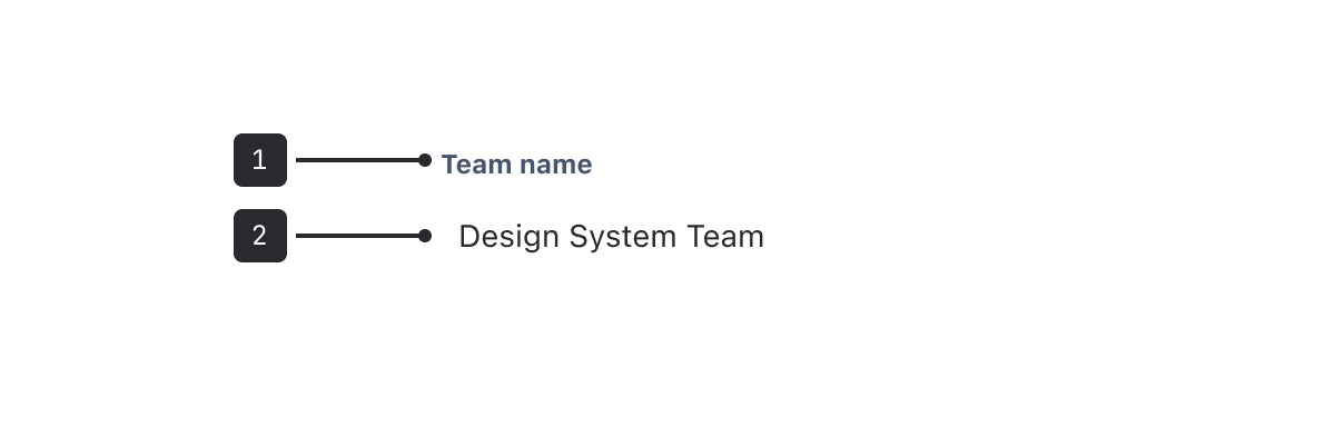
Label: Labels are concise, sentence case text describing what to enter in the field.
Field: When in read view, the field is hidden and aligned with the label. When in an empty state, you can customise what placeholder text is shown here.
Edit view
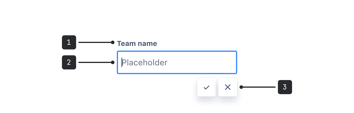
Label: Labels are concise, sentence case text describing what to enter in the field.
Field: When in edit view, the field snaps to the width of the column and the text remains aligned with the label.
Controls: Options to save or cancel the current data entry appear at the end of the field.
Accessibility
- For larger areas of text, set
keepEditViewOpenOnBlurto true. This ensures that inline edit stays in editing mode when the user clicks or moves away. This is recommended to help prevent people from accidentally discarding or saving their unfinished work. - Keep action buttons visible wherever possible. The contents in the field are saved when the user navigates away from the element, but this isn't immediately obvious on its' own.
- Make sure that inline edit fields have enough visual affordance that sighted people recognise them as editable, especially if you are using custom font sizing.
- Only use
placeholderprop to show default values. Don't use it to act as a label for the field.
Best practices
- Use inline edit for an editable field that is not part of a form. Don't use inline edit inside of a form.
- If you need a simple inline editable text field, use inline editable textfield component to get our recommended default settings.
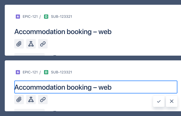
Do
To avoid confusing experiences, ensure read view and edit view components have identical styling.
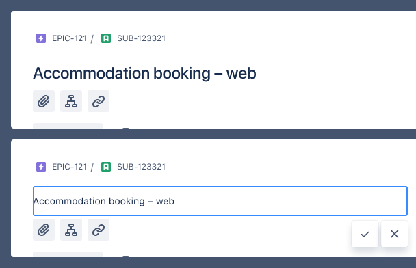
Don’t
Pass in read view and edit view components that have different styling.
Behavior
Inline edit wraps around any standard text field. Any styling of the text field component is handled outside of this component. If you are placing a custom inline edit on a component like a header, check that the font and box size line up properly.
Since inline edit is used for entering content, it's optimized for use with keyboard inputs (use return to save and esc to cancel). When using a mouse, controls should always display at the end of the field. For example, at the bottom right in a left-to-right reading order.