Text area
A text area lets users enter long form text which spans over multiple lines.Usage
Use text areas to let people enter long-form plain text that spans over multiple lines, in an area that can expand in height. Text areas are normally used in forms, (opens new window).
Parts
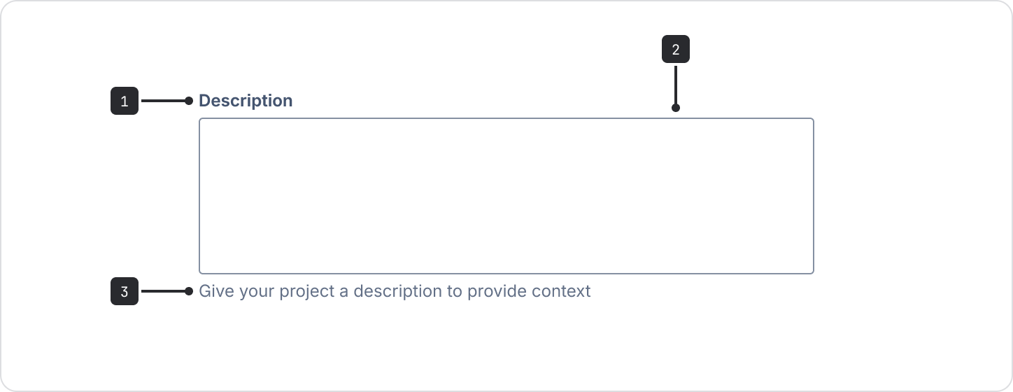
- Label: Indicates the information the text area requires.
- Input area: This is where users enter text.
- Helper text (optional): Use to provide extra information about the field or to give
specific formats the text area will accept (for
example:
Passwords must contain at least 8 characters).
Accessibility
- Always use a label and associate the label to the field properly so that the text area is accessible to assistive technology.
- Don’t use placeholder text. Make sure any critical information is communicated in the field label or helper text below the field. Search fields are the only exception, but only if they include a search icon and accessible label.
Character counter
You can add a character counter to a text area. It shows people how many characters can be entered and provides real-time feedback on characters used and remaining.
A counter can be set to show a maximum length, minimum length, and both a minimum and maximum length.
Content guidelines
- Write a clear, concise label and use helper text to clarify the field input. Don’t use placeholder text as it isn’t announced by assistive technologies and disappears when the field is selected.
- The label should be a noun string. For example, if the text area appears in a modal called “Create component”, the label for a description text area should only say “Description” and not repeat the modal’s title.
- Text areas are commonly used in forms.
- For shorter text inputs, use the text field component.