Layout
Layout components define a page’s structure and the areas for navigation and content.Usage
Use layout to compose the structure of your application. It also defines the page behavior and navigational areas.
When applying components to the navigational areas, see navigation resources (Atlassians only), (opens new window).
Parts
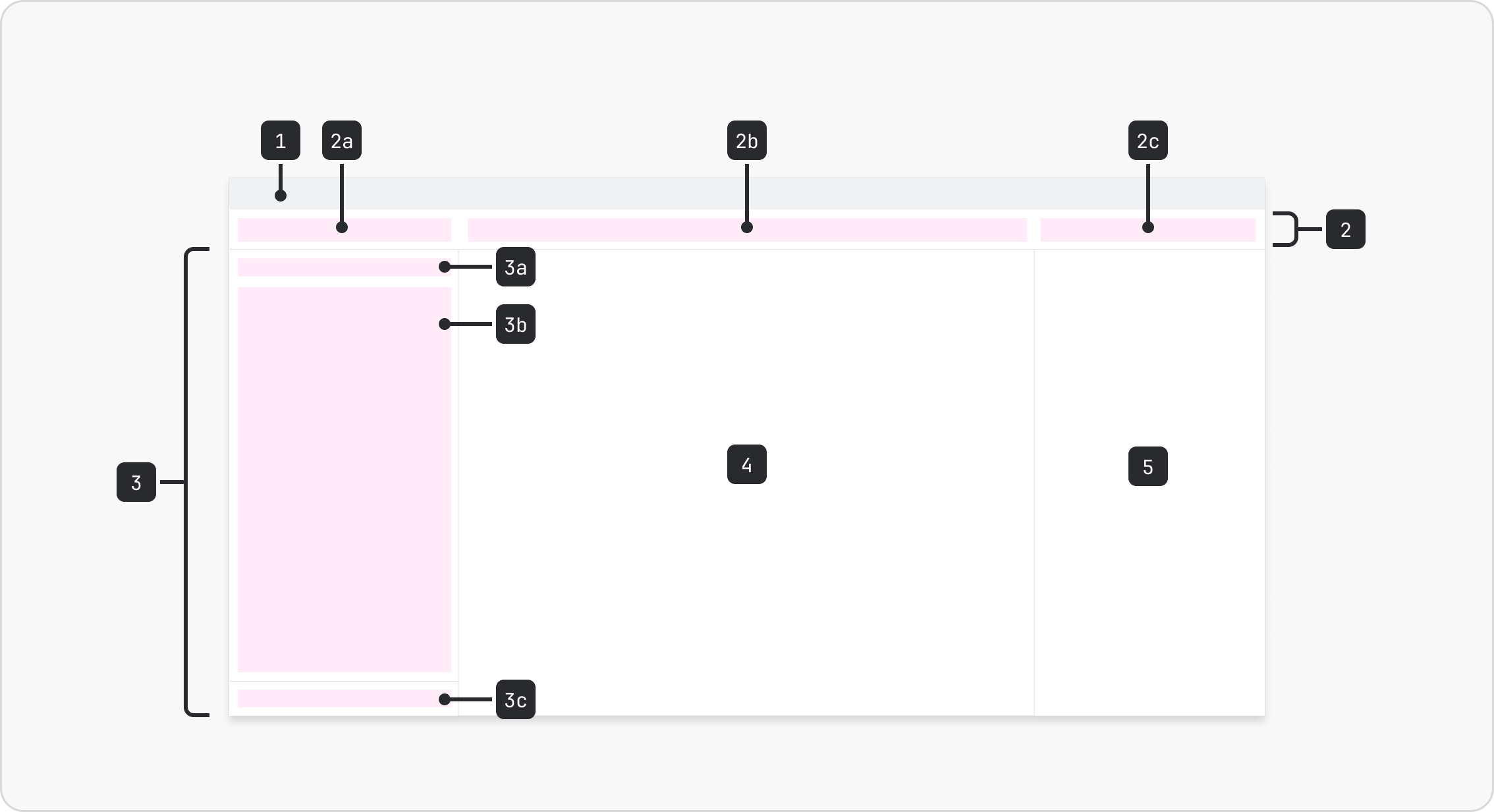
- Banner: Optional. Use to display a banner.
- Top nav: Use to display top nav items.
- Top nav start: Area for left-aligned actions.
- Top nav middle: Area for centre-aligned actions.
- Top nav end: Area for right-aligned actions.
- Side nav: Use to display side nav items, (opens new window). Is resizable and collapsible.
- Side nav header: Optional. Top part of the side nav (fixed).
- Side nav content: Middle part of the side nav. Acts as the scroll container.
- Side nav footer: Optional. Bottom part of the side nav (fixed).
- Main: Use for the page content. Expands to fill available space.
- Panel: Optional. Use to display supporting or supplementary content. Is resizable and collapsible. Wrap `Panel` in `ExitingPersistence` from `@atlaskit/motion/exiting-persistence` so it stays in the DOM until its exit animation completes.
The difference between panel and modal dialog
The main difference between panel and modal dialog is their behaviors:
- Panel presents content alongside the main area, while a modal dialog appears in a layer above the page.
- Panel can be collapsed and resized. On small viewports (1024px and below), the panel becomes an overlay.
Usage guidance
- Use the panel for contextual information or tertiary actions that complement the user's workflow. Panels enable multitasking by providing an additional work space, while keeping users connected to their primary task.
- Use a modal dialog when you need the user to focus on a specific task, such as making a decision or completing an action, before they can return to their primary task.
Accessibility
- Always place slots in this order as direct children of the root: banner, top nav, side nav, main, panel. This determines the keyboard tab order, screen reader reading order, and skip link order.
- Provide a unique, meaningful
labelfor side nav, panel, and top nav end. The label is exposed as the landmark's accessible name. Don't repeat the landmark's role in the label. - Slots provide landmark roles automatically. Don't add or duplicate landmark roles inside them.
- Use custom skip links sparingly. Too many skip links makes the skip links menu noisy. Consider the utility of each one before adding it.
Best practices
Design using grid in the main area
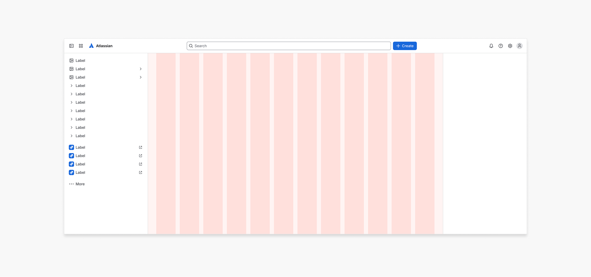
Do
When designing, use grid to position content within the main area only.
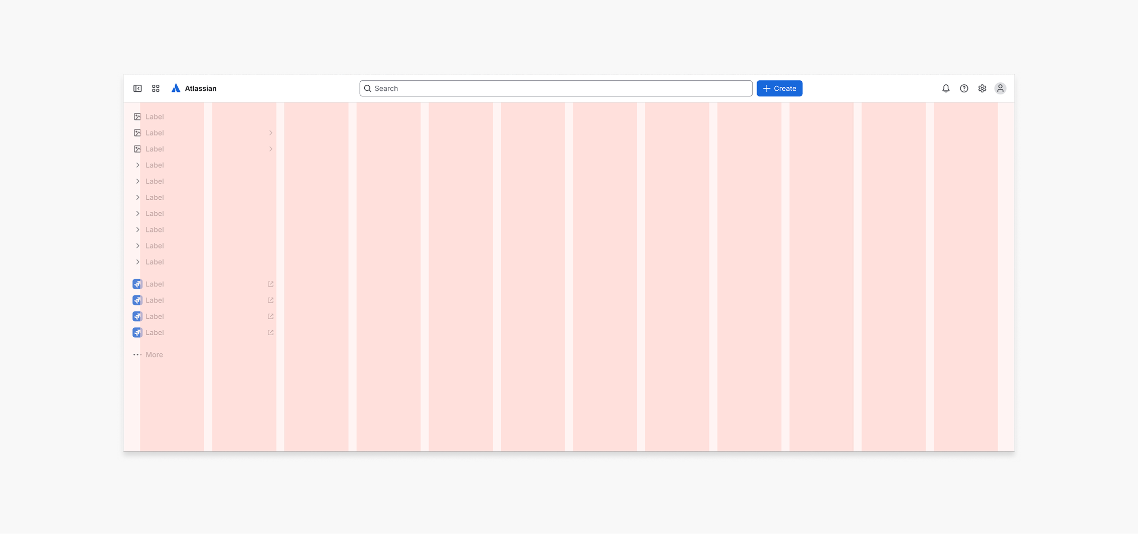
Don’t
Don't include side nav or panel areas as part of your grid.