Banner
A banner displays a prominent message at the top of the screen.Usage
Use banners sparingly at the top of the screen to display critical messaging about the loss of data, functionality, or important site-wide information that affects the user's ability to use the app.
Banners should appear one at a time, are not dismissible, and only disappear when no longer required. Banners animate into a screen by pushing the entire content below down.
Parts
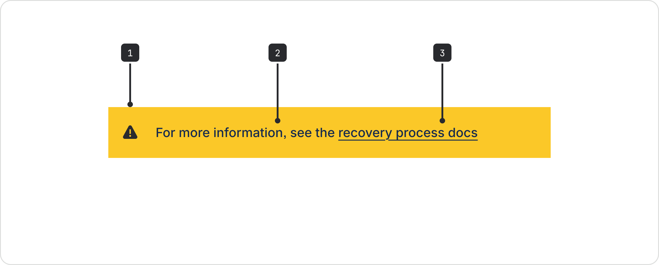
- Icon: Only use the error and warning icons.
- Message: A short description of the severity of the issue, apps affected, and any actions to remedy the situation.
- Actions (optional): A link to a call to action or next steps. Any links to documentation should open in a new tab.
Accessibility
Indicate severity
Don't rely on color alone to indicate severity. Provide an accessible label for the warning and
error icons.
Avoid truncation
The banner will truncate if the content spans beyond the width of the screen. To avoid truncation, keep banner content concise. There is no way to expand and read the full copy.
Alert role
The banner currently uses the alert role. This is a live region that sends out a time-sensitive
alert to assistive technology and doesn't take focus. This makes the banner very noisy for people
who use assistive technology, so only use banners if the message is very important.
For banners that need to take focus, and non-alert banners, compose your banner with design token primitives instead.
Best practices
- Use banners sparingly, particularly warning and error banners, as they are persistent and disrupt the user’s workflow.
- Always be clear, concise and, where possible, give follow up actions to help people resolve the issue.
Content guidelines
- Use concise, scannable language that communicates the problem.
- In error messages, (opens new window) admit when the problem is ours by using we instead of you. Using you can make the person feel like they’re responsible – for example, "We've lost the connection" is friendlier than "Something's wrong with your connection."
Data Center apps
For all new features, we recommend using Atlassian Design System and other Atlaskit components, (opens new window). For existing code, you can continue to use Atlassian User Interface (AUI), (opens new window).
- For confirmations, alerts, and acknowledgments that require minimal user interaction use a flag message.
- To alert users that important information is available or an action is required use an inline message.