Top nav items
Buttons and elements for the top nav.Usage
Use top nav items to create common utilities in the top nav within layout.
Parts

- Start items: Left-aligned buttons.
- Middle items: Centre-aligned actions.
- End items: Right-aligned buttons.
The current navigation has specific menu items that are similar across apps. Make sure your top navigation follows Atlassian patterns consistently. For all the guidelines, see navigation resources (Atlassians only), (opens new window).
Accessibility
- Always provide a meaningful
labelfor every top nav item. The label becomes the accessible name and the visible tooltip. - When a top nav item triggers a popup, menu, or dialog, pass the relevant
aria-controls,aria-expanded, andaria-haspopupprops from that component to the top nav item. - Use the
shortcutprop to surface a keyboard shortcut in the tooltip when one exists. This makes the shortcut discoverable for keyboard users. - Use
isSelectedto indicate when a corresponding popup or panel is open. This exposes the state to assistive technology.
Best practices

Do
Use the top nav items provided.

Don’t
Don't use regular button in the top nav, as it won't respect custom theming.
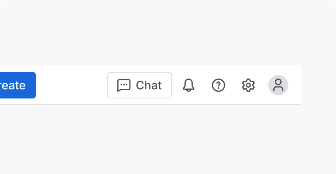
Do
Use the top nav items as intended.
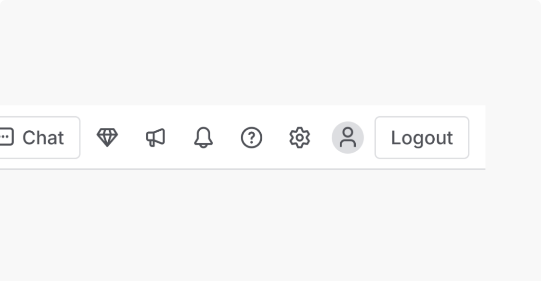
Don’t
Don't add elements to the top nav, which may negatively impact consistency across apps.