Layout
Layout components define a page’s structure and the areas for navigation and content.The full page layout with all areas rendered has the structure depicted below, or see the interactive example, (opens new window).
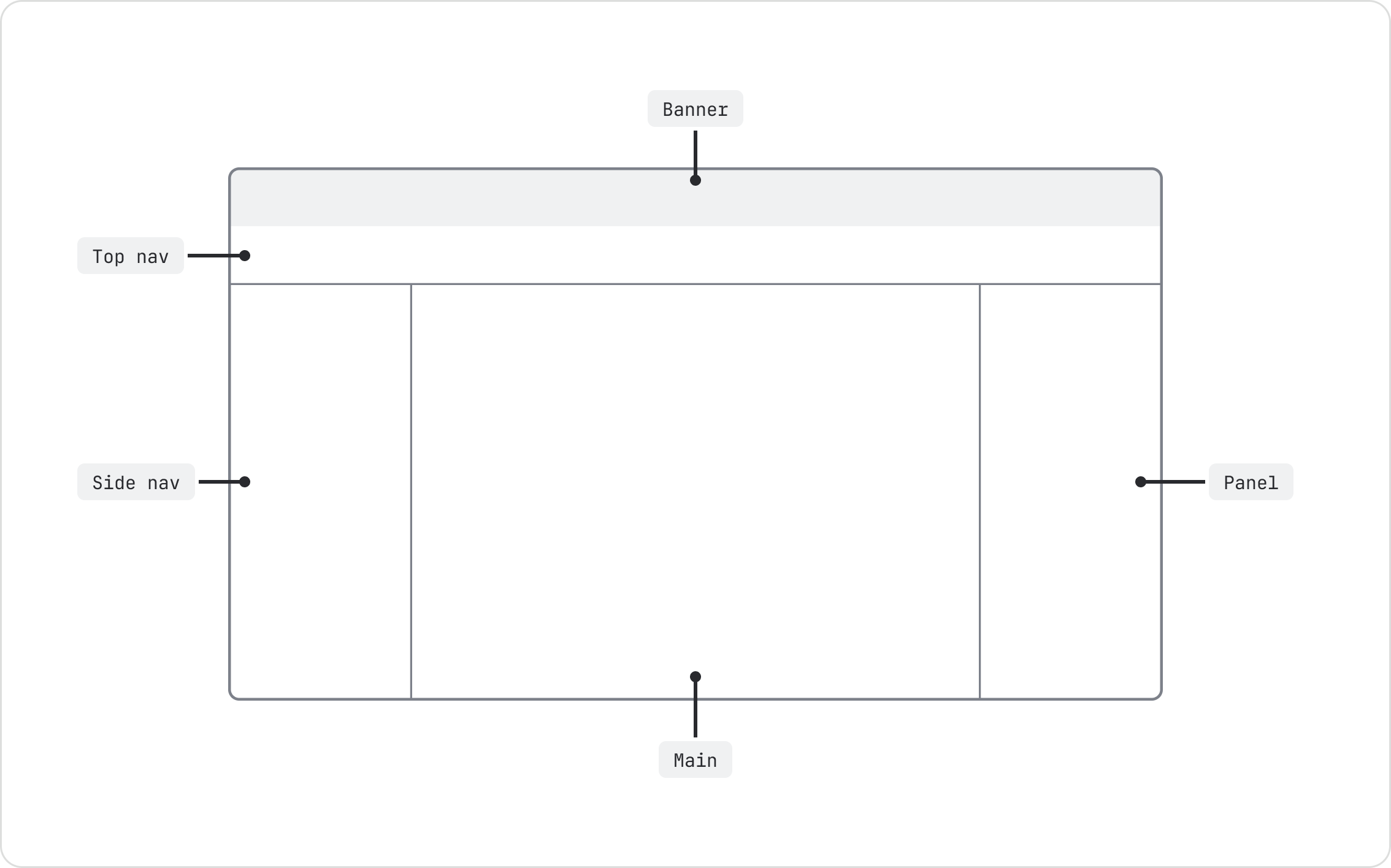
When composing your page layout ensure that:
- The
Rootelement wraps your entire view - All layout areas are rendered as immediate children of the
Rootelement
Layout areas
These are the distinct areas in the layout. These components are designed to contain other components and content.
For examples, see navigation resources (Atlassians only), (opens new window).
Use the banner area to render a banner component. It will always display at the top of the screen.
Use the top nav area to render top nav items.
- It will display at the top of the screen, below the banner if one is present. Its default height
is 48px, or 56px with the updated app switcher. Use the
heightprop to override it. - Use the top nav slots to position actions within top nav.
- The top nav is responsive, with the top nav items changing according to the viewport size.
The top nav has three layout components that you must use to position top nav items within the top nav flexbox.
TopNavStart: Area for left-aligned items.TopNavMiddle: Area for centre-aligned items.TopNavEnd: Area for right-aligned items.

See the custom theming tab.
- Use the side nav area to render side nav items, (opens new window). It will show on the left of the screen. The default width of the side nav is 320px.
- Use the side nav slots to position content within the side nav.
- The side nav is collapsable and expandable, resizable, responsive, and offers flyout behavior.
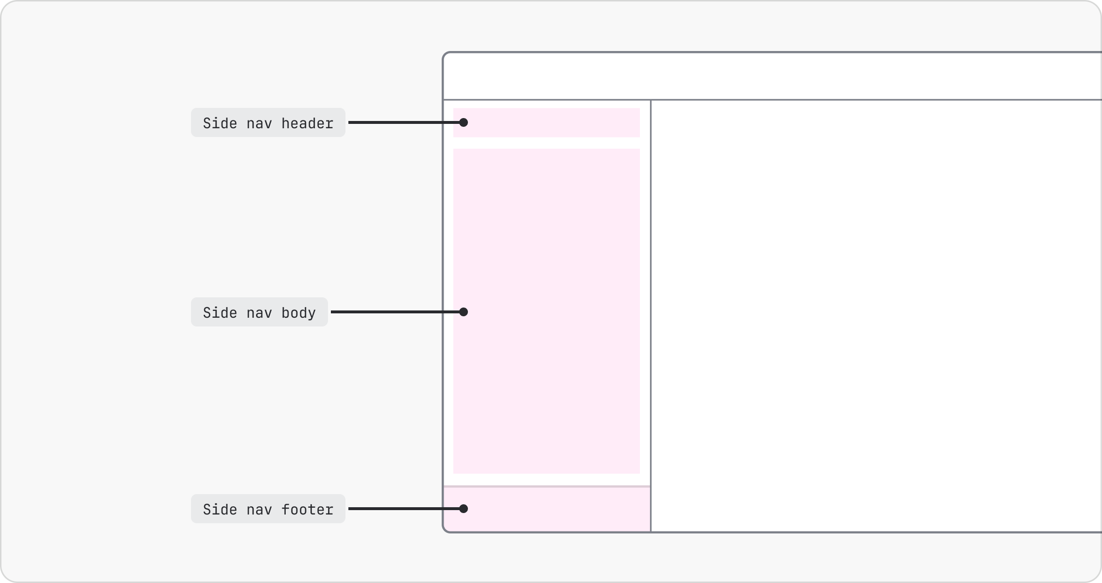
The side nav has three layout components that you can use to position components within the side nav flexbox.
SideNavHeader: The top part of the side nav.SideNavBody: The middle part of the side nav. It acts as a scroll container. It will grow to take up the available space — this is used to push the footer to the bottom of the side nav.SideNavFooter: The bottom part of the side nav.
Note: make sure to render SideNavBody to ensure that the footer is positioned at the bottom of the
side nav, simulating a sticky footer.
The side nav can collapse and expand based on user input or programmatically through hooks.
Toggle button
The side nav can collapse and expand using the SideNavToggleButton from
top nav items or the keyboard
shortcut.
Keyboard shortcut
The keyboard shortcut Ctrl+[ is enabled globally through the isSideNavShortcutEnabled on Root.
It’s disabled by default.
When enabled, additional checks can be performed on individual keypresses through the
canToggleWithShortcut prop on the side nav. This allows for apps to conditionally disable the
shortcut based on additional app-specific requirements.
Programmatic / Hooks
There are two hooks available for programmatically toggling the side nav.
useExpandSideNavuseToggleSideNav
Usage
useExpandSideNav
Returns a function that will expand the side nav.
This can be useful for ensuring the side nav is expanded before displaying an onboarding spotlight, for example. If the side nav is already expanded, it will simply no-op.
useToggleSideNav
Returns a function that will toggle the side nav.
This is useful for toggling the side nav based on a keyboard shortcut.
In the collapsed state, hovering over the
SideNavToggleButtonfrom top nav items will trigger the side nav to open as an overlay. Moving the cursor away will close it. If there are any open supported ADS layering components (e.g. popups, dropdown menus) within the side nav, the flyout will stay locked open, until the layering components are closed.The expansion and collapse of the side nav flyout is animated on supported browsers. Currently, Firefox does not support the animation. Instead, it will instantly expand and collapse.
You can optionally render a side nav panel splitter as a child to make the side nav resizable.
- The side nav is resized using the drag handle. When you hover over the drag handle, the mouse pointer changes to a resize cursor.
- The side nav can be resized to a minimum width of 240px and a maximum width equal to 50% of the viewport width.
- The side nav retains its resized width after it's collapsed or expanded. Persist the chosen width
across page refreshes by providing it to the
defaultWidthprop. - When resizing, any open layer components (for example, popups, dropdowns, selects, and tooltips) are closed.
- You can also double-click the side nav panel splitter to collapse the side nav.
- At
s,xs, andxxsbreakpoints (i.e. viewports smaller than 1024px), the side nav automatically collapses to make room for the content. Users have the option to manually open or close the side nav according to their preferences. Doing so will open it as an overlay. - At
xsandxxsbreakpoints (i.e. viewports smaller than 768px), the max width of the overlay side nav is either 320px or 90% of the screen width - whichever value is smaller.
Main
Use the main area for the page header and main page content. It will expand to fill available space.
- On large viewports main can be fixed, meaning it will have its own scroll container and not use the body scroll.
- On small viewports, the element will always use body scroll, to make it easier to scroll the page when the content is tall.
Panel
The panel area is rendered to the right of the main area. Wrap Panel in ExitingPersistence from
@atlaskit/motion/exiting-persistence. This keeps the panel in the DOM until its exit animation
completes when you conditionally render it.
- The default width of the panel is 365px, which can be modified using the
defaultWidthprop. - The panel is collapsable and expandable, resizable, and responsive.
Panel collapse/expand
The panel can be collapsed and expanded using a trigger of your choosing.
Panel resizing
You can optionally render a panel splitter as a child to make the panel resizable.
- The panel is resized using the drag handle. When you hover over the drag handle, the mouse pointer changes to a resize cursor.
- The panel can be resized larger than
defaultWidthto a maximum of 50% of the content area (viewport minus the side nav area). The panel can't be resized smaller thandefaultWidth. - The panel retains its resized width after it's collapsed or expanded. Persist the chosen width
across page refreshes by providing it to the
defaultWidthprop.
Panel responsive
At s breakpoints and below (less than 1024px) the panel will start to overlay the main area.
Resizable areas
Render a PanelSplitter in a layout area to make it resizable.
Resizing is supported for the following areas:
| Area | Default width | Min width | Max width |
|---|---|---|---|
SideNav | 320px | 240px | 50% of viewport width |
Panel | 365px (modifiable) | Same as default width | 50% of content area (viewport minus the side nav area) |
Responsive
Layout areas respond to the viewport size. See default behavior below, or the interactive example, (opens new window).
| Breakpoint | Viewport | Side nav | Panel |
|---|---|---|---|
xxs | 320 - 479px | Collapsed; opens as overlay | Opens as overlay |
xs | 480 - 767px | Collapsed; opens as overlay | Opens as overlay |
s | 768 - 1023px | Collapsed; opens as overlay | Opens as overlay |
m | 1024 - 1439px | Expanded (inline) | Opens inline |
l | 1440 - 1767px | Expanded (inline) | Opens inline |
xl | 1768+px | Expanded (inline) | Opens inline |
Custom skip links
Use useSkipLink to register custom skip links where appropriate. The useSkipLink hook accepts an
optional third argument to manually specify the index of the skip link in the list.
You can also optionally use the useSkipLinkId hook to retrieve a unique ID for use for your skip
link.
import React from 'react';

import { useSkipLink, useSkipLinkId } from '@atlaskit/navigation-system/layout/skip-links';

export function CustomSkipLinkExample(): React.JSX.Element {
	const id = useSkipLinkId();
	useSkipLink(id, 'Landmark name');

	return <div id={id} />;
}

export default CustomSkipLinkExample;