Panel
Panel components provide a surface for contextual information alongside the main content area.Beta
New and ready to use. We'll provide comms and support for any major changes.
Usage
Use a panel to show contextual information or supplementary tasks without users leaving the page. A panel is triggered from a user action, sits on the right edge of the page, and is always dismissible.
Parts
The panel is composed of four structural blocks. Apps have full control over the body area. The remaining blocks follow defined constraints to maintain visual cohesion across apps.
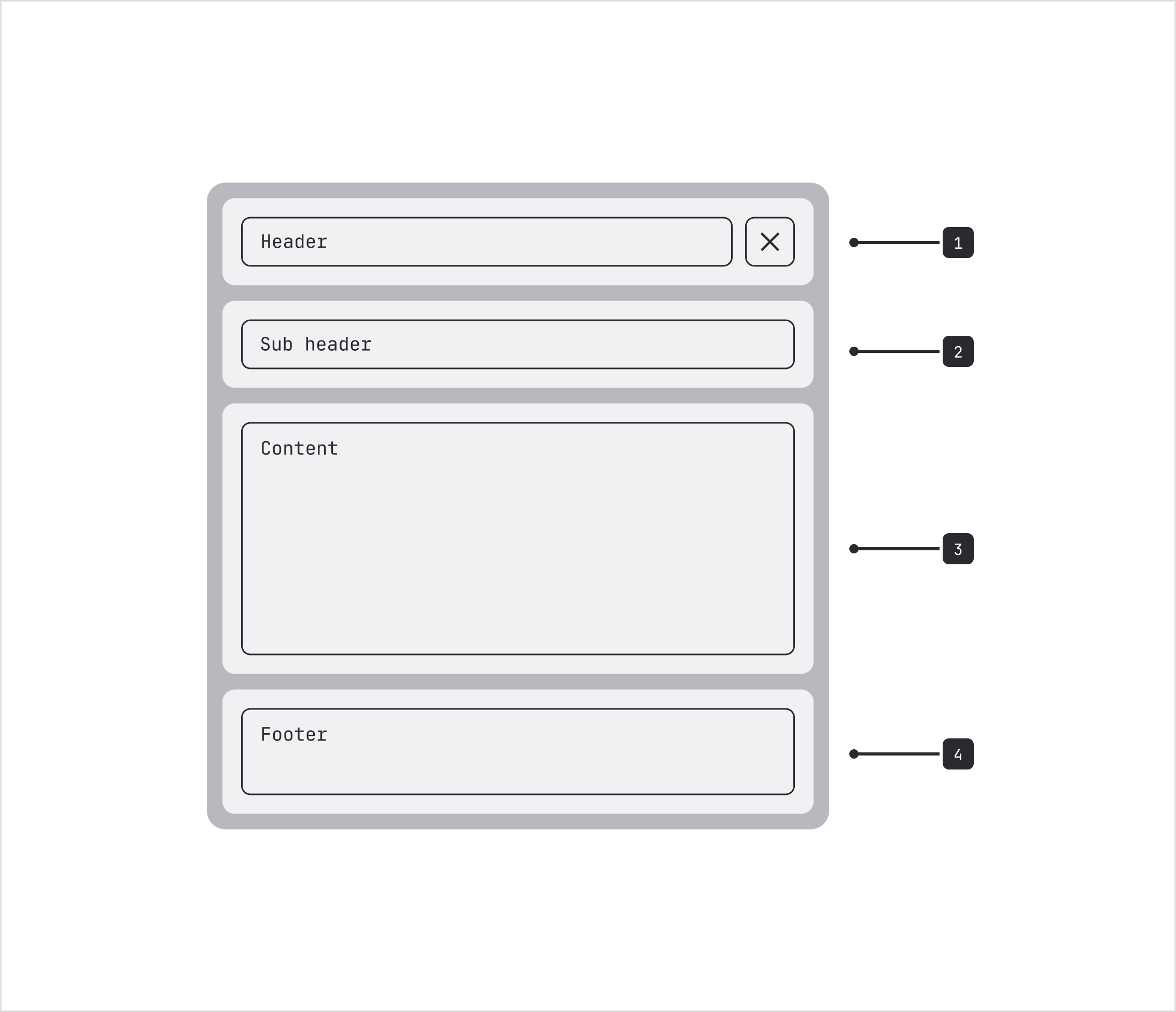
- Header: The top bar of the panel used to identify where users are and conduct actions related to the panel.
- Subheader (optional): An optional section below the header for secondary information.
- Body: The main content area.
- Footer (optional): A sticky bottom bar containing actions.
Header and subheader parts
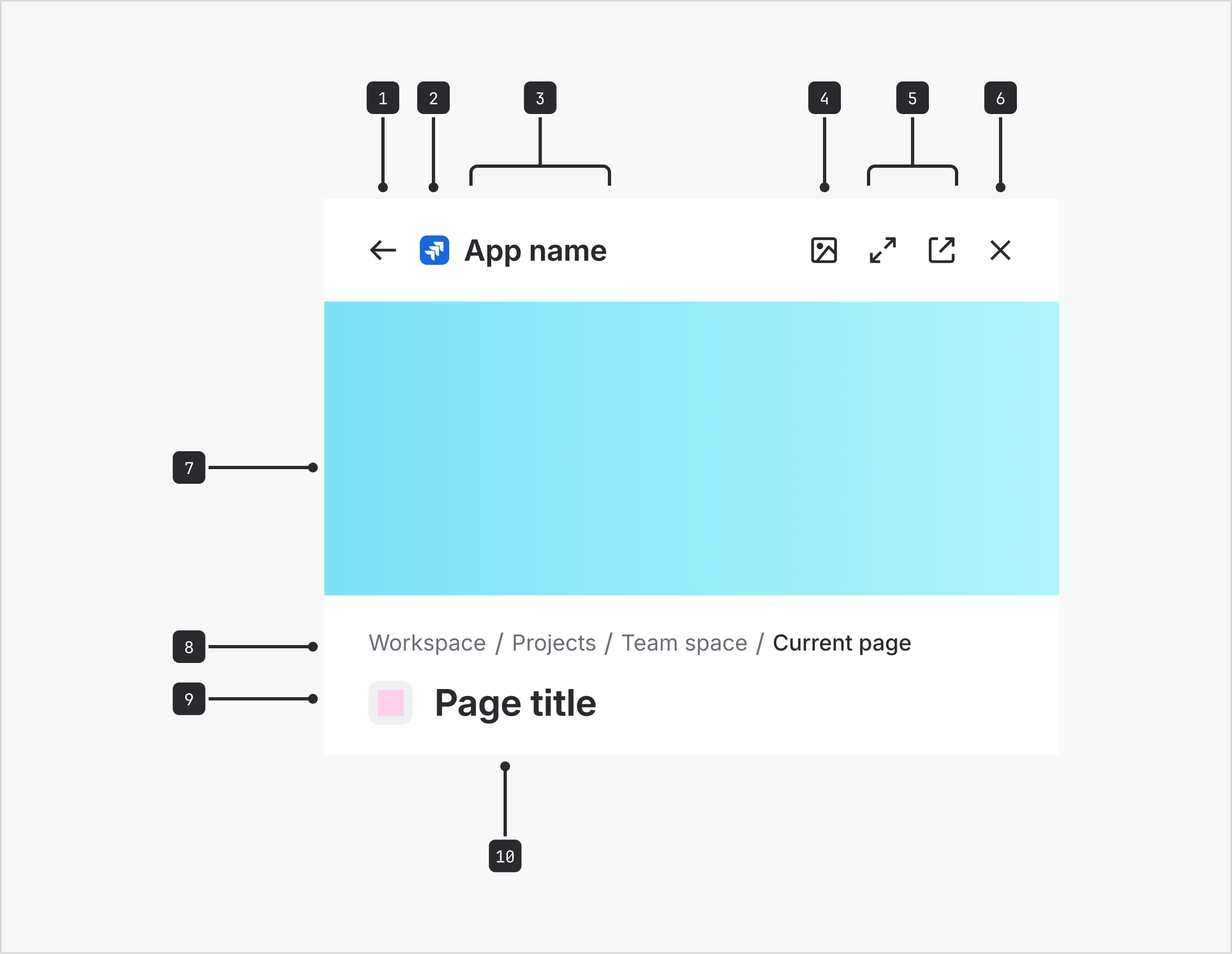
- Back button: A button that navigates back to the previous panel view. Only appears after a user selects a nested link within the panel.
- App logo / header icon (optional): App logo used to help users identify the panel's source app.
- Header title: The main title of the panel.
- App-specific action (optional): A single customizable app action defined by the app.
- Panel actions (optional): Actions related to navigating the panel, such as opening in a new tab or modal dialog.
- Close button: A button to close the panel from the header.
- Cover image (optional): An image that supports the panel's content.
- Breadcrumbs (optional): Shows the current location of the panel's content within a navigational hierarchy.
- Title icon (optional): An icon placed before the subheader title to add visual context.
- Title: The title that describes the panel's content.
Header types
There are two header types: branded and non-branded. The type you use depends on the purpose of the panel and whether the panel needs to identify its source app.
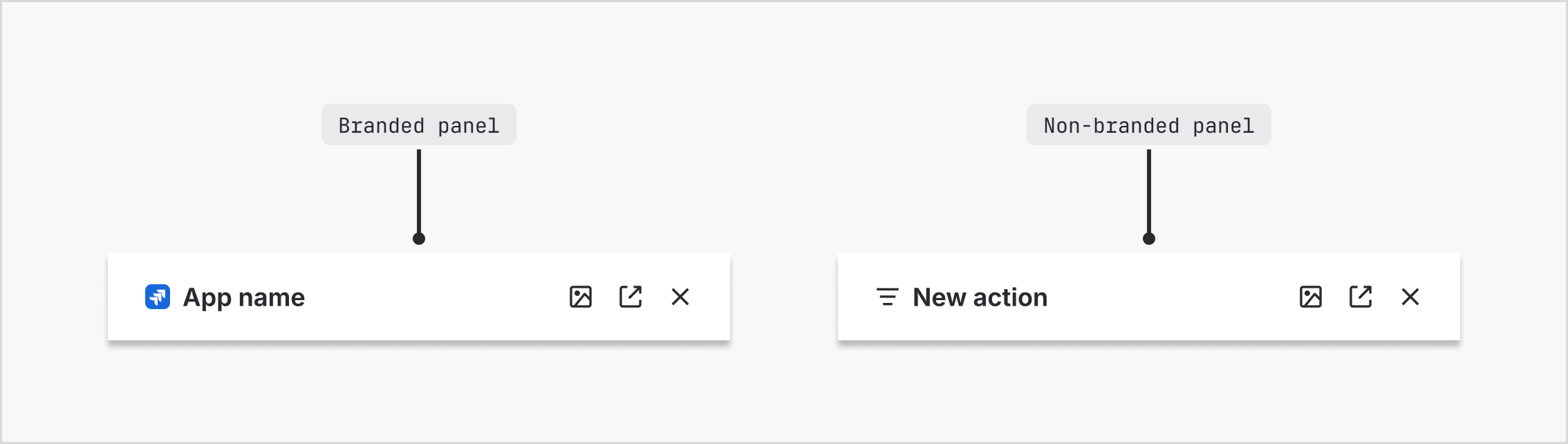
Branded headers
Branded headers include the source app's name and logo. Use these when the panel's content comes from a different app than the one the user is currently in. Branded headers are also appropriate within the same app when the panel functions as a preview or split-screen view of app-owned content, such as a Confluence page preview shown inside Confluence.
Non-branded headers
A non-branded header omits the app name and logo. Use this type when the panel operates within the current app for focused tasks, actions, or contextual views where extra content is not needed. Examples include filters, settings, or detail panels.
When to use a panel
Use a panel when:
- displaying contextual details about a selected item, such as settings or properties
- the user needs to complete a supplementary task without leaving their current view
- previewing linked content
Don't use a panel when:
- the content requires the user's full attention (use a modal dialog instead)
- a complex multi-step flow needs dedicated screen real estate (use a full page instead)
- the content includes dense, heavy data or tables (use a full page instead)
Behavior
Opening and closing
- Panels open in response to a deliberate user action such as a button select or keyboard shortcut.
- The Close button is always visible in the header.
- Panels do not persist between sessions. Navigating away in the main page will close the panel.
- The Back button only appears after a user has clicked a link within the panel that opens a new view inside the panel. The initial panel does not show a back button.
- Pressing back must preserve the scroll position of the previously loaded view.
Header actions
- The header supports one app-specific action, followed by up to two panel actions, and a close button. The Close button is always visible.
- If more than one app-specific action is required, use an overflow menu (ellipsis) to house additional actions, for example Share or Edit.
- Panel actions control where the panel content is displayed, such as opening the content in a new tab, new window, or modal dialog.
Padding
There is 24px padding on the left and right of the panel. If you believe your use case is an exception, contact the Design System team for guidance.
Best practices
Don’t place modal dialogs over a panel
Modal dialogs should always be presented at the full-page level, not layered over a panel.
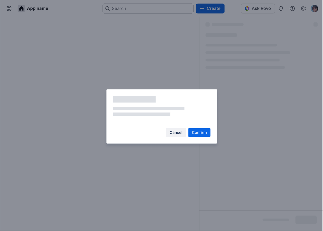
Do
Do place a modal dialog over the entire page.
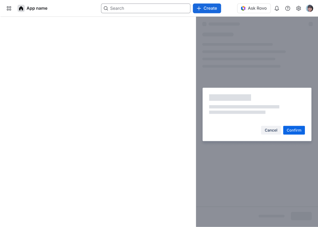
Don’t
Avoid placing a modal dialog over the panel.
Header titles
For branded headers, use the app name as the header title. For non-branded headers, use:
- The object name when the panel displays or browses content (e.g. "Comments")
- The action name when the panel completes a task (e.g. "Edit settings")
For panels with the action name in the header (task based panels), you can use the subheader title to display the object name if needed — but avoid swapping these (i.e. don't put the object name in the header and the action name in the subheader). Where possible, match the header title to the panel's trigger label.
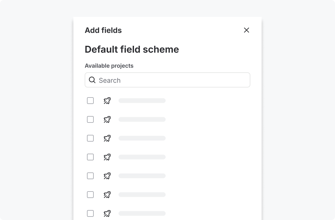
Do
Header title: Add fields (action) Subheader title: Default field scheme (object)
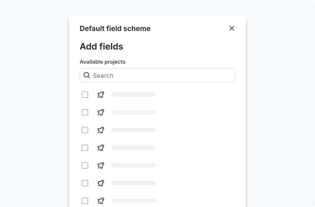
Don’t
Header title: Default field scheme (object) Subheader title: Add fields (action)
Confirm changes before closing or leaving a panel
- If a user is editing content within a panel and attempts to close it or navigate to a new panel, display a warning that they have unsaved changes.
- When a user saves changes via an action like "Update" or "Add", use a visual indicator to confirm the changes have been saved. We recommend using the flag, (opens new window) component for this.
Panel triggers
A panel trigger is the element a user interacts with to open a panel. To help users predict that something will open in a panel, triggers should be consistent and recognisable. Here are some approaches:
- Position: Place triggers in a consistent zone that always opens a panel, for example in a container or toolbar.
- Icon: Use a panel icon to indicate content will open in a panel.
- Type: Use the same trigger type consistently within a context, for example all rows in a table opens in a panel.
If content can open in more than one place (for example in a modal dialog as well as a panel), use distinct icons for each method so users can associate the icon with the destination.
The footer is an optional sticky bar at the bottom of the panel. Use it when the panel contains a task that requires a clear commit or cancel action.
Footer actions:
- Place the primary action on the right (for example: Save, Add, Confirm).
- Place the secondary action to the left of the primary action (for example: Cancel). Include a Cancel button when possible so keyboard users don't have to tab back to the top to dismiss the panel.
- Limit to one primary and one secondary action where possible.
Disclaimer bar (optional):
- Use a disclaimer bar when users need to be informed of important context, for example AI disclaimer content.
- Keep disclaimer text short and to one line.
Content guidelines
For panel header and subheader titles:
- use sentence case and capitalize the first word and proper nouns only
- keep titles short and specific as longer titles may be truncated. Avoid truncated titles
- avoid generic titles like "Details" or "Info" in isolation. Add enough context for users to understand what's shown
Accessibility
- Provide a meaningful
labelprop on thePanelnavigation slot, (opens new window) so screen reader users understand the panel's purpose. For example,label="Issue details". - Ensure panel body content follows our accessibility guidelines: correct heading hierarchy, form labels, and sufficient color contrast.
- If user navigates away from a form inside the panel, preserve the form state when the user navigates back within the panel.