Designing messages
How to choose the right component, icon, and color for effective messages.People care about how apps talk to them. YouTube, GitHub, and Slack all have a distinct voice, tone, and personality.
Apps engage us, manage to make us feel at home, capture our attention, and earn our loyalty.
Poor messaging contributes to a poor user experience, which leads to dissatisfaction. On the other hand, good copy reflects our apps' voice (personality) and enables us to build a better relationship with our audience.
In short, good messaging may not be the reason people stay with our apps, but bad messaging could be the reason they decide to leave.
Choose a message type
Use different types of messages to guide people through their tasks. Each message type has a consistent visual and writing style to help people know what to expect.
Use these guidelines to choose and write the types of messages:
- Information message — provides additional information to motivate people.
- Error message — alerts people of a problem that has occurred and informs them what to do next.
- Success message — celebrates success along with the people using our apps.
- Warning message — gives advanced notice of a potential change that may result in loss of data or an error state.
- Feature discovery — lets people know about a new feature.
Select the right component
Use the table to identify the right component for your content.
For example:
- If you want to highlight a new feature to a user, consider using spotlight or empty state.
- If you want to tell someone they've accomplished a task, consider a flag.
| Component | Information message | Success message | Warning message | Error message | Feature discovery |
|---|---|---|---|---|---|
| Empty state | Yes | Yes | Yes | ||
| Banner | Yes | Yes | Yes | ||
| Flag | Yes | Yes | Yes | Yes | |
| Section message | Yes | Yes | Yes | ||
| Inline message | Yes | Yes | Yes | Yes | |
| Modal dialog | Yes | Yes | |||
| Spotlight | Yes |
Empty state
Use empty states to show when there is nothing to display in a view, for example, when a board has no tasks, someone clears their inbox, or a search returns no results.
Read guidance on writing effective empty state messages.
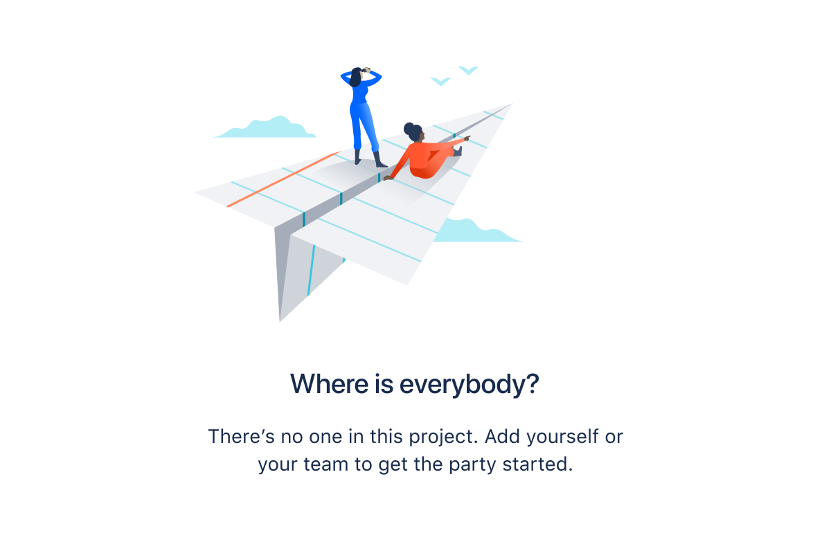
An empty state can appear as a full-screen message or within panels, tables, and other containers.
Use banners only for critical system-level messaging for example, warnings about loss of data or functionality.

Banners appear at the top of the screen and shift the content below them.
Flag
Use flags for confirmations, alerts, and acknowledgments that require minimal user interaction.
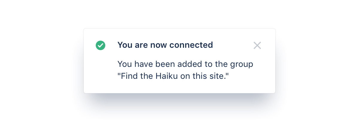
Flags are event-driven messages that appear by overlaying content at the bottom left of the screen, emerging from the navigation sidebar.
Section message
Use section messages to alert the user of something that has happened in a specific section of the screen.
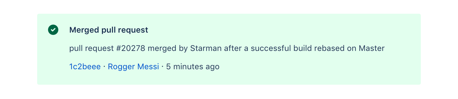
Section messages appear above the affected area (for example, work items in Jira).
Inline message
Use inline messages to alert people to a required action or important information.
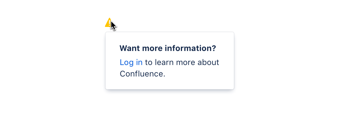
Inline messages consist of an icon, message, and sometimes secondary text. People can interact with the icon, title, or secondary text to reveal the full inline message.
Modal dialog
Use modal dialogs to present a short-term task the user needs to perform.
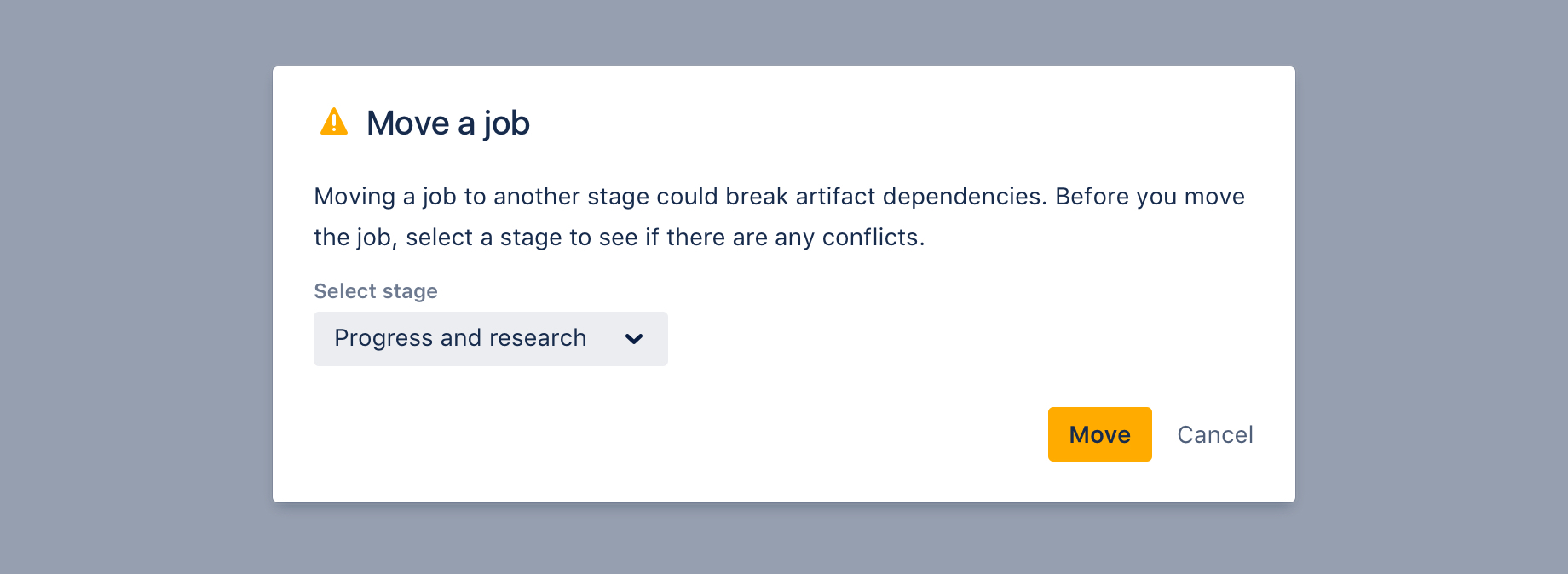
Modal dialogs display content in a layer above the page.
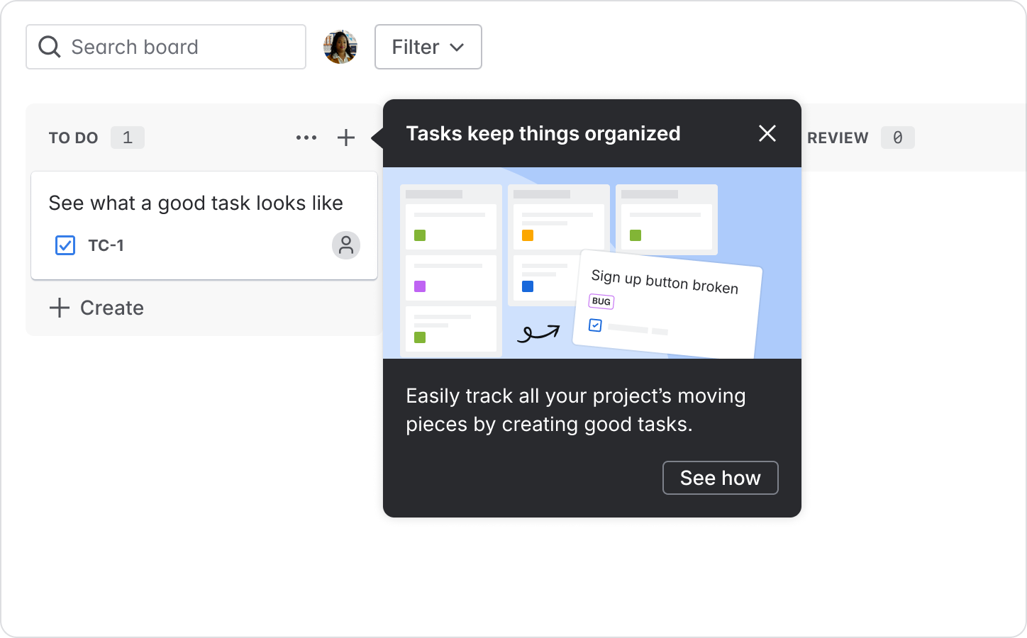
Spotlight
Use a spotlight to bring attention to a specific part of the UI, such as a button or icon, to educate users about key features or workflows.
Read guidance on writing effective feature discovery messages.
Set the appearance (color and icon)
Messages use colors and icons to help indicate content and urgency.
Make sure you use the right color role for your situation. For example, yellow typically implies a warning, while green can imply success.