Icon
An icon is a symbol representing a command, device, directory, or common action.Usage
Clear and consistent icon use should help people complete tasks, providing more affordance for certain actions and features across Atlassian apps. Use icons following these guidelines.
For more on Atlassian's icon style and how icons are drawn, see the iconography foundation.
Use clear, recognizable icons
There are very few icons that have clear associations across cultures and contexts. Use icons with clear and established associations to across the web wherever possible.

Do
Use symbols that clearly represent a concept. Use metaphors with clear and established associations across apps and industries.

Don’t
Don't use uncommon icons. Be careful when creating or using new symbols as icons. They may be confused with other concepts or misunderstood.
Icon types: Use icons consistently across Atlassian experiences
We organize our icons in categories to help with consistency across apps and features:
- Single purpose: Icons that represent a single feature or concept. Avoid using these icons outside of their intended purpose.
- Multi-purpose: Icons that can be used to represent multiple different things, depending on context.
Check the usage description of the icon for details on where it's typically used. You can find these descriptions in the icon explorer or in Figma.
Don't overuse icons
Does the icon aid comprehension or detract? Sometimes having an icon on every single menu item can take away from the overall clarity of a page.
If you're struggling to choose a clear icon for every item in a view or menu, reconsider whether the icons are needed at all.
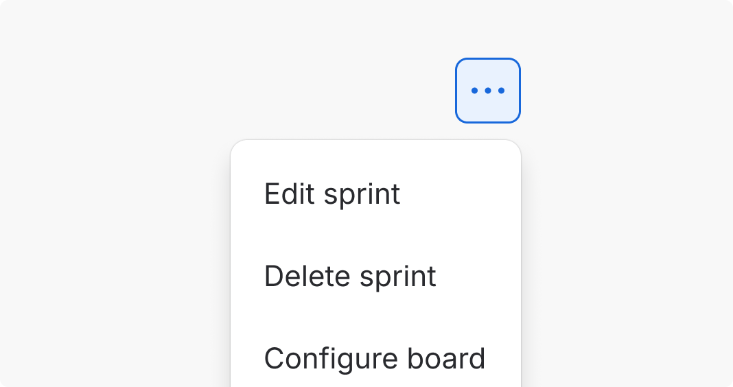
Do
Use an icon to aid navigation and provide clarity.
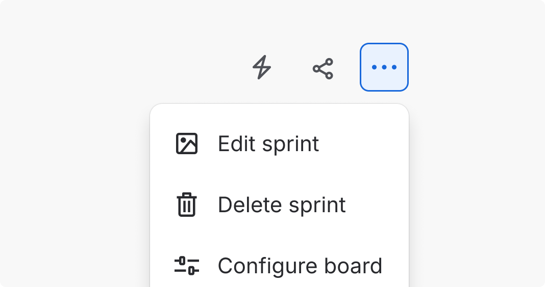
Don’t
Don't use too many icons in an area. This can create visual noise and make things harder to find.
Accessibility
Make sure any meaningful icons are legible and understandable, including to people using assistive technologies.
Use text labels to support comprehension
Very few icons are clear to all users. Use text labels to clarify what a feature or button is for.
If a UI element has a text label, there’s usually no need to provide an accessible label for the icon as well. The visible text label should communicate the same idea as the icon, and repeating this info to assistive technologies isn’t necessary.
Provide accessible labels for icons that communicate additional information
Most of the time, icons are associated with text labels on buttons or other elements. In these
cases, don’t provide alternative text for the icon, because the label describes the meaning of the
icon already. In code, this can be done by setting the required label prop to an empty string
("").
If an icon doesn’t have an existing text label or accessible text, provide a clear label with the
label prop.
Sometimes an icon communicates additional information about a feature, such as a warning status or external link icon. In these cases, make sure that information is available to people using assistive technologies, either through the icon label or through other methods.
Target size
When icons are placed inside interactive elements, such as buttons and links, the size of the target for pointer inputs should be a minimum of 24 by 24 pixels, unless exempt from Target Size (Minimum) (Level AA), (opens new window).
Using icon button will ensure the target is large enough, but use caution when composing custom selectable elements with icons.
Spacing and sizing
Icons are intentionally spacing-neutral. Whitespace around an icon should be defined by the composition it sits within, not baked into the icon itself. This keeps layouts flexible, debuggable, and consistent with how the rest of ADS handles spacing.
The spacing prop was introduced as a migration shortcut and is now deprecated. It will be removed in a future release. Where possible, move the spacing into the surrounding component. In code, wrap icons in a Flex primitive with explicit padding tokens for a quick 1:1 migration.
See the examples page for migration guidance.
Don't scale or resize icons
Our icons were designed to work in harmony with the typography and spacing systems across Atlassian apps. Don't scale or resize the icons. Instead, use existing sizes and components.
Medium 16px icons (default)
The majority of icons in Atlassian apps are 16 by 16px.
Icons have no padding by default, allowing the buttons or other components to control the whitespace between icons and other elements. Use center-alignment to position icons in larger spaces.

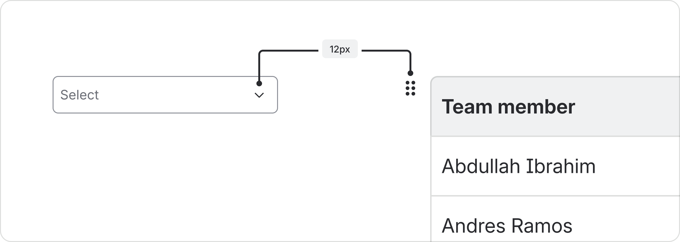
Small 12px icons
New
Icons are also available at a smaller size for visual alignment in small spaces. Because the size is smaller and harder to read, they should be used sparingly, such as for chevrons in buttons and menus.
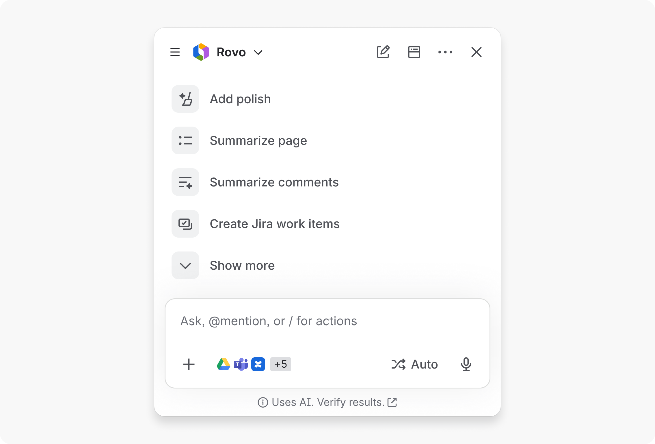
Larger than 16px icons — consider icon tile
We don't offer regular icons larger than 16px.
However, Icon tile comes in varying sizes for specific use cases that require more emphasis or color. Consider using icon tile for icons larger than 16px.
Data Center apps
For all new features, we recommend using Atlassian Design System and other Atlaskit components, (opens new window). For existing code, you can continue to use Atlassian User Interface (AUI), (opens new window).
- For more on icon design, go to the iconography foundation.
- To add a new icon to the system, contribute an icon.
- For icons with colored backgrounds, use icon tile.
- For buttons with icons, use icon button.