Modal dialog
A modal dialog displays content that requires user interaction, in a layer above the page.Usage
Use a modal dialog to present an immediate task a user needs to perform. This can include critical or warning information where a response is required or an action to support task completion, without losing the context of the underlying page.
Users can’t interact with the page until the dialog is closed.
In some cases, you can add support information to a dialog modal, such as filters or hint text, but remember to keep the content concise and direct as space is limited.
Although highly versatile, modal dialogs aren't fit for all purposes. They can be invasive and should be used sparingly.
Parts
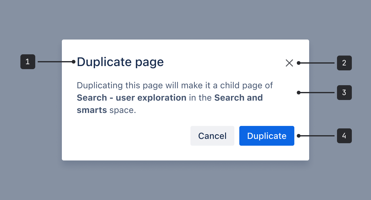
- Header: Contains the modal title. It should always be a level
h1heading. - Button Closes the modal dialog from the header.
- Body: Provides an overview of the modal dialog's purpose and any controls that might be needed to complete a task.
- Footer: Contains a primary action and the ability to cancel or close the dialog.
Accessibility
Indicating severity
Don't rely on color alone to indicate severity. Provide an accessible label for the warning and
error icons.
Labeling modals
Modals must have a title so all users can understand what the modal is for.
There are 3 ways to make sure your modal has an accessible title:
- Use the modal title component (view the modal header example).
- Add the
titleIdfrom theuseModalhook to an element within your modal (view the custom header example). - Use the
labelprop – though this should be avoided as it means there's no visual title available for sighted users.
Dismissing modals
Users can't interact with the rest of the page until a modal is closed. To help both mouse and keyboard users perform this action, the dialog can be closed by:
- Selecting the close button in the header
- Pressing
Escon a keyboard - Selecting anywhere outside the modal (in the blanket)
- Selecting Cancel or Close in the footer (optional)
A close button in the header should always be used, except in extremely rare circumstances.
If you think an exception applies to your use case, you must contact the accessibility team to confirm. Otherwise, it could introduce an accessibility violation.
Setting focus
Focus order should follow a logical and predictable sequence for keyboard and screen reader users.
The focus should move as follows:
- Close button in header: If the modal doesn’t have a close button, focus should start on the title. If there isn’t a title, focus should start on the container (modal window).
- Main content: For form fields or other interactive elements, focus should move to the first focusable element. If the content is text and not actionable, focus should move to the text.
- Secondary button, if using.
- Primary button.
- Modal trigger: When the modal is closed, focus should return to the element that triggered the modal.
Best practices
- Limit the number of interactions in a modal dialog. Simplify by removing unnecessary elements or content that doesn't support the task.
- Avoid multiple steps that require navigation within the modal dialog.
- Provide all the information a user needs to complete the task within the modal. Avoid complex decision-making that requires additional information not available in the modal.
- Modal dialogs are responsive. When adding content, respect the dimensions set by modal dialog to maintain responsiveness.
- Support multiple methods for dismissal. A ‘close’ button is required in the header, but decide whether a ‘cancel’ or 'close’ button is needed in the footer.
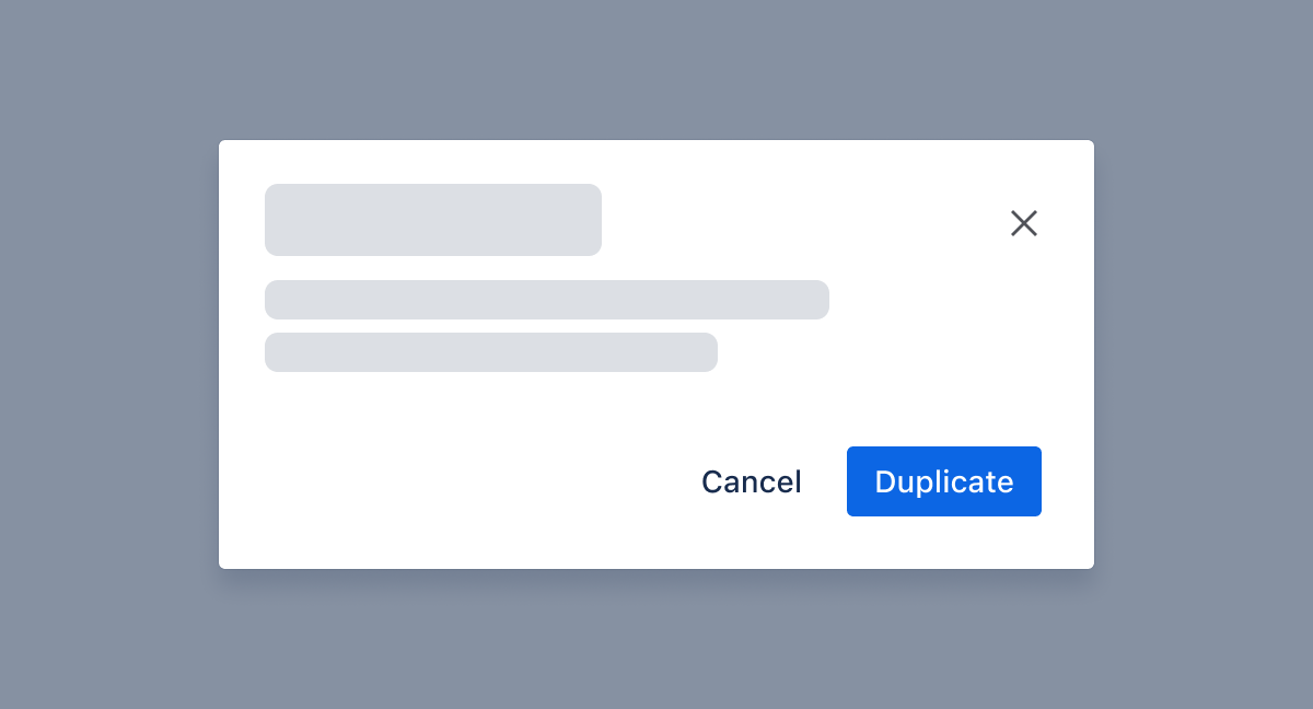
When adding buttons to the footer, place them on the right.
Do
Align buttons on the right in the footer.
If you have more than 1 button, place the primary button to the right of the secondary button.
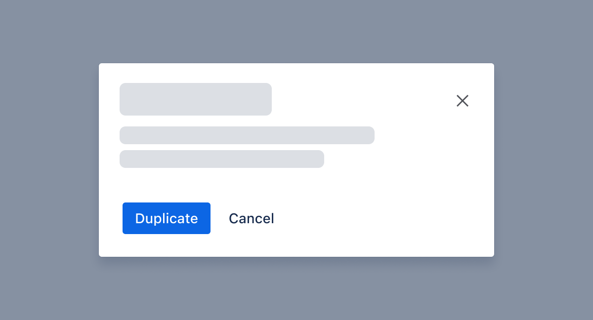
Don’t
Don’t place buttons to the left or middle of the footer. This can confuse users and disrupt the expected flow of actions.
Don't put primary buttons to the left of secondary or tertiary buttons.
Simple and focused experiences
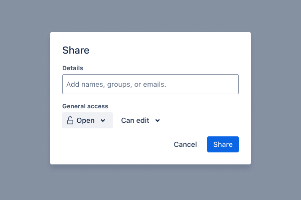
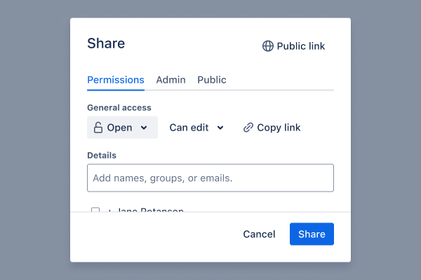
Avoid complex experiences and scrolling behavior as they reduce the usability of the experience.
Do
Keep `h1` headings and body content concise and clear. Focus on a single task or message.
Don’t
Don’t use a modal dialog for complex interactions or large tables.
Avoid horizontal scrolling and minimize vertical scrolling whenever possible.
Nesting
Do
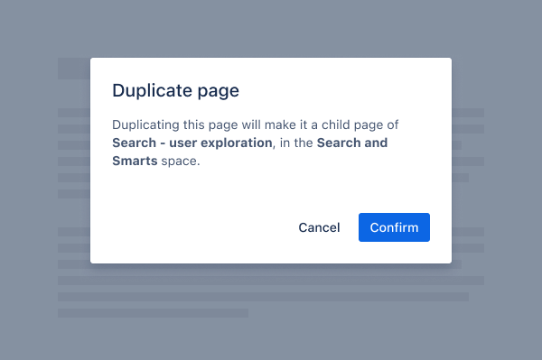
Modal dialogs should appear above a blanket that covers the main page content. Use one at a time.
Don’t
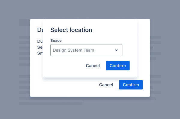
Don’t use dialogs to trigger other dialogs, as this is inaccessible and confusing.
Instead, make sure links or buttons open in a new tab or dismiss the modal.
Content guidelines
- Body copy for a modal dialog should contain only valuable and relevant information.
- In label elements, use action verbs that indicate what happens when the element is selected. For example, label a select menu with 'Choose a user' instead of 'Users.
- The main action (a primary button) should reflect the modal
title.
- For example, a modal with the title 'Fork <repository name>' should have a button labeled 'Fork repository'.
- The title 'Select a template' should have a button labeled 'Select'.
- Use popups for smaller amounts of information along with controls.
- To onboard or update people about new functionality, use custom modal dialog or spotlight pattern.
- To alert people about important information, or an action that's required to complete a task, use inline messages.