Spotlight card
A spotlight card is for onboarding messages that need a more flexible layout, or don't require a dialog.Deprecated
This package is deprecated. Use @atlaskit/spotlight.
Usage
You can customise the spotlight card to highlight app features in different contexts.
Parts
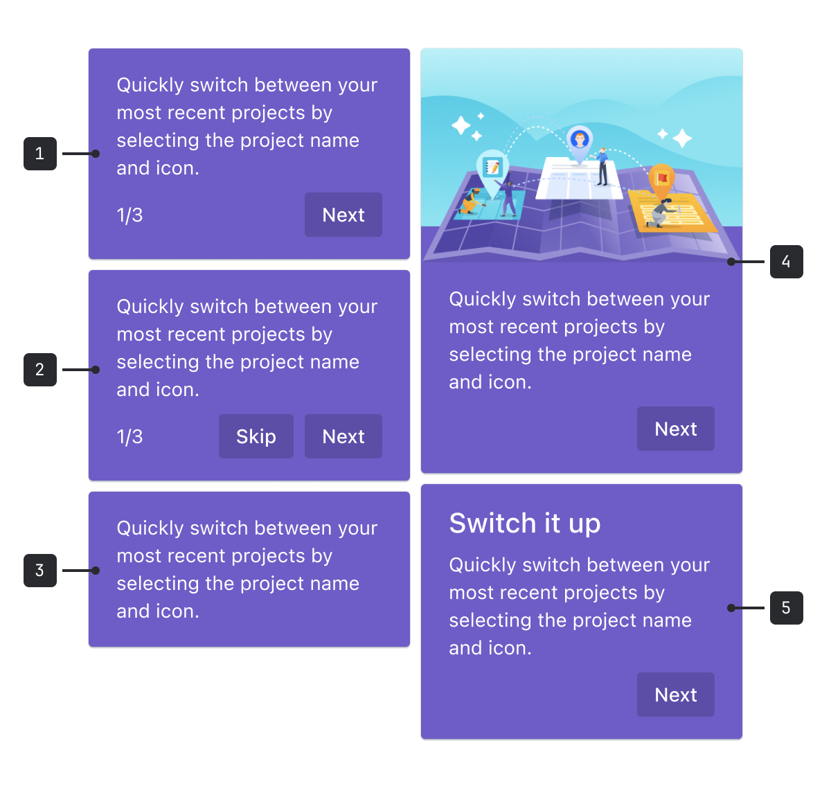
- Stepper: Step through a series of cards to communicate multiple benefits of a single element or related task. Avoid using this to show the actual steps of a task, and always use as few steps as possible.
- Secondary button: Include a primary and secondary action. Best practice is to always allow people to dismiss the spotlight.
- Spotlight area action: Include a call to action to help the person interact with the spotlit feature.
- Illustration: Include an illustration if it enhances understanding for people, and doesn't distract. Illustrations should relate to the spotlight content or benefit.
- Heading: Include a heading to draw attention to the message. Keep your UI copy focused on the task that it helps people complete.
Accessibility
- If you use an illustration that provides useful information, include alternative text. If it's only for decoration, avoid alt text, or consider removing the image altogether.
- For spotlight tours with pre-configured options, see onboarding spotlight.
- For an onboarding modal, see benefits modal.
- See more in our first impressions patterns.