Empty state
An empty state appears when there is no data to display and describes what the user can do next.Usage
Empty states show when there is nothing to display in a view, for example, when a board has no tasks, someone clears their inbox, or a search returns no results.
An empty state can appear as a full screen message or within panels, tables, and other containers. Empty states can be a chance to celebrate, educate, and inform people of what they can do next.
Parts
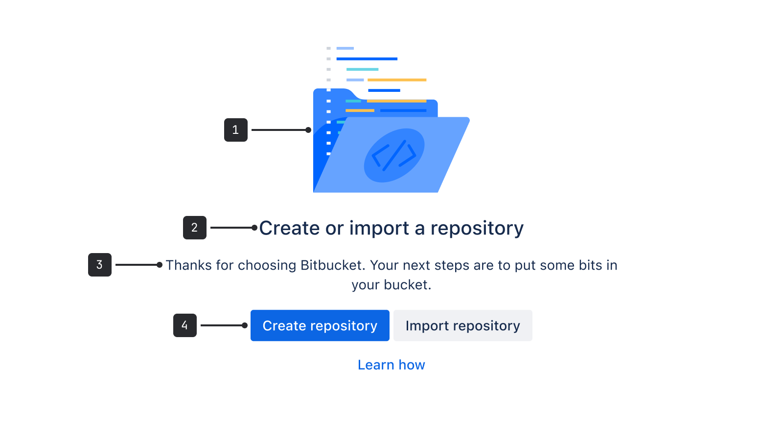
- Illustration (optional): A spot illustration that relates to the message literally or as a metaphor (see illustration best practices below).
- Header: A title that provides a concise description of the current state.
- Description (optional): A short message describing the reason for the state and what to do next. See content guidelines below for details.
- Buttons (optional): Next steps or a way to dismiss the message. Can be a primary button, secondary button, or link-styled button.
Accessibility
- Avoid jargon and use simple language.
- Make links descriptive of their destination.
- If the illustration provides useful information, include alternative text. If it's only for decoration, avoid alt text or remove the image altogether.
Best practices
Include an action or link to help people understand what to do next.
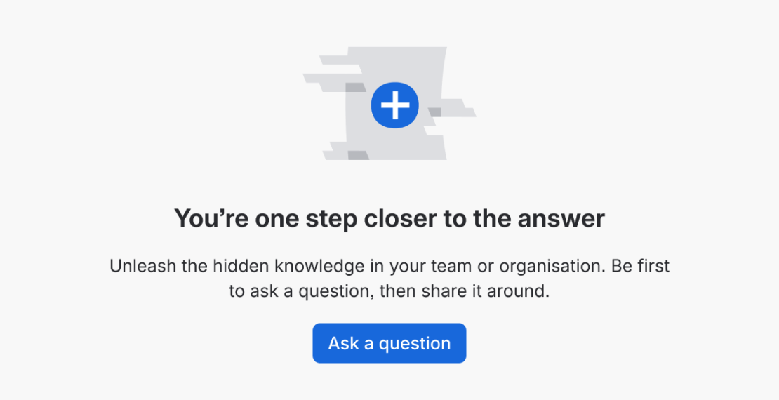
Do
Include a relevant call to action.
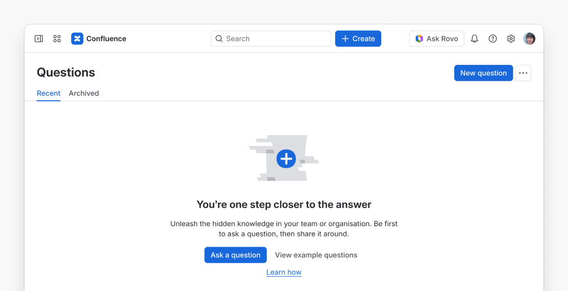
Don’t
Include too many call to action buttons on one page.
Illustrations
- This component is optimized for spot illustrations. Don’t resize spot heroes or other larger illustrations to fit a smaller space.
- Make sure the image is relevant to the current task and context. Some spot images are designed specifically for empty states.
- Choose an image that has a neutral or humorous tone (never negative).
- Using an image as a metaphor may not translate to all cultures and languages. When choosing imagery, consider internationalization.
- Illustrations are optional. Consider leaving out the illustration if there are other visuals that might be competing on one screen, or if the space is too small for a spot illustration.
- If there isn’t a relevant illustration in the library, internal Atlassians can request one through the illustration request process, (opens new window).

Do
Use a relevant spot illustration (optional).
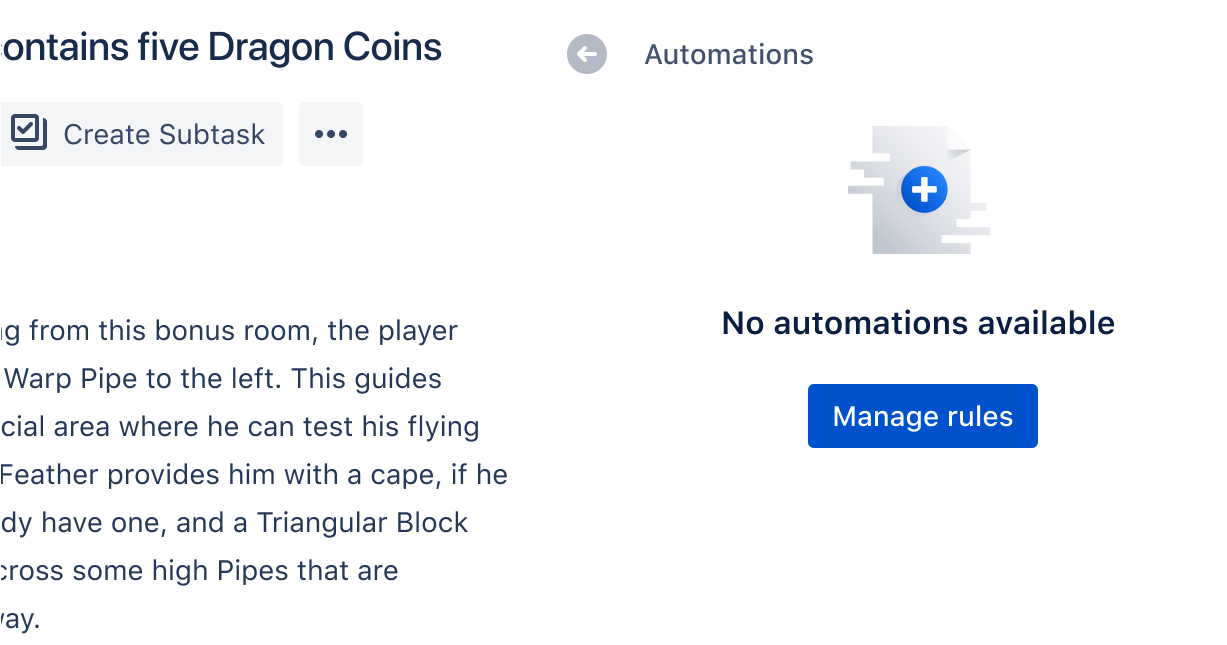
Don’t
Resize illustrations to fit.
Content guidelines
Consider all scenarios that could cause the empty state to occur, and use that to inform the tone of your writing:
- The first time someone views an empty board (blank slate) might call for an inspirational, motivating, or educational tone.
- An empty state that appears when a user finishes all their tasks could have a more celebratory tone and illustration.
- A general no-result state (such as no search results) might be more neutral, but still motivate by showing next steps.
When crafting your message, see the Atlassian voice and tone principles for empty states.
- Always use sentence case for titles and headings.
- Try to limit the number of words in the message as much as possible. Remember that most people scan text instead of reading everything.
- Keep call to action (CTA) buttons short, and use imperative verbs such as Try, Remove, or Create to describe what action people can take next.
- Be mindful of how many CTAs might appear on one page.
- Empty states are often an opportunity to teach or give more information, especially if it’s the first time a person sees a screen. Avoid sending people to another location for more reading where possible, but if it can't be avoided, use a tertiary action link.
- See all writing guidelines on empty state CTAs.
Behavior
This component has two width options for containers of different sizes:
- The default width,
wide, is 464px. This is based on six columns in the cozy grid system. - The
narrowsize shrinks the text width to 304px. That's four columns in the cozy grid system. Use this for empty states in containers smaller than the default width.
The only required part of the empty state component is the heading, which uses h600 heading type. If this doesn't fit your case, you may have to consider another component or custom design. See the grid and typography foundations for more guidelines.
- For more empty state guidelines and examples, see empty state messaging.
- For very small spaces or situations where this component doesn’t fit, you may consider designing an empty state from scratch. See our grid and typography foundations for guidelines.
- Some error messages, such as not found errors, may also fit this component layout. If you use this component for an error message, follow the error message guidelines and use an appropriate illustration.