Benefits modal
A benefits modal explains the benefits of a significant new feature or experience change.Deprecated
This package is deprecated. Use @atlaskit/modal-dialog.
Usage
A benefits modal focuses a person's attention on a large or impactful update.
The modal can be followed by a spotlight tour to highlight changes and benefits at the right time and place.
Parts
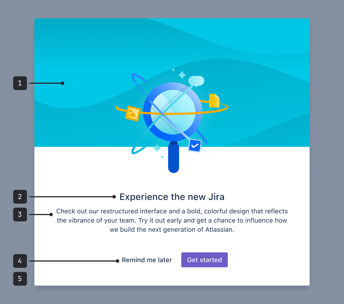
The benefits modal component is made up of the following:
- Illustration: Should relate to the content or benefit literally or metaphorically.
- Title: A primary heading (h600). The title provides a concise overview of the contents of the journey.
- Message: The contents of the dialog. See content guidelines below.
- Actions: Contains a maximum of two centered buttons: a primary action and a dismiss button.
- Blanket: Covers the content underneath the modal, so that the focus is on the modal, and people can't accidentally interact with the background content.
Accessibility
Use custom modal dialogs where possible
We recommend using a custom modal dialog instead
of this component for all new experiences. This is because modal dialog has
shouldCloseOnEscapeKeyPress and shouldCloseOnOverlayClick behavior which significantly improves
the accessibility.
Write clear onboarding messages
Avoid jargon and use simple language. Write button text that clearly explains what will happen next in the flow.
Use images sparingly
If the illustration provides useful information, include alternative text. If it's only for
decoration, use an empty alt attribute (alt="") to save time for people using assistive
technology.
Using an image as a metaphor may not translate to all cultures and languages. When choosing imagery, consider internationalization.
Best practices
- Make sure onboarding messages complement rather than compete with each other. Try using the entire end-to-end journey that your new experience is a part of. This can help you discover where you may be repetitive or where steps may not be needed. Less is more.
- Try not to overwhelm people with too much information at once. Focus on the top two to three benefits and then gradually introduce changes over time.
- Offer a dismiss option at every point in the journey.
- Ask yourself if a modal is the right medium for this message - modals are intrusive and should only be used for large-scale changes.
- Illustrations should be a spot hero image that relates to the UI copy.
Content guidelines
Titles
- Use the title to communicate the main benefit in an active and personalized way, for example: "Manage your work", instead of "Work items."
- Personalize where you can, for example: "A better experience for your team", instead of "Better team experiences."
- Limit titles to three words. Four words are okay if you are using a short article like “an”, “a”, or “the”.
Message copy
- Keep the message length to less than three lines at the app's minimum supported size.
- Don't just point out what the feature or functionality is. Tell people why it's important at this point in time.
- Be considerate of people's time and patience. Be short and to the point, and avoid using company jargon.
- For most use cases, use the modal dialog component.
- For a smaller onboarding message, see onboarding spotlight.
- For more information about how to use buttons, see the button usage guidelines.