Flag
A flag is used for confirmations, alerts, and acknowledgments that require minimal user interaction, often displayed using a flag group.Usage
Flags appear at the bottom left of the screen and overlay any content.
There are two types of flags: default and bold.
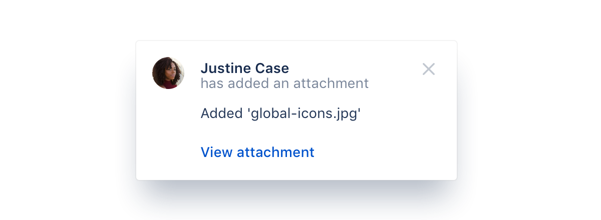
Default flags are for general, event-driven messages that are dismissible. For example, as notifications for recent activity. This lets people jump into a conversation or activity feed to get a quick update. In these cases, use an avatar instead of the icon.
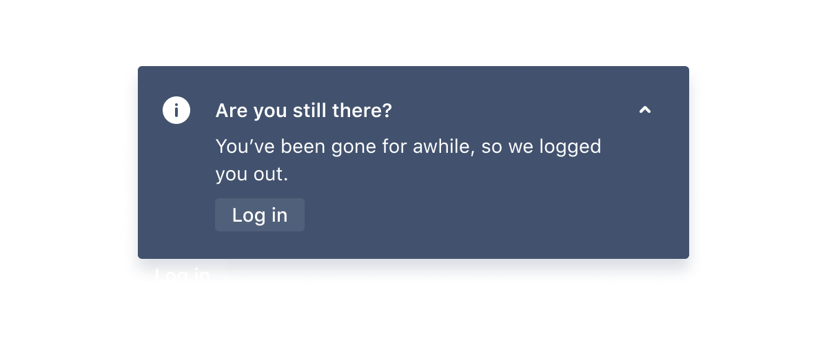
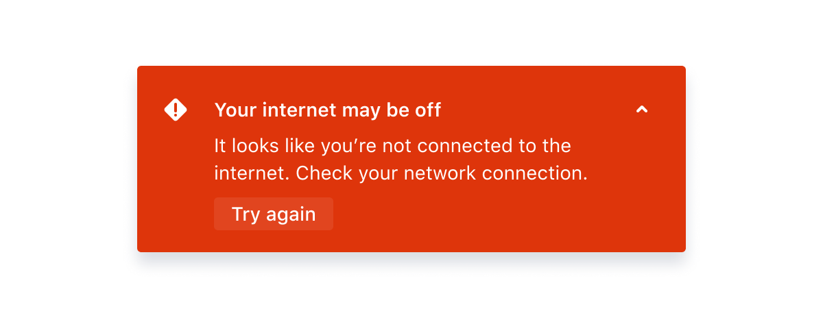
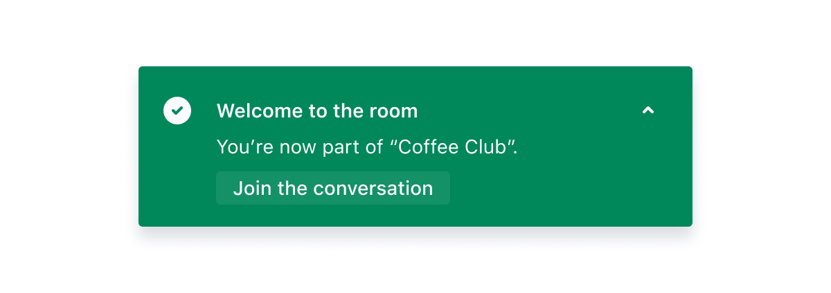
Bold flags are not dismissible and use color to reinforce the severity or importance of a message. They are reserved for messages about success, loading, warnings, and errors. They can't be dismissed until the issue is resolved or the message has expired (in the case of a success message). A collapsed and expanded state exists so additional information can be shared.
Parts
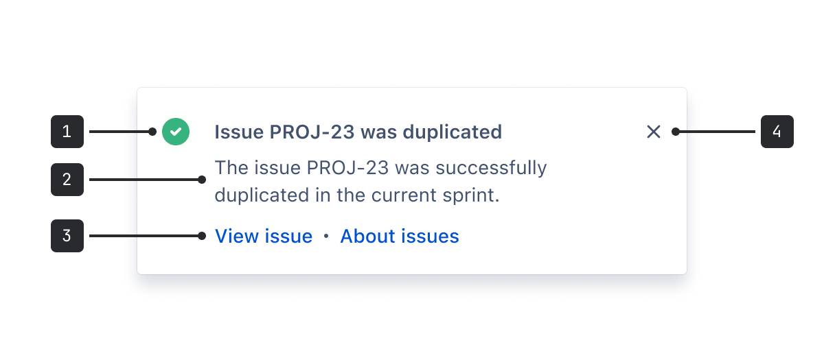
- Icon (or avatar) and title: The title should always summarize the reason for the flag. Titles longer than the width of the flag will wrap. Include an appropriate icon color or user avatar.
- Message (optional): Provide additional information that will help users understand the flag, such as what went wrong or why this is important. Text longer than 5 lines will scroll. Try to make text as short as possible.
- Actions (optional): A maximum of two links that enable users to act on the flag's content.
- Dismiss: Used to close the flag. This is for default flags only.
Accessibility
- Keep flag titles and messages concise so people who increase zoom or those reading in languages with longer words can easily read the flag.
- Use an h2 heading level for the title. This will help people using assistive technologies navigate to the flag.
- Never use dismissible and non-dismissible flags in a stack. Flags that automatically dismiss will no longer be visible to people.
- Don't rely on color alone to convey the severity of the flag. Ensure that the accompanying text clearly explains when there is a warning or error.
- For warning and error messages, always try to avoid dead ends and provide people with information on how to proceed to resolve the issue.
- Keep in mind that some people require more time to read and make decisions about your message. Never use auto dismiss flags for any critical warning or error messages, or anything else where it's important that people don't miss the message.
- Ensure that links accurately describe the destination. For example, say "About user permissions" rather than "Learn more".
Best practices
- Use the color system to indicate the theme and severity of the flags.
- When there are multiple flags, they will stack on top of one another with the most recent flag on top. When a user dismisses a flag, any older flags below will come to the top. Careful consideration should be taken to take into account the ordering and priority of flags in the stack.
- When a modal is active, flags should always be visible above the modal.
- If a long message is needed, consider linking to an additional page for more information or using an alternative component such as banner, inline mesage, or modal.
Content guidelines
Information
Information messages alert people to additional information without requiring an action. Let them know about something that might help or impact them. Then, let them get back to work. Information messages are also used for loading states.
Warning
Warning messages appear before we request people to take action. This is usually in anticipation of a significant change. Have empathy for the user. Inform, but don't alarm. If the warning comes before an action, clearly communicate what will happen if they proceed, and provide an alternative where possible.
Make sure you're not talking about something that has already occurred (this should be an error message instead).
Error
Explain the problem and provide people with a next step or an alternative. Keep the message simple and direct, and avoid confusing people with technical details.
Avoid blame and accept if something is our fault - "we're having trouble connecting" rather than "you're having connection issues." Be clear and conversational by thinking about how you might explain a technical error to your non-technical friends.
Success
Success messages let people know they have completed an action. For these messages, it's best to confirm the outcome and let people continue. If they have just created something, give them an option to view it.
Messages that appear more frequently should be more concise. Messages that appear after a bigger or more infrequent action can be more playful.
Data Center apps
For all new features, we recommend using Atlassian Design System and other Atlaskit components, (opens new window). For existing code, you can continue to use Atlassian User Interface (AUI), (opens new window).
- For critical messaging about loss of data or functionality use banners.
- To alert users that important information is available or an action is required use an inline message.
- For critical messaging that requires immediate action, use a modal dialog.