Design guidelines
Design consistent drag and drop experiences.These guidelines provide an opinionated way to implement drag and drop experiences with Pragmatic drag and drop for Atlassian interfaces. These guidelines work within web platform design constraints for drag and drop, and aim to optimise clarity and performance. Non-Atlassian consumers are welcome to use these guidelines, or create their own visual language for drag and drop. The core package does not have any baked in design opinions, but some of the optional packages embody these design choices.
These design decisions are available in our Pragmatic drag drop Figma UI Kit (Atlassians only), (opens new window) (Atlassian only).
We plan on soon making this Figma public soon.
Cards, lists, and other UI can often be dragged and reordered. Design clear and consistent drag and drop experiences in Atlassian apps following these principles:
Before the drag starts
Make it clear what can be dragged
When drag and drop is a primary action for an entity, you should:
- use an always visible drag handle icon (an exception for this is when drag and drop is "implied", for example cards on a board)
- use
:hover { cursor: grab } - Change the background color on item hover
When drag and drop is a secondary action for an entity, you should:
- use a drag handle icon that is visible on
:hoveror:focus-within - use
:hover { cursor: grab }after an800msdelay (see below for how to do this with CSS) - Change the background color on item hover
An example of drag and drop as a secondary section is a menu items in a side navigation. The primary action for a menu item would be navigation, and a secondary action would be moving the menu item through drag and drop.
Please also see our accessibility guidelines which talks about our guidance for placing an action menu trigger on draggable entities to enable the same outcomes as drag and drop interactions for assistive technology users.
Which parts of an entity should be draggable?
As a starting position, if an entity is draggable (eg a card), then make the whole entity draggable. If the entity has other interactive parts (eg buttons, dropdowns), then just make the drag handle icon the draggable part of the entity.
Something to keep in mind is that making an entire entity draggable will prevent text selection
inside that entity (platform limitation)
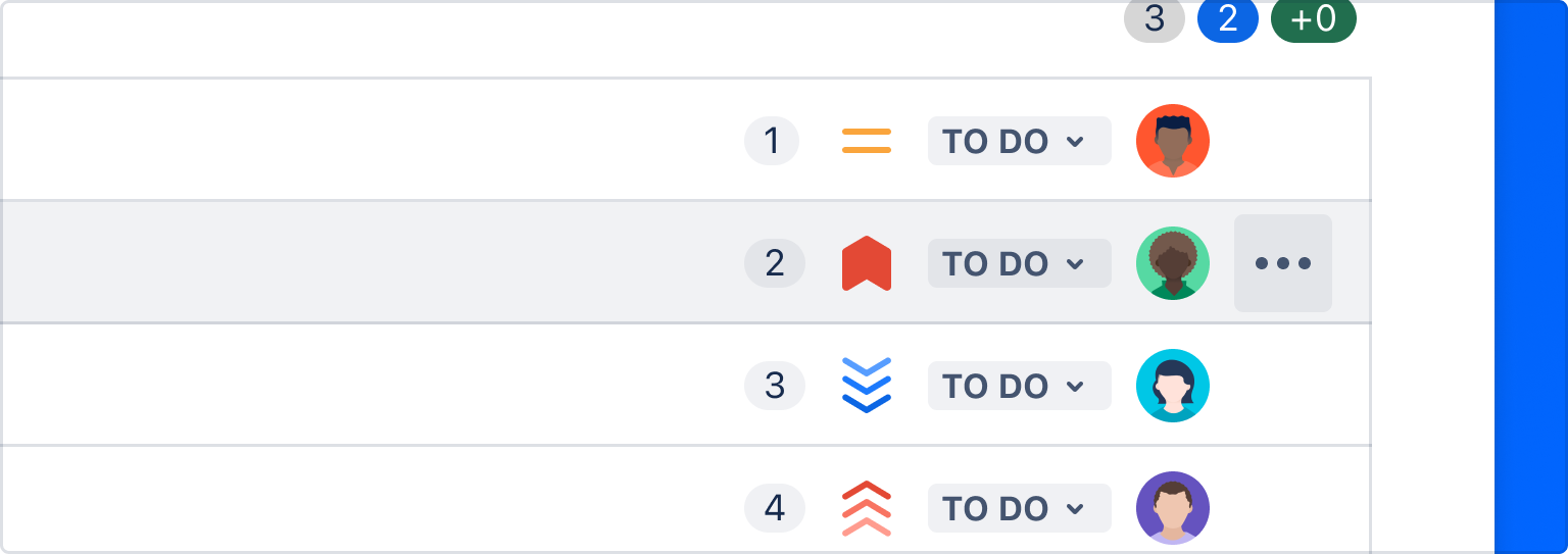
Drag handle icons
Our drag handle icon helps people understand what is draggable. Please use the "small"
DragHandleVerticalIcon from @atlaskit/icon.
import DragHandleVerticalIcon from '@atlaskit/icon/core/drag-handle-vertical';
function DragHandle() {
return <DragHandleVerticalIcon size="small" />;
}The color of the icon should match the text color of text in the draggable entity. This is usually
handled for you by default with @atlaskit/icon as it uses currentColor by
default.
All available variants, which are explained in detail below:
"/%3E%3Cpath d="M126.1 37.9004C154.9 38.1004 172.5 57.6004 175.2 60.7004C193.5 81.7004 191.6 106.8 191.2 112C190.1 125 188 135.3 178 156.2C163.7 189.8 137.8 196.5 126.1 197C114.4 197.5 84.1005 181.2 74.2005 156.2C64.2005 135.3 62.1005 125 61.1005 112C60.7005 106.8 58.7005 81.7004 77.0005 60.7004C79.7005 57.6004 97.3005 38.1004 126.1 37.9004Z" fill="%23ECC19C"/%3E%3Cpath d="M142.4 104.701C144.331 103.63 146.426 102.887 148.6 102.501C150.772 102.068 152.992 101.934 155.2 102.101C157.397 102.209 159.56 102.682 161.6 103.501C163.641 104.252 165.561 105.296 167.3 106.601C167.471 106.721 167.587 106.904 167.624 107.11C167.662 107.315 167.617 107.527 167.5 107.701C167.383 107.845 167.219 107.944 167.036 107.981C166.854 108.017 166.664 107.989 166.5 107.901C162.969 106.097 159.066 105.138 155.1 105.101C153.124 105.114 151.151 105.281 149.2 105.601L143.5 107.101C143.337 107.164 143.162 107.193 142.986 107.187C142.811 107.18 142.638 107.138 142.479 107.064C142.321 106.989 142.179 106.883 142.062 106.752C141.945 106.62 141.856 106.467 141.8 106.301C141.69 106.006 141.69 105.682 141.801 105.388C141.911 105.094 142.124 104.85 142.4 104.701Z" fill="%23344563"/%3E%3Cpath d="M87.3002 119C90.4798 116.773 94.2235 115.491 98.1002 115.3C102.027 115.197 105.894 116.277 109.2 118.4C109.357 118.55 109.461 118.748 109.495 118.962C109.53 119.177 109.494 119.397 109.392 119.589C109.29 119.782 109.129 119.935 108.932 120.027C108.735 120.12 108.513 120.145 108.3 120.1H108.2C106.714 119.188 105.094 118.513 103.4 118.1C99.9623 117.199 96.3547 117.165 92.9002 118C91.1854 118.492 89.5392 119.197 88.0002 120.1C87.8378 120.152 87.6629 120.151 87.5009 120.097C87.339 120.043 87.1986 119.939 87.1002 119.8C87.0464 119.739 87.0082 119.666 86.9889 119.587C86.9696 119.508 86.9698 119.426 86.9895 119.347C87.0092 119.268 87.0478 119.195 87.1019 119.135C87.1561 119.074 87.2241 119.028 87.3002 119Z" fill="%23172B4D"/%3E%3Cpath d="M162.6 120.1C161.026 119.198 159.347 118.492 157.6 118C154.179 117.165 150.604 117.2 147.2 118.1C145.48 118.531 143.83 119.205 142.3 120.1C142.07 120.189 141.817 120.198 141.581 120.125C141.345 120.053 141.141 119.903 141 119.7C140.901 119.481 140.876 119.234 140.931 118.999C140.985 118.765 141.115 118.554 141.3 118.4C144.611 116.289 148.475 115.21 152.4 115.3C156.305 115.505 160.078 116.785 163.3 119C163.383 119.114 163.43 119.25 163.435 119.391C163.439 119.531 163.401 119.67 163.326 119.789C163.25 119.908 163.14 120.001 163.011 120.057C162.881 120.112 162.738 120.127 162.6 120.1Z" fill="%23172B4D"/%3E%3Cpath d="M151.3 122.9C153.178 122.9 154.7 121.377 154.7 119.5C154.7 117.622 153.178 116.1 151.3 116.1C149.423 116.1 147.9 117.622 147.9 119.5C147.9 121.377 149.423 122.9 151.3 122.9Z" fill="%23172B4D"/%3E%3Cpath d="M98.8004 122.9C100.678 122.9 102.2 121.377 102.2 119.5C102.2 117.622 100.678 116.1 98.8004 116.1C96.9226 116.1 95.4004 117.622 95.4004 119.5C95.4004 121.377 96.9226 122.9 98.8004 122.9Z" fill="%23172B4D"/%3E%3Cpath d="M107.701 107.101C105.864 106.495 103.994 105.994 102.101 105.601C100.15 105.285 98.1773 105.118 96.2008 105.101C92.2353 105.138 88.3327 106.097 84.8008 107.901H84.7008C84.6168 107.952 84.5229 107.985 84.4251 107.998C84.3274 108.011 84.2281 108.003 84.1337 107.974C84.0393 107.946 83.9519 107.898 83.8774 107.834C83.8028 107.769 83.7426 107.69 83.7008 107.601C83.6587 107.429 83.6548 107.251 83.6893 107.078C83.7239 106.905 83.7961 106.742 83.9008 106.601C85.6656 105.336 87.5802 104.295 89.6008 103.501C91.6794 102.692 93.8736 102.219 96.1008 102.101C98.3088 101.934 100.529 102.068 102.701 102.501C104.871 102.902 106.963 103.644 108.901 104.701C109.054 104.784 109.189 104.897 109.297 105.033C109.406 105.17 109.486 105.327 109.532 105.495C109.579 105.663 109.591 105.838 109.569 106.011C109.546 106.184 109.489 106.35 109.401 106.501C109.336 106.646 109.243 106.777 109.127 106.886C109.011 106.994 108.875 107.079 108.726 107.135C108.577 107.191 108.419 107.217 108.26 107.211C108.101 107.205 107.945 107.167 107.801 107.101H107.701Z" fill="%23344563"/%3E%3Cpath d="M164.6 51L163.4 59C168.284 66.9442 172.371 75.3518 175.6 84.1C179.5 94.9 181.5 100.2 182.4 106.9C183.7 115.4 183.1 121.3 186.9 123.5C187.718 124.005 188.643 124.313 189.6 124.4C190.4 120.2 190.8 116.3 191.2 112C191.6 107.7 193.5 81.7 175.2 60.7C172.03 57.0911 168.476 53.8386 164.6 51Z" fill="%23172B4D"/%3E%3Cpath d="M77.0005 60.7C58.7005 81.7 60.7005 106.8 61.1005 112C61.381 116.162 61.9153 120.303 62.7005 124.4C63.6236 124.299 64.5122 123.991 65.3005 123.5C69.1005 121.3 68.5005 115.4 69.8005 106.9C70.8005 100.2 72.7005 94.9 76.6005 84.1C79.8301 75.3342 83.9518 66.9234 88.9005 59L87.6005 51C83.7495 53.8682 80.1982 57.118 77.0005 60.7Z" fill="%23172B4D"/%3E%3Cpath d="M142.8 163.4C137.3 162.5 133.7 161.5 129.6 162.1H128.7C126.427 162.598 124.073 162.598 121.8 162.1H121C117.1 161.5 113.6 162.4 108 163.2L102.7 164C103.1 164.3 111.1 172.1 125.3 172.1C133.565 172.219 141.593 169.342 147.9 164L142.8 163.4Z" fill="%23E0ADA6"/%3E%3Cpath d="M116.2 139L119.8 139.9L121.6 140.4L123.2 140.7C124.315 140.754 125.43 140.618 126.5 140.3C127.697 140.039 128.869 139.671 130 139.2C130.199 139.136 130.415 139.153 130.602 139.246C130.789 139.34 130.932 139.503 131 139.7C131.052 139.862 131.052 140.037 130.998 140.199C130.944 140.361 130.839 140.502 130.7 140.6C129.604 141.365 128.387 141.94 127.1 142.3C125.834 142.833 124.474 143.105 123.1 143.1L121 142.7L119.1 142.1L115.6 140.5C115.507 140.448 115.426 140.378 115.361 140.295C115.296 140.211 115.248 140.115 115.22 140.013C115.192 139.91 115.184 139.804 115.198 139.698C115.212 139.593 115.247 139.492 115.3 139.4C115.4 139.1 115.8 139 116.1 139H116.2Z" fill="%23CEA28B"/%3E%3Cpath d="M99.8994 162.799C108.436 165.651 117.401 167.005 126.399 166.799C134.392 166.598 142.311 165.217 149.899 162.699" fill="%23E0ADA6"/%3E%3Cpath d="M99.9998 162.3C104.065 163.463 108.21 164.332 112.4 164.9C116.537 165.518 120.718 165.786 124.9 165.7C129.083 165.702 133.26 165.402 137.4 164.8C139.484 164.539 141.553 164.172 143.6 163.7C145.66 163.273 147.696 162.739 149.7 162.1C149.845 162.068 149.998 162.091 150.127 162.165C150.256 162.239 150.354 162.358 150.4 162.5C150.439 162.633 150.43 162.776 150.375 162.904C150.32 163.031 150.223 163.136 150.1 163.2C146.088 164.761 141.936 165.933 137.7 166.7C133.471 167.418 129.189 167.786 124.9 167.8C122.8 167.8 120.6 167.7 118.5 167.5C116.35 167.388 114.211 167.12 112.1 166.7C107.854 166.027 103.695 164.887 99.6998 163.3C99.6306 163.279 99.5669 163.242 99.5131 163.194C99.4593 163.146 99.4166 163.086 99.3881 163.019C99.3596 162.953 99.3458 162.881 99.3479 162.808C99.3499 162.736 99.3676 162.665 99.3998 162.6C99.4998 162.4 99.7998 162.2 99.9998 162.3Z" fill="%23CB8C84"/%3E%3Cpath d="M178.2 66.2002C180 54.0002 159.9 40.0002 143.3 35.7002C131.7 32.7002 122 34.5002 116.4 35.5002C108.3 37.1002 88.6998 40.9002 78.7998 55.7002C74.9998 61.3002 72.9998 68.0002 66.0998 70.2002C61.7998 71.6002 57.4998 70.1002 56.0998 72.5002C54.6998 74.9002 56.8998 77.9002 57.7998 79.2002C60.3159 82.9356 64.0136 85.7176 68.2998 87.1002C72.8998 88.9002 79.5998 90.3002 89.3998 89.0002C103.6 87.1002 106.2 81.8003 117.7 81.9002C124.4 82.0002 126.3 83.8002 132.2 85.0002C150.7 88.5002 176.3 78.9002 178.2 66.2002Z" fill="%23172B4D"/%3E%3Cpath d="M98.7002 139.8H91.3002C88.6238 139.543 86.0835 138.499 84.0002 136.8C81.8618 135.188 80.1743 133.053 79.1002 130.6C78.009 128.208 77.3975 125.626 77.3002 123V117.5C77.272 116.761 77.3392 116.021 77.5002 115.3C77.7606 113.733 78.5772 112.313 79.8002 111.3C80.8899 110.319 82.1898 109.6 83.6002 109.2C86.0935 108.596 88.638 108.228 91.2002 108.1H98.5002C101 108.1 103.4 108.2 105.9 108.4L113.2 109.2H114.1L115.1 109.5C115.795 109.643 116.468 109.879 117.1 110.2C117.786 110.545 118.397 111.02 118.9 111.6C119.414 112.191 119.82 112.868 120.1 113.6C120.392 114.912 120.493 116.259 120.4 117.6C120.396 118.872 120.296 120.142 120.1 121.4C119.263 126.459 116.723 131.081 112.9 134.5C108.94 137.885 103.91 139.762 98.7002 139.8ZM98.7002 137.4C100.978 137.392 103.24 137.02 105.4 136.3C107.546 135.466 109.54 134.283 111.3 132.8C113.447 130.926 115.152 128.6 116.293 125.989C117.434 123.379 117.983 120.548 117.9 117.7C117.97 116.624 117.869 115.544 117.6 114.5C117.457 114.082 117.22 113.703 116.908 113.392C116.596 113.08 116.217 112.843 115.8 112.7L114.4 112.2L113.6 112H112.7L105.6 111.5H98.5002L91.3002 111.9C89.0692 112.046 86.8583 112.415 84.7002 113C83.7638 113.323 82.8858 113.796 82.1002 114.4C81.4985 114.94 81.0501 115.63 80.8002 116.4L80.5002 117.9C80.5138 118.468 80.4804 119.037 80.4002 119.6V123C80.4291 125.205 80.9254 127.379 81.8562 129.379C82.787 131.378 84.1312 133.158 85.8002 134.6C87.4819 135.944 89.4777 136.839 91.6002 137.2H98.7002V137.4Z" fill="%23403294"/%3E%3Cpath d="M153 137.401H160.1C162.222 137.04 164.218 136.145 165.9 134.801C167.569 133.359 168.913 131.58 169.844 129.58C170.774 127.581 171.271 125.407 171.3 123.201V119.601C171.3 119.001 171.2 118.401 171.2 117.901C171.148 117.393 171.047 116.89 170.9 116.401C170.65 115.632 170.201 114.942 169.6 114.401C168.85 113.798 168.005 113.325 167.1 113.001C164.908 112.416 162.664 112.048 160.4 111.901L153.2 111.501H146.1L139 112.001H138.1L137.4 112.201C136.881 112.307 136.378 112.475 135.9 112.701C135.497 112.851 135.135 113.091 134.84 113.403C134.545 113.715 134.326 114.091 134.2 114.501C133.845 115.528 133.709 116.618 133.8 117.701C133.763 118.838 133.83 119.976 134 121.101C134.639 125.673 136.956 129.843 140.5 132.801C142.209 134.304 144.173 135.489 146.3 136.301C148.462 137.014 150.723 137.385 153 137.401ZM153 139.801C147.863 139.788 142.9 137.944 139 134.601C135.12 131.213 132.54 126.582 131.7 121.501C131.504 120.244 131.404 118.974 131.4 117.701C131.293 116.355 131.428 115 131.8 113.701C132.004 112.957 132.381 112.272 132.9 111.701C133.423 111.143 134.03 110.671 134.7 110.301C135.332 109.98 136.005 109.745 136.7 109.601L137.7 109.301H138.6L145.9 108.501C148.4 108.301 150.8 108.201 153.3 108.201H160.6C163.162 108.329 165.706 108.698 168.2 109.301C169.619 109.681 170.923 110.402 172 111.401C173.221 112.431 174.066 113.838 174.4 115.401C174.531 116.127 174.564 116.867 174.5 117.601V119.401C174.4 120.701 174.5 121.801 174.4 123.101C174.302 125.728 173.691 128.31 172.6 130.701C171.531 133.13 169.883 135.259 167.8 136.901C165.671 138.588 163.102 139.63 160.4 139.901H153V139.801Z" fill="%23403294"/%3E%3Cpath d="M131.4 120.501C131.038 120.456 130.693 120.319 130.4 120.101C129.059 119.334 127.545 118.921 126 118.901C124.485 118.905 122.999 119.32 121.7 120.101C121.315 120.323 120.861 120.394 120.425 120.301C119.99 120.208 119.605 119.957 119.344 119.597C119.083 119.236 118.965 118.792 119.012 118.349C119.06 117.907 119.269 117.498 119.6 117.201C121.471 115.878 123.71 115.178 126 115.201C128.324 115.164 130.599 115.864 132.5 117.201C132.883 117.481 133.139 117.9 133.214 118.368C133.289 118.836 133.176 119.315 132.9 119.701C132.73 119.941 132.505 120.139 132.245 120.278C131.985 120.417 131.695 120.493 131.4 120.501Z" fill="%23403294"/%3E%3Cpath d="M173.8 114.201H188.4C188.983 114.201 189.543 114.433 189.955 114.846C190.368 115.258 190.6 115.818 190.6 116.401C190.6 116.985 190.368 117.544 189.955 117.957C189.543 118.369 188.983 118.601 188.4 118.601H173.8V114.201Z" fill="%23403294"/%3E%3Cpath d="M79.3996 117.8H63.7996C63.2161 117.8 62.6566 117.569 62.244 117.156C61.8314 116.743 61.5996 116.184 61.5996 115.6C61.5996 115.017 61.8314 114.457 62.244 114.045C62.6566 113.632 63.2161 113.4 63.7996 113.4H79.3996V117.8Z" fill="%23403294"/%3E%3Cpath d="M182.801 216L179.301 204L160.901 212.8L142.101 221.8V231.9L142.601 255.2L148.101 254.4L184.801 222.9L182.801 216Z" fill="%235243AA"/%3E%3Cpath d="M73.3002 204L69.8002 216.1L67.7002 222.9L107.9 254.4L108.8 254.6V231.9H108.9V223.1L90.0002 212.9L73.3002 204Z" fill="%235243AA"/%3E%3Cdefs%3E%3ClinearGradient id="paint0_linear" x1="128.42" y1="235.371" x2="128.42" y2="138.291" gradientUnits="userSpaceOnUse"%3E%3Cstop stop-color="%23ECC19C"/%3E%3Cstop offset="1" stop-color="%23CEA28B"/%3E%3C/linearGradient%3E%3C/defs%3E%3C/svg%3E)
Always visible drag handle
When dragging is a primary action of an entity, there should be a visible drag handle on the left hand side of the entity at all times.
You should also make your drag handle always visible if your drag handle is also your action button.
When the drag handle is the only part of an entity that is draggable, it's touch target size should
be at least 24px x 24px in size ("spacious" icon spacing).
import React, { Fragment, useEffect, useRef, useState } from 'react';

import { createPortal } from 'react-dom';
import invariant from 'tiny-invariant';

import DragHandleVerticalIcon from '@atlaskit/icon/core/drag-handle-vertical';
import { draggable } from '@atlaskit/pragmatic-drag-and-drop/element/adapter';
import { pointerOutsideOfPreview } from '@atlaskit/pragmatic-drag-and-drop/element/pointer-outside-of-preview';
import { setCustomNativeDragPreview } from '@atlaskit/pragmatic-drag-and-drop/element/set-custom-native-drag-preview';
// eslint-disable-next-line @atlaskit/design-system/no-emotion-primitives -- to be migrated to @atlaskit/primitives/compiled – go/akcss
import { Box, Grid, Stack, xcss } from '@atlaskit/primitives';
import { token } from '@atlaskit/tokens';

import { ActionMenu } from './shared/action-menu';
import { DragPreview } from './shared/drag-preview';
import { type DraggableState } from './shared/types';

const listItemStyles = xcss({
	borderWidth: 'border.width',
	borderStyle: 'solid',
	borderColor: 'color.border',
	padding: 'space.100',
	paddingInlineStart: 'space.0',
	borderRadius: 'radius.small',
	backgroundColor: 'elevation.surface',
});

const draggableStyles = xcss({
	':hover': {
		cursor: 'grab',
		backgroundColor: 'elevation.surface.hovered',
	},
});

const draggingStyles = xcss({
	opacity: 0.4,
});

const roundedIconStyles = xcss({ borderRadius: 'radius.small' });

export function OnlyDraggableFromDragHandle(): React.JSX.Element {
	const draggableRef = useRef<HTMLDivElement | null>(null);
	const [state, setState] = useState<DraggableState>({ type: 'idle' });

	useEffect(() => {
		const element = draggableRef.current;
		invariant(element);
		return draggable({
			element,
			onGenerateDragPreview({ nativeSetDragImage }) {
				setCustomNativeDragPreview({
					getOffset: pointerOutsideOfPreview({
						x: token('space.200'),
						y: token('space.100'),
					}),
					nativeSetDragImage,
					render({ container }) {
						setState({ type: 'preview', container });
						return () => setState({ type: 'dragging' });
					},
				});
			},
			onDrop() {
				setState({ type: 'idle' });
			},
		});
	}, []);

	return (
		<Fragment>
			<Grid
				alignItems="center"
				templateColumns="auto 1fr auto"
				xcss={[listItemStyles, state.type === 'dragging' ? draggingStyles : undefined]}
			>
				<Stack xcss={[draggableStyles, roundedIconStyles]} ref={draggableRef}>
					<DragHandleVerticalIcon
						spacing="spacious"
						label="Drag list item"
						color={token('color.icon')}
						size="small"
					/>
				</Stack>
				<Box>Drag handle always visible (only draggable from drag handle)</Box>
				<ActionMenu />
			</Grid>
			{state.type === 'preview' ? createPortal(<DragPreview />, state.container) : null}
		</Fragment>
	);
}Visible on hover drag handle
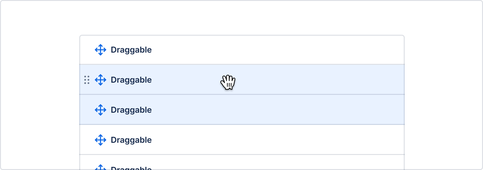
If dragging is a secondary action for an entity, then you can use a delayed drag handle (it is
only visible on :hover and :focus-within).
- This approach can be helpful when you don't want add clutter to an interface when drag and drop is a secondary action.
- Keep in mind that using this approach will make it harder for users to discover that an entity is draggable.
- The drag handle icon should use
"compact"spacing (16px x 16px) so you don't leave a big gap in the interface for where the drag handle icon will appear. - For best performance, use CSS to hide and show the drag handle on
:focus-withinor:hover.
import DragHandleVerticalIcon from '@atlaskit/icon/core/drag-handle-vertical';

function DragHandle() {
    return <DragHandleVerticalIcon spacing="compact" size="small" />;
}A visible on hover drag handle can appear outside of the bounds of an element if you are pressed for room. In this scenario it's important that you make sure that a user can start the drag from the drag handle.
What you need to do:
- Make sure your drag handle is a part of the hitbox of the containing element, (opens new window)
- Make sure your drag handle allows pointer events (
pointer-events: auto)
Implied draggables
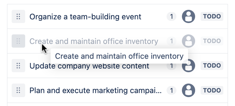
Some entities are considered to be "implied" to be draggable (eg cards and columns) and these entities do not require a drag handle icon - although you can still encouraged to add them. Implied draggable entities should use background color and cursor changes to make it clear which part of the entity is draggable, and there should be a strong preference to make as much of the entity draggable as possible.
Sometimes, your drag handle icon should be a button for triggering actions too (see our accessibility guidelines). In those cases, please use our drag handle icon button.
Cursor changes
Use :hover { cursor:grab; } as a helpful signal that an entity is draggable. Only the draggable
part of an entity should have cursor:grab. So when a draggable is only draggable from a drag
handle, only the drag handle should have cursor:grab.
For entities where dragging is a secondary action (and you are therefore using a "visible on focus
drag handle"), you should also delay the changing of the cursor to grab by 800ms
cursor:drag delayed by 800ms@keyframes change-cursor {
to {
cursor: grab;
}
}
.item:hover {
animation-name: cursor-change;
/* instant animation */
animation-duration: 0s;
/* delay cursor change */
animation-delay: 800ms;
/* keep the end state when the animation ends */
animation-fill-mode: forwards;
}Background color changes
The draggable part of an entity should have a background color change applied when hovering over it.
Please use the appropriate hover token for the entity.
Usually for a draggable entity you will be using:
elevation.surfaceas the background color.elevation.surface.hoveredon as thehoverbackground color on the draggable part of the entity.
For some situations it might be appropriate to use a different color pairing. Please try to use a
".background" color token for the draggable entity, and a matching ".hovered" token for the
hover.
Start of a drag
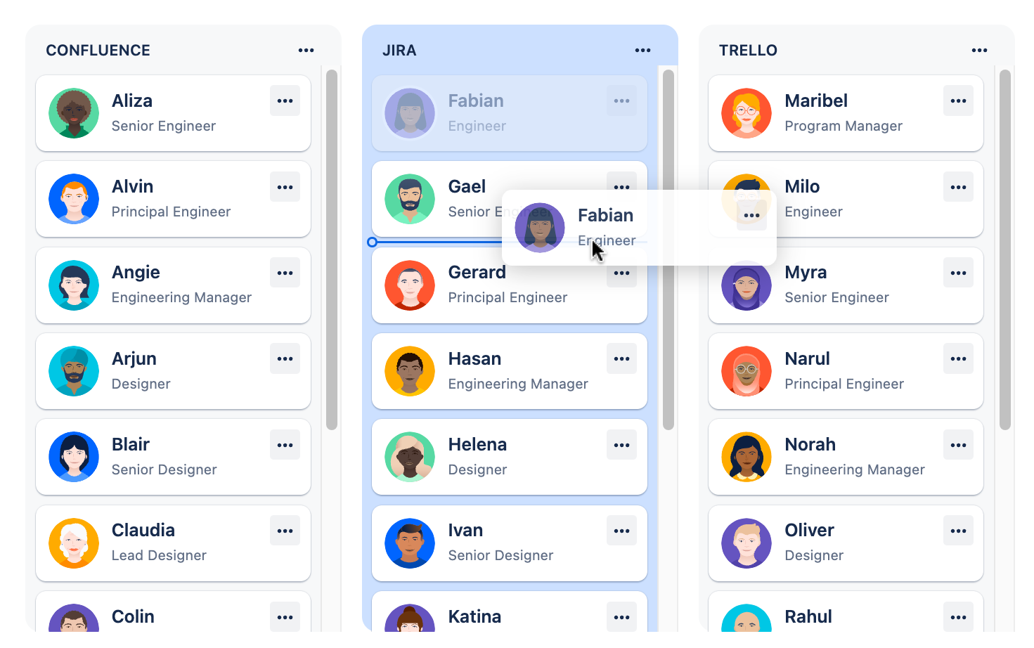
Make it clear what is being dragged
It is important that you give clear feedback to the user about what is being dragged.
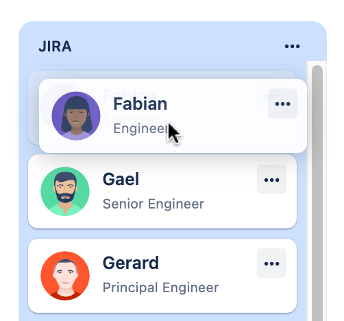
Drag previews
A drag preview is a representation of the item being dragged. Generally a drag preview is a picture of the item being dragged around the page, and not the draggable item itself.
When an item is small and simple, the drag preview can be an exact copy of the item being dragged. If an item is larger or more complex, you should simplify the drag preview.
Simplification suggestions:
- Use a maximum of three pieces of information in a preview
- Use a maximum preview size of
280px x 280pxto prevent super low drag preview opacity on Windows
Standard
Drag previews should generally be pushed away from the users pointer by space.100 vertically, and
space.200 horizontally. Do not rotate the drag preview.
{
  x: token('space.200', '16px'),
  y: token('space.100', '8px'),
}
Cards
Cards are to be dragged from the point they're grabbed from (no offset).
Do not rotate card drag previews. Exception: Trello, which has a 4deg rotation.
Cursor
Due to
web platform constraints, we
have limited control of the cursor during a drag operation. The cursor will generally be
cursor:default during a drag operation.
The draggable item
While an item is being dragged, the original item should stay in place and dim to 40% opacity
(opacity: 0.4) while the drag preview is being moved around.
Multiple-item drag previews
For multi-item drag previews, use a stacked appearance with a badge indicating the number of items being dragged.
- Four or more small items such as list items should appear as a stacked preview under the first item. Less than four small items can appear separately where space allows (all items showing in the preview).
- Any more than one large item (card) should show as a stack with a badge indicating the number underneath.
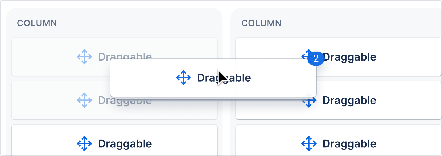
Implement with native drag previews, or use the Figma kit (Atlassian only), (opens new window) in designs.
While dragging
Make it clear what the result will be
It should be clear to a user what the final result of the drag operation will be during the drag operation.
There are two signals you can use to indicate drop placement:
- Drop indicator (a line)
- Background color (
color.background.selected.hovered)
Drop indicator
The drop indicator line is used to communicate relative placement (for example, before or after an item in a list)
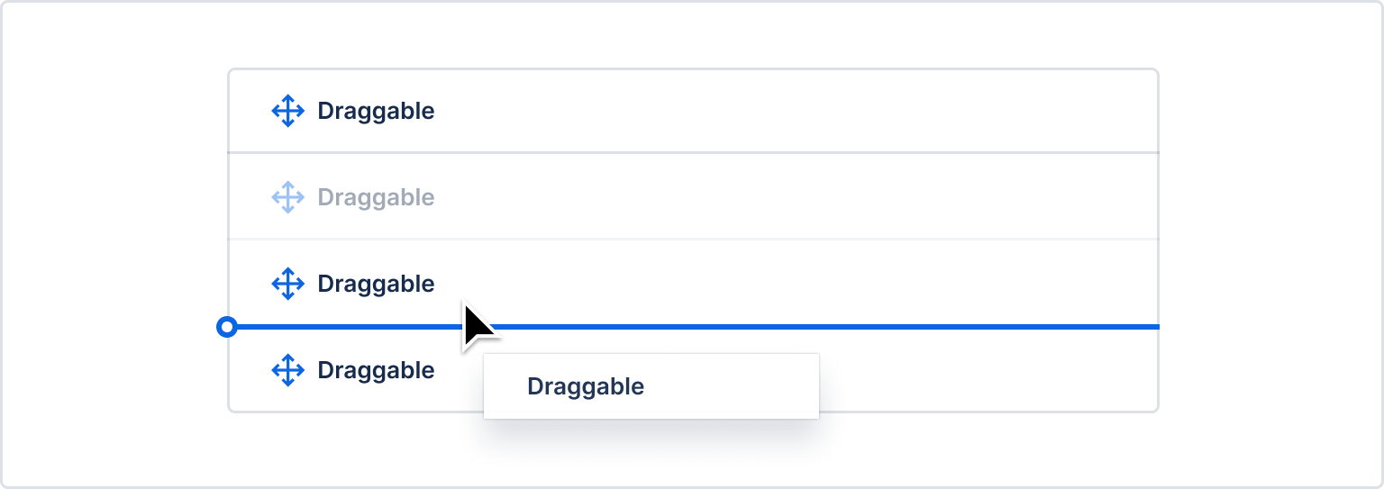
A drop indicator line should have the following properties:
| Property | Value |
|---|---|
| Stroke size | 2px |
| Color | "color.border.selected" |
| Terminal diameter | 8px ("space.100") |
| Border radius on right hand side | none |
The terminal should bleed 4px outwards on the left hand side of the target item. When this
bleeding is not possible due to UI constraints (such as the element appearing in a scroll container
which would cause the terminal to be cut off) then the terminal "bleeding" can be disabled and the
terminal can sit against the left edge of the entity
For stacked items, the line should appear in the middle of the gap between the items.
- Edge detection package: determines when and where the drop indicator shows based on the location of the dragged item.
- React drop indicator package: draw drop indicators
A drop indicator line should not be used when a draggable item is being dragged over a droppable area where there is no relative placement possible (for example, dropping into an empty sibling list).
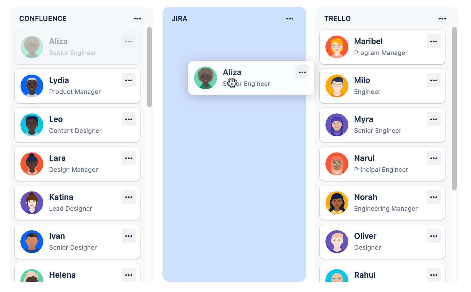
Background color
A background color change is used to communicate that an item will be placed within a particular droppable area. Background color changes should be used when there are multiple possible areas of the page a draggable item can be dropped on. The droppable area that the user is currently over should have its background color changed. A background color change should also occur when a draggable item starts in a droppable area, when there are multiple possible droppable areas.
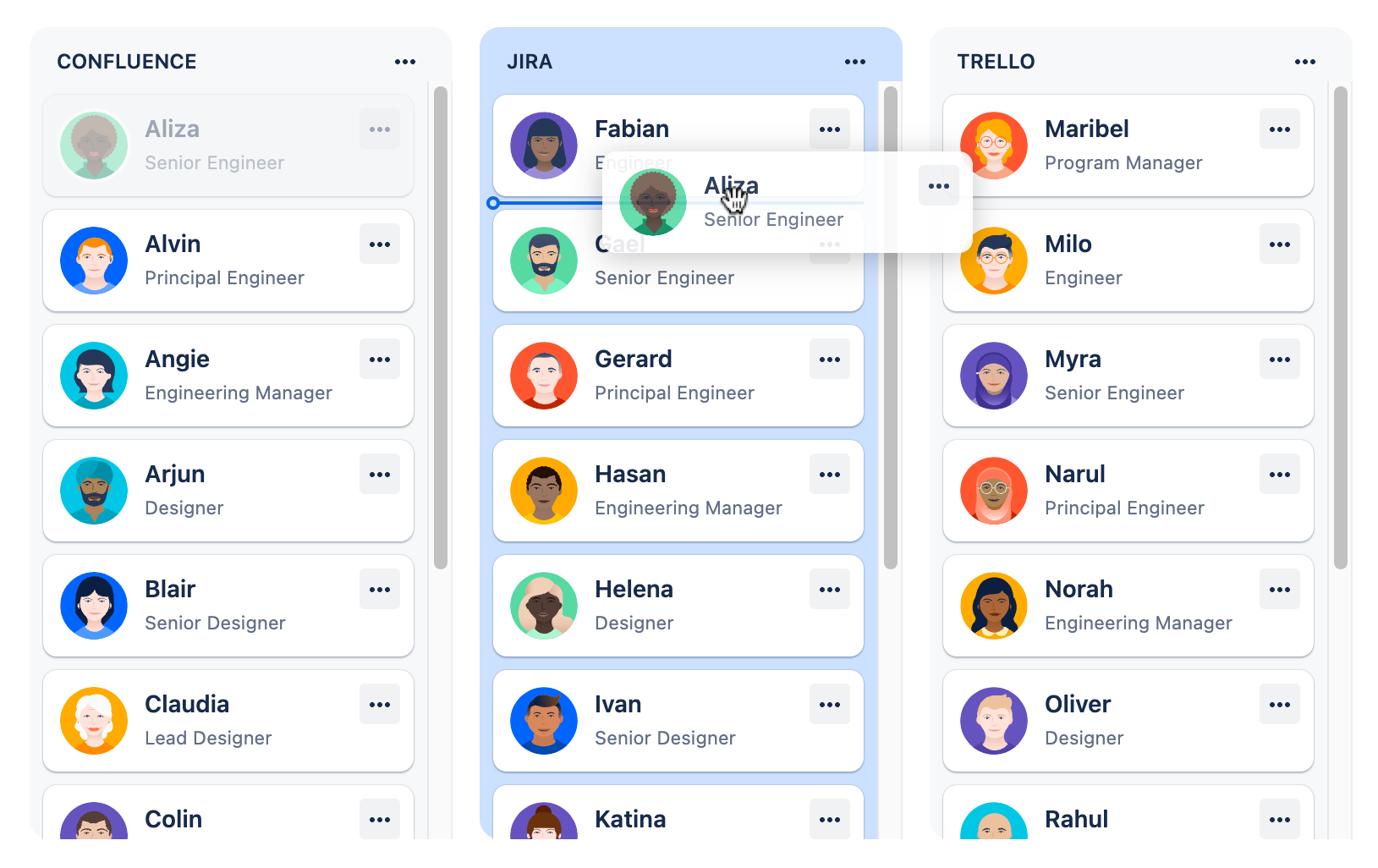
A background color change to communicate that dropping is possible should only be applied when a user can perform a drop operation. Sometimes an entity (eg a column) only allows dropping on a subset of that entity. Only the subset that allows dropping should have a background color change, and only when the user is dragging over that subset. We don't want to have a situation where a background color changes, but when the user drops, nothing happens.
Background color change animation details:
| Property | Value |
|---|---|
| Background color | "color.background.selected.hovered" |
| Easing | cubic-bezier(0.15, 1.0, 0.3, 1.0) (import {easeInOut} from '@atlaskit/motion') |
| Duration | 350ms (import {mediumDurationMs} from '@atlaskit/motion') |
When draggable items can only be moved relatively within a single container, then no background color change should be used when the user is dragging something within the experience.
Nested structures
When there are multiple horizontal levels available as drop targets (for example, trees), then we encourage the use of extra visual affordances to make the levelling clearer:
- Change the background color to
'color.background.information'for all items on the level - Add an outline to the level with the following properties:
const styles = css({
    backgroundColor: token('color.background.information'),
    borderRadius: token('radius.xsmall'),
    outlineOffset: token('space.075'),
    outlineWidth: token('border.width.selected'),
    outlineStyle: 'solid',
    outlineColor: token('color.border.selected'),
});On drop
When the drag operation finishes, we want to:
- Allow users to quickly perform other operations
- Make it clear what the user achieved
Optimistically update the UI
After a drag operation completes, you should immediately update the interface to reflect the outcome of the drag operation. This is known an as "optimistic update" as the interface is updated before the change has been persisted on your backend. In addition to your optimistic update, you should fire off an asynchronous request to persist the outcome of the drag operation.
Optimistic updates might not be available for every possible interaction, but it should be an extremely strong preference to provide optimistic updates.
Flash the moved item
To improve clarity about what the user achieved, the background color of the moved item should flash once it has been moved.
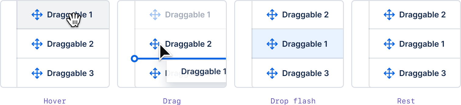 .
.
We have implemented this flash in our flourish package for you to use with any framework.
Background color flash details:
| Property | Value |
|---|---|
| Background color | "color.background.selected" |
| Easing | cubic-bezier(0.25, 0.1, 0.25, 1.0) (not available in @atlaskit/motion) |
| Duration | 700ms (import {largeDurationMs} from '@atlaskit/motion') |
Provide accessible controls
All draggable items should also have the ability to achieve the same outcomes using assistive technology friendly controls.
See our accessibility guidelines
Prefer visible drag handle icons
Please make drag handle icons visible (where possible) as this is a helpful signal for people that an item is draggable.
If the item already has a more actions (…) menu, put the move actions inside of the menu. This provides a keyboard accessible way to move items that doesn’t rely on mouse clicking and dragging.
If the entity does not have any more actions (…), make the drag handle icon into a menu button. When triggered, the drag handle button opens a menu that allows the users to move the item.
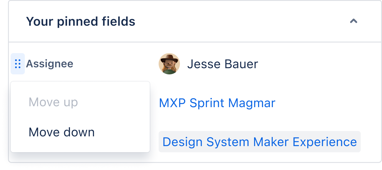
Use the drag handle menu component in code or the Figma kit drag handle menu (Atlassian only), (opens new window) in designs.
Experience specific guidance
These are guidelines that are in addition to our standard guidance for specific experiences
Trees
For tree items, you should use our list item hitbox and our list item react drop indicator (if your experience uses react).
If you are wiring up drag and drop for our navigation-system side navigation,
we have specific guidance for you
Drag starting
- If dragging a tree item that has children in it, you should collapse the tree item when the drag starts. A video explaining the rationale for this, (opens new window)
- If your tree uses a pattern where tree items that have icons are replaced by chevrons on hover, when the drag starts change all the tree item icons to be chevrons. This will help make it clearer to users which part of the interface are potentially expandable.
While dragging
- Tree items can be drop targets and can support up to three operations:
"reorder-before","reorder-after"and"combine"(see list item hitbox for more details). - The size of the operation hitboxes are controlled by the list item hitbox.
- Use the
list item react drop indicator
to visualize the
list item hitbox operation
(eg
"combine") that would be achieved if the user dropped the item. This will be a line above the target tree item for"reorder-above", a line below the target tree item for"reorder-below"and a border around the target tree item for"combine". - If a user drags over a collapsed tree item with the
"combine"operation for500ms, then the collapsed tree item should expand (and should stay expanded even after the drag finishes) - Use our group drop indicator around the innermost group of tree items being dragged over (see tree example for illustration)
On drop
- If the tree item being dragged was expanded when the drag started, re-expand the item. If the tree item was collapsed when the drag started, keep it collapsed.
- The dragged tree item must be visible after the drag has finished. This can involve expanding any
parent tree items needed. For example: dragging
item Aontoitem Bwith a"combine"operation can makeitem Aa child ofitem B. Ifitem Bwas not expanded at the end of the drag (ie it was not dragged over for500mswith the"combine"operation), thenitem Bshould be expanded so thatitem Ais visible at the conclusion of the drag.
Accessible actions
- Tree items should have a standard '...' more menu to trigger movement outcomes
- For list items you generally have predefined movement actions in a dropdown menu (eg
"reorder above","reorder below"etc). However, for tree items, you add a"move"item to the more menu dropdown, and that"move"item should trigger a Modal. The Modal should contain a form which enables all possible movement outcomes for a tree item.
There may be some experiences where exceptions to these recommendations are are warranted, and for those you should refer to our accessibility guidelines for general principles and practices.
Dragging multiple items
How to show when more than one element is selected to be dragged.
Work in progress guidance
Cards and boards
Use color.background.selected and color.border.selected to show the elements that have been
selected, then change to the typical background color at 40% opacity once dragging begins. This
shows where the objects are currently, and where they'll return if no drag location is chosen.
Because cards are larger, multiple cards should be stacked under the first card in the preview. Use a badge to show how many items are being moved.
Checkboxes are highly recommended to show when one or more items are selected.
List items
Use the selected background color token to indicate which items have been selected. Use drag previews as usual, with all items being dragged in a column in the order they’d appear when dropped.
For more than three or four items, show a badge indicating the number and an implied stack beneath the top item.