Design guidelines
Design consistent drag and drop experiences.These guidelines provide an opinionated way to implement drag and drop experiences with Pragmatic drag and drop for Atlassian interfaces. These guidelines work within web platform design constraints for drag and drop, and aim to optimise clarity and performance. Non-Atlassian consumers are welcome to use these guidelines, or create their own visual language for drag and drop. The core package does not have any baked in design opinions, but some of the optional packages embody these design choices.
These design decisions are available in our Pragmatic drag drop Figma UI Kit (Atlassian only).
We plan on soon making this Figma public soon.
Cards, lists, and other UI can often be dragged and reordered. Design clear and consistent drag and drop experiences in Atlassian products following these principles:
Which parts of an entity should be draggable?
As a starting position, if an entity is draggable (eg a card), then make the whole entity draggable. If the entity has other interactive parts (eg buttons, dropdowns), then just make the drag handle icon the draggable part of the entity.
Something to keep in mind is that making an entire entity draggable will prevent text selection
inside that entity (platform limitation)
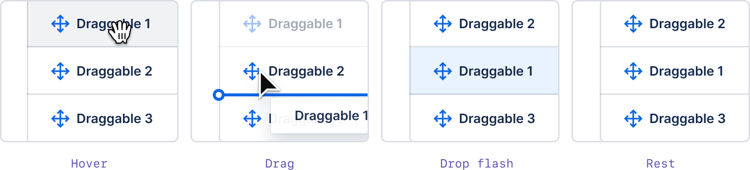
Show what is draggable
It should be clear to a user that an entity is draggable by using the following:
- a drag handle icon
- cursor changes
- background color changes
Please also see our accessibility guidelines which talks about our guidance for placing an action menu trigger on draggable entities.
Drag handle icons
A drag handle icon helps people understand what is draggable. Use the DragHandlerIcon from
@atlaskit/icon as your drag handle icon. Please use "color.icon" as the icon
color as it provides the greatest contrast for accessibility.
import DragHandlerIcon from '@atlaskit/icon/glyph/drag-handler';
import { token } from '@atlaskit/tokens';
function App() {
return <DragHandlerIcon label="Drag list item" primaryColor={token('color.icon')} />;
}Our
drag handle icon button
uses "color.text" as the icon color (rather than "color.icon") to align with other icon buttons
in our system, and for correct colors for different states. We expect this minor mismatch will be
corrected during our upcoming icon work.
When dragging is a primary action of an entity, there should be a visible drag handle on the left hand side of the entity at all times.
If dragging is possible on the item, but dragging is not considered a primary action (it is a
"delighter"), then you can just show the drag handle icon on focus and hover.
:hover and :focus-withinWhen the drag handle is a delighter, it can drop down to a minium of 16px in width. Try to keep
the whole entity draggable so that the draggable touch target is greater than 24px x 24px. 16px
is the size of a "small" @atlaskit/icon.
16px) visible on :hover and :focus-within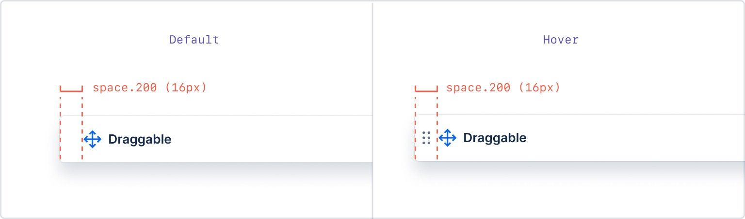
When the drag handle is the only part of an entity that is draggable, it's touch target size should
be at least 24px x 24px in size (which is the size of a @atlaskit/icon). You
will see that the spacing of our example item has changed to give the drag handle more breathing
room.
Some entities are considered to be "implied" to be draggable (eg cards, columns, tree items) and these entities do not require a drag handle icon - although you can still add them. Implied draggable entities should use background color and cursor changes to make it clear which part of the entity is draggable, and there should be a strong preference to make as much of the entity draggable as possible.
"%3E%3Cpath d="M0 0H256V256H0V0Z" fill="white" fill-opacity="0.01"/%3E%3Cpath d="M128 256C198.692 256 256 198.692 256 128C256 57.3075 198.692 0 128 0C57.3075 0 0 57.3075 0 128C0 198.692 57.3075 256 128 256Z" fill="%2357D9A3"/%3E%3Cpath d="M171.4 206.4L132.3 204.4L93.3001 206.4C92.5551 206.467 91.836 206.707 91.2001 207.1L55.8001 230.5C55.0249 231.011 54.2895 231.579 53.6001 232.2C76.0451 248.218 103.063 256.56 130.631 255.983C158.199 255.406 184.844 245.943 206.6 229L173.5 207.1C172.852 206.734 172.139 206.497 171.4 206.4Z" fill="%2300875A"/%3E%3Cpath d="M217.6 99.9009C217.6 102.601 213.5 105.101 213.3 107.801C213.1 110.501 216.6 113.601 216.1 116.201C215.6 118.801 211.2 120.601 210.4 123.201C209.6 125.801 212.6 129.501 211.6 132.001C210.6 134.501 206 135.401 204.8 137.701C203.6 140.001 205.7 144.401 204.3 146.701C202.9 149.001 198.1 148.901 196.5 151.001C194.9 153.101 196.2 157.701 194.4 159.701C192.6 161.701 188 160.801 186 162.601C184 164.401 184.5 169.101 182.3 170.701C180.1 172.301 175.8 170.601 173.5 172.101C171.2 173.601 170.8 178.201 168.4 179.401C166 180.601 162 178.101 159.5 179.001C157 179.901 155.7 184.601 153.1 185.301C150.5 186.001 147.1 182.801 144.4 183.301C141.7 183.801 139.7 188.001 137 188.301C134.3 188.601 131.6 184.701 128.9 184.701C126.2 184.701 123.3 188.501 120.7 188.301C118.1 188.101 115.9 183.801 113.3 183.301C110.7 182.801 107.1 186.001 104.6 185.301C102.1 184.601 100.7 180.001 98.2001 179.001C95.7001 178.001 91.7001 180.601 89.3001 179.401C86.9001 178.201 86.5001 173.501 84.2001 172.101C81.9001 170.701 77.5001 172.401 75.4001 170.701C73.3001 169.001 73.7001 164.401 71.7001 162.601C69.7001 160.801 65.1001 161.701 63.3001 159.701C61.5001 157.701 62.8001 153.201 61.2001 151.001C59.6001 148.801 54.8001 148.901 53.4001 146.701C52.0001 144.501 54.1001 140.101 52.9001 137.701C51.7001 135.301 47.1001 134.501 46.1001 132.001C45.1001 129.501 48.0001 125.701 47.3001 123.201C46.6001 120.701 42.1001 118.901 41.6001 116.201C41.1001 113.501 44.6001 110.401 44.4001 107.801C44.2001 105.201 40.1001 102.601 40.1001 99.9009C40.1001 97.2009 44.2001 94.7009 44.4001 92.1009C44.6001 89.5009 41.1001 86.2009 41.6001 83.6009C42.1001 81.0009 46.5001 79.3008 47.3001 76.7009C48.1001 74.1009 45.1001 70.4009 46.1001 67.9009C47.1001 65.4009 51.7001 64.5009 52.9001 62.1009C54.1001 59.7009 52.0001 55.5009 53.4001 53.2009C54.8001 50.9009 59.6001 51.0009 61.2001 48.8009C62.8001 46.6009 61.5001 42.1009 63.3001 40.2009C65.1001 38.3009 69.7001 39.1009 71.7001 37.3009C73.7001 35.5009 73.2001 30.7009 75.4001 29.1009C77.6001 27.5009 81.9001 29.2009 84.2001 27.8009C86.5001 26.4009 86.9001 21.7009 89.3001 20.5009C91.7001 19.3009 95.7001 21.8009 98.2001 20.8009C100.7 19.8009 102 15.3009 104.6 14.6009C107.2 13.9009 110.6 17.0009 113.3 16.6009C116 16.2009 118 11.8009 120.7 11.6009C123.4 11.4009 126.2 15.1009 128.9 15.1009C131.6 15.1009 134.4 11.3009 137 11.6009C139.6 11.9009 141.8 16.1009 144.4 16.6009C147 17.1009 150.6 13.8009 153.1 14.6009C155.6 15.4009 157 19.9009 159.5 20.8009C162 21.7009 166 19.3009 168.4 20.5009C170.8 21.7009 171.2 26.4009 173.5 27.8009C175.8 29.2009 180.2 27.5009 182.3 29.1009C184.4 30.7009 184 35.5009 186 37.3009C188 39.1009 192.6 38.2009 194.4 40.2009C196.2 42.2009 194.9 46.7009 196.5 48.8009C198.1 50.9009 202.9 50.9009 204.3 53.2009C205.7 55.5009 203.6 59.7009 204.8 62.1009C206 64.5009 210.6 65.4009 211.6 67.9009C212.6 70.4009 209.7 74.1009 210.4 76.7009C211.1 79.3008 215.6 81.0009 216.1 83.6009C216.6 86.2009 213.1 89.4009 213.3 92.1009C213.5 94.8008 217.6 97.2009 217.6 99.9009Z" fill="%2372594B"/%3E%3Cpath d="M88 190.301L177.5 191.701L175.8 208.901L89.4 208.401L88 190.301Z" fill="%2300875A"/%3E%3Cpath d="M159.7 218.3L132.8 247.7L103.4 217.7C101.184 215.438 99.7685 212.513 99.3712 209.371C98.974 206.229 99.6163 203.043 101.2 200.3C102.575 197.978 103.555 195.444 104.1 192.8C106.9 179 97.8002 168.6 96.7002 167.5L164.1 164.9C162.8 166.9 155.7 178.2 159.3 192.1C159.93 194.37 160.837 196.553 162 198.6C163.712 201.716 164.41 205.287 163.998 208.818C163.586 212.349 162.084 215.663 159.7 218.3Z" fill="url(%23paint0_linear)"/%3E%3Cpath d="M78.3 140.301C85.9215 140.301 92.1 134.123 92.1 126.501C92.1 118.88 85.9215 112.701 78.3 112.701C70.6785 112.701 64.5 118.88 64.5 126.501C64.5 134.123 70.6785 140.301 78.3 140.301Z" fill="%234A3222"/%3E%3Cpath d="M180.3 140.301C187.922 140.301 194.1 134.123 194.1 126.501C194.1 118.88 187.922 112.701 180.3 112.701C172.678 112.701 166.5 118.88 166.5 126.501C166.5 134.123 172.678 140.301 180.3 140.301Z" fill="%234A3222"/%3E%3Cpath d="M77.4002 98.3015C80.2002 103.968 82.8002 109.468 85.2002 114.801C87.5002 120.101 87.0002 119.301 89.2002 124.401C95.5002 138.601 98.0002 141.801 96.7002 146.601C95.9002 149.701 93.7002 152.801 92.1002 152.501C90.5002 152.201 90.6002 148.201 88.9002 142.901C84.5002 130.001 74.5002 119.901 73.6002 119.001C72.7002 118.101 69.3002 115.101 67.7002 111.501C66.1002 107.901 64.5002 104.501 67.0002 101.001C69.5002 97.5015 73.1002 97.2015 77.4002 98.3015Z" fill="%2372594B"/%3E%3Cpath d="M185.2 121.301C184 150.901 153.3 184.901 129.5 184.901C105.7 184.901 74.9999 150.901 73.7999 121.301C72.4999 88.6008 96.9999 51.8008 129.5 51.8008C162 51.8008 186.5 88.6008 185.2 121.301Z" fill="%23543E36"/%3E%3Cpath d="M172.1 104.101C169.555 102.423 166.88 100.952 164.1 99.7008C161.306 98.576 158.311 98.0316 155.3 98.1008C152.32 98.1224 149.369 98.6989 146.6 99.8009C143.829 100.931 141.287 102.558 139.1 104.601C138.913 104.784 138.662 104.887 138.4 104.887C138.138 104.887 137.887 104.784 137.7 104.601C137.553 104.397 137.475 104.152 137.475 103.901C137.475 103.65 137.553 103.405 137.7 103.201C139.998 100.881 142.712 99.0156 145.7 97.7008C148.743 96.4387 152.006 95.7929 155.3 95.8009C158.603 95.8082 161.869 96.4887 164.9 97.8009C167.959 98.9799 170.578 101.076 172.4 103.801C172.44 103.841 172.462 103.895 172.462 103.951C172.462 104.007 172.44 104.061 172.4 104.101C172.36 104.141 172.306 104.163 172.25 104.163C172.194 104.163 172.14 104.141 172.1 104.101Z" fill="%23091E42"/%3E%3Cpath d="M82.5 103.801C84.3217 101.076 86.9413 98.9802 90 97.8012C93.0308 96.4891 96.2973 95.8085 99.6 95.8012C102.895 95.7825 106.16 96.4287 109.2 97.7012C112.203 98.9896 114.922 100.859 117.2 103.201C117.315 103.287 117.409 103.397 117.478 103.523C117.547 103.648 117.587 103.787 117.597 103.93C117.608 104.073 117.587 104.217 117.537 104.351C117.487 104.485 117.408 104.607 117.307 104.708C117.206 104.81 117.084 104.888 116.95 104.938C116.815 104.988 116.672 105.009 116.529 104.999C116.386 104.988 116.247 104.948 116.121 104.879C115.996 104.811 115.886 104.716 115.8 104.601C113.613 102.558 111.071 100.932 108.3 99.8012C105.533 98.6901 102.581 98.1132 99.6 98.1012C96.5885 98.0319 93.5944 98.5763 90.8 99.7012C88 100.801 85.6 102.501 82.8 104.101C82.7 104.201 82.5 104.201 82.5 104.001C82.5 103.801 82.4 103.801 82.5 103.801Z" fill="%23091E42"/%3E%3Cpath d="M103.6 117.002C105.643 117.002 107.3 115.345 107.3 113.302C107.3 111.258 105.643 109.602 103.6 109.602C101.556 109.602 99.8999 111.258 99.8999 113.302C99.8999 115.345 101.556 117.002 103.6 117.002Z" fill="%23091E42"/%3E%3Cpath d="M87.1001 112.001C87.5861 112.225 88.1149 112.341 88.6501 112.341C89.1853 112.341 89.7141 112.225 90.2001 112.001L90.7001 111.601L90.9001 111.401L91.3001 111.101C91.7856 110.582 92.3216 110.113 92.9001 109.701C95.1286 107.9 97.7783 106.696 100.6 106.201C103.409 105.749 106.284 105.954 109 106.801C111.702 107.741 114.138 109.319 116.1 111.401C116.212 111.512 116.301 111.645 116.361 111.79C116.422 111.936 116.453 112.093 116.453 112.251C116.453 112.409 116.422 112.565 116.361 112.711C116.301 112.857 116.212 112.989 116.1 113.101C115.856 113.287 115.557 113.388 115.25 113.388C114.943 113.388 114.644 113.287 114.4 113.101C112.617 111.468 110.502 110.241 108.2 109.501C105.895 108.838 103.476 108.667 101.1 109.001C98.6939 109.391 96.405 110.314 94.4001 111.701C93.9091 112.071 93.4416 112.472 93.0001 112.901L92.6001 113.201L92.1001 113.601L90.9001 114.101C90.1236 114.369 89.2773 114.356 88.5094 114.064C87.7415 113.771 87.101 113.218 86.7001 112.501C86.656 112.419 86.6419 112.324 86.6601 112.233C86.6784 112.141 86.7279 112.059 86.8001 112.001H87.1001Z" fill="%23091E42"/%3E%3Cpath d="M155.3 117.002C157.344 117.002 159 115.345 159 113.302C159 111.258 157.344 109.602 155.3 109.602C153.257 109.602 151.6 111.258 151.6 113.302C151.6 115.345 153.257 117.002 155.3 117.002Z" fill="%23091E42"/%3E%3Cpath d="M172.1 112.501C171.699 113.218 171.059 113.771 170.291 114.064C169.523 114.356 168.677 114.369 167.9 114.101L166.7 113.601L166.2 113.201L165.8 112.901C165.359 112.472 164.891 112.071 164.4 111.701C162.423 110.33 160.171 109.409 157.8 109.001C155.391 108.665 152.939 108.835 150.6 109.501C148.298 110.241 146.184 111.468 144.4 113.101C144.282 113.206 144.145 113.287 143.995 113.339C143.846 113.392 143.687 113.414 143.529 113.404C143.371 113.395 143.217 113.355 143.074 113.285C142.932 113.216 142.805 113.119 142.7 113.001C142.503 112.781 142.395 112.496 142.395 112.201C142.395 111.905 142.503 111.621 142.7 111.401C144.663 109.319 147.098 107.741 149.8 106.801C152.516 105.954 155.391 105.749 158.2 106.201C161.022 106.696 163.672 107.9 165.9 109.701C166.479 110.113 167.015 110.582 167.5 111.101L167.9 111.401L168.1 111.601L168.6 112.001C169.086 112.225 169.615 112.341 170.15 112.341C170.685 112.341 171.214 112.225 171.7 112.001C171.9 111.901 172.1 112.001 172.1 112.201C172.121 112.219 172.138 112.242 172.15 112.268C172.162 112.294 172.168 112.322 172.168 112.351C172.168 112.379 172.162 112.407 172.15 112.433C172.138 112.459 172.121 112.482 172.1 112.501Z" fill="%23091E42"/%3E%3Cpath d="M120.4 139.4L123.9 140.3L125.7 140.7L127.2 141.1C128.283 141.065 129.358 140.897 130.4 140.6C131.526 140.359 132.63 140.024 133.7 139.6C133.899 139.536 134.115 139.553 134.302 139.646C134.489 139.74 134.631 139.902 134.7 140.1C134.752 140.262 134.752 140.437 134.698 140.599C134.644 140.761 134.539 140.901 134.4 141C133.348 141.691 132.203 142.23 131 142.6C129.762 143.099 128.434 143.337 127.1 143.3C126.415 143.284 125.738 143.148 125.1 142.9L123.3 142.3C122.124 141.903 120.986 141.401 119.9 140.8C119.811 140.758 119.731 140.698 119.667 140.623C119.602 140.549 119.554 140.461 119.526 140.367C119.498 140.273 119.49 140.173 119.502 140.076C119.515 139.978 119.548 139.884 119.6 139.8C119.687 139.669 119.806 139.564 119.947 139.493C120.087 139.423 120.243 139.391 120.4 139.4Z" fill="%23091E42"/%3E%3Cpath d="M122.5 115.802C123.07 117.156 123.505 118.563 123.8 120.002C124.071 121.455 124.238 122.925 124.3 124.402C124.3 125.84 124.2 127.277 124 128.702C123.821 130.167 123.486 131.608 123 133.002C122.981 133.108 122.936 133.209 122.871 133.296C122.806 133.382 122.722 133.453 122.625 133.501C122.528 133.55 122.421 133.575 122.313 133.575C122.204 133.575 122.097 133.55 122 133.502C121.816 133.437 121.658 133.314 121.55 133.152C121.442 132.99 121.389 132.797 121.4 132.602C121.6 131.202 121.8 129.902 121.9 128.502C122.033 127.139 122.067 125.769 122 124.402C122 123.063 121.9 121.726 121.7 120.402C121.5 119.002 121.2 117.702 120.9 116.302C120.87 116.078 120.925 115.85 121.055 115.665C121.184 115.48 121.379 115.35 121.6 115.302C121.785 115.266 121.977 115.296 122.141 115.388C122.306 115.479 122.433 115.626 122.5 115.802Z" fill="%23091E42"/%3E%3Cpath d="M149.6 156.7C136.469 161.369 122.131 161.369 109 156.7L114.9 154.7C117.914 153.631 121.21 153.666 124.2 154.8H124.4C127.557 155.999 131.043 155.999 134.2 154.8C137.223 153.684 140.533 153.613 143.6 154.6L149.6 156.7Z" fill="%23FF5630"/%3E%3Cpath d="M149.6 156.701C149.6 156.701 144.9 166.701 129.3 166.701C113.7 166.701 109 156.701 109 156.701C122.131 161.369 136.469 161.369 149.6 156.701Z" fill="%23FF7452"/%3E%3Cpath d="M106.4 154.701C108.2 155.501 110.1 156.201 111.9 156.801C113.7 157.401 115.7 158.001 117.6 158.501C125.352 160.133 133.362 160.099 141.1 158.401C144.955 157.527 148.709 156.253 152.3 154.601C152.408 154.56 152.526 154.558 152.636 154.594C152.745 154.63 152.838 154.704 152.9 154.801C153 155.001 152.9 155.201 152.7 155.401C145.71 159.762 137.639 162.083 129.4 162.101C127.326 162.12 125.254 161.987 123.2 161.701C121.132 161.504 119.089 161.102 117.1 160.501C113.128 159.482 109.323 157.9 105.8 155.801C105.663 155.701 105.568 155.554 105.531 155.389C105.494 155.223 105.519 155.05 105.6 154.901C105.628 154.825 105.675 154.757 105.735 154.703C105.796 154.649 105.868 154.61 105.947 154.59C106.026 154.571 106.108 154.57 106.187 154.59C106.266 154.609 106.339 154.647 106.4 154.701Z" fill="%23091E42"/%3E%3Cg style="mix-blend-mode:multiply" opacity="0.31"%3E%3Cg style="mix-blend-mode:multiply" opacity="0.31"%3E%3Cpath d="M156.8 156.9C156.284 155.29 155.579 153.746 154.7 152.3C154.288 151.602 153.783 150.963 153.2 150.4C152.654 149.718 152.052 149.083 151.4 148.5C151.348 148.409 151.32 148.306 151.32 148.2C151.32 148.095 151.348 147.992 151.4 147.9H151.8C153.718 148.391 155.368 149.611 156.4 151.3C157.511 152.98 157.973 155.006 157.7 157C157.6 157.2 157.4 157.4 157.2 157.3C157 157.2 156.9 157.2 156.8 157V156.9Z" fill="%23543E36"/%3E%3C/g%3E%3C/g%3E%3Cg style="mix-blend-mode:multiply" opacity="0.31"%3E%3Cg style="mix-blend-mode:multiply" opacity="0.31"%3E%3Cpath d="M106.2 146.201C105.108 147.489 104.168 148.898 103.4 150.401L102.5 152.701L101.9 155.201C101.888 155.255 101.866 155.305 101.834 155.35C101.802 155.394 101.762 155.431 101.715 155.459C101.668 155.488 101.616 155.506 101.562 155.513C101.508 155.52 101.452 155.516 101.4 155.501L101.1 155.301C100.781 154.352 100.661 153.347 100.747 152.349C100.833 151.352 101.123 150.382 101.6 149.501C102.456 147.729 103.907 146.313 105.7 145.501C105.808 145.46 105.926 145.458 106.036 145.494C106.145 145.531 106.238 145.604 106.3 145.701C106.315 145.874 106.281 146.048 106.2 146.201Z" fill="%23543E36"/%3E%3C/g%3E%3C/g%3E%3Cpath d="M192.2 64.8006C191.2 62.4006 193.5 58.0006 191.9 55.5006C190.3 53.0006 185.5 53.4006 183.5 51.2006C181.5 49.0006 182.6 44.4006 180.4 42.4006C178.2 40.4006 173.6 42.0006 171.3 40.3006C169 38.6006 168.8 33.8006 166.3 32.3006C163.8 30.8006 159.5 33.2006 157 32.0006C154.5 30.8006 153.2 26.1006 150.6 25.2006C148 24.3006 144 27.4006 141.4 26.9006C138.8 26.4006 136.2 21.9006 133.5 21.8006C130.8 21.7006 127.9 25.8006 125.3 26.2006C122.7 26.6006 118.3 23.9006 116 25.2006C113.7 26.5006 114.1 31.3006 112.7 33.7006C112.145 34.5277 111.471 35.2689 110.7 35.9006C108.2 35.9006 104.9 33.0006 102.3 33.8006C99.7003 34.6006 98.9003 39.3006 96.3003 40.5006C93.7003 41.7006 89.8003 39.2006 87.4003 40.6006C85.0003 42.0006 85.1003 46.7006 82.8003 48.2006C80.5003 49.7006 76.1003 48.0006 74.0003 49.7006C71.9003 51.4006 72.4003 56.2006 70.5003 57.9006C68.6003 59.6006 63.8003 58.8006 62.1003 60.7006C60.4003 62.6006 61.5003 67.3006 59.9003 69.4006C58.3003 71.5006 53.4003 71.5006 52.1003 73.7006C50.8003 75.9006 53.0003 80.3006 52.1003 82.5006C51.2003 84.7006 46.6003 87.1006 46.5003 89.5006C46.4003 91.9006 50.6003 93.8006 52.1003 95.8006C53.6003 97.8006 54.1003 102.201 57.0003 102.801C59.9003 103.401 62.1003 99.3006 65.1003 98.9006C68.1003 98.5006 71.0003 101.801 73.7003 100.901C76.4003 100.001 77.1003 95.4006 79.7003 94.3006C82.3003 93.2006 86.2003 95.5006 88.6003 94.2006C91.0003 92.9006 91.0003 88.1006 93.2003 86.5006C95.4003 84.9006 99.9003 86.7006 102 85.0006C104.1 83.3006 103.6 78.6006 105.5 76.8006C107.4 75.0006 112.2 75.9006 114 74.0006C115.8 72.1006 114.5 67.4006 116.1 65.4006C117.7 63.4006 119.7 63.4006 121.6 62.7006C122.8 65.0006 122.3 69.0006 124.3 70.8006C126.3 72.6006 131 71.2006 133.4 72.9006C135.8 74.6006 135.8 79.4006 138.3 80.8006C140.8 82.2006 145.2 80.0006 147.7 81.2006C150.2 82.4006 151.5 87.1006 154.1 88.0006C156.7 88.9006 160.6 85.8006 163.3 86.3006C166 86.8006 168.5 91.2006 171.2 91.4006C173.9 91.6006 176.8 87.4006 179.4 87.0006C182 86.6006 186.4 89.3006 188.7 88.0006C191 86.7006 190.6 81.9006 192 79.5006C193.4 77.1006 197.7 75.3006 197.7 72.3006C197.7 69.3006 193.2 67.7006 192.2 64.8006Z" fill="%2372594B"/%3E%3C/g%3E%3Cdefs%3E%3ClinearGradient id="paint0_linear" x1="130.43" y1="166.52" x2="130.43" y2="247.26" gradientUnits="userSpaceOnUse"%3E%3Cstop stop-color="%23382926"/%3E%3Cstop offset="0.64" stop-color="%23543E36"/%3E%3C/linearGradient%3E%3CclipPath id="clip0"%3E%3Cpath d="M0 0H256V256H0V0Z" fill="white"/%3E%3C/clipPath%3E%3C/defs%3E%3C/svg%3E)
Sometimes, your drag handle icon should be a button for triggering actions too (see our accessibility guidelines). In those cases, please use our drag handle icon button.
Cursor changes
Use cursor:grab as a signal that an entity is draggable. Only the draggable part of an entity
should have cursor:grab. So when a draggable is only draggable from a drag handle, only the drag
handle should have cursor:grab.
:hover and :focus-within16px) visible on :hover and :focus-withinWhen dragging is a secondary action, and the entity has multiple operations, it might be
appropriate to delay the cursor:grab by 800ms.
cursor:drag delayed by 800msYou can implement this behaviour just using CSS (no JS needed!)
.item:hover {
    animation-duration: 0s;
    animation-name: change-cursor;
    animation-delay: 800ms;
    animation-fill-mode: forwards;
}

@keyframes change-cursor {
    to {
        cursor: grab;
    }
}
Background color changes
The draggable part of an entity should have a background color change applied when hovering over it.
Please use the appropriate hover token for the entity.
Usually for a draggable entity you will be using:
elevation.surfaceas the background color.elevation.surface.hoveredon as thehoverbackground color on the draggable part of the entity.
:hover and :focus-within16px) visible on :hover and :focus-withinFor some situations it might be appriopriate to use a different color pairing. Please try to use a
".background" color token for the draggable entity, and a matching ".hovered" token for the
hover.
Give feedback during a drag
While an item is being dragged, it is important that you give clear feedback to the user about what is being dragged, and what will occur when the user completes the drag.
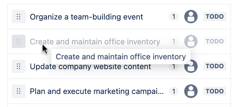
Drag previews
A drag preview is a representation of the item being dragged. Generally a drag preview is a picture of the item being dragged around the page, and not the draggable item itself.
When an item is small and simple, the drag preview can be an exact copy of the item being dragged. If an item is larger or more complex, you should simplify the drag preview.
Simplification suggestions:
- Use a maximum of three pieces of information in a preview
- Use a maximum preview size of
280px x 280pxto prevent super low drag preview opacity on Windows
Standard
Drag previews should generally be pushed away from the users pointer by space.100 vertically, and
space.200 horizontally. Do not rotate the drag preview.
{
  x: token('space.200', '16px'),
  y: token('space.100', '8px'),
}
Cards
Cards are to be dragged from the point they're grabbed from (no offset).

Do not rotate card drag previews. Exception: Trello, which has a 4deg rotation.
Cursor
Due to
web platform constraints, we
have limited control of the cursor during a drag operation. The cursor will generally be
cursor:default during a drag operation.
The draggable item
While an item is being dragged, the original item should stay in place and dim to 40% opacity
(opacity: 0.4) while the drag preview is being moved around.

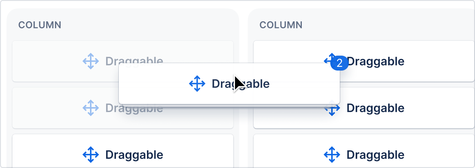
Multiple-item drag previews
For multi-item drag previews, use a stacked appearance with a badge indicating the number of items being dragged.
- Four or more small items such as list items should appear as a stacked preview under the first item. Less than four small items can appear separately where space allows (all items showing in the preview).
- Any more than one large item (card) should show as a stack with a badge indicating the number underneath.
Implement with native drag previews, or use the Figma kit (Atlassian only) in designs.
Drop placement indication
It is important to communicate during a drag operation, what the result of the operation will be. There are two signals you can use to indicate drop placement:
- Drop indicator (a line)
- Background color (
color.background.selected.hovered)
Drop indicator
The drop indicator line is used to communicate relative placement (for example, before or after an item in a list)
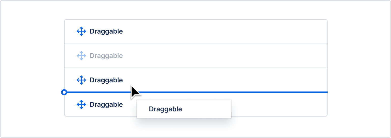
A drop indicator line should have the following properties:
| Property | Value |
|---|---|
| Stroke size | 2px |
| Color | "color.border.selected" |
| Terminal diameter | 8px ("space.100") |
| Border radius on right hand side | none |
The terminal should bleed 4px outwards on the left hand side of the target item. When this
bleeding is not possible due to UI constraints (such as the element appearing in a scroll container
which would cause the terminal to be cut off) then the terminal "bleeding" can be disabled and the
terminal can sit against the left edge of the entity
For stacked items, the line should appear in the middle of the gap between the items.
- Edge detection package: determines when and where the drop indicator shows based on the location of the dragged item.
- React drop indicator package: draw drop indicators
A drop indicator line should not be used when a draggable item is being dragged over a droppable area where there is no relative placement possible (for example, dropping into an empty sibling list).

Background color
A background color change is used to communicate that an item will be placed within a particular droppable area. Background color changes should be used when there are multiple possible areas of the page a draggable item can be dropped on. The droppable area that the user is currently over should have its background color changed. A background color change should also occur when a draggable item starts in a droppable area, when there are multiple possible droppable areas.

A background color change to communicate that dropping is possible should only be applied when a user can perform a drop operation. Sometimes an entity (eg a column) only allows dropping on a subset of that entity. Only the subset that allows dropping should have a background color change, and only when the user is dragging over that subset. We don't want to have a situation where a background color changes, but when the user drops, nothing happens.
Background color change animation details:
| Property | Value |
|---|---|
| Background color | "color.background.selected.hovered" |
| Easing | cubic-bezier(0.15, 1.0, 0.3, 1.0) (import {easeInOut} from '@atlaskit/motion') |
| Duration | 350ms (import {mediumDurationMs} from '@atlaskit/motion') |
When draggable items can only be moved relatively within a single container, then no background color change should be used when the user is dragging something within the experience.
Nested structures
When there are multiple horizontal levels available as drop targets (for example, trees), then we encourage the use of extra visual affordances to make the levelling clearer:
- Change the background color to
'color.background.information'for all items on the level - Add an outline to the level with the following properties:
const styles = css({
    backgroundColor: token('color.background.information'),
    borderRadius: token('border.radius.050'),
    outlineOffset: token('space.075'),
    outlineWidth: token('border.width.outline'),
    outlineStyle: 'solid',
    outlineColor: token('color.border.selected'),
});After a drop, show the item in its new position
After a drop, the drag preview disappears and the original item should to it's new location. To improve clarity about what the user achieved, the background color of the moved item should flash once it has been moved.
 .
.
We have implemented this flash in our flourish package for you to use with any framework.
Background color flash details:
| Property | Value |
|---|---|
| Background color | "color.background.selected" |
| Easing | cubic-bezier(0.25, 0.1, 0.25, 1.0) (not available in @atlaskit/motion) |
| Duration | 700ms (import {largeDurationMs} from '@atlaskit/motion') |
Provide accessible controls
Be sure to see our accessibility guidelines
All draggable items should also have the ability to trigger the same outcomes using assistive technology friendly controls.
Visible drag handle icons
Please make drag handle icons visible (where possible) as this is a helpful signal for people that an item is draggable.
If the item already has a more actions (…) menu, put the move actions inside of the menu. This provides a keyboard accessible way to move items that doesn’t rely on mouse clicking and dragging.

If the entity does not have any more actions (…), make the drag handle icon into a menu button. When triggered, the drag handle button opens a menu that allows the users to move the item.
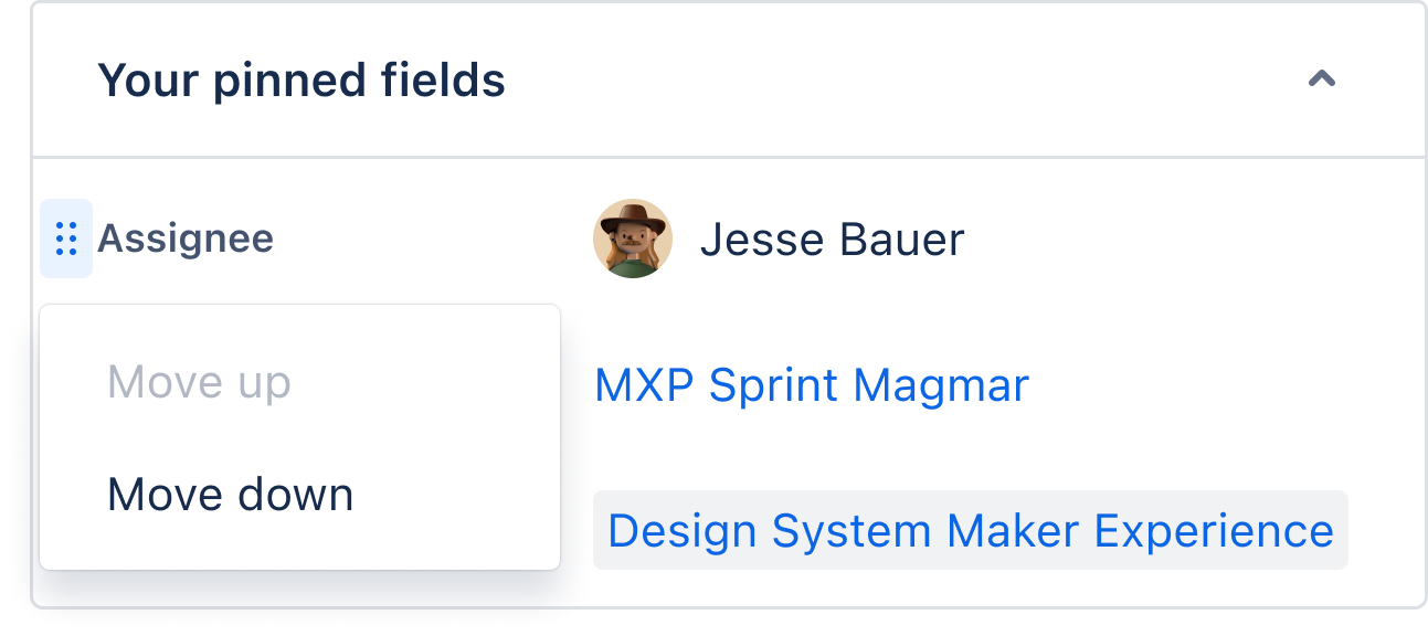
Use the drag handle menu component in code or the Figma kit drag handle menu (Atlassian only) in designs.
Trees
We have no standalone tree spec at this stage, So please refer to:
- Our tree example below
- Our navigation drag and drop spec spec
Dragging multiple items
How to show when more than one element is selected to be dragged.
Cards and boards
Use color.background.selected and color.border.selected to show the elements that have been
selected, then change to the typical background color at 40% opacity once dragging begins. This
shows where the objects are currently, and where they'll return if no drag location is chosen.
Because cards are larger, multiple cards should be stacked under the first card in the preview. Use a badge to show how many items are being moved.
Checkboxes are highly recommended to show when one or more items are selected.
List items
Use the selected background color token to indicate which items have been selected. Use drag previews as usual, with all items being dragged in a column in the order they’d appear when dropped.
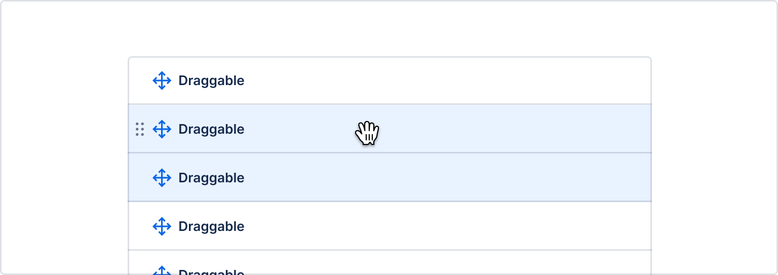
For more than three or four items, show a badge indicating the number and an implied stack beneath the top item.