Tile
A tile is a rounded square that takes an asset and represents a noun.Usage
Tile is a versatile, foundational container with baked in sizing and radii properties for displaying elements in a tile shape. It is unopinionated in its content and can be used to slot in any asset, background, color or foreground element as needed.
Both Icon tile and Object tile inherit properties of tile ensuring a consistent and cohesive tile system across various applications.
Use tiles to slot in elements such as:
- Emojis
- Third-party logos
Parts
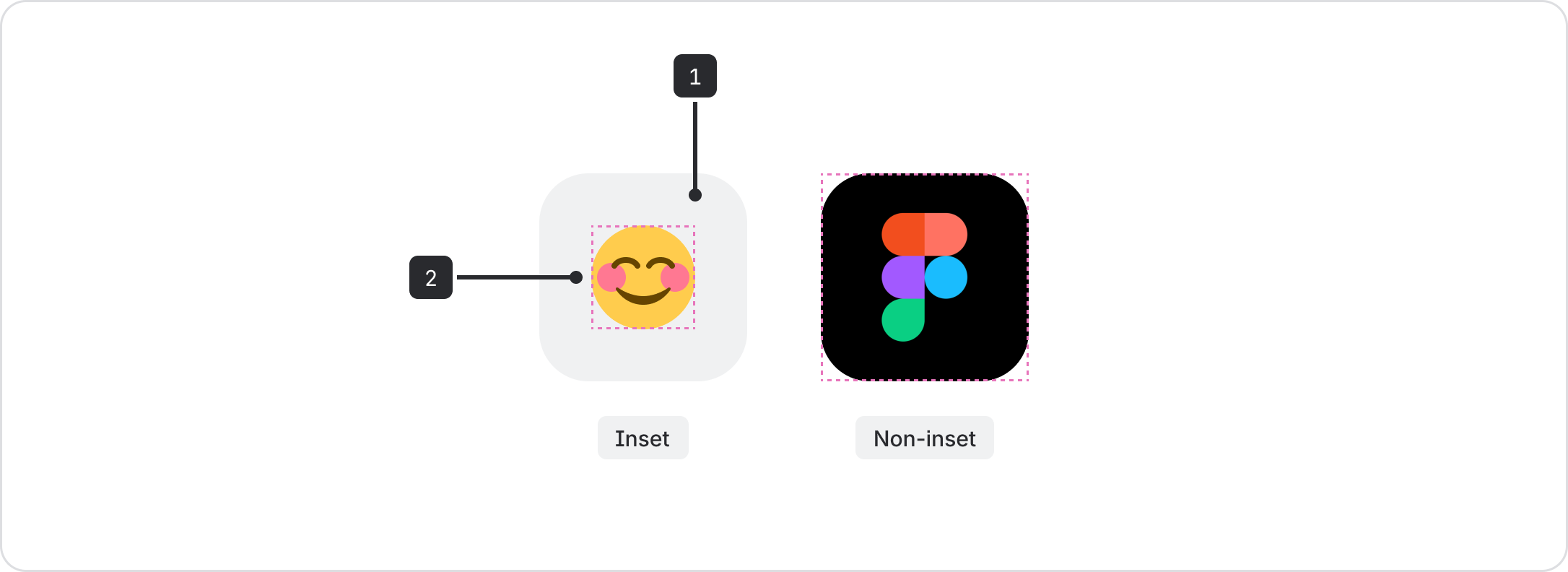
- Tile background: By default, the inset variant has a neutral background set to
color.background.neutral. This can be switched out with other background tokens, white, or black. - Foreground element: Place any element within the bounds of the slot.
Best practices
Always use the correct variant
- Non-inset variant: suited for full bleed assets as it allows for an end-to-end fill
- Inset variant: use for any other content
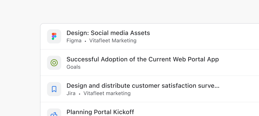
Do
Use the same variant when tiles are listed or grouped.
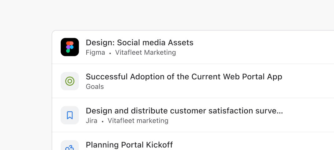
Don’t
Avoid mixing inset and non-inset variables in a group.
Reference height of adjacent content for size
Tiles support a range of sizes from 16px to 48px. As a general rule when selecting size, reference the size of the tile to the height of its adjacent content for visual balance.

Do
Align tile sizing to closely match the height of its adjacent content.

Don’t
Avoid selecting tile sizes smaller than the height of its adjacent content.
- For icons with colored backgrounds, use Icon tile
- For objects in a tile, use Object tile