Tile
A tile is a rounded square that takes an asset and represents a noun.Tile system
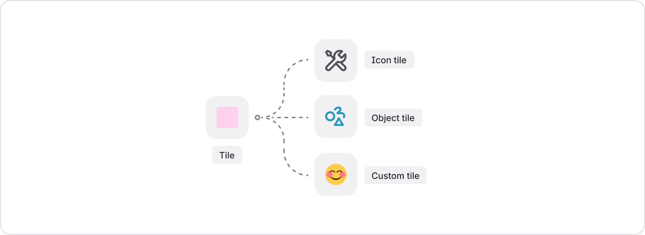
The tile component sets the foundation of our tile system, setting a standard for size, space, and shape properties for all tile-shaped elements within Atlassian UI.
So far, the properties of tile is inherited by the following components:
- Icon tile
- Object tile
Makers should default to using these components, but in cases where a 'custom' tile is needed (for assets such as third-party logos or emojis), the tile component can be leveraged.
Together, these components make a comprehensive system that brings flexibility and consistency to our apps.
Tile components
| Component | Description | Used for |
|---|---|---|
| Tile | A versatile, foundational container with baked-in sizing and radii properties for displaying elements in a tile shape. It is flexible and can be used as a container to add in any foreground element, background, or color as needed. | Anything that's not an icon or object, such as emojis and third-party logos |
| Icon tile | Allows icons to be scaled larger than 16px. It has pre-set options for color and size to ensure accessibility and readability, and to prominently highlight icons in a layout. | Icons |
| Object tile | Use instead of an icon tile to represent Atlassian-specific content icons, such as pages, live docs, whiteboard, or bugs. Each object tile has a specific color token that cannot be changed. | Objects |

