Link
A link takes people to a new location in the app or another website.Usage
Links help users navigate to another page or sections of a page. They can also download files or provide contact information such as phone numbers or email addresses.
Parts

- Label: Text describing the link. Clearly describe where the link navigates or it's purpose.
- Icon (optional): If the the link opens in a new window, an icon will be automatically displayed as an indicator.
If the icon is not desired, reconsider if the link should open in a new window. Links that open new windows without warning can be disorienting for users.
Accessibility
Don't use subtle links when surrounded by regular text
The default link appearance has an underline and color, making it distinguishable from regular text which is an accessibility requirement. Don't use 'subtle' appearance links in this context, as they are difficult to differentiate from regular text.
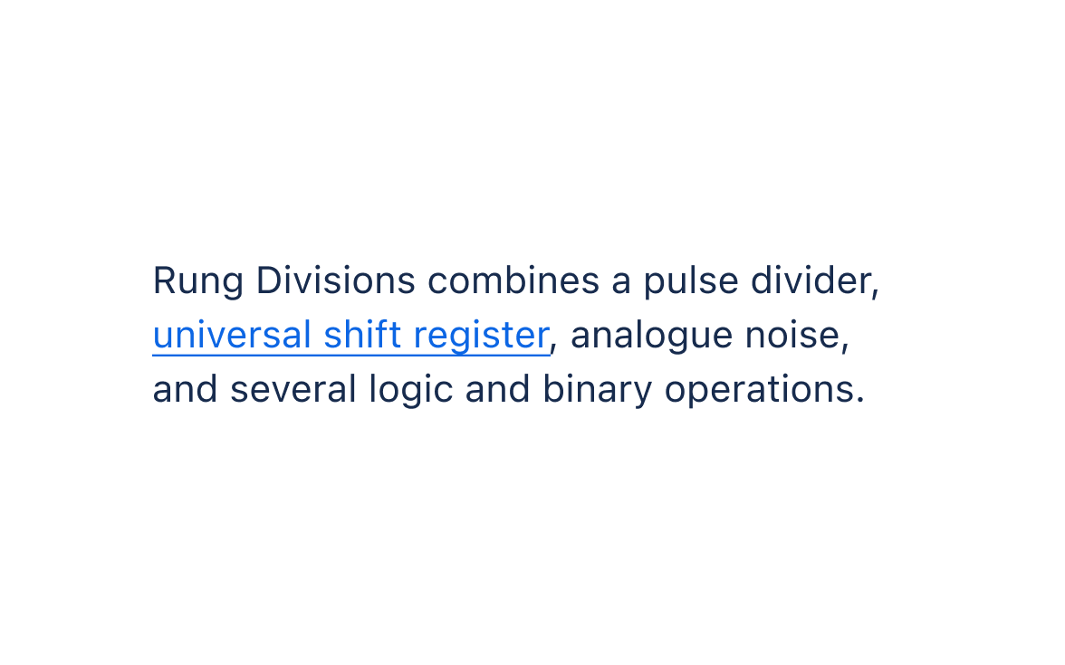
Do
Use the default link appearance when surrounded by regular text.
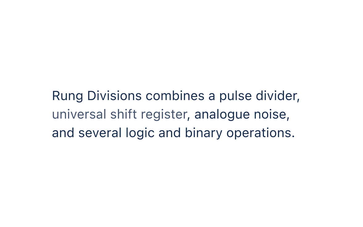
Don’t
Use the subtle link appearance when surrounded by regular text.
Don't use subtle links unless other context already indicates it's a link
Only use the 'subtle' appearance if the surrounding context makes it clear that it's a link, such as in navigation or breadcrumbs.

Do
Use the subtle appearance when surrounding context makes it clear it's a link.

Don’t
Use the default appearance when surrounding context already makes it clear it's a link.
Use descriptive link text that clarifies the purpose of the link
Don't link vague words or phrases like “here” or “learn more.” Make sure the linked text clearly describes the purpose of the link for assistive technologies.
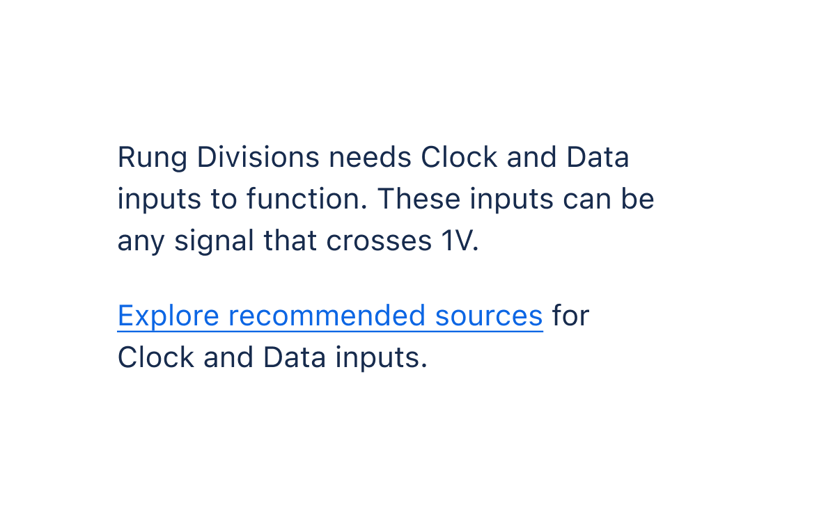
Do
Clearly describe the purpose of the link.
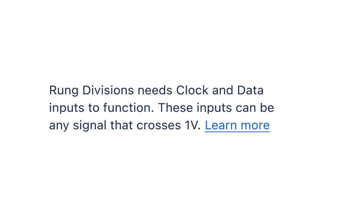
Don’t
Link vague words or phrases.
Only open links in a new window or tab when necessary
Opening links in a new window can be disorienting, (opens new window), so only do it if necessary.
It might make sense for a link to open in a new window if:
- There's a risk of someone losing their current place or task
- The link takes the person out of the current app or to an external website
As a technique to improve accessibility for links that open in new windows, (opens new window), link will automatically provide a visually hidden warning for screen readers.
Keep links large enough to interact with
Make link text size at least 12px. Smaller text is harder to read and interact with.
Links are for navigation and URL changes, while buttons are for on-page actions such as form submissions or opening modals. These elements are treated differently by assistive technologies, so avoid using one in place of the other.
More details on when to use links and buttons.
Content guidelines
Use clear and unique link text
Try not to repeat the same link text over and over on a page. Make sure link text is clear about where the link will go.
Specify download links, including file type and size
Always specify if a link triggers a download, and make the linked text clear about what exactly will be downloaded. Include file type and size as well.
Don't include unnecessary links
Using too many links can overwhelm other, more important information on a page.
Links take people to a new page or location. Be mindful of whether or not the linked resource is helpful or distracting to the current task.
Links in sentences or body copy
Only link the words that are necessary to clarify where the link goes. Don't link the entire sentence. (Linking smaller phrases can be better for internationalization when sentence structures change across languages.)
Only include the verb in the linked text if it better describes the purpose the link or differentiates it from other links and actions on the page.
For example:
Update Jira settings to turn off notifications. To upgrade, sign up for Jira.
If only Jira was linked, it wouldn't be clear that this was a sign up page.
For standalone links, link the whole phrase. Don't add punctuation.
These type of links typically follow general button or other label content rules (sentence case capitalization, no punctuation, etc.)
- For editable experiences, use smart links.
- For navigational items, use Atlassian navigation buttons and menu link items.
- For links that look like buttons, use link button.
- This component is built using the anchor primitive.