Migration guide
Migrate to the link component
This migration guide will help you migrate from native HTML anchors to the link component which is more accessible, and automatically uses preconfigured router components.
Is link suitable?
Before migrating to the link component, ensure it's the right component for your use case.
Link is intended for navigating to a new page or location. If you need to perform an action, use a button instead such as the button component or pressable primitive.
Link is also intended for use within a sentence or paragraph, or as a standalone text link. It has preset styles and appearances, but it's not customizable beyond this. If you need to use custom styles, use the anchor primitive instead, but ensure to follow guidance to ensure it remains accessible.
Set up AppProvider
The link component automatically uses the router component configured in the app provider to support Single Page Application routing. App provider is already widely adopted, but ensure your app has this set up before migrating. Without this, the link component will act as a regular anchor tag and cause full page reloads.
For guidance on how to configure your router, see the app provider documentation.
Set up the ESLint rule
Use the no-html-anchor lint rule to prevent new usages of native HTML anchors in your codebase,
and encourage the use of the link component.
For details on how to enable this rule, see the Design System ESLint plugin documentation.
Use the codemod for automated migration
To streamline migrations, we provide a codemod to automate a majority of the work. It can be run with the following command in your terminal, using a path to the file or folder you'd like to migrate.
npx @atlaskit/codemod-cli -n migrate-to-link --extensions tsx,ts,js --parser tsx <your-path>This finds all eligible HTML anchors or elements with role="link", and migrates them to use the
link component. (If this doesn't work,
make sure your environment is set up properly.)
Code changes
The codemod will replace native HTML anchors with the link component.
+ import Link from '@atlaskit/link';

  const App = () => (
+  <Link href="https://www.atlassian.com">
-  <a href="https://www.atlassian.com">
     Visit the Atlassian website
+  </Link>
-  </a>
  );
It will also replace elements with the attribute role="link" with the link component, and remove
the unnecessary role attribute.
+ import Link from '@atlaskit/link';

  const App = () => (
+  <Link href="https://www.atlassian.com">
-  <div role="link" href="https://www.atlassian.com">
     Visit the Atlassian website
+  </Link>
-  </div>
  );
Tasks
Some links may require manual migration if they have custom styles unsuitable for the link component, or if they have spread props that are unanalyzable by the codemod. The codemod will add comments to these links with guidance on how to proceed with manual migration to alternative Design System components.
Visual changes
This link component has a few minor visual changes compared to native HTML anchors, which may impact VR tests.
Underlines
The link component includes a default underline to improve accessibility. This would cause visual changes if your application does not apply underlines to links in existing global styles. Do not remove this underline through style overrides as it will reintroduce accessibility violations.

Before
Native HTML anchors may not have an underline.

After
The link component includes an underline by default.
Colors
The link component is blue by default. Prior to migration, links could be a different color due to existing styles on parent elements. This would cause visual changes.
To prevent this, you could attempt to match this to an appearance option, such as subtle for grey links. If this isn't possible, you may need to manually migrate to the anchor primitive instead to allow fully customizable styles.

Before
Native HTML anchors may not be blue.

After
The link component is blue by default.
Links that open in new windows or tabs
The link component shows indicators for links that open in new windows or tabs (using
target="_blank"). An icon will display next to the link which would cause visual changes.
This is important for accessibility. If you don't wish to show this, reconsider if the link should open in a new window. Opening links in a new window can be disorienting for people, so only do it when necessary. For more information see 'G200: Opening new windows and tabs from a link only when necessary', (opens new window).
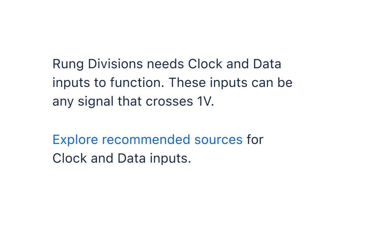
Before
Native HTML anchors do not show an icon for links that open in new windows.
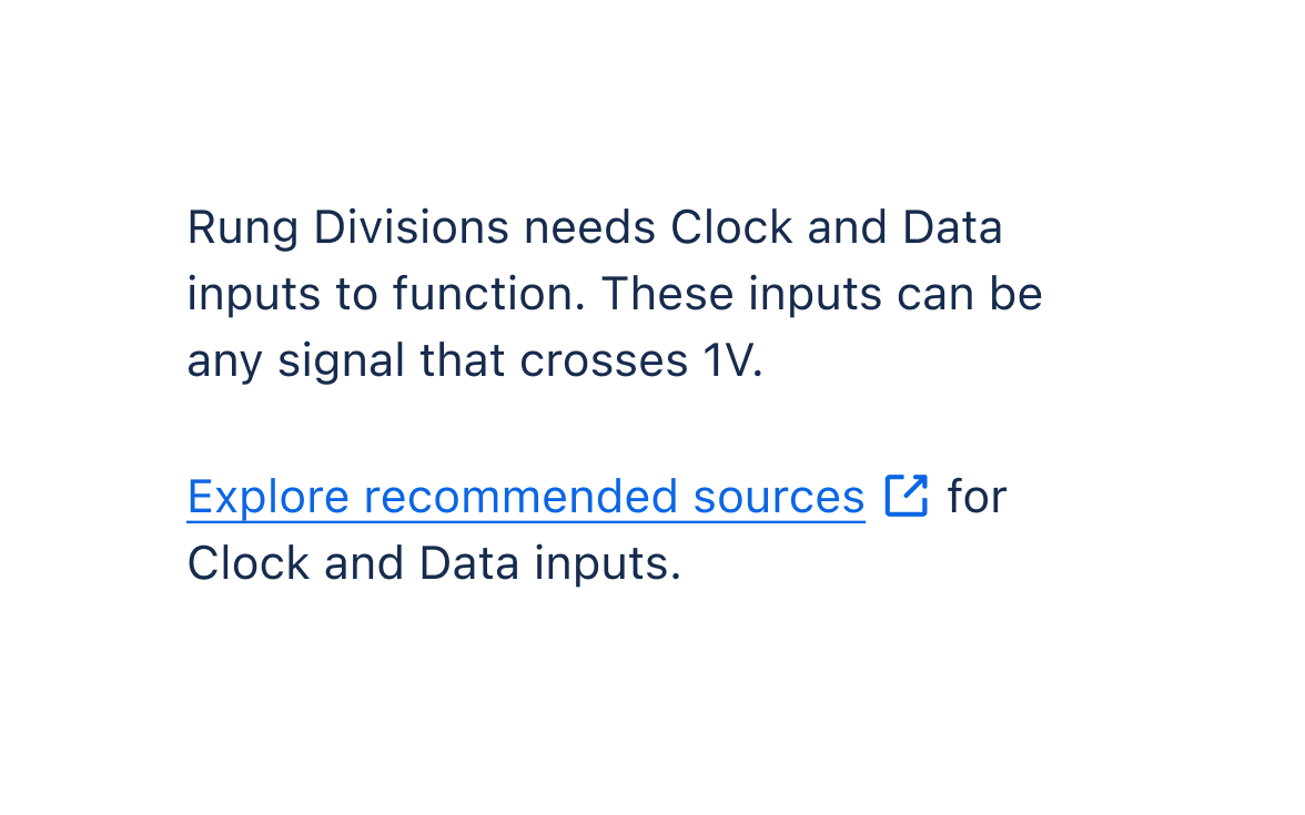
After
The link component shows an icon for links that open in new windows.
Visited links
The link component also supports visited links, which are styled differently to regular links. This would cause visual changes if your existing global link styles don't have visited link styles.

Before
Native HTML anchors may not have a different style.
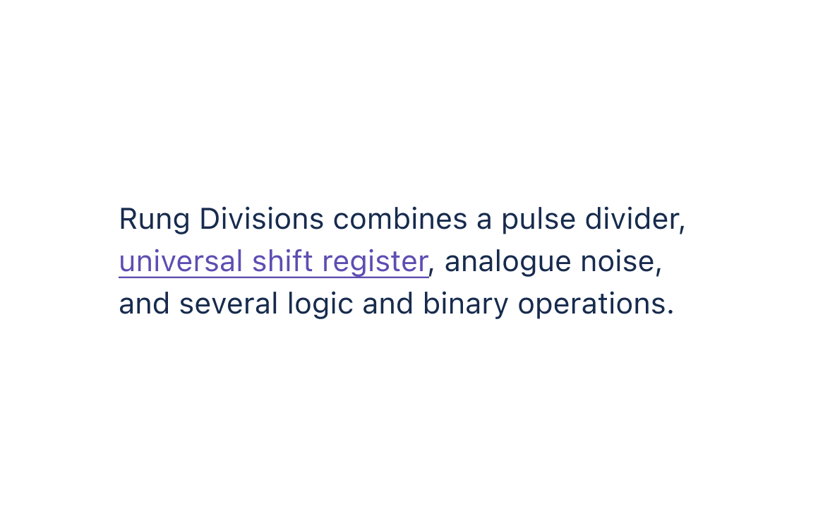
After
The link component has a different style for visited links.
DOM element changes
For links that open in new windows or tabs (using target="_blank"), the link component includes
visually hidden text "(opens new window)" for screen
reader users. This may affect unit tests that target the text content of links.