Tooltip
A tooltip briefly describes an interactive element on mouse hover or keyboard focus.Usage
Use tooltips to provide additional information about interactive elements. Tooltips appear as floating, non-interactive labels when users hover over or focus on an element using a mouse or keyboard.
Parts
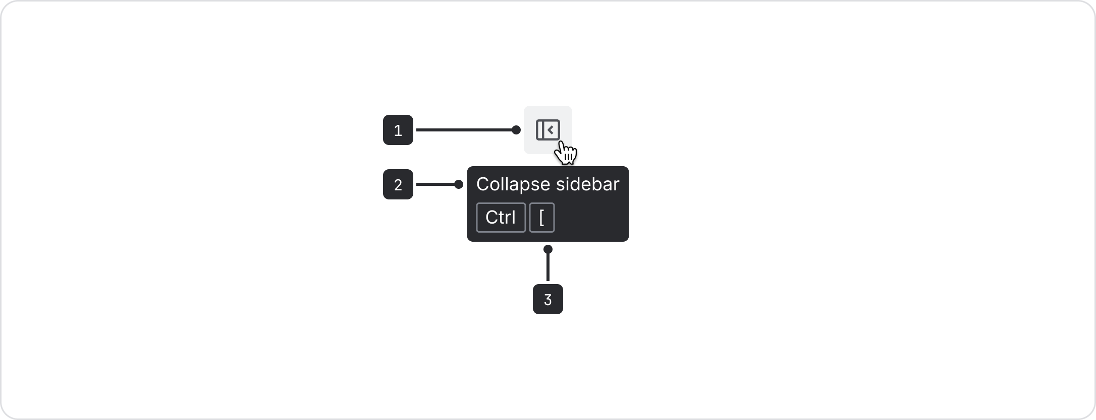
- Trigger: The interactive element which opens the tooltip on hover or keyboard focus.
- Content: The label or description of the interactive element (text only).
- Keyboard keys (optional): The keyboard shortcut of the mouse action.
Use tooltips to provide clear labels for icon buttons, so their purpose is easy to understand.
Tooltips are already built into icon button, (opens new window) and link icon button, (opens new window). Follow the content guidelines for these components when writing tooltip text.

Do
Use tooltips with icon buttons to display the button label.

Don’t
Don’t use tooltips on labeled buttons when the tooltip text is obvious or redundant.
Use tooltips to display useful, non-essential information
Tooltips should offer helpful information that supports the user experience by supplying extra details, context, or efficiency tips. The information should not be critical for understanding or completing a task.
Examples include keyboard shortcuts, concise explanations of icons buttons, and brief descriptions that clarify function.
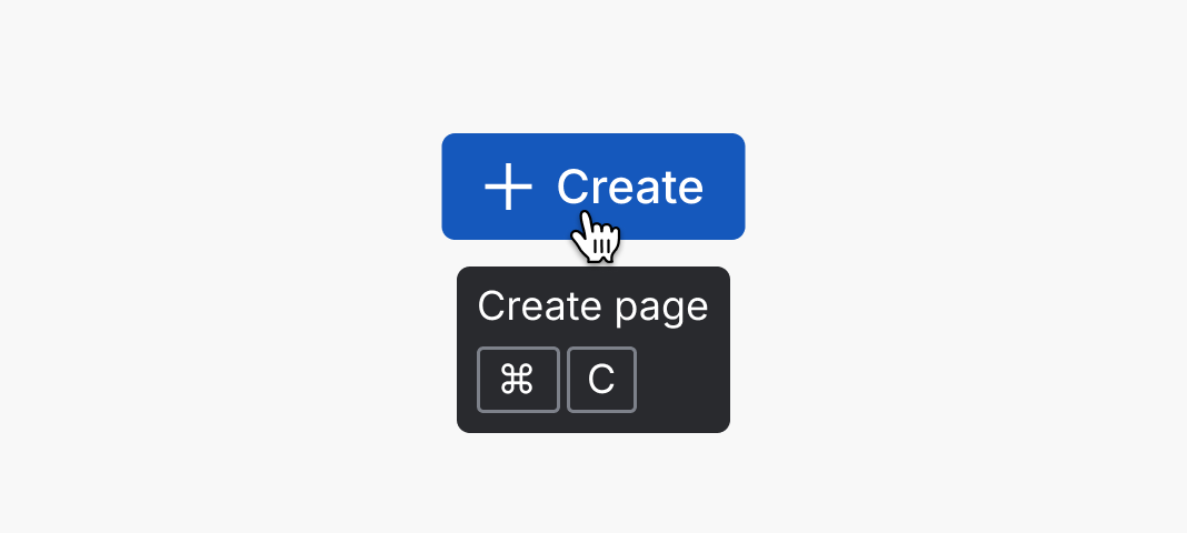
Do
Use tooltips to surface useful, non-critical information, such as keyboard shortcuts.
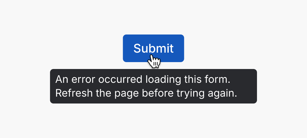
Don’t
Don’t put critical task information in a tooltip – show it directly in the interface instead.
Use tooltips to display truncated text
Truncating text should be avoided whenever possible. However, in cases where truncation is unavoidable, such as displaying user-generated content of unknown length, provide a tooltip so people can access the full text.
Important: Tooltip text itself should never truncate. Always write concise tooltip content that fits without truncation.
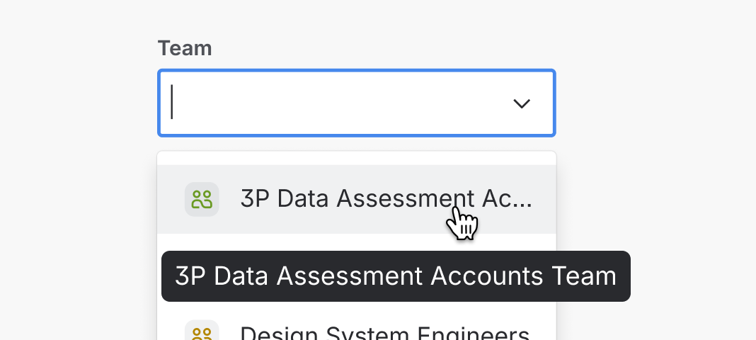
Do
If truncation cannot be avoided (for example, in user generated content), use tooltips to display the truncated text.
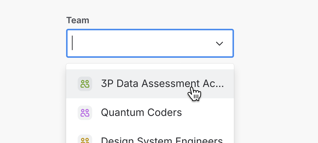
Don’t
Don’t truncate without providing a way for people to read the full text.
Accessibility
Only use tooltips on interactive elements
Use tooltips only on interactive elements so they’re accessible to everyone, including keyboard and assistive technology users. This ensures tooltips can be triggered by keyboard focus and read by screen readers.
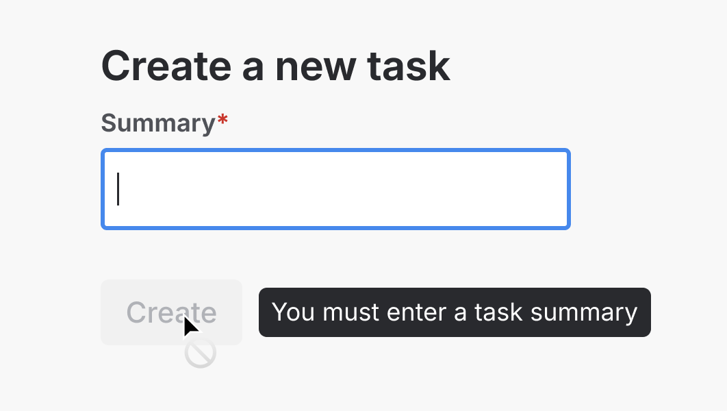
Never use tooltips with disabled elements because they are not interactive. Find more details in our button usage guidelines, (opens new window).
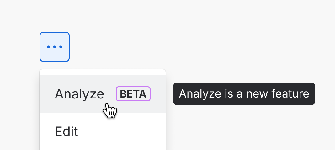
Do
Only use tooltips on interactive elements, such as buttons, links, and menu items.
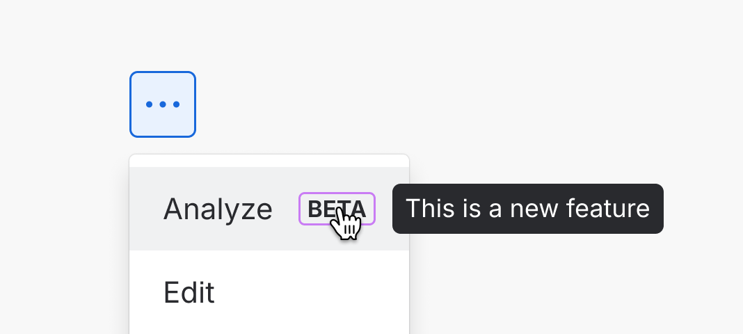
Don’t
Don’t use tooltips on elements that are not interactive, such as lozenges.
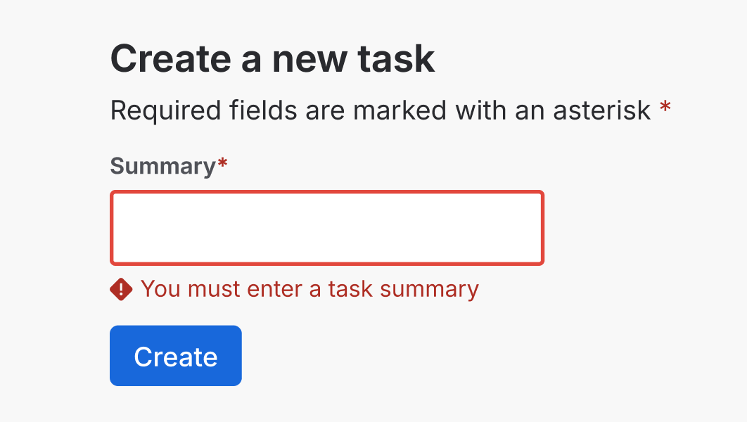
Do
Use validation or other on-screen directions to help people understand requirements.
Don’t
Never use tooltips on disabled buttons, as these are not interactive.
Don’t put critical information in tooltips
Critical information is anything a user needs to understand, make decisions, or complete a task. This information should always be visible on the interface and not hidden in a tooltip. Tooltips can reduce accessibility and are hard to discover, especially on devices without hover support.
Instead of tooltips, use labels, helper text, or error messaging, (opens new window) to present essential information. When space is limited, an inline message, (opens new window) offers a more accessible alternative.
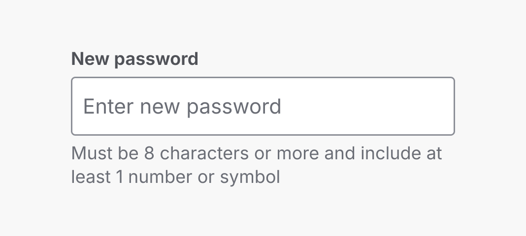
Do
Display critical information directly on the user interface so it remains visible at all times.
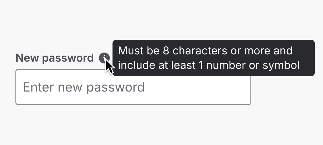
Don’t
Never put critical information in tooltips, as this can create accessibility barriers for different devices and users.
Don’t put interactive or visual elements in tooltips
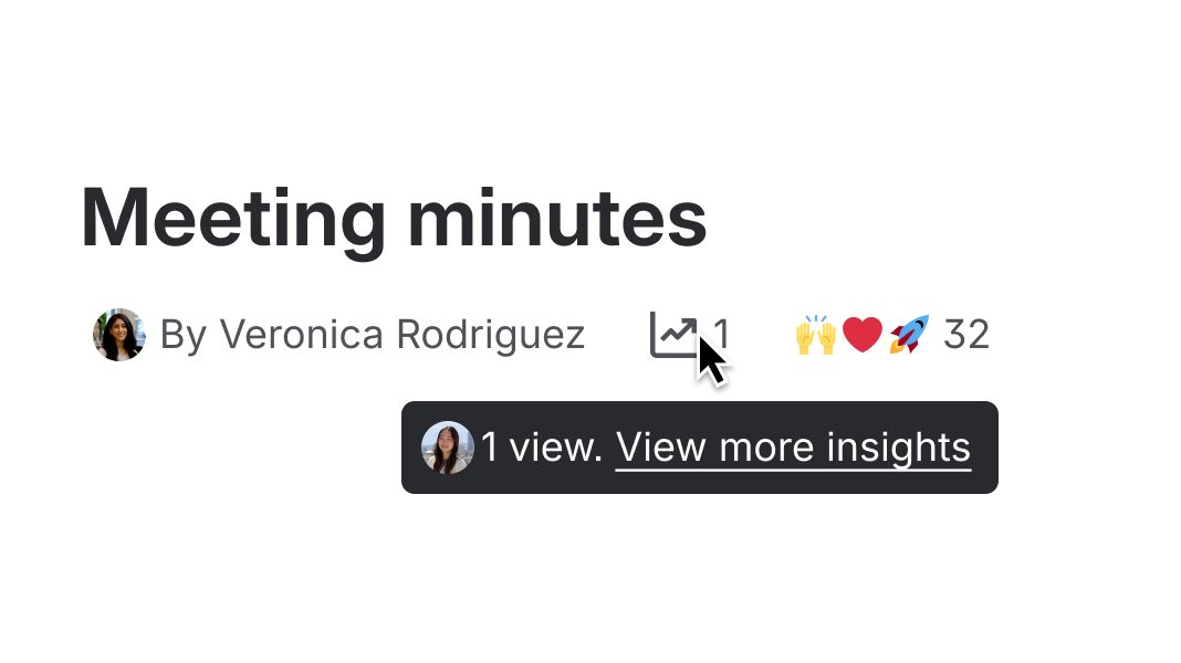
Never place interactive elements like links or buttons inside tooltips. Tooltips are not accessible via keyboard navigation, so users cannot tab into or interact with these elements, making them inaccessible.
Similarly, visual elements like icons or images should be avoided as they can introduce clutter, hurt performance, obscure content, and increase cognitive load. Tooltips are meant to provide quick, concise clarification.
Use a popup, (opens new window) or modal dialog, (opens new window) to display interactive and visual elements instead.
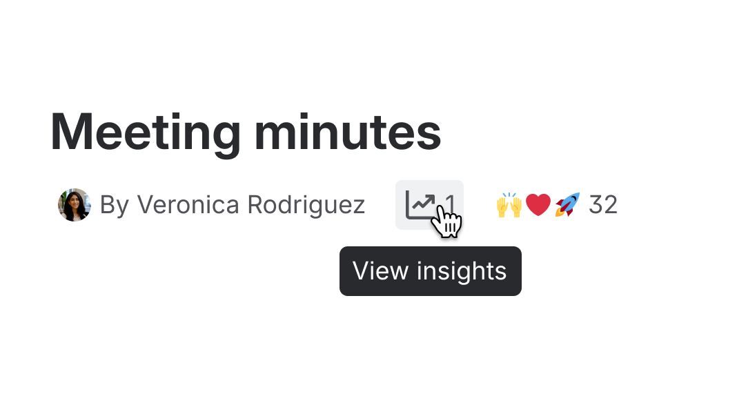
Do
Write short and simple tooltip copy.
Don’t
Never put interactive components or images into tooltips.
Don’t rely on tooltips alone for keyboard shortcuts
Keyboard shortcuts in tooltips are hidden from assistive technologies in order to:
- avoid overwhelming users with extra announcements
- prevent shortcut characters from being read incorrectly (are dependent on assistive technologies verbosity settings).
Because of these limitations, shortcuts shown only in tooltips aren’t accessible to everyone. Always provide alternative ways for people to access keyboard shortcuts, for example in a panel or dialog, so they’re easy to discover and use, no matter how someone navigates.
Content guidelines
- Keep it concise: Tooltips should contain only short and clear text that quickly clarifies or adds value.
- Avoid repetition: Don’t repeat information already visible in a label. If you cannot provide helpful information, don't use a tooltip.
For tooltips on icon button, (opens new window) and link icon button, (opens new window), follow the specific content guidelines provided for those components.
Data Center apps
For all new features, we recommend using Atlassian Design System and other Atlaskit components, (opens new window). For existing code, you can continue to use Atlassian User Interface (AUI), (opens new window).
- Use an inline message, (opens new window) when you need to display richer or longer information.
- Use a popup, (opens new window) or modal dialog, (opens new window) when you want to include interactive elements, such as links or buttons, in the information.