Tabs
Tabs are used to organize content by grouping similar information on the same page.Neutral selected states
When the platform-dst-tokens-finesse feature flag is enabled, this component uses the new neutral treatment for selected states.
Usage
Tabs are an easy way to organize content by grouping similar information on the same page. People can view the content without having to navigate away from that page.
Parts
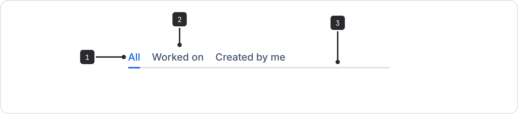
- Selected: The active tab is blue and underlined.
- Unselected: The other available tabs have text that is lighter.
- Divider: A light visual line separates the tab navigation and content.
Accessibility
- Keyboard users can navigate between tabs using the left and right arrow keys. The tab key is used to navigate to the tab content, not to the next tab. This is so that people who use screen readers don't have to tab through all of the tabs to read the content.
- Surface important information outside of tabs, and keep the number of tabs low wherever possible in order to increase the visibility of content.
- Avoid complex nesting of interactive controls such as dropdowns and buttons in order to increase information visibility and ease navigation.
Best practices
Use tabs when you have concise content or content that users need to access regularly.

Do
Use tabs for a short list, or any list of content to group that customers use regularly.

Don’t
Don’t use tabs for a long list of content that isn’t used regularly by customers or when space is limited.
Hierarchy
Maintain content hierarchy within the UI when using tabs, ensuring common information is surfaced in the right places and information is prioritized appropriately.
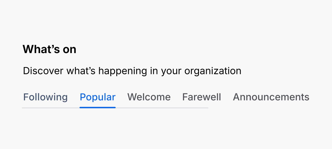
Do
Use headings or information related to all tabs above the tab line.
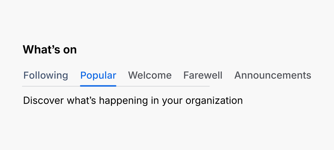
Don’t
Don’t use information that applies to all tabs underneath the tab line.

Do
Use tabs to switch between views within the same context.

Don’t
Don’t use tabs to navigate to different pages, or states.
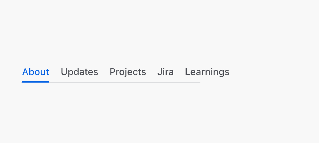
Do
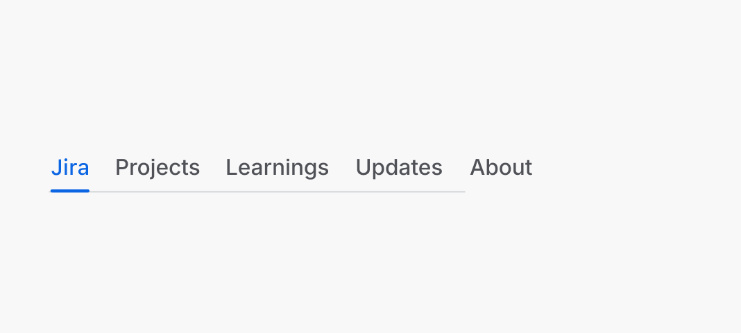
Prioritize tabs by importance or most frequently used.
Don’t
Don’t make important tabs less visible.
Apply motion to custom tabs
Prefer ADS Tabs or its custom tab composition to inherit motion. For an independent implementation,
use motion.tab for text color and hover underline fades, and motion.tab.indicator.* for
directional selected underline animations. Respect reduced-motion preferences.
Grouping
Arrange content in a consistent and effective way with logical and distinct groupings.

Do
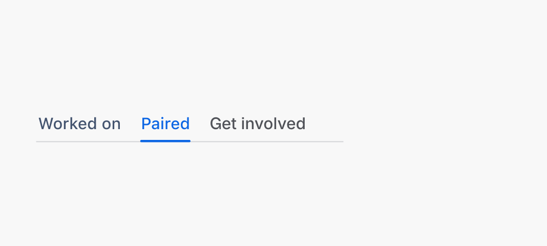
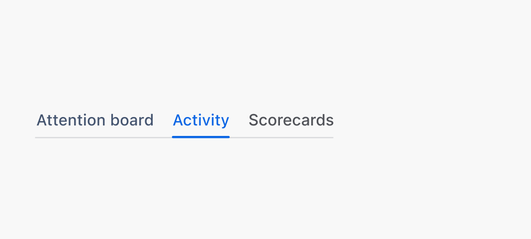
Use tabs to logically group information.
Don’t
Don’t use tabs to group indistinct information.
Do
Use tabs to manage independent data that users don’t need to see simultaneously.
Don’t
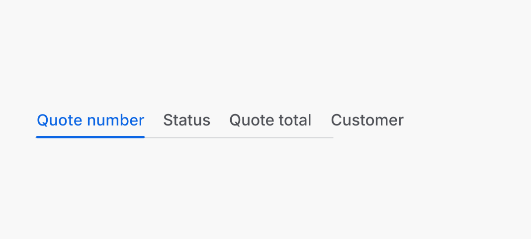
Don’t use tabs to separate information that users need at the same time, such as filtering data within a single table.
Content guidelines
Tab labels provide clear and concise explanations of the content within. When using tabs, make sure that the content is broken down into categories that make sense and don't overlap.
For example, in a series of instructions about setting up a mobile app, you could use "for iOS", and "for Android" tabs, but not "Part 1" and "Part 2" tabs.

Do
Write clear and concise tab labels (usually 1-2 words).

Don’t
Don't write vague and long tab labels which are too complex to understand at a glance.
Behavior
Tab behavior during default, focus, hover, and active states are important because it lets people know where they are in the experience.
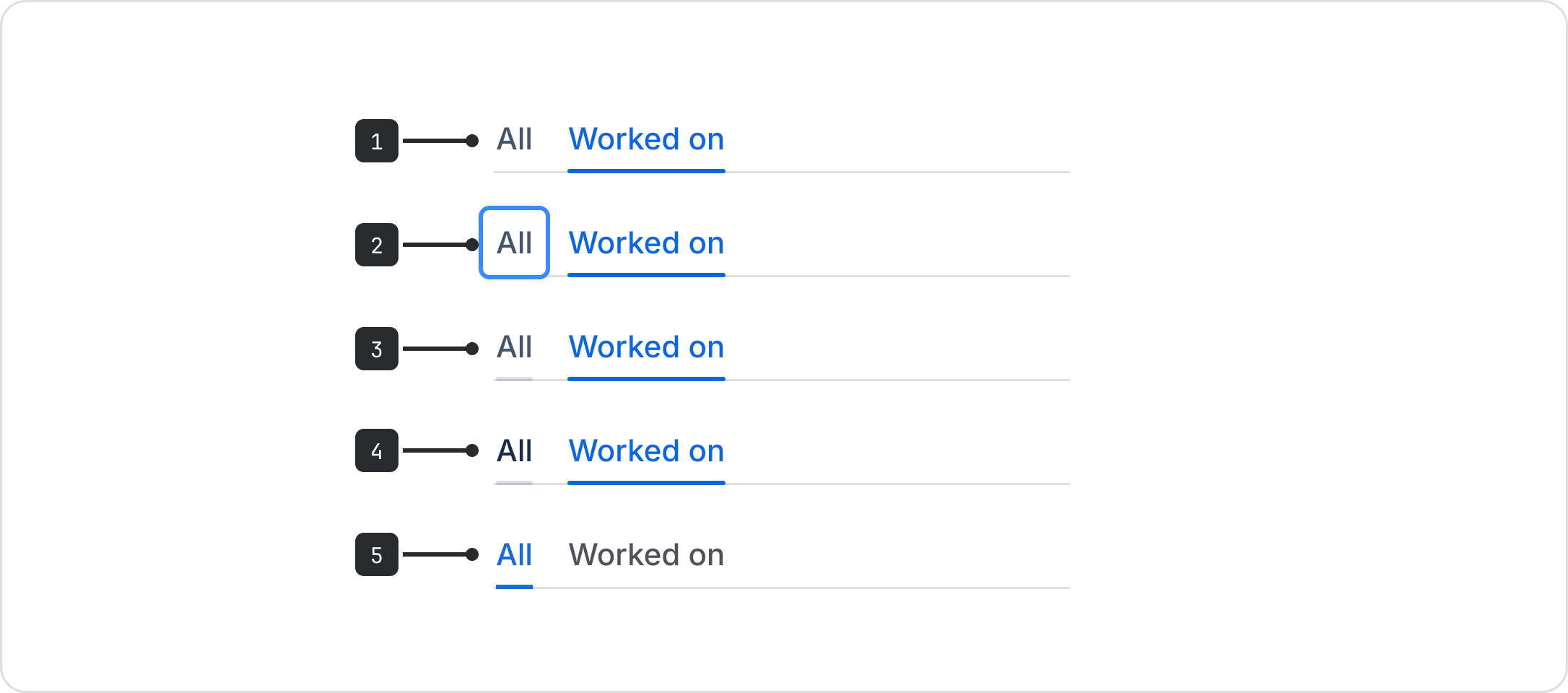
- Default: The standard view.
- Focus: Keyboard focus on a tab.
- Hover: Hovering over a tab.
- Press: Pressing a tab.
- Selected: Indicates the tab that the user is viewing.
Data Center apps
For all new features, we recommend using Atlassian Design System and other Atlaskit components, (opens new window). For existing code, you can continue to use Atlassian User Interface (AUI), (opens new window).
- Use tooltips to let people know what happens when the tab is selected.