Spotlight
A spotlight introduces users to points of interest, from focused messages to multi-step tours.Usage
Use a spotlight to bring attention to a specific part of the UI, such as a button or icon, to educate users about key features or workflows.
Spotlights are most effective for onboarding new users, driving feature discovery, or highlighting important changes. Use them sparingly. If your UI needs frequent spotlights, consider simplifying the core experience instead.
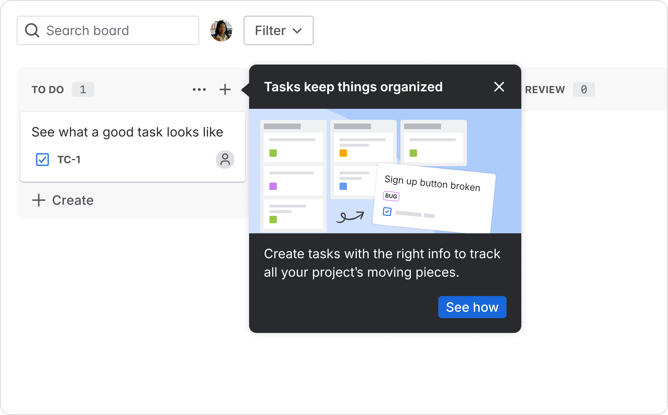
Single-step spotlight
The ideal spotlight experience is lightweight and a single-step. Always try to limit your experience to one spotlight to prevent information overload for the user.
Multi-step tour
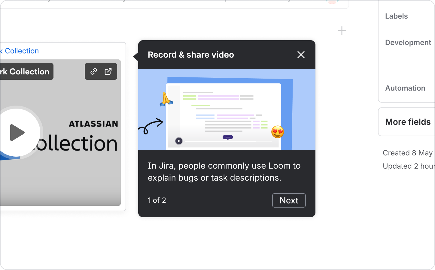
A tour is a series of spotlights that point to multiple areas of the UI.
Ensure your tour:
- has a maximum of three steps
- is logically sequenced
- is limited to one screen
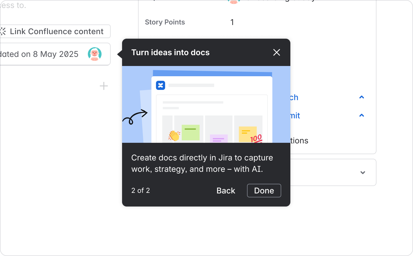
- includes a “Back” call-to-action (CTA) after the initial spotlight
- displays a step count
In a tour, the initial spotlight references step count and clear next action
Advancing to the next step introduces a Back button
Tour use
Tours should be used sparingly. Before designing a tour, assess if you can combine or eliminate steps to keep the experience as lightweight as possible, as seen below.
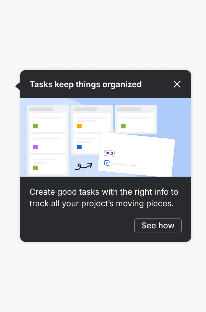
Do
Keep things lightweight. Aim for one step with active and concise messaging.
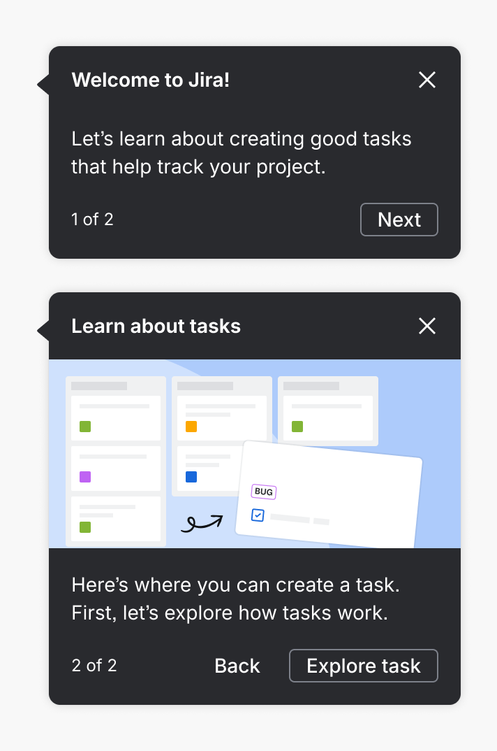
Don’t
Avoid tours unless the steps are crucial. Consolidate information first.
Triggered spotlights
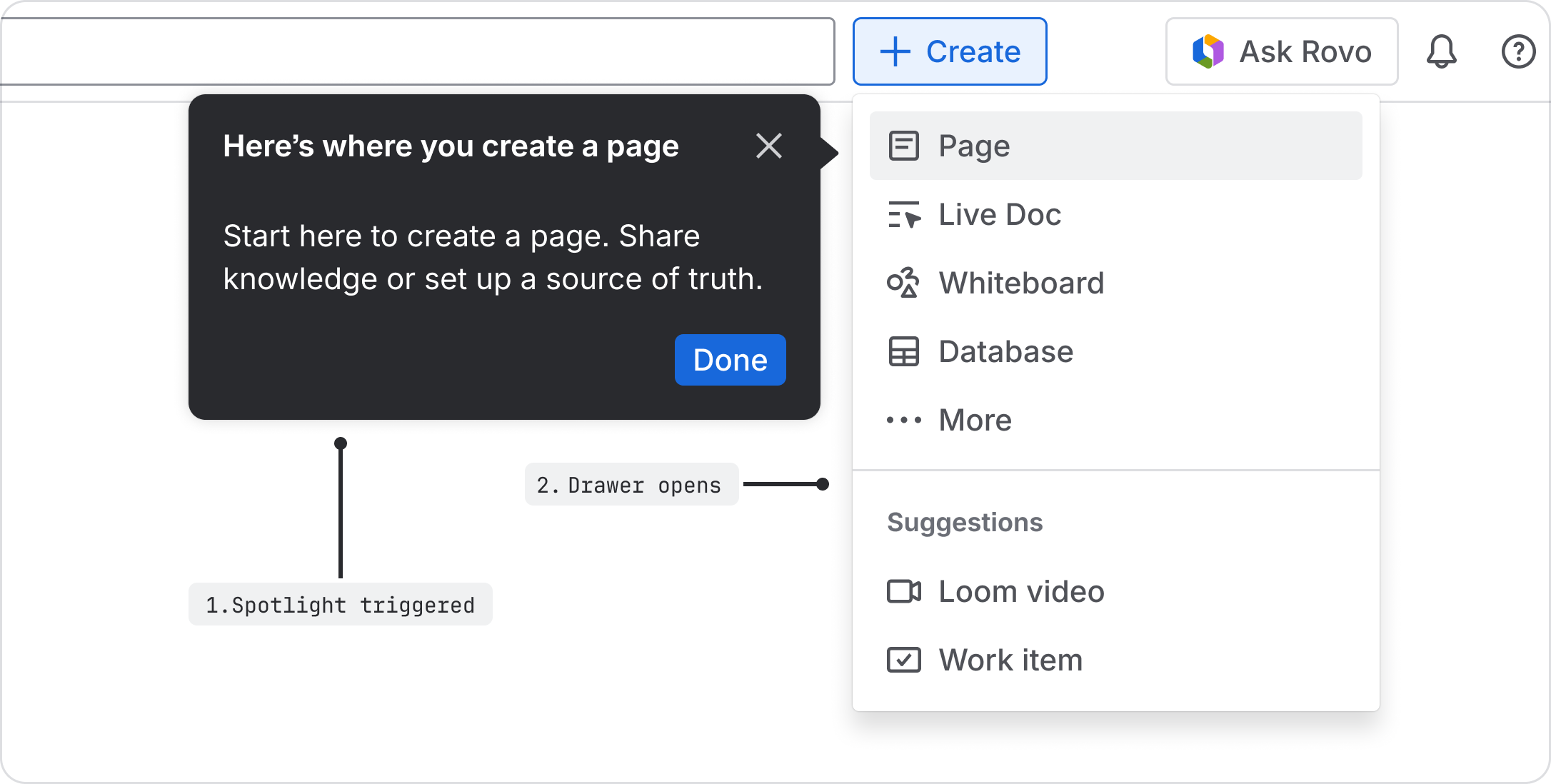
Spotlights can activate UI if triggered by another component. Although they are a second step in an experience, they should not use a step count or “Back” CTA.
In this example, a banner triggers a spotlight that opens a dropdown
Spotlight use cases
Onboarding
Guide first-time users to essential features and workflows.
Feature discovery
Help existing users learn about new or updated capabilities.
Cross-flow, cross-join, and co-use
Trigger a spotlight from another component to elaborate on the message. For example, a flag with a “Show me” CTA triggers a spotlight to demonstrate the feature in context. Triggered spotlights can also activate UI.
Principles of use
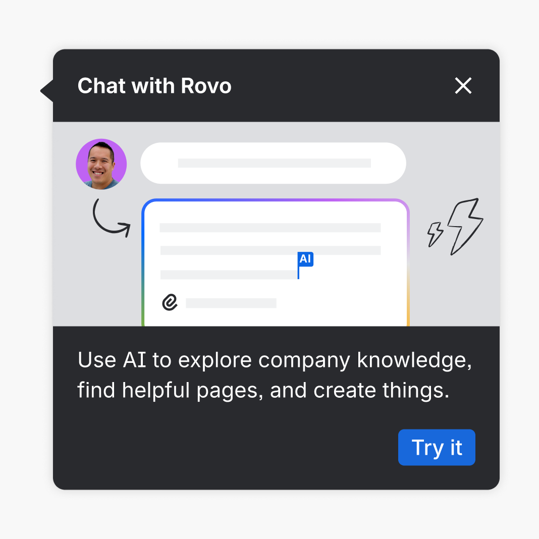
Do
Use spotlights to educate users or introduce them to something new.
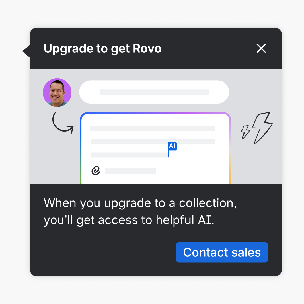
Don’t
Use spotlights for upsells or other transactional messaging.
Parts
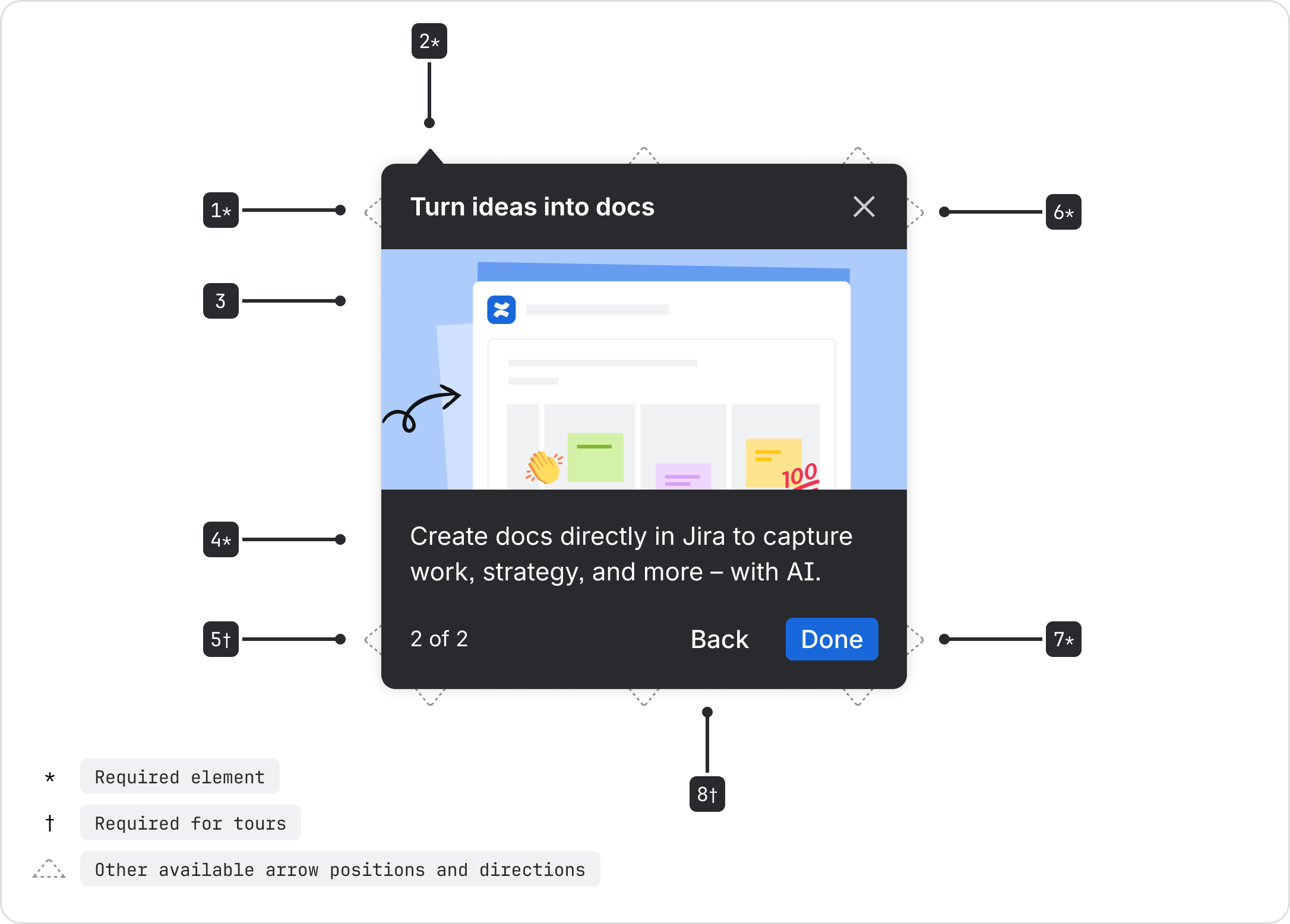
| Name | Usage | Description |
|---|---|---|
Headline | required |
|
Arrow | required | Points to the referenced UI element.
|
Media | optional |
|
Body | required |
|
StepCount | required | Only used in tours and is required to guide the user |
Dismiss | required | Included dismissal at the upper right |
PrimaryCTA | required | See content guidelines for appropriate usage |
SecondaryCTA | required | Required in tours for “Back” navigation to previous spotlight |
Visual guidelines
Media
Media should only be used to make messaging clearer for more complex features. For simple experiences, stick to text to avoid distracting the user.
The cognitive load necessary for comprehension should determine the level of complexity.
Low complexity
Low cognitive load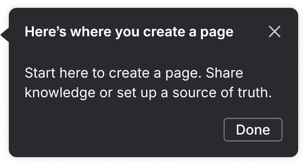
Medium complexity
Moderate cognitive load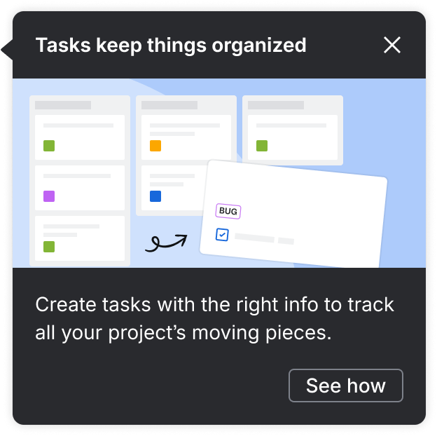
High complexity
High cognitive load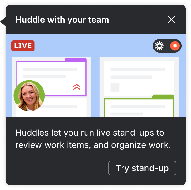
Color application
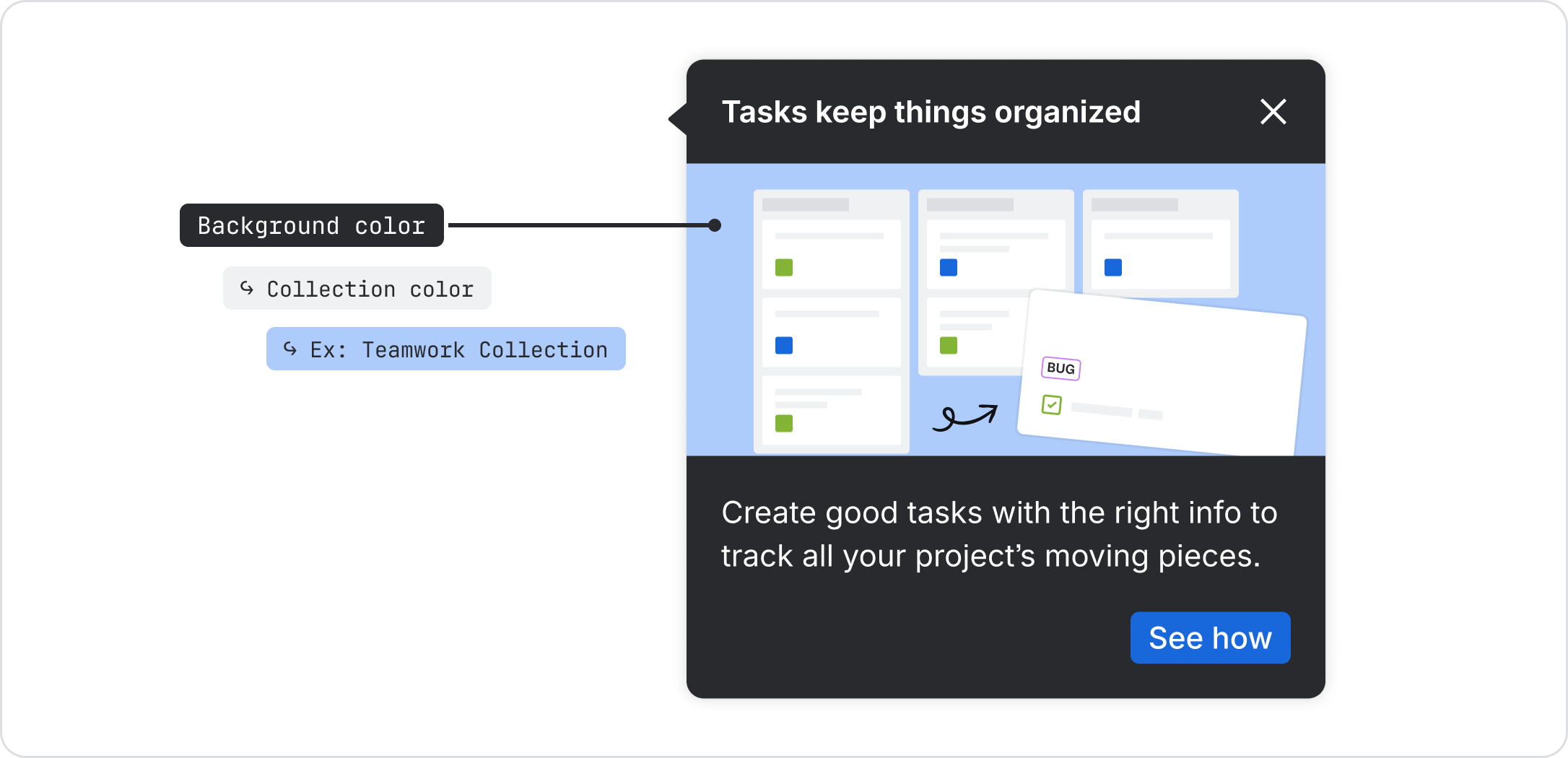
- Use solid color for the background color to drive focus to the main UI elements
- Incorporate the collection color into background color to further strengthen the color association to the collection (see colors below)
- Start with the color designated for each collection, then evenly distribute other brand colors to the UI elements
- Limit the use to no more than three different colors in a single composition
- Different shades can be used to create contrast and spatial depth in the UI illustrations, but avoid using too many shades within one composition
Collection background colors
Platform Collection
- Apps: Home, Teams, Goals, Projects
- Background color: color/background/accent/gray/subtler/default
Teamwork Collection
- Apps: Jira, Confluence, Loom
- Background color: color/background/accent/blue/subtlest/pressed
Software Collection
- Apps: Rovo Dev, DX, Pipelines, Bitbucket, Compass
- Background color: color/background/accent/lime/subtler/hovered
Strategy Collection
- Apps: Focus, Talent, Align
- Background color: color/background/accent/orange/subtler/pressed
Service Collection
- Apps: Jira Service Management, Customer Service Management, Assets
- Background color: color/background/accent/orange/subtlest/pressed
Content guidelines
A successful spotlight can be understood in just a few seconds. Spotlight content should be as concise as possible, easy to scan, and only communicate essential information.
Messaging guidelines
- Prioritize the most relevant information and if more context is needed, find a way to provide a path to further learning
- Don’t talk about things the user cannot see at that time
Headline
- 27 characters max
- Start with an active verb
- Clearly communicate intent
- Focus on benefits rather than announcements
- Personalize with words such as, “your” where it is relevant
Body copy
- 75 characters max
- Brief and direct
- Elaborate value
- 24 characters max for single-step
- 15 characters max for tour
- Provide an obvious next action
- If used for dismissal, use “Done”
- Let them know where they’re going next when navigating to another screen “Go to Jira”
- Be explicit when activating UI components “Chat with Rovo” opens the Rovo panel
- Use “Learn more” when navigating to more detailed information
- For tours: start with “Next” and conclude the flow with “Done”
Secondary CTA
- Reserved for “Back” navigation in tours
Accessibility
- The headline is used as the accessible name for the spotlight dialog
- Keep content concise and avoid motion that could be disruptive
- Ensure the arrow and spotlight are not truncated by the browser bounds
Focus management
For a single-step spotlight or the first in a multi-step tour, tabbing begins after the targeted element so the user is aware of what the spotlight is referring to. It follows a normal tabbing order, automatically starting with the "X" dismissal on the top right, even if a "…" show more is included ahead of it.
Unless the first spotlight is dismissed with the "X," in a multi-step tour the second and third spotlights grab focus to continue the messaging narrative then return to the targeted element once complete so the user can perform the intended action.