Progress tracker
A progress tracker displays the steps and progress through a journey.Usage
Use a progress tracker to guide people through steps or actions across multiple screens, in order to complete a task. The progress tracker must have three or more steps.
The tracker shows people what stage they are in a process. They can navigate through the process by selecting one of the steps.
Parts
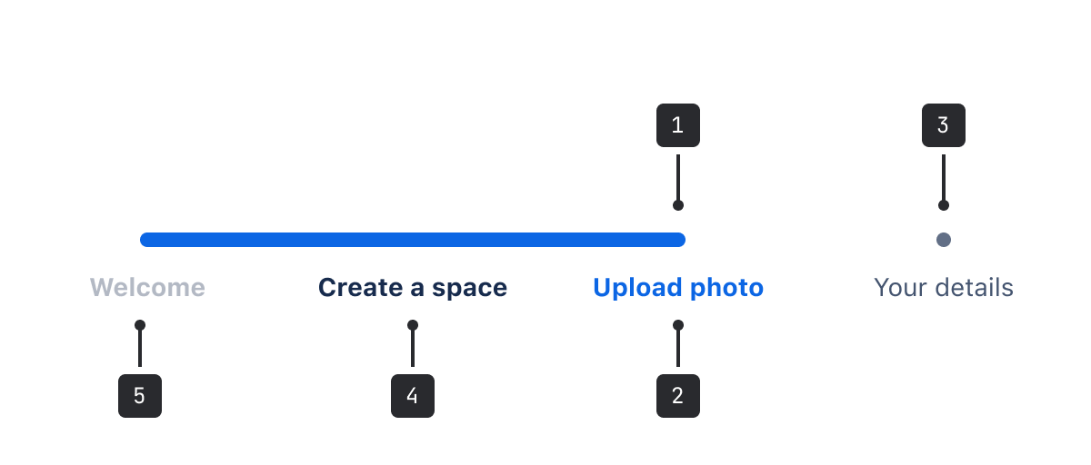
- Progress bar: A filled horizontal bar that shows people their progress and the number of steps required to complete the task.
- Current step: The current step in the progress aligns with the color fill and has colored text.
- Unvisited: Shows steps that haven't been visited yet. The step and label are more subtle to indicate this.
- Visited: Steps that have already been visited are higher contrast and have clickable links, so that people can navigate back to them.
- Disabled: A grayed-out label indicates a step that people can't revisit.
Best practices
- If a task needs more than six steps, consider simplifying the process or breaking it up into multiple tasks
- If there are less than three steps, consider using a button labelled "Next"
Content guidelines
Use labels that clearly indicate the purpose of the step. When writing, keep options to a single line of text, be short and concise (1-2 words), and follow the writing guidelines.
When labeling each step, identify the general theme of each step so that if details in the process change, the label still makes sense.
For example, in a checkout process people may or may not need to enter their shipping details, depending on whether the purchase is of a digital item or a physical item, but must always enter payment details. Calling this step "Your details” allows it to either be connected to the payment and shipping details screen, or just the payment screen.

Data Center apps
For all new features, we recommend using Atlassian Design System and other Atlaskit components, (opens new window). For existing code, you can continue to use Atlassian User Interface (AUI), (opens new window).
- Use a progress indicator for a simpler experience that also shows people where they are in a journey.