Progress bar
A progress bar communicates the status of a system process.Usage
A progress bar shows the duration of a system process, such as saving or processing changes, uploading and downloading files, and loading or updating an application.
Use a progress bar when the process is complex or has a long wait time, and you can determine the percentage of the process that has been completed.
For short loading times, use a spinner instead.
Parts

- Progress line: Progress is visually represented by a filled line. It can be partially filled, complete, or indeterminate (partial completion of an unknown amount).
- Progress bar container: This determines the length of the bar within the available screen space.
Accessibility
Provide clear labels and messaging
Always provide a clear ariaLabel that describes the current state of the progress bar. For
example, "5 of 10 files uploaded", not "Files uploading".
Wherever possible, also include this text as visual helper text. This lets people know what sub-processes are taking place.
Use a clear success state when the actions required to continue have been fulfilled.
Don't use progress bars for data visualization
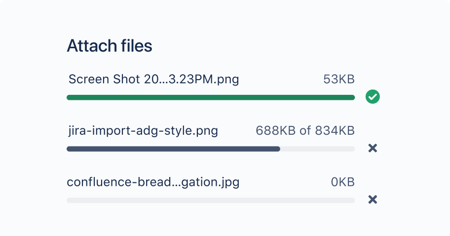
Do
Use the progress bar component as a loading indicator or to communicate the status of a system process.
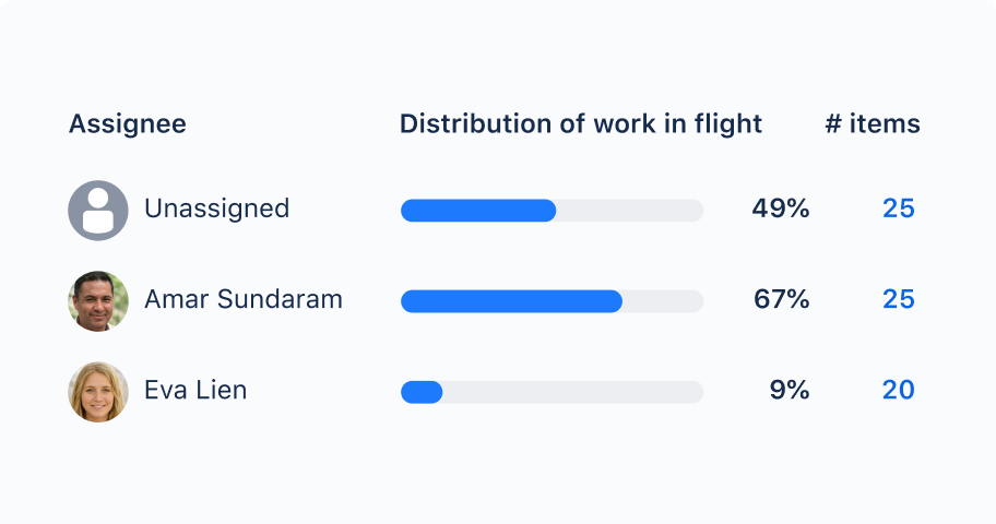
Don’t
Don't use the progress bar for data visualization. Use a custom component instead.
- For most loading use cases, choose a spinner component.
- For guidelines on applying color to custom components for data visualization, see data visualization color.