Pressable
A pressable is a primitive for building custom buttons.Usage
Use pressable to make custom-styled buttons and other pressable elements. Pressable works similarly
to an HTML <button>, but with Atlassian focus styles, analytics events, and styling APIs built in.
For example, you could use pressable to make a colored square button that opens a color picker, or a basic card that shows more details when selected.
Parts
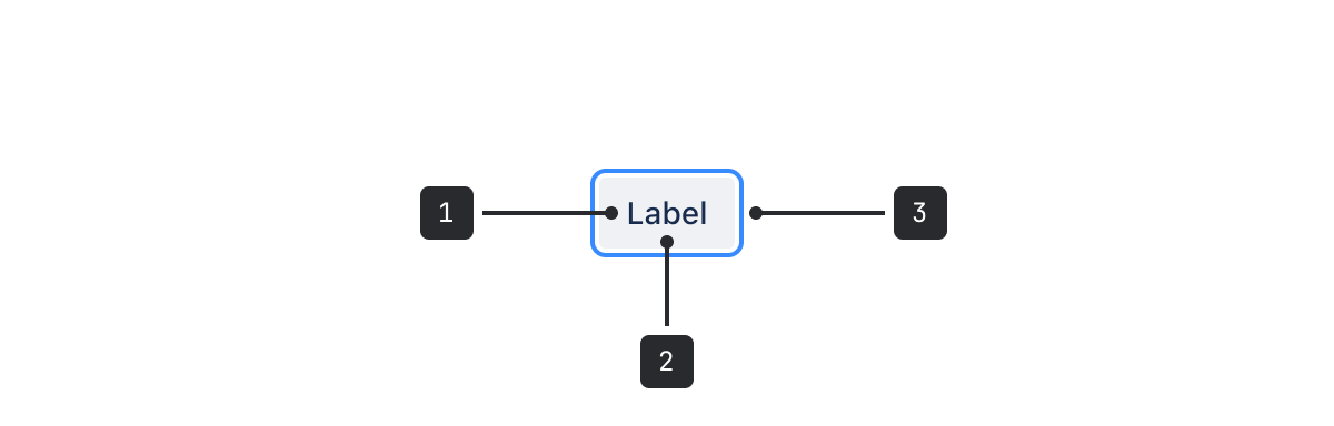
- Pressable area: For accessibility this should be a minimum of 24 by 24 pixels, unless exempt from Target Size (Minimum) (Level AA), (opens new window).
- Focus ring: This is included in pressable and appears on keyboard focus.
- Accessible label: Pressable should always include a clear label for accessibility. Use this to communicate the action that occurs when the button is pressed.
Only use pressable when existing components such as buttons or menus can't be customized to fit your case.
Using existing components with safe customizations is usually faster and keeps Atlassian UI more visually consistent as things change.

Do
Use pressable to create buttons when there isn't an existing design system component to achieve your use case.

Don’t
Don't use pressable to redesign elements that already exists in the Atlassian design system, such as buttons. This can cause visual and behavioral inconsistency in apps.
Accessibility
Use clear labels for assistive technology
Pressable elements should always announce what action will happen once pressed, especially for elements with no visible label, such as icon buttons.
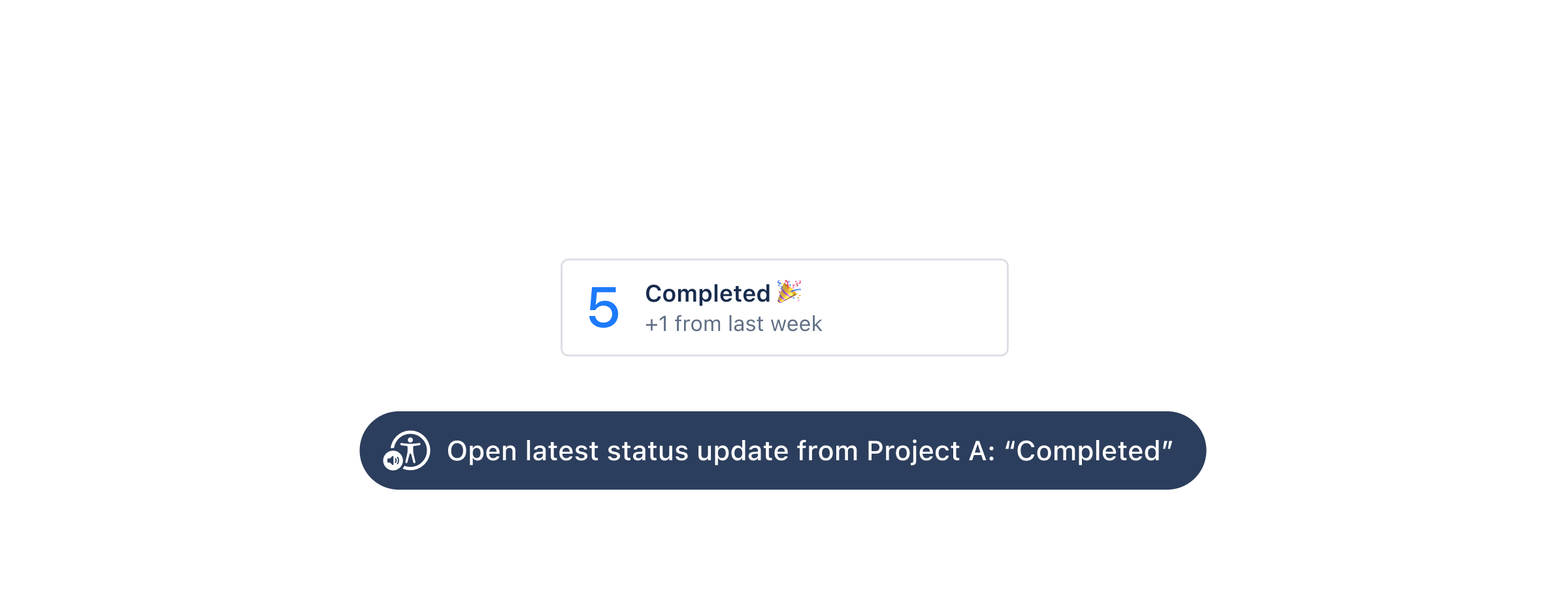
Use the visually hidden component to provide an accessible
label. This will render hidden text inside the button, which is preferable over the aria-label
attribute because not all screen readers translate this between languages.
Also consider a tooltip to provide sighted users with the same information.
Focus ring behavior
Pressable buttons are available in focus order, and include a visual ring to clarify what is in focus by default. Adding additional focus styles is unnecessary.
Disabled buttons can cause accessibility problems. Avoid disabling buttons and follow our disabled button and tooltip guidance.
Best practices
Make it clear what can be pressed
Custom buttons should look interactive. Make sure clickable elements are clearly identifiable through styles, surrounding context, labels, and other cues.
Apply motion to Pressable
Pressable has no motion by default because it can be used to build a variety of button-like interactive elements.
If a custom control looks and acts like a button, apply button motion tokens to background-color changes:
- Use
motion.button.hoveredfor the default and hover transition. - Use
motion.button.pressedfor the pressed state. - Apply these tokens only to background-color transitions.
If it does not look and act like a button, use the appropriate semantic motion tokens where available. If no semantic motion token exists, build custom motion using base tokens. For example, as a card looks and behaves differently to a button and has no semantic motion token, build custom motion using base tokens.
Use the ADS Button component whenever it supports the customisation you need. It includes button motion by default.
Apply motion to Pressable list items
Pressable has no motion by default. If a custom control looks and acts like a list item, apply list-item motion tokens to the properties that change between interaction states.
List-item motion is intended for series of interactive items placed close together, such as side-navigation links and menu items. Because users may move across these items quickly, use short, snappy transitions to keep the interface responsive.
- Use
motion.listitem.hoveredfor normal and hover states (50ms). - Use
motion.listitem.pressedfor the pressed (:active) state (100ms). - Use
motion.listitem.selectedfor the selected (data-selected) state (100ms). - Use
motion.listitem.hoveredfor selected hover andmotion.listitem.pressedfor selected active.
Choose the motion family based on how the custom control looks and acts: use button motion for buttons, list-item motion for list items, and base motion tokens when neither semantic category applies. Do not animate focus indicators; focus feedback should appear immediately.
Pressable is meant for on-page actions such as opening modals or submitting forms. If you're making
something that navigates to a new page, use a component that renders a semantically correct HTML
<a> element such as:
Also, don't add underlines to a pressable. This makes the button appear to be a link, which can be confusing for users who assume they can perform actions specific to links, such as opening links in new windows.
Content guidelines
Use sentence case capitalization
Use sentence case capitalization, only capitalizing the first letter of the label and any proper
nouns. Other forms of capitalization should be only applied through styling with text-transform.
Make sure labels are concise, active, and clear about what pressing the button does.
For example, Change issue color to yellow instead of yellow.
Follow other label and UI content guidance
Follow label and content guidelines for buttons. Review the general UI text guidance for specific questions.
- Use existing components such as buttons or menus for most actions in Atlassian apps.
- Use the anchor primitive for custom links.