Primitives
Primitives are components that create layouts, add styling, make up other components.Installation
| Install | yarn add @atlaskit/primitives |
|---|---|
| Source | Bitbucket.org, (opens new window) |
| npm | @atlaskit/primitives, (opens new window) |
| Bundle | unpkg.com, (opens new window) |
Primitives are a new type of component for layouts, styling, and the placement of elements. They act as building blocks to compose different parts of the user experience, from the smallest design decisions (for example, the spacing around an icon) to larger layout decisions (for example, how a page is structured).
Primitives are powered by design tokens and make it easier to apply design decisions. This reduces cognitive overhead, improves productivity and prevents accidents or mistakes.
Available primitives
Primitives are used together to compose complex designs not otherwise implemented directly in the Design System. Currently, three layout primitive components are available:
Additional layouts not well-expressed by these core primitives can also be composed using:
Interactive primitives can be used to build:
Installation
To install primitive components, add @atlaskit/primitives as a dependency on your project:
$ yarn add @atlaskit/primitivesUsing primitives
Use primitives for composing layouts. Primitives are not currently available in Figma, so the first step in implementing primitive components is identifying where they might fit in a given design. This involves breaking down a design into its core layout components to as granular level as is useful.
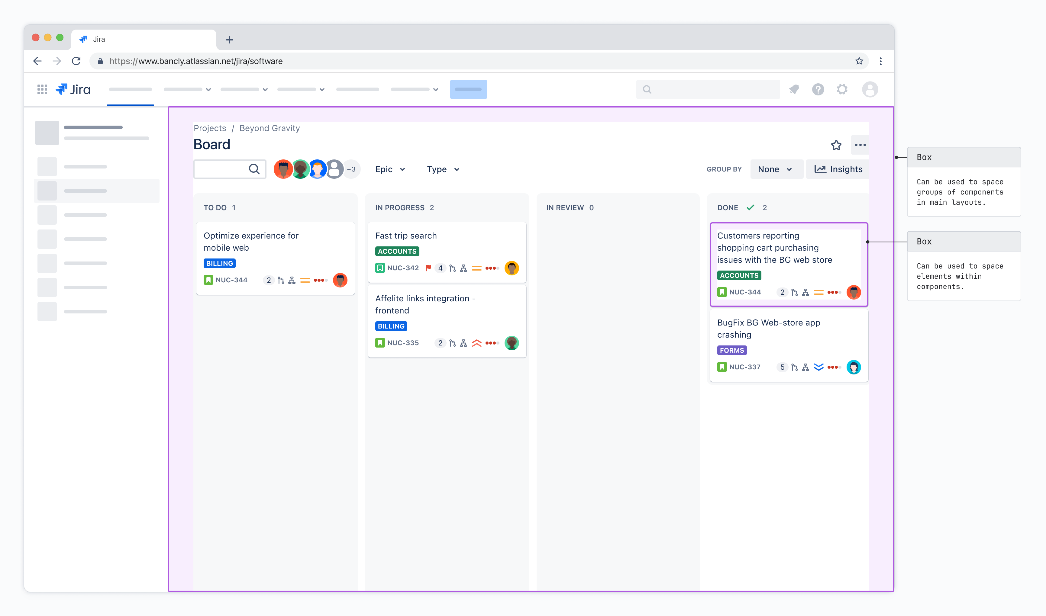
You might like to think first about breaking down a page into Box containers, identifying larger
pieces of a design that function in a similar manner or fulfill a singular purpose in a layout and
grouping them together under a Box.
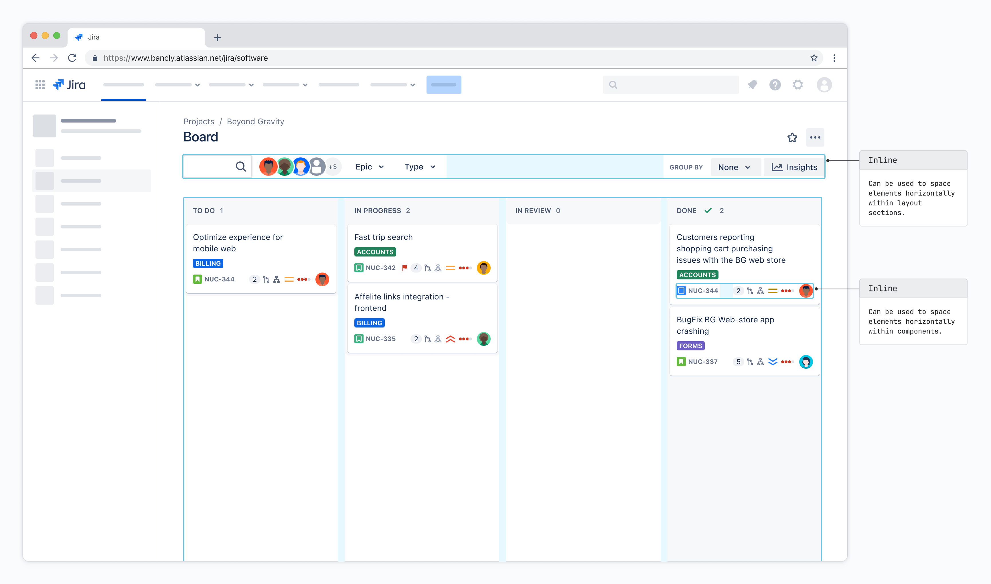
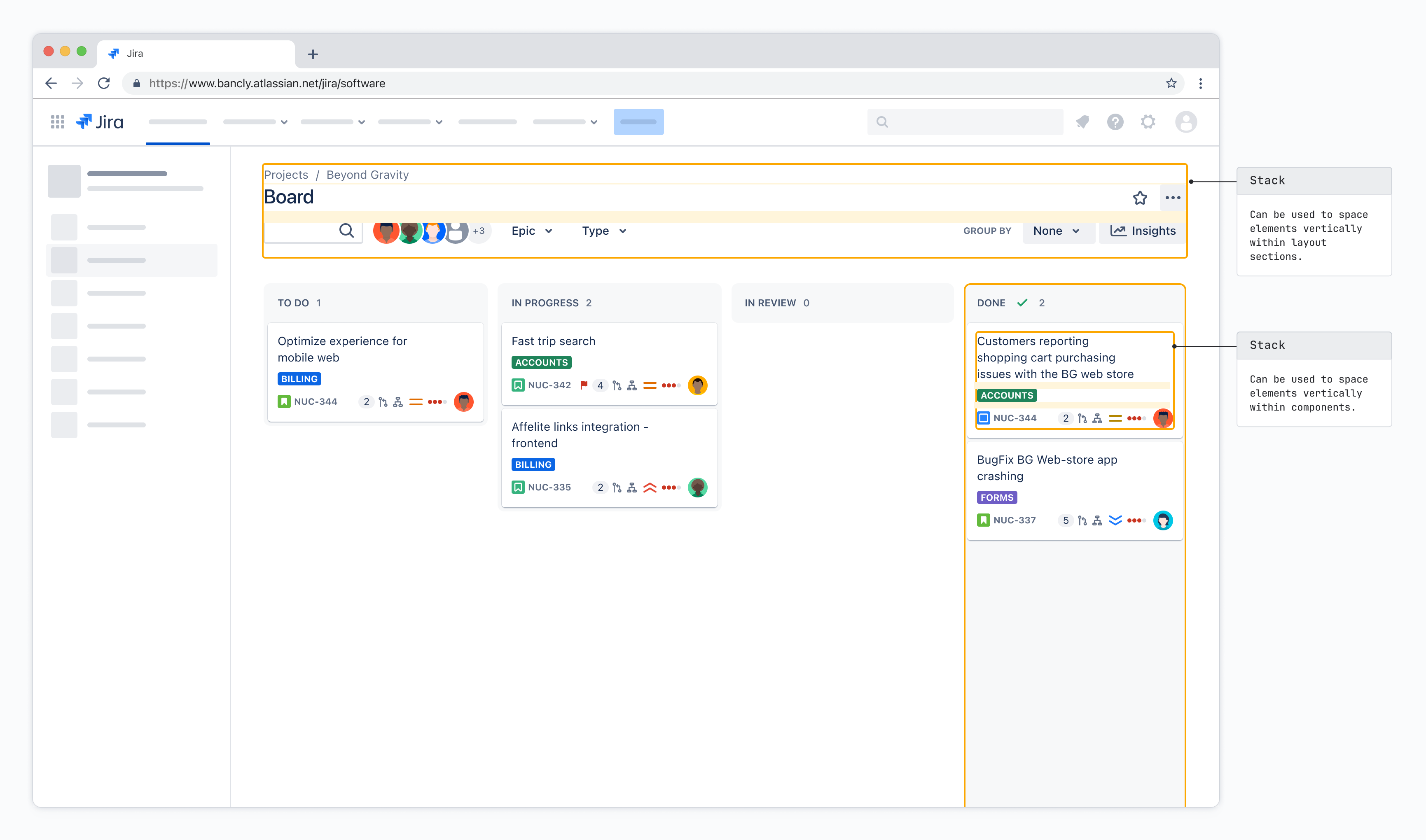
The behavior within and around these boxes can then be broken down into their horizontal Inline
and vertical Stack components.