Pagination
Pagination allows you to divide large amounts of content into smaller chunks across multiple pages.Usage
Use pagination when there are too many results to show on one page, so that people aren't overwhelmed by too much information. Pagination is a control that sits at the bottom of the page and allows the user to easily move between each page.
Parts
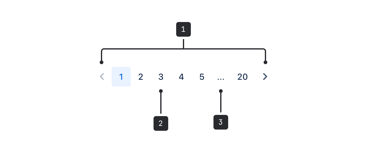
- Previous and next: Arrow icons that people use to move backward and forward from the currently selected page.
- Page navigation: Numbers that people can select to move to a specific page.
- Truncation: When a threshold of pages is reached, the list is truncated using an ellipsis.
Pagination is commonly used for things like table listings, search results, and directories. What constitutes “too many results” can be influenced by:
- system load times
- the amount of data in each entry
- the available screen space
Accessibility
- Using
aria-labelattributes improves the experience for people who use assistive technologies, like screen readers and speech recognition software. - Use the
label,pageLabel,nextLabel, andpreviousLabelprops to provide labels for the pagination buttons. While the default label props are in English, passing these props will ensure that assistive technologies in non-English languages can properly identify the content. - Be mindful of people using your app on small screen sizes and adjust the maximum number of pages accordingly.
Best practices
- For smaller screens, show a maximum of seven pages (including the ellipsis).
- For larger screens, show a maximum of 14 pages (including the ellipsis).

Behavior
- The ellipsis representing truncated pages isn't interactive. To reach page numbers that are truncated, people need to move to a page number that is closer to the number in the series. For example, in a pagination component numbered 1-5, people need to select 5 to reveal page 6.
- Double truncation is used when the current page is separated by more than five pages from both the first and last page.
Data Center apps
For all new features, we recommend using Atlassian Design System and other Atlaskit components, (opens new window). For existing code, you can continue to use Atlassian User Interface (AUI), (opens new window).
- Each page in the pagination control is a button link that lets people quickly navigate through the results.
- This component is mostly used with tables, see dynamic table for examples.