Page header
A page header defines the top of a page. It contains a title and can be optionally combined with breadcrumbs buttons, search, and filters.Usage
The page header helps people understand what the page is for, and what to expect on the rest of the page. Use a page header to create a consistent experience at the top of a full page.
Parts
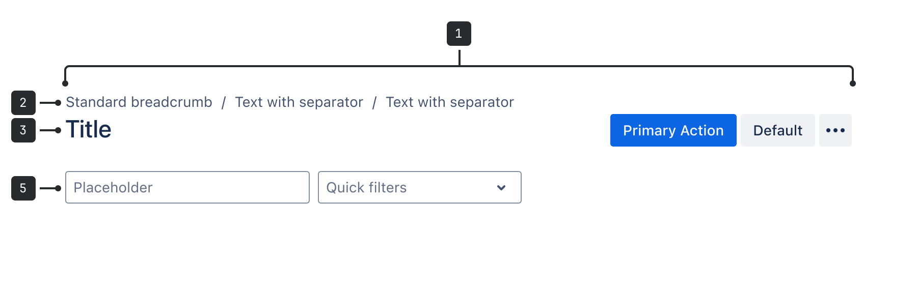
- Page grid: The content area where the page header sits. Each page requires grid spacing to be set to account for page size and fixed/fluid pages.
- Breadcrumbs: Breadcrumbs are an optional navigation aid that shows people their current location in relation to the rest of the site.
- Title: The page title summarizes the page content. The title wraps onto multiple lines when using fluid grid alignment and truncates when using fixed grid alignment.
- Actions: This area contains buttons that modify the page and its content. Use primary, secondary, subtle, compact, or other buttons defined in the button guidelines.
- Search bar and filters: The search and filter bar allows people to refine the page content using search or select.
Accessibility
- Avoid truncating the text as much as possible.
innerRefexists so that people can set the focus to the DOM element of the title.
Best practices
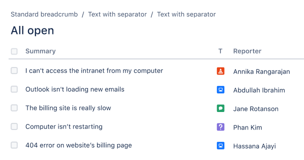
Do
Use one page header per page.

Don’t
Use multiple page headers in one page.
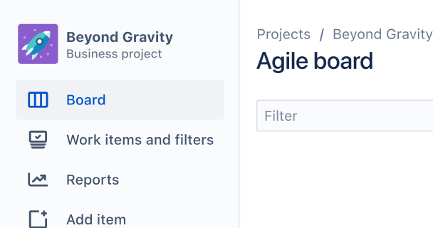
Do
Use a page header at the start of any page in Atlassian apps.
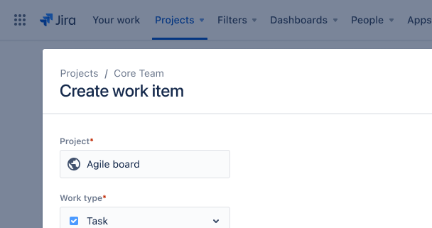
Don’t
Use a page header at the top of a smaller container like a popup, dialog, or drawer.
Content guidelines
- Headings should be sentence case unless they include proper nouns.
- Headings should be short and let people know what to expect on the page.