Object tile
An object tile represents Atlassian-specific content in a tile.Usage
Object tile represents objects in a tile shape with properties inherited from the tile component. Use them to highlight objects in a layout, such as next to a group of text. To represent standard icons in a tile, use
Parts

- Icon object: Foreground icon represents Atlassian-specific content.
- Background: The default appearance has a neutral background set to
color.background.neutral. Bold tiles have an assigned background token that cannot be changed.
Size
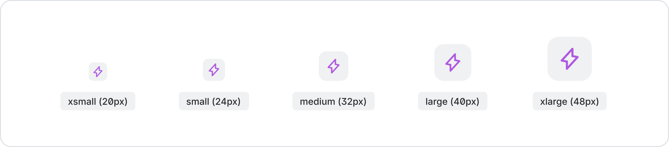
There are currently 5 size options, representing the width and height in pixels: 20, 24, 32, 40, 48. To keep things easy to see, objects smaller than 20px must be shown without a tile container using the object component.
Accessibility
Use object tiles in combination with a title and meta-information, such as author, creation date, or sub-heading.
Best practices
Smaller than 20px - use an Object
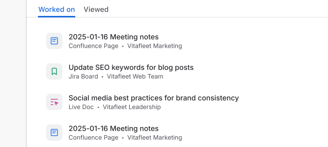
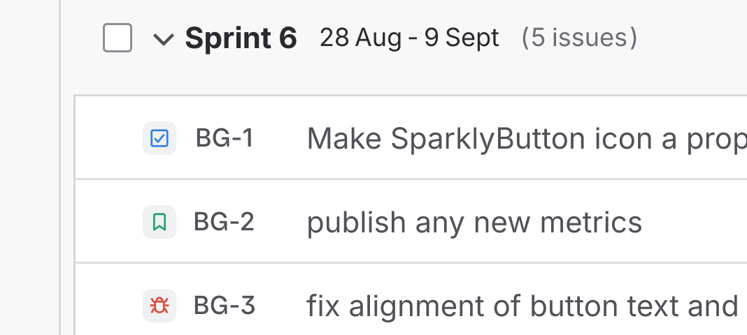
For smaller representations such as in tables or smart links, use Object. Do not scale down object tile below 20px.
Do
Use the prescribed size for object tiles.
Don’t
Scale down object tile below 20px.
Don’t change object tile colors
Object tiles are assigned specific colors. For consistency across our apps, don’t change their color.

Do
Maintain the assigned color.

Don’t
Switch color tokens or use custom fills.