Menu
A list of options to help users navigate, or perform actions.Neutral selected states
When the platform-dst-tokens-finesse feature flag is enabled, this component uses the new neutral treatment for selected states.
Usage
Use a menu to display a list of options that users can either action or navigate to.
Parts
Menus are made up of a section or multiple sections.
Section
Each section can contain either Button or Link menu items, as well as a separator or section header.
Group similar menu items together into sections.
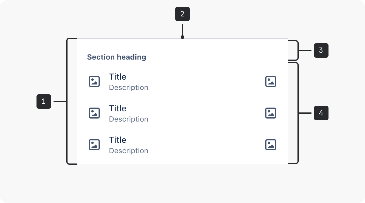
- Section. Menus are made up of a section or multiple sections.
- Separator. Graphic device to separate a section of similar menu items. If there is more than one section, a separator is not needed in the first section.
- Section header. Contains a heading to name a section of a group of similar menu items.
- Menu items. Menu items can include an optional description and/or icons before and after.
Section header
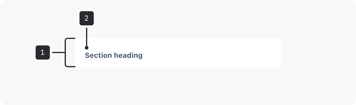
- Section header. The area surrounding the section heading.
- Section heading. A heading to name a section of a group of similar menu items.
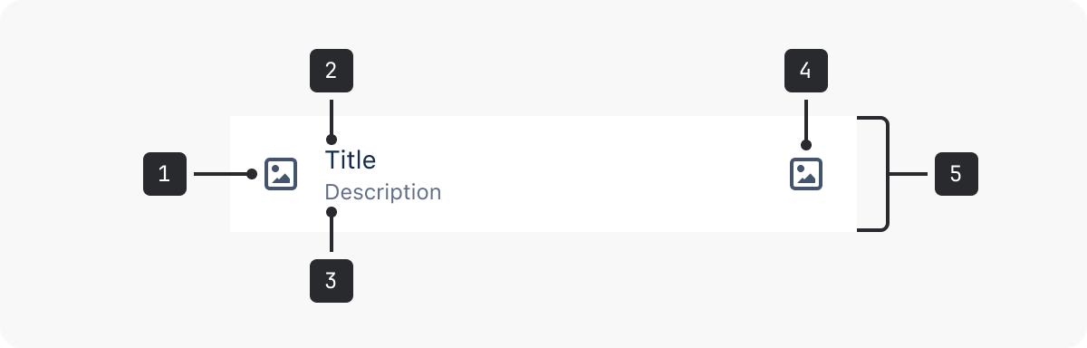
- iconBefore. Optional.
- Menu title. Text that succinctly describes the menu item link or action.
- Menu description. Optional. Text to succinctly describe the menu item.
- iconAfter. Optional.
- Menu item. The interactive area of the menu item.
There are two types of menu items:
A menu item is wrapped in an button tag.
A button is an “input that allows for user-triggered actions when clicked or pressed”.
Use menus with Button items when asking users to perform an action, e.g. Copy.
Link items
A menu item is wrapped in an anchor tag.
A link is an “interactive reference to an internal or external resource that, when activated, causes the user agent to navigate to that resource”.
Use menus with Link items if sending users to another page, e.g. Team Spaces.
Accessibility
- Compose your menu with the correct semantic elements using sections, heading items, button items, and link items.
- Use sections. Always compose your menu using sections, even if there’s only one section. Sections support better navigation for assistive technology.
- Use correct heading levels. Using headingLevel prop to change the level of the heading. The default heading level is h2. Make sure that headings are in the correct order relative to the pages the menu is on, and don’t skip levels.
- Don’t disable menu items. Leave the menu item enabled, and use visual affordance and error messaging to let people know why the menu item is unavailable.
- Be consistent. If your menu appears in more than one place, make sure that the order and availability of menu items is consistent throughout your app.
- Avoid icons. If icons must be included, make sure any meaningful imagery has alternative text.
Best practices
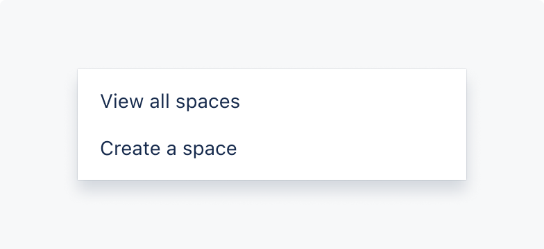
Do
Use button menu items when users need an action performed, e.g. Copy.
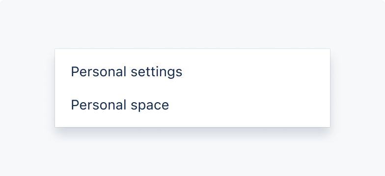
Don’t
Don’t use buttons if navigating users to a specific place.
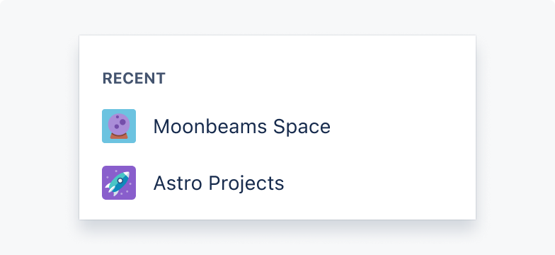
Do
Use link menu items to navigate users to a resource.
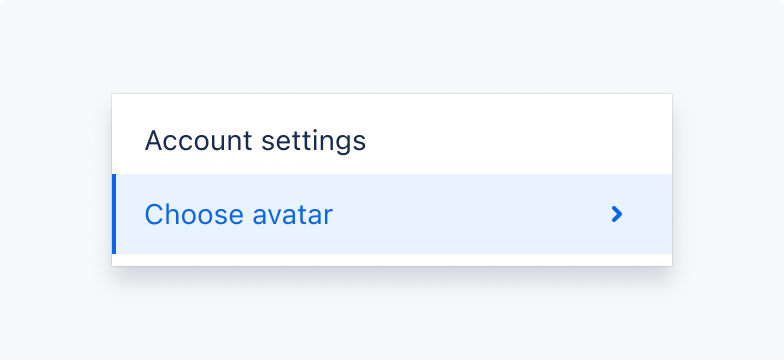
Don’t
Don’t use link menu items for actions required by users.
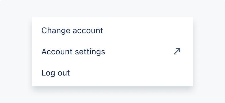
Do
Use icons to support and indicate if menu items are taking users to a new resource.
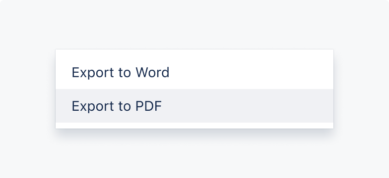
Don’t
Don’t use link menu items as button menu items. Use an icon to indicate if a button menu item is taking users to a new place.
Content guidelines
- Use concise labels. (max. 24 characters) Avoid unnecessary verbs, jargon, or brand names. Navigation doesn’t benefit from conversational language, and putting the most important word at the start of the label helps people navigate quickly.
- Prioritise menu items. Organise your menu items based on priority, and put the most used items at the start of the menu.
- Test your label names. Make sure that your menu helps people complete their tasks. Contact the Research Hub for further guidance on testing.
- Be mindful of menu length. Putting more items in a menu doesn’t necessarily translate to more exposure or usage.