Lozenge
A lozenge is a prominent, compact label used to communicate a meaningful attribute that affects how people understand, prioritize or act on an object.Usage
Use lozenges for important labels that need to be easily noticed — like workflow status (e.g. On track, In progress, Completed), system state (e.g. Live, Active, On, Disabled), priority (High, P1, Urgent), permissions (Locked, Read only, Private) and promotional labels (Premium, New, Try). Lozenges should help people quickly scan and understand a meaningful attribute, so it's important they are used accurately and consistently.
Parts

- Label: Text describing the attribute. For example, "On track", "Blocked", or "Beta".
- Icon (optional): Use an icon from the iconography library to add additional affordance where the icon has a clear and well-established meaning. For example, arrow up right for "On track".
- Badge (optional): The
trailingMetricprop can be utilised on semantic colored lozenges to add a score or metric that supports the label.
Best practices
Use lozenge when the label communicates a meaningful attribute.
Lozenges should be used to indicate an important label that affects prioritization, action, interpretation or product understanding. They have higher visual prominence than a tag which should be used instead when the label is just descriptive metadata that helps classify, group, or filter information.
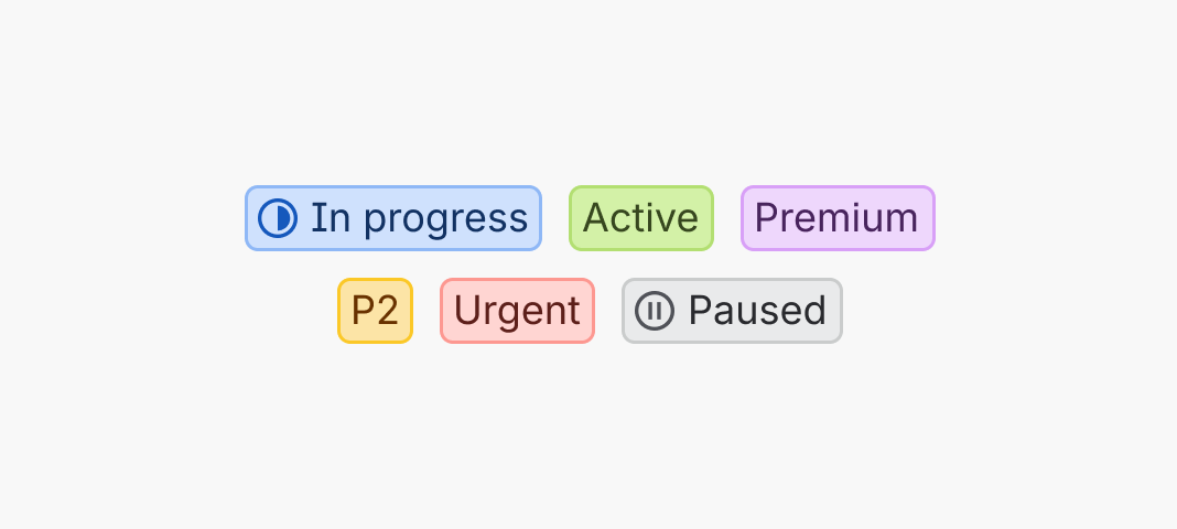
Do
Use lozenges for workflow status, system state, priority, permissions, or promotional labels.

Don’t
Don't use lozenges for descriptive metadata that only classifies or categorizes — use a tag instead.
Use filled icons to manage visual hierarchy
When choosing an icon to complement a lozenge, some icons have an outlined design as well as a filled alternative. Use icon weight to establish visual hierarchy and draw attention to what matters most on the screen. For example:
- Lozenges could use a filled icon for 'Done', indicating a satisfying visual closure that marks the end of the workflow cycle.
- In Goals, a filled icon could be used for the ‘Off-track’ state to maintain urgency around a critical status that requires user attention.
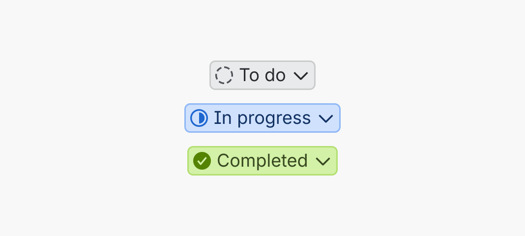
Do
Use filled icons intentionally to draw user attention where it’s needed.
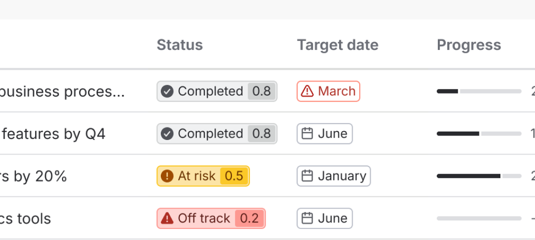
Don’t
Don't overuse filled icons as it reduces the impact of critical status indicators.
Use accent and semantic colors correctly
When choosing a lozenge color, there's two sets of color choices available:
- Semantic colors (for example, "success"): use when color reflects shared semantic meaning for the label (including workflow status, risk, and other well-defined conditions).
- Accent colors (for example, "accent-red"): use when color isn't carrying semantic intent. In most cases, accent colors are used for user-generated content, where customers can choose a color and the text label.

Do
Choose the right semantic color to reflect the meaning of the label.

Don’t
Don't use accents when the label has semantic meaning and isn't user generated content.
Use the appropriate badge within a semantic colored lozenge
When the appearance is set to a semantic color, you can use the trailingMetric prop to add a
matching badge to the lozenge. Use it to add a score to a status, for example
for a goal.

Do
Use a semantic lozenge with the matching badge to score a goal.

Don’t
Don't use a badge within a lozenge with an accent color and avoid mixing semantics.
Use lozenge dropdown trigger when interactivity is required
Lozenges are non-interactive. If you require a lozenge that opens a dropdown menu, for example an inline status switcher, use a lozenge dropdown trigger.
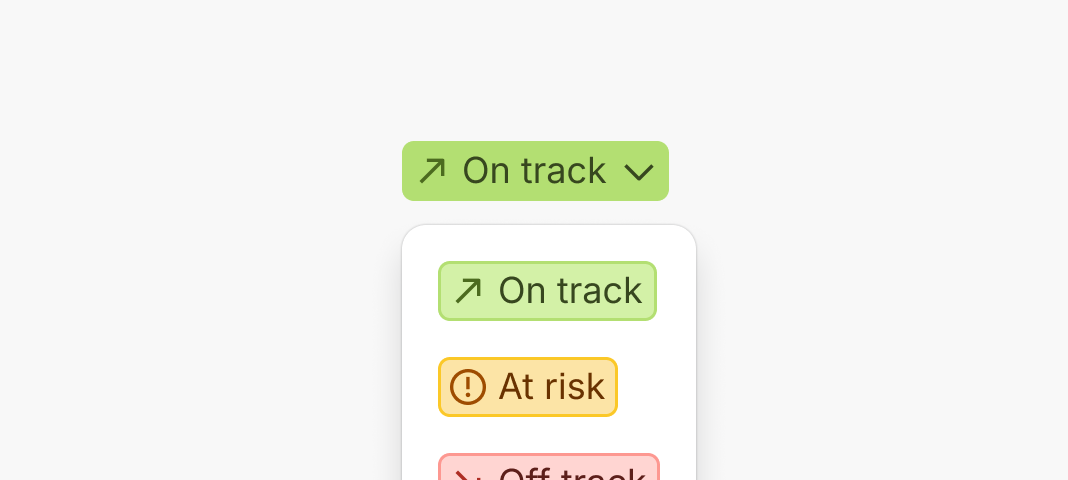
Do
Use a lozenge dropdown trigger if interactivity is required.

Don’t
Don't add custom functionality to the lozenge.
Content guidelines
Use sentence case capitalization
Only capitalize the first letter of the label and any proper nouns. View our capitalization guidance for more information.

Do
Use sentence-case capitalization.

Don’t
Don't use title case capitalization or all caps.
Accessibility
- Don't use color alone to signify an important attribute. Instead, use clear labels and, if relevant, a supporting icon. For example: for a critical condition, use descriptors like "Off track" or "Blocked".
- Don't use long labels in lozenge. They have a max width of 200 pixels (or a custom
maxWidthvalue) causing labels to truncate. Lozenges can't be focused, so truncated text will not be visible.
Data Center products
For all new features, we recommend using Atlassian Design System and other Atlaskit components, (opens new window). For existing code, continue to use Atlassian User Interface (AUI), (opens new window).
- For lozenges requiring dropdown interactivity, use lozenge dropdown trigger.
- For tallies or scores, use a badge.
- For descriptive metadata and information, use a tag.