Inline dialog
An inline dialog is a pop-up container for small amounts of information. It can also contain controls.Caution
We are planning on deprecating Inline dialog. We recommend using the Popup component instead.
Usage
Inline dialogs are displayed when triggered by a user action, usually by clicking a button.
Parts
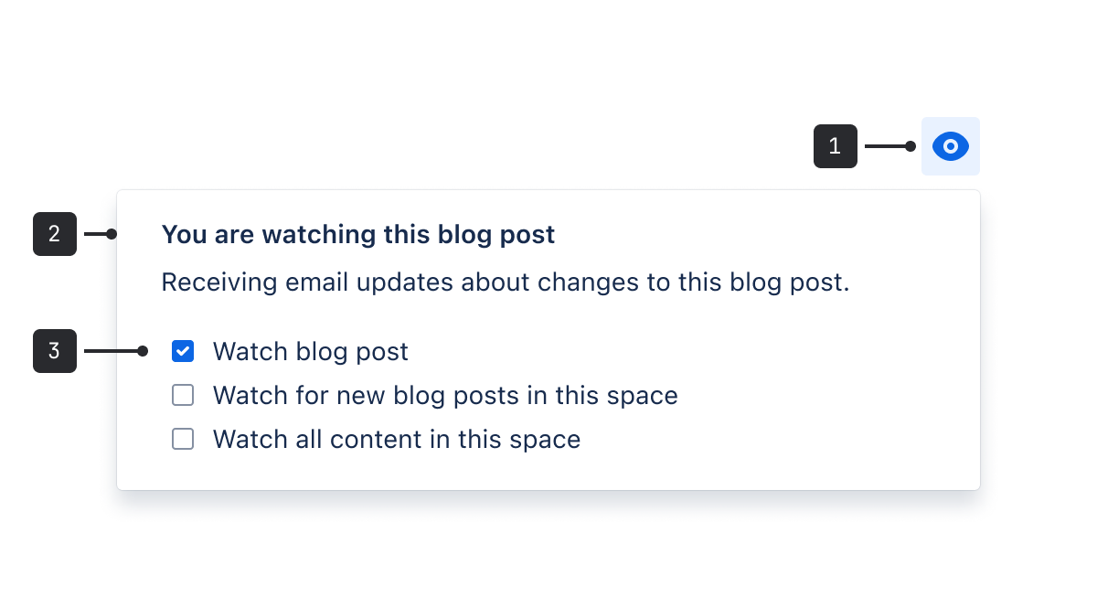
- Trigger: Indicates what information the inline dialog will surface.
- Window: Displayed when the trigger is selected.
- Controls: Control items can include buttons, checkboxes, and text fields.
Best practices
- Inline dialogs should be used when sections within the page require further information or actions, but are not crucial to the page as a whole.
- Inline dialogs should be concise to get the point across as quickly as possible. This is a focused component, so only one dialog can be open at a time.
- A great use for inline dialogs is feature discovery.
Content guidelines
Text in an inline dialog should be concise to get the point across as quickly as possible.
Data Center apps
For all new features, we recommend using Atlassian Design System and other Atlaskit components, (opens new window). For existing code, you can continue to use Atlassian User Interface (AUI), (opens new window).
- Use inline messages to alert users that important information is available or an action is required to complete the current task.
- See flags for messages containing confirmations, alerts, and acknowledgments that require minimal user interaction.
- Use modal dialogs for more complex interactions and information.