Dynamic table
A dynamic table displays rows of data with built-in pagination, sorting, and re-ordering functionality.Neutral selected states
When the platform-dst-tokens-finesse feature flag is enabled, this component uses the new neutral treatment for selected states.
Usage
Use dynamic tables when you need to display data in rows and columns, with additional features like drag and drop and loading states that go beyond what’s available in native HTML tables.
Dynamic tables are best used if there is a large volume of information so that people can scan, sort and analyse data.
Parts
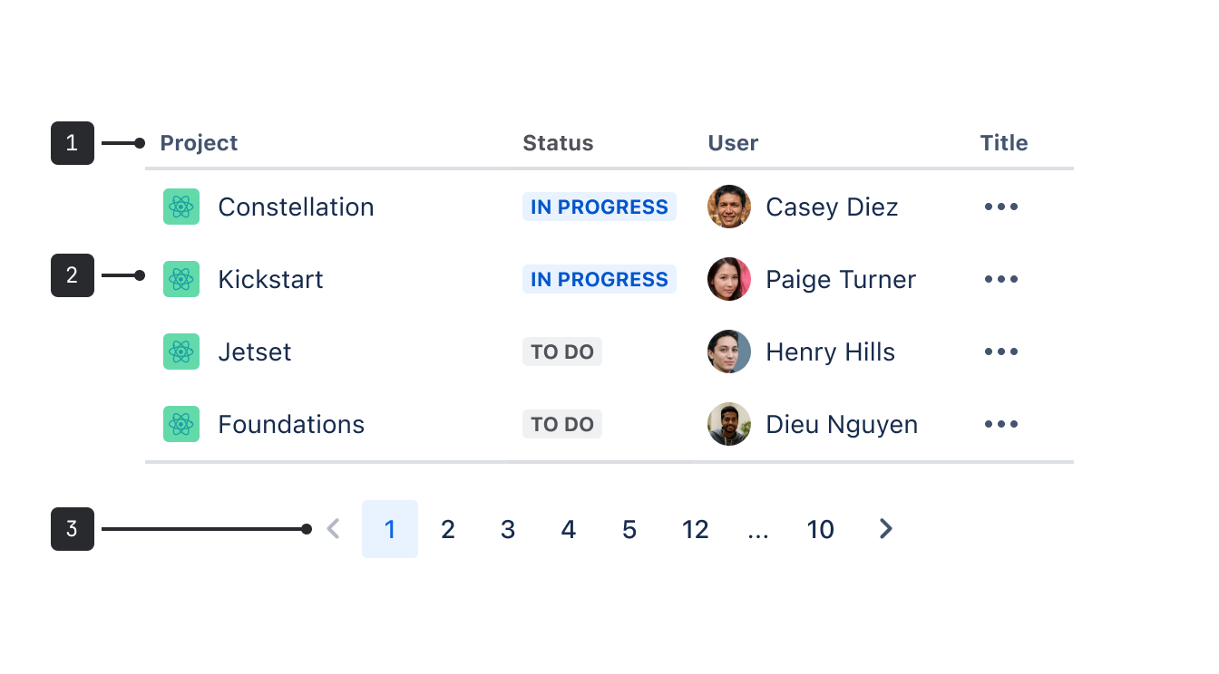
- Header label: Use this to indicate what type of information is in each column.
- Row: Displays a relationship between separate table cells.
- Pagination: If there's more than the maximum number of rows for one page, the pagination component appears at the end of the table, enabling people to navigate between pages.
Accessibility
- Provide a visual
captionfor complex tables. This helps people gain context about the data. It also helps people with screen readers have an overview of the table. - If you don’t use a
caption, then you’ll need to uselabelto describe the table for assistive technologies. Avoid using both as they may conflict. - Never rely on highlighted rows to convey important meaning, selection, or focus, as this isn’t accessible to people with visual disabilities.
- Never put additional controls like links or buttons in table headings.
- Never use tables to build visual layouts. Only use tables for structured data, and avoid headless tables.
- Clearly label columns with simple language. This makes it easier to understand and eases screen reader navigation.
- When offering edit options, make sure that the label for the button is unique to each row and references the row that’s being edited. For example, “Edit component 3" not “Edit".
Best practices
Editing row content
On simple tables where there's only a single type of content to display, an edit button is not required.
For more complex tables where there are multiple types of editable content, add an edit link to the more actions button. Use a modal dialog or dedicated page for entering content instead of input fields that are directly part of the dynamic table.
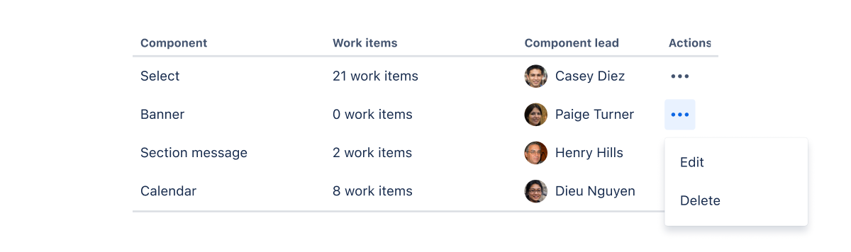
Removing a row
Use either a delete action in the "more actions" menu (if multiple actions are available) or a close icon to allow people to delete a row. Once the row is deleted, both the content rows and input row will shift upwards. Keyboard focus should move to the next focusable item.
Error state
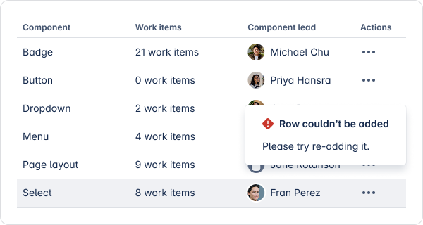
If an error occurs, highlight the affected row or text input with a supporting error icon, and help people know how to proceed to resolve the error.
- For more empty state guidance, check out the empty state component.
- For pagination guidance, see the pagination component.
- For guidance on showing contextual information, see the modal dialog component.
- For more on interactive table components, see the select, dropdown, and avatar components.