Dropdown menu
A dropdown menu displays a list of actions or options to a user.Neutral selected states
When the platform-dst-tokens-finesse feature flag is enabled, this component uses the new neutral treatment for selected states.
Motion in Early Access
Motion updates for this component are in Early Access and available behind the platform-dst-motion-uplift-popup feature flag.
Usage
Use the dropdown menu when you have 5-15 items to choose from. They're used for navigation or command menus, where an action is initiated based on the selection.
Parts
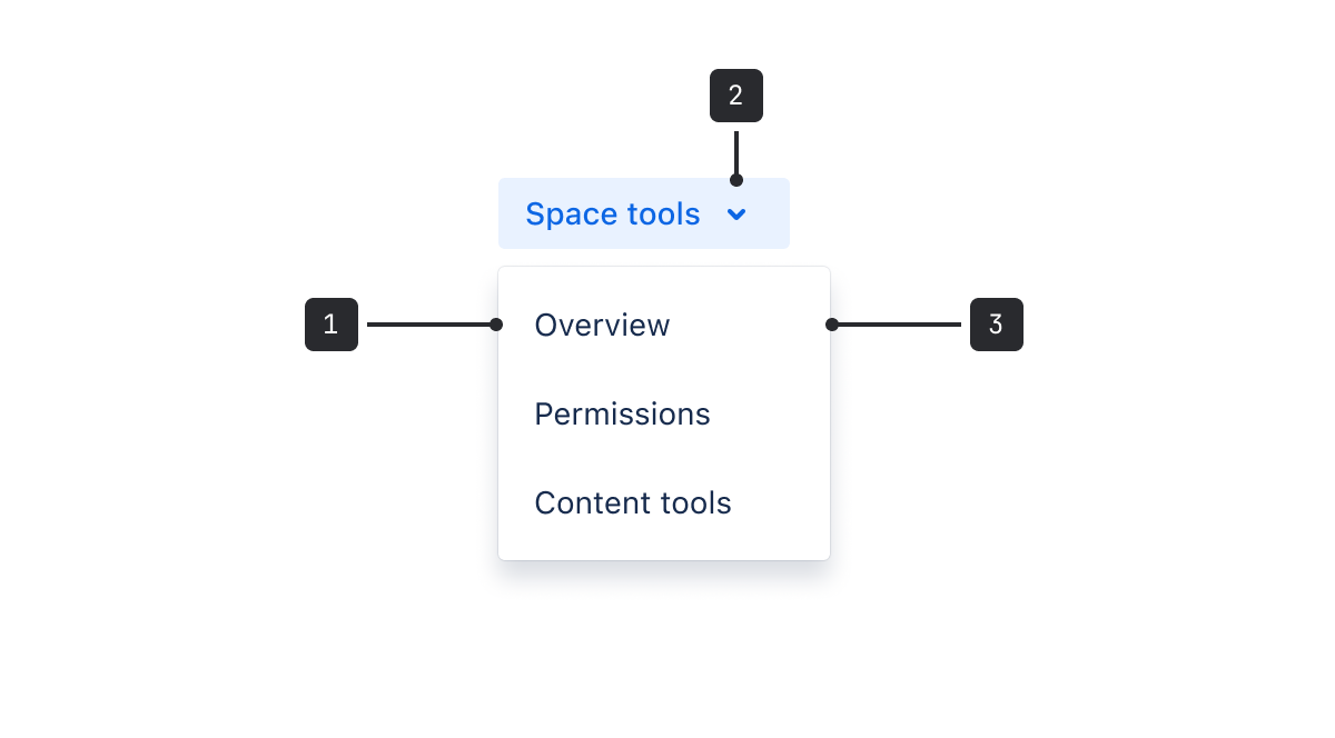
- Control: A button that may contain an icon, or be labeled with text.
- Trigger: Used if the button is labeled with text.
- Menu: Container for links and action items.
Menu items can include both radio buttons and checkboxes.
A "more" menu, where the control contains an icon.

For user profiles, where the control is an avatar.

Accessibility
- Avoid truncated labels wherever possible by checking that they do not exceed the maximum width of the component.
- The menu has a focus lock which traps the focus within the menu. If the menu is triggered using the keyboard, the first item gets focused on automatically.
- When using a nested menu, limit the menu to two layers wherever possible. Menus with a lot of nested layers are difficult to operate.
- When using a dropdown menu inside a modal dialog, use the
shouldRenderToParentprop. This prevents loss of focus and ensures proper voicing by screen reading programs to render content in the nearest DOM node to the trigger element instead ofReact.Portal. - Disabled triggers are not supported - see the general button accessibility guidance.
- When using multiple dropdown item groups, provide a
titlefor each group to help the user understand the menu's structure.
Best practices
- You can use a number of components to give people the ability to select options. See the list of related components below for advice on choosing the right one.
- When organizing dropdown menu items, sort the list in a logical order by putting the most selected option at the top, if known. Test and refine over time to re-evaluate if all menu items are needed.
- For long lists, group related menu items. If including radio buttons and checkboxes as menu items, try grouping related actions.
- Grouped items are separated by a short, uppercase title that describes the options in that sub-category.
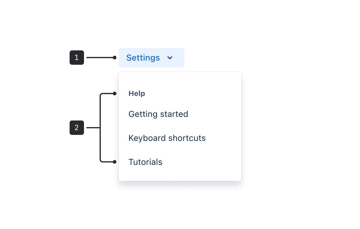
- Group title (not selectable)
- Grouped menu items
Content guidelines
- People navigate menus and choose menu items based on their labels, so it’s important that they're accurate and informative.
- Use sentence case and write concise labels that clearly indicate the purpose of the selection.
- For action menu items, use verbs and verb phrases to describe the action that occurs when the item is chosen (for example, “Move”, “Log time”, or “Hide epic labels”).
- In most cases, links should be nouns. For example, Profile or Keyboard shortcuts.
- Exclude articles in menu items. For example, use "Add flag" instead of "Add a flag".
- Keep menu items to a single line of text.
Behavior
In cases where a menu item is longer than the button's text label, the menu will grow to the width of the longest item listed. However, there is a maximum width specified by the component. If the menu item exceeds the maximum width, it will be truncated. Avoid truncated labels where possible.

Data Center apps
For all new features, we recommend using Atlassian Design System and other Atlaskit components, (opens new window). For existing code, you can continue to use Atlassian User Interface (AUI), (opens new window).
- To allow users to search and select one or more options from a list, use the select component.
- To collect user input from a related list of items use checkboxes.
- To allow users to make a single selection from a short list, use radio buttons.