Date picker
A date picker allows the user to select a particular date.Usage
Date pickers help users navigate past, present, and future dates.
Date picker is commonly used in forms.
Parts
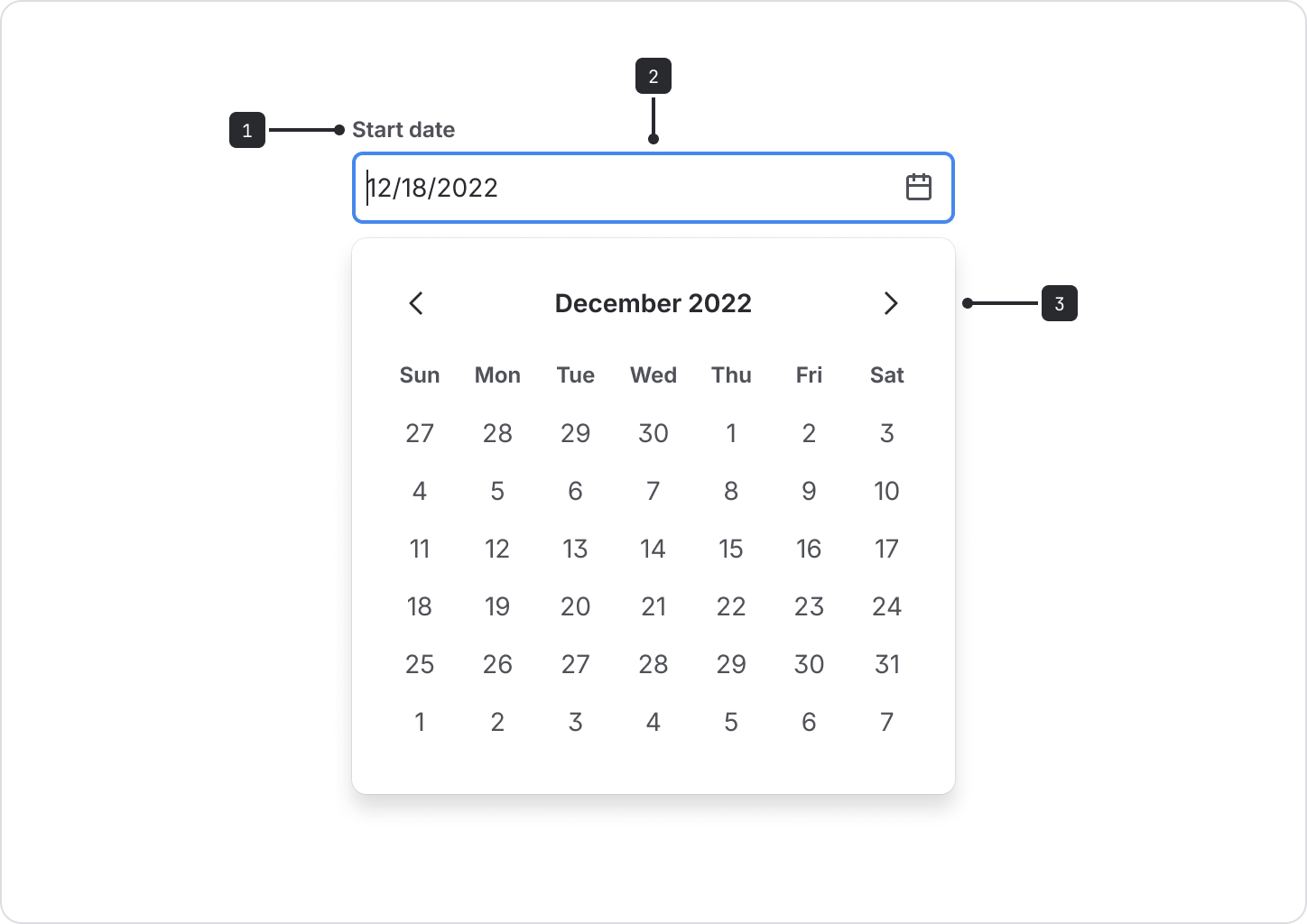
Label: Labels should indicate what information the field requires. The label is left-aligned above the input area.
Date input field: Selecting this field opens the calendar component. Users can also input dates into the field. Once a date is selected, the option will be shown in the text input. This example shows date formatted in ‘dd/mm/yyyy’ but this can be customized using the
dateFormatprop.Calendar: Contains the list of all dates. Selecting the previous or next arrows moves the calendar through months. The selected date area is highlighted by a different color fill.
Content guidelines
- Ensure that locale is appropriately set so that users see dates in a familiar format.
- Use a concise label to indicate what the date selection refers to.
Accessibility
- If using a field with a label other than "Date", use the
labelprop. Assistive technologies will announce these along with the label from the field component when activated. - Allow multiple modes of data entry. Some users prefer entering date and time information by typing instead of selection, especially keyboard users.
- If some dates are
disabled, provide accurate validation and error messaging for keyboard users, like:Please enter a future date. - Use the
shouldShowCalendarButtonprop. It provides a button for users to show the calendar picker popup. This should also be used with both theopenCalendarLabeland one of the following props:label,inputLabel, orinputLabelId. This ensures the calendar button gets a proper accessible name. This will become the standard in the future.
- If you need to specify date and time, see date time picker.
- If you need to specify time only, see time picker.