Split button
A split button lets people perform an action or choose from a small group of similar actions.Usage
Split buttons have one clear default action alongside a group of similar actions.
Parts
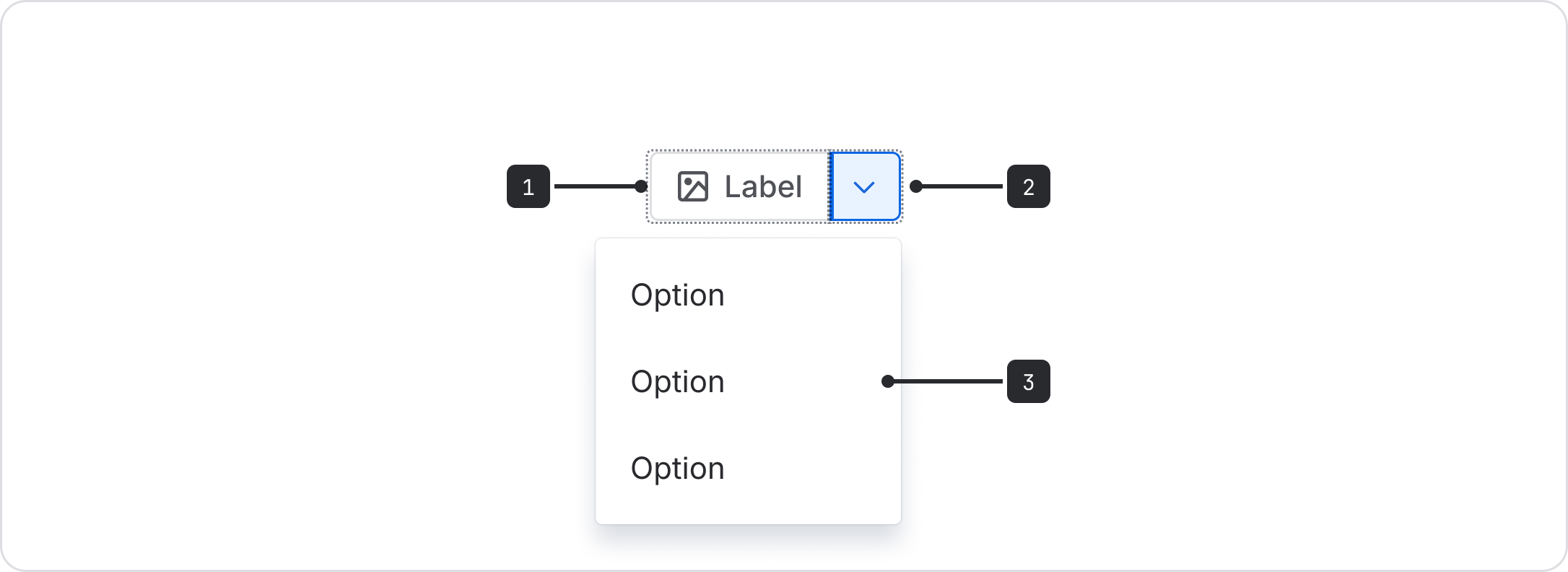
- Main action button: The default action that most users will take. Make sure button labels follow the button content guidelines. This button can optionally include an icon.
- Dropdown menu icon button: A dropdown button attached to the main action button, separated by a visual divider. This opens a menu of related actions. Requires an accessible name for assistive technologies.
- Secondary actions menu: A menu of actions that are parallel or similar to the main action.
The small menu is easy to miss and requires more focus, so expect people to use the main action button in most cases.
When there isn’t a clear default action, present all options equally using a basic dropdown menu or button group.
Do
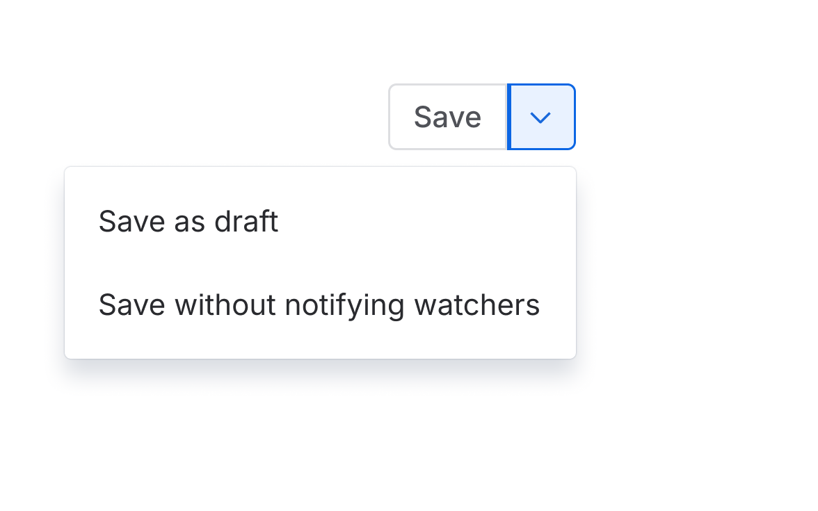
Group related actions under the split button dropdown.
Don’t
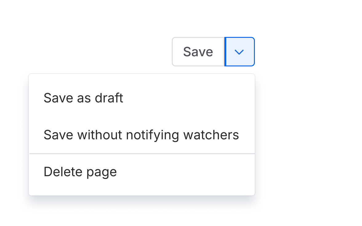
Don't use a split button to group actions that aren't directly related or similar.
Accessibility
Provide an accessible name (using the label prop) to describe the actions behind the dropdown icon button. The text should say something like "More 'main action' actions."
Avoid disabling buttons and follow all general button accessibility guidance.

Do
Give icon buttons an accessible name with the label prop.
Don’t
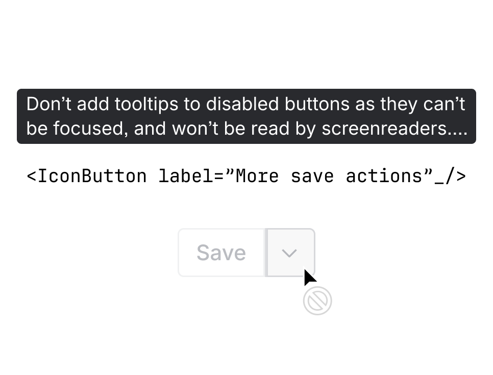
Don't use a tooltip on a disabled button.
Best practices
Aim for fewer dropdown items
Try to keep the number of dropdown menus items to a minimum (fewer than six) to aid focus and comprehension.
Remember that some users may miss the secondary action entirely, so ensure users aren’t required to interact with the secondary action to proceed. In other words, make sure the main action button allows people to proceed in most cases.
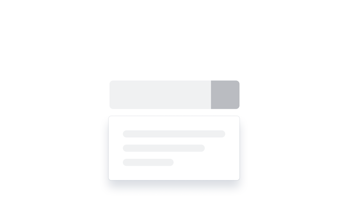
Do
Keep the number of dropdown menu items to a minimum.
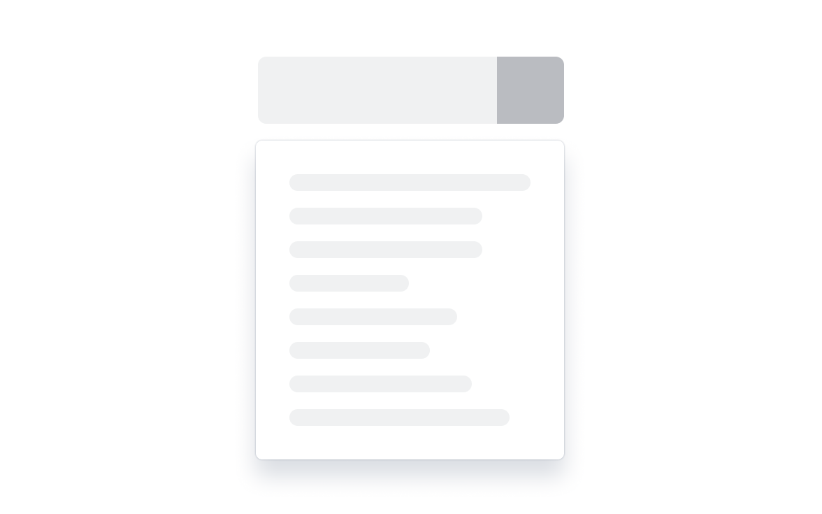
Don’t
Don't use more than six menu items in a dropdown menu.
In general, the secondary action button opens a dropdown menu.
When the secondary action doesn’t open a dropdown menu, don’t use a dropdown icon like the chevron down. Make sure any icon button provides a clear and consistent signifier that relates to the purpose of that action.
If you are customizing the secondary action menu (not a dropdown), strongly consider whether these actions are directly related, with one being a clear default. In most cases, a separate button may be more appropriate than a split button with a custom icon.
Content guidelines
Use sentence case for labels
Use sentence case (only capitalize the first letter) for all button actions and menu items, unless there’s a proper noun in the label.
Don't repeat the default action in the dropdown
Don’t include the default action as one of the dropdown menu items. This helps keep the number of items to a minimum.
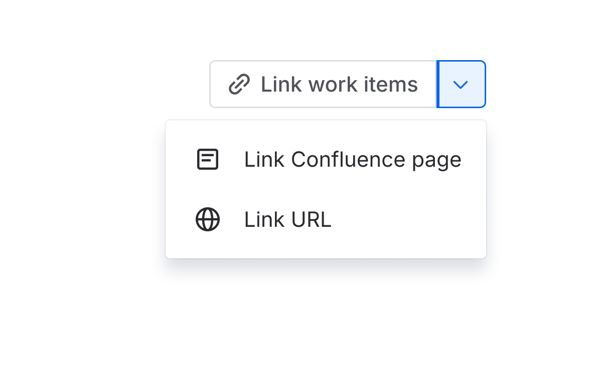
Do
Use clear and concise labels for the main and secondary actions.
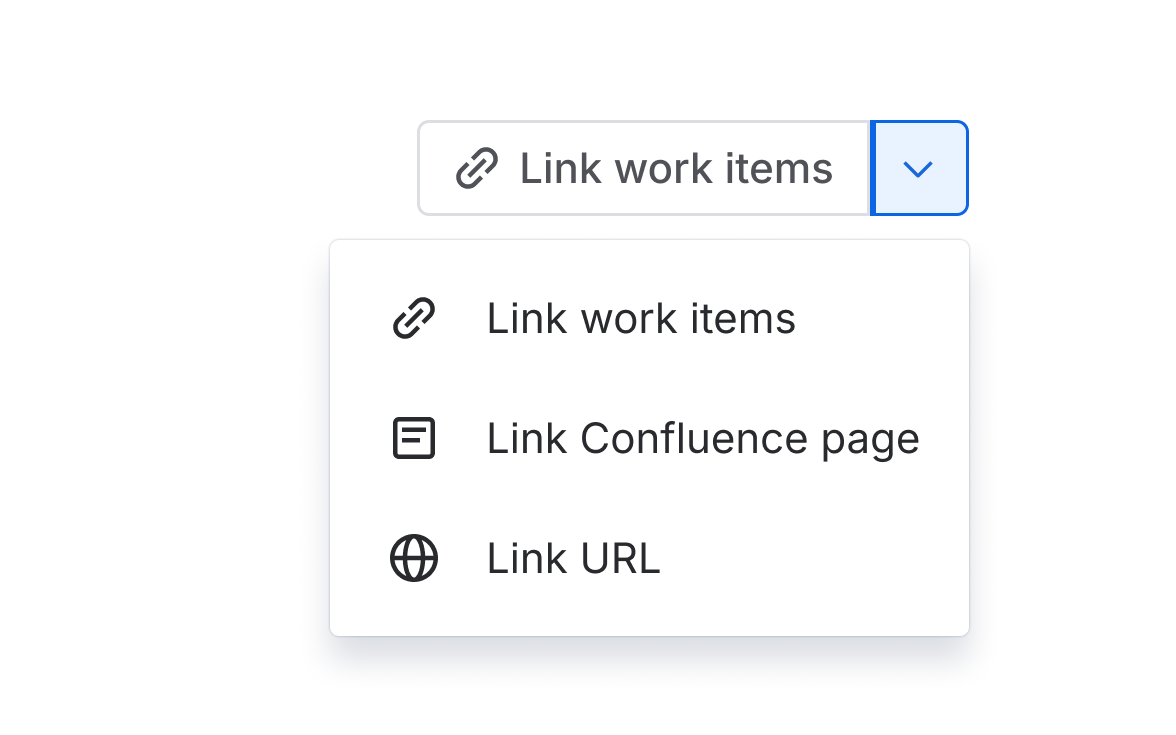
Don’t
Don't repeat the main action as one of the dropdown items.
Mobile guidelines
Avoid using split buttons in mobile experiences. The menu button touch target is small and easy to miss accidentally.
- To group actions that are dissimilar or of equal importance, use a button group or a basic dropdown menu to present options more equally.
- To present more actions in views with limited space, use an icon button as a more actions (…) menu.
- In navigation, use a basic navigation dropdown to simplify.