Icon button
An icon-only button lets people take a common and recognizable action where space is limited.Usage
Use icon-only buttons when space is limited and the icon has a clear association with the action.
Parts
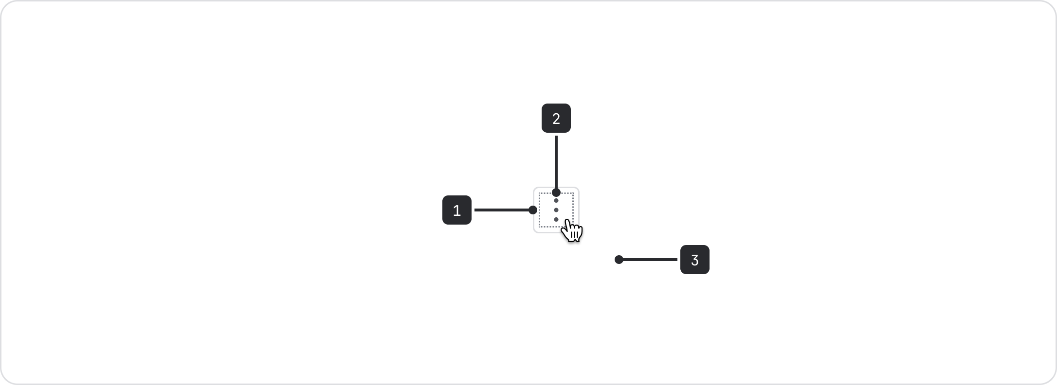
- Button: Most icon buttons should be square, aside from some select round icons that appear in the top navigation.
- Icon: An existing system icon.
- Tooltip: All icon buttons require a clear name for tooltips (and screen readers).
Choose an existing system icon
Don’t use icon-only buttons with custom icons. If you are creating a new icon, it’s probably a more complex idea that would require a button with a text label.
Use an existing system icon instead.
There are very few icons that have clear and common associations across apps, so use buttons with text labels where space allows or when the action is very important.
Also consider localization when using icons. Does the icon have a clear meaning that holds up for everyone, including people from different cultures or places?
To test whether an icon button will be clear, apply the five-second rule: if it takes you more than five seconds to think of an appropriate icon, it is unlikely that an icon can effectively communicate that action.

Do
Use an icons with a well-established association to an action in Atlassian and other software products.

Don’t
Don't use one icon to mean many different things, and don't use icons that aren't clear and obvious to most people.
Accessibility
Always include a clear, accessible name as a label
Clearly describe the icon button action in a label for screen readers. Follow the button label content guidance for clear and active labels. The provided label will be rendered as visually hidden content in the button, rather than using aria-label which is not always translated into other languages by translation services.
Avoid disabling buttons and follow all general button accessibility guidance.
Best practices
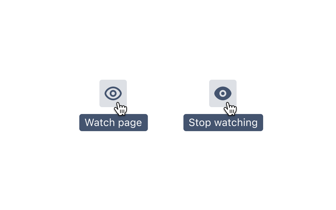
Follow our iconography guidance and use the line versions of icons for most cases. You can use filled icons to show an action has been taken or selected.
Content guidelines
Use sentence casing for labels
Use sentence case for all button tooltips and labels. This creates consistency for assistive technologies.
Only capitalize the first letter of the button label and any proper nouns. Most feature names aren’t capitalized or considered proper nouns when following our capitalization guidance.
Use specific labels wherever possible
Where possible, specify the object being acted on in the tooltip and label. For example “Edit page” instead of just “Edit”.