Button (legacy)
Caution
Legacy buttons will soon be deprecated. Please use the new button, icon button, link button, or link icon button. Migrate from legacy buttons using our codemod.
Usage
Buttons are triggers for events or actions. They're a common part of larger experiences such as forms or modal dialogs.
Parts

Buttons typically have a label and can include an icon before or after the label.
- Icon (optional): Most buttons don't need an icon. Use an icon to add additional affordance where the icon has a clear and well-established meaning.
- Label: Text that explains the result of selecting the button. Use action verbs or phrases to tell the user what will happen next, and follow the button label content guidelines.
Use one primary call to action
Only include one primary button or call to action (CTA) in a page or area of UI.
Primary buttons indicate the most important action in a group or area. Having multiple primary CTAs in one area can be confusing or visually overwhelming.

Do
Use one primary call to action to help people proceed.

Don’t
Don’t use many calls to action in one page or container.
Make sure the button is large enough to interact with but not visually overwhelming. There is a compact button for tight spaces.
Buttons are for actions that affect something on the current page, such as submitting a form, playing media, or closing a modal.
Links navigate to a new page or anchor location, changing the URL.
In general, don’t use a <button> in place of a link (<a>) or a link in place of a button. HTML
buttons and links are treated differently by assistive technologies such as screen readers, so using
the wrong one can make experiences harder to use for some people.
Accessibility
- Include alternative text using the
aria-labelprop when using icon-only buttons. - When using an icon alongside text, do not add a label to the icon. Doing so will unnecessarily repeat labels for people using screen readers.
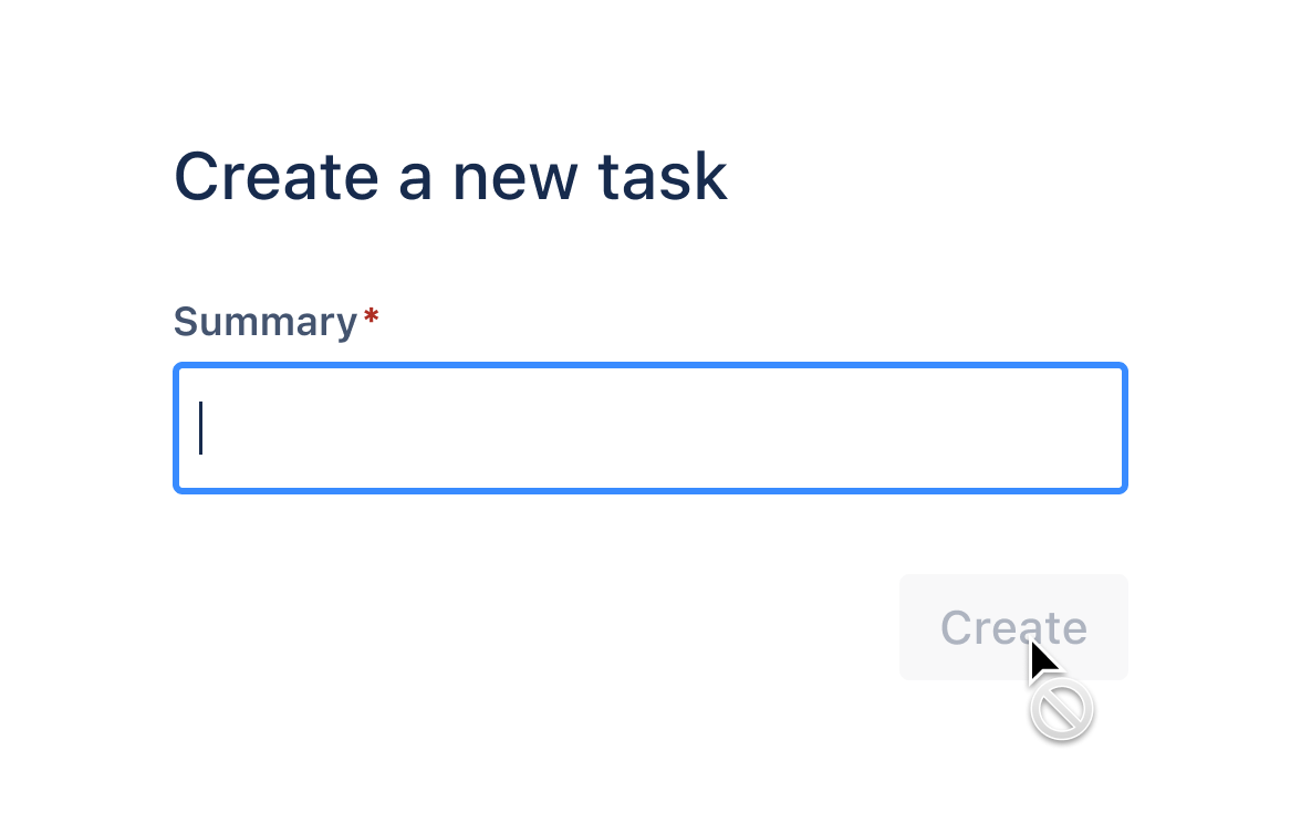
Avoid using disabled buttons, especially in forms. Disabled buttons don't explain why the button isn't usable, and they aren't focusable at all for people using keyboard navigation.
Instead, keep the button pressable, and use validation and errors to explain what needs to be done to proceed.

Do
Use validation or other clear on-screen directions to help people proceed.
Don’t
Don’t disable form submission buttons, as this doesn't give people clear a direction for how to proceed.
This is not accessible. Disabled buttons aren't reachable in the tab order and don't receive hover, focus, or click events. Don't attempt to create workarounds. If you are an Atlassian, Accessibility QA will make you redesign these implementations.
Some questions you should ask if you feel you need a tooltip on a disabled button:
- Is this information essential to the user experience? If so, don’t hide it behind a tooltip. Tooltips aren’t easy to discover and aren’t accessible on mobile. If it isn’t essential, consider whether you need to show it at all.
- Is this information actionable? Being shown things that you can’t use without any actionable next step can be frustrating or confusing. Consider only showing UI that a user is able to interact with, or replacing the disabled button with text that has the same content you were going to put in the tooltip. If you do this, you can make things even more actionable for the user by providing a link to a next step that they can take, or further information.
We know that disabled buttons with tooltips are sometimes used to promote feature discovery. We are working to provide guidance for this use case in the future.
Focus behavior
By default tabIndex={0} is added when the component prop is specified, so the button element can
get browser focus regardless of the element type used.
On a mousedown, event.preventDefault() is always called to prevent the button from getting
focus. This is questionable behavior that we hope to change in future.
When a native <button> is disabled, it loses browser focus and cannot be focused. We replicate
this behavior by setting tabIndex={-1} on the button element and calling element.blur() when a
button becomes disabled (isDisabled prop is set to true).
Best practices
Alignment and positioning
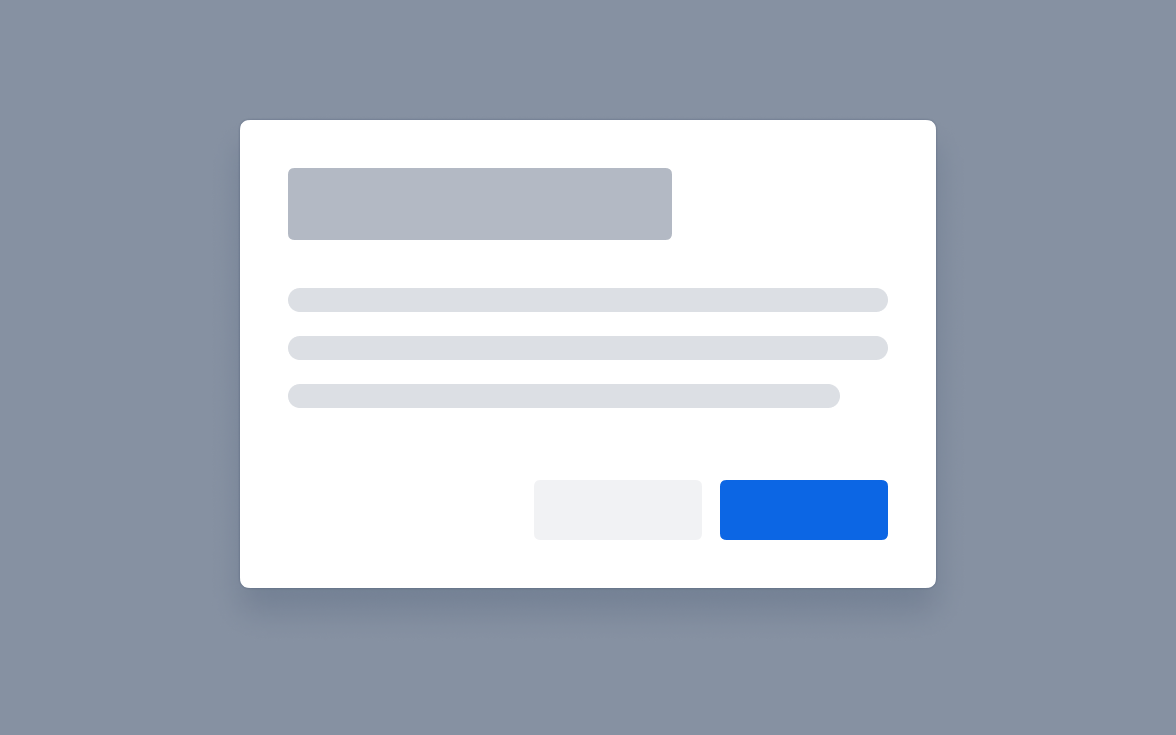
In general, the primary button or main CTA should match the alignment of the button group. For example, right aligned button groups place the primary button on the right. Left aligned button groups would place the primary button on the left.
Right align buttons for focussed tasks, series of tasks (such as onboarding), and modal dialogs. Right aligning buttons is best for experiences with less copy, so users end scanning on the most important action (following a Z-pattern).
Left align buttons for single-page forms and other full-page tasks where there is a lot of content in view. This aligns with how people scan full pages with more content (F-pattern), sorting by importance from left to right. Cards can also left-align the primary action, as they're typically part of a larger page experience.
Exceptions: Benefits modals and login forms currently center align buttons.
Do
Right-align buttons for focussed tasks, modal dialogs, and other areas with less content.

Do
Left align buttons on full-page forms, long lists of cards, or other screens with a lot of full-page content.
Form patterns show more detailed button alignment diagrams.
Content guidelines
Use sentence case capitalization
Only capitalize the first letter of the button and any proper nouns. (Most feature names aren’t capitalized or considered proper nouns when following our capitalization guidance.)

Do
Use sentence-case capitalization.

Don’t
Use title case capitalization or all caps.
Keep labels short and free of punctuation. Drop unnecessary articles, such as ‘a’ or ‘the’, for a more concise label.

Do
Use concise, easy to scan button labels to describe the action.

Don’t
Use long, redundant button labels.
Use specific labels wherever possible
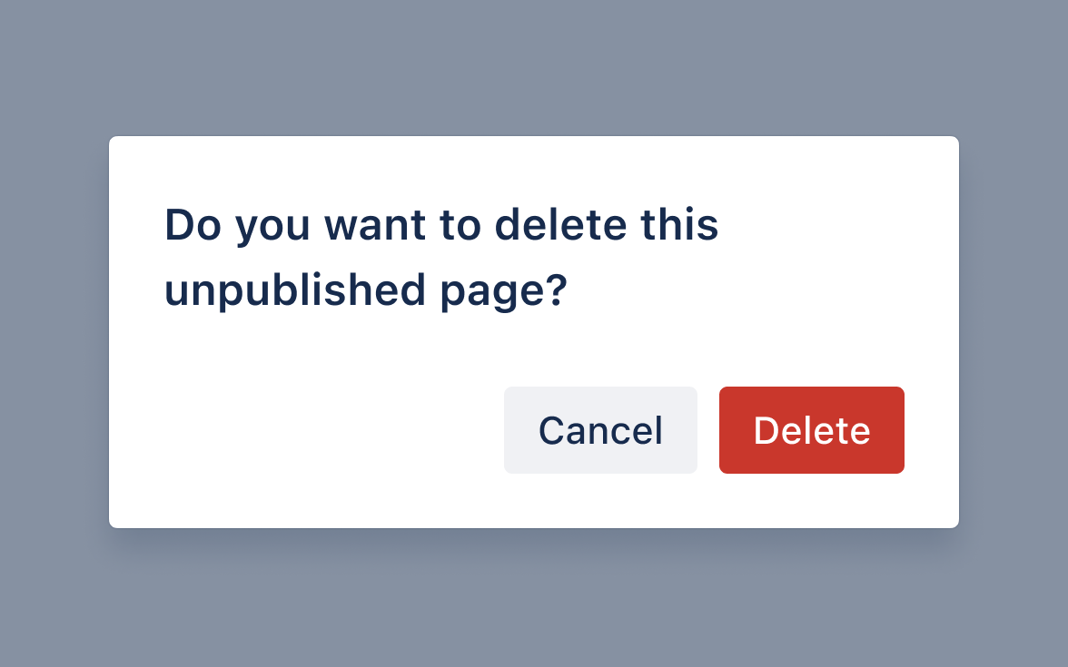
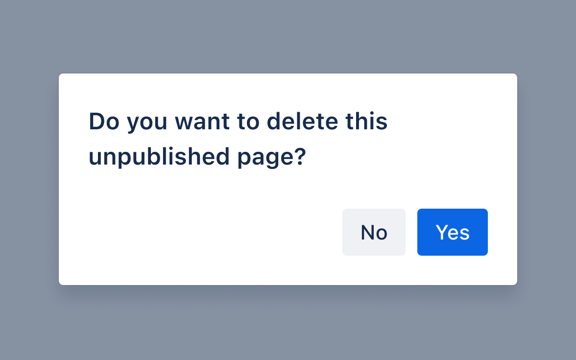
Start with the verb and specify what is being acted on. Use dynamic text to make the button very specific if posible.
Do
Use active verbs or phrases that clearly indicate action.
Don’t
Use vague and generic labels that make the user read the dialog before taking action.
Make labels consistent with other UI in view
For example, if a button is part of a larger modal, use the same language in the button as in headings and other related text.
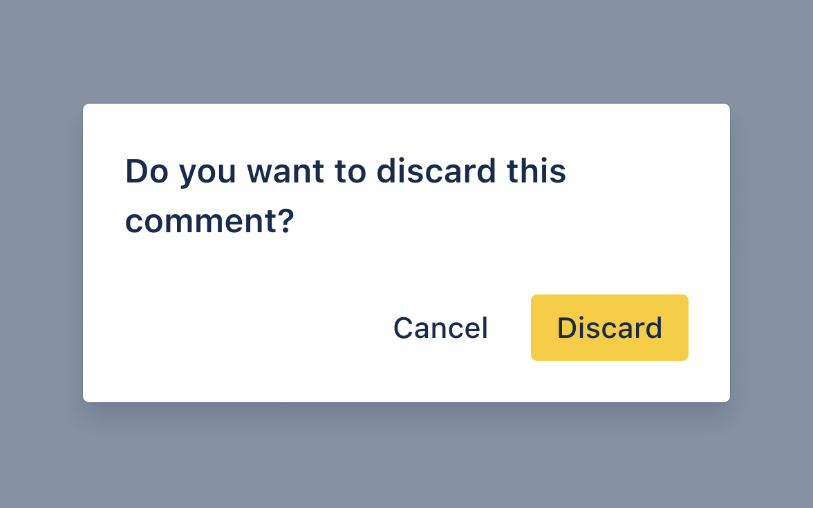
Do
Use consistent language for the button and other text descibing the same action.
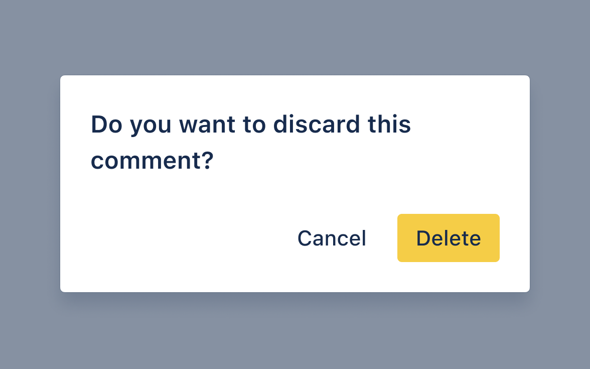
Don’t
Use different words to refer to the same action.
Data Center apps
For all new features, we recommend using Atlassian Design System and other Atlaskit components, (opens new window). For existing code, you can continue to use Atlassian User Interface (AUI), (opens new window).
Technical considerations
Behavior
Each button variation (Button, LoadingButton and CustomThemeButton) will render out a
<button> element, an <a> element if a href prop is supplied, or render any other element type
by using the component prop (for example, component="span"). Each button element looks and behaves
similarly, regardless of element tag, as it is guided by the native <button> behavior.
A role prop is inferred from the element type or you can pass in a role prop if you need to.
Buttons support an overlay element, which is used to display a spinner for
LoadingButton > isLoading. When there is an overlay, the normal button content fades out and the
button is non-interactive but not disabled.
A button with an overlay:
- will block events as if it is disabled
- won’t lose focus automatically when the overlay is shown (unlike when it is disabled, where the focus is lost)
- allows focus to be given and removed from the element
The button will not show :active and :hover styles and otherwise keeps the same visual and
cursor experience as if it did not have an overlay.
Adding event listeners
For the most consistent behavior across elements, it’s safest to use bubble phase listeners on the
button element and parent elements, for example, use onClick rather than onClickCapture.
Although, event listeners can be added in either the capture or bubble phase on the button
element.
Bubble and capture event listeners will not be called when the button component is disabled.
For elements that are parents of a button you need to bind on the bubble phase (for example,
onClick) since button does not abort the event until the capture phase. So as the event goes down
the DOM tree in the capture phase, it’s not aborted until it reaches the button element. This means
you will get a click event from a button on parents in the capture phase. A workaround is to add
events to the window when disabled and stop the event a bit earlier, but that's a bit heavy.