Badge
Badge is used to display numeric status data.Usage
Use badges to represent numerical data such as counts and metrics. Leading symbols like additions (+) and subtractions (-) can be used to indicate change. Trailing letters like day (d), thousand (K), million (M) can be used to represent abbreviations.
Parts

- Label: Should only contain a numeric value.
- Letters or special character (optional): leading special characters can be used to represent additions (+) or subtractions (-), and trailing letters can be used to represent abbreviations (d for day, K for thousand, and M for million).
Color
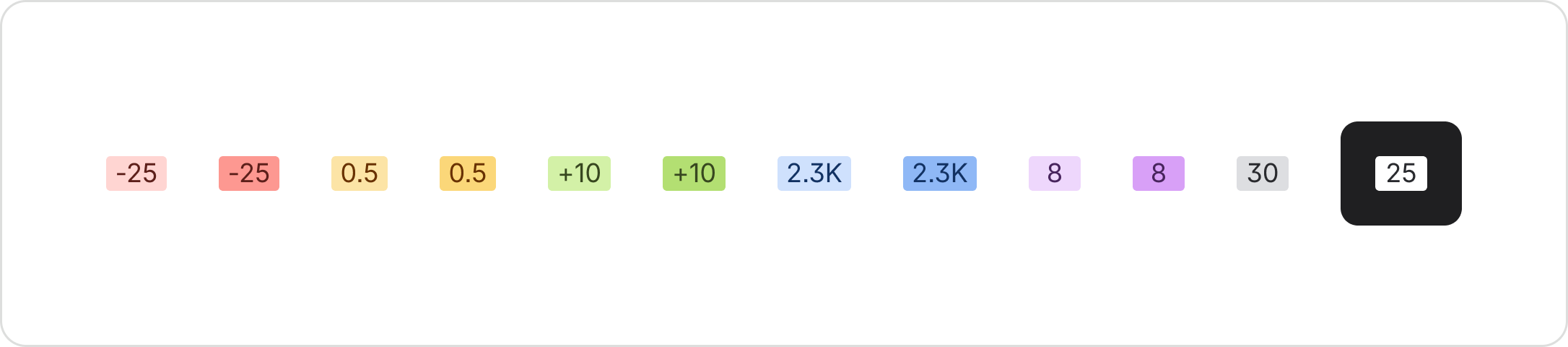
Badges offer 6 default semantic appearances: danger, warning, success, information, discovery, and neutral, and 5 bold semantic appearances: dangerBold, warningBold, successBold, informationBold, and discoveryBold. They also include an inverse appearance for use on inverse backgrounds relative to the selected theme.
Accessibility
Number values are grouped and separated differently across countries and regions. Use your app's internationalization library or the browser's internationalization features. Make sure the user's locale is set correctly so numbers display in a familiar format.
Best practices
Apply the correct semantics
Ensure you use the correct semantic appearance for your particular use case to ensure consistency across apps. Each semantic represents a specific intent — for example, danger represents deletion, removal, or critical information. Using a semantic appearance that doesn’t represent the information being conveyed can cause confusion for users and create inconsistent experiences across apps.

Do
Use the correct semantic color for your use case.

Don’t
Don't deviate from established semantics.
Only use bold semantic badges for elements of high importance
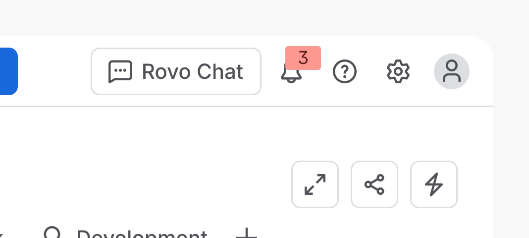
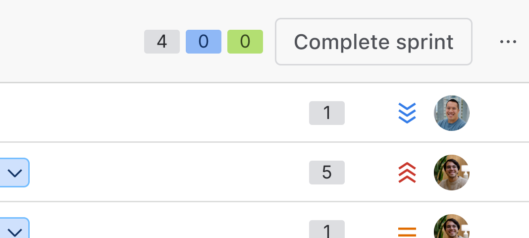
Usage of the bold semantic appearances should only be used for badges of high importance or for badges requiring higher visual prominence, such as notification counts.
Do
Use bold badges sparingly, and only when the element requires high visual prominence.
Don’t
Don't use bold badges for elements that are secondary to other labels such as lozenges.
Provide additional cues to avoid ambiguity
Use badges alongside a label to clearly show which item is quantified.

Do
Use badges alongside labels or with single items.

Don’t
Don't use badges without context, unless they contain an attached tooltip.
Data Center products
For all new features, we recommend using Atlassian Design System and other Atlaskit components, (opens new window). For existing code, you can continue to use Atlassian User Interface (AUI), (opens new window).
- For non-numeric information such as status and other high importance attributes, use a lozenge.
- For non-numeric information such as status and other high importance attributes with dropdown interactivity, use a lozenge dropdown trigger.
- To descriptive metadata and information, use a tag.